
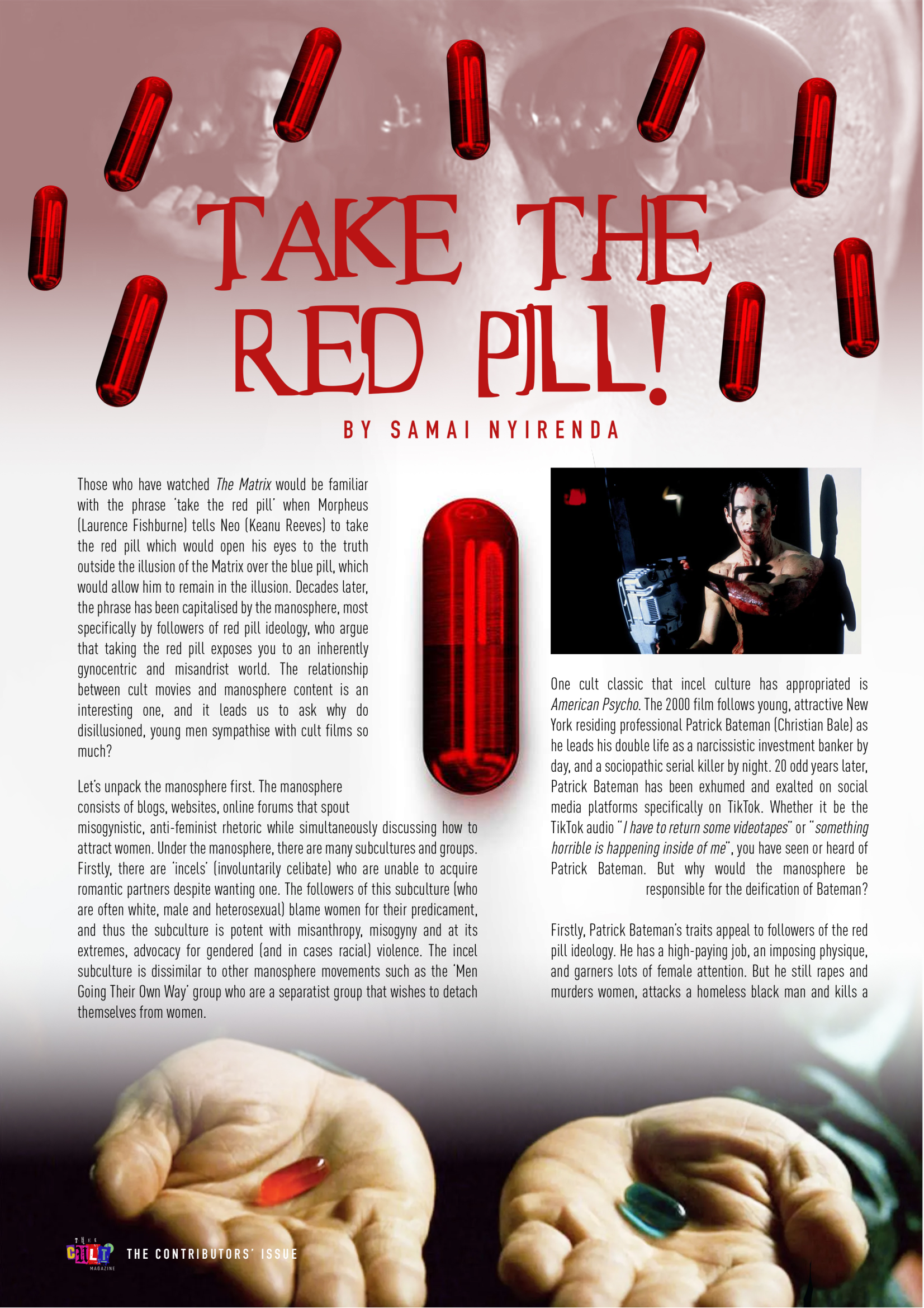
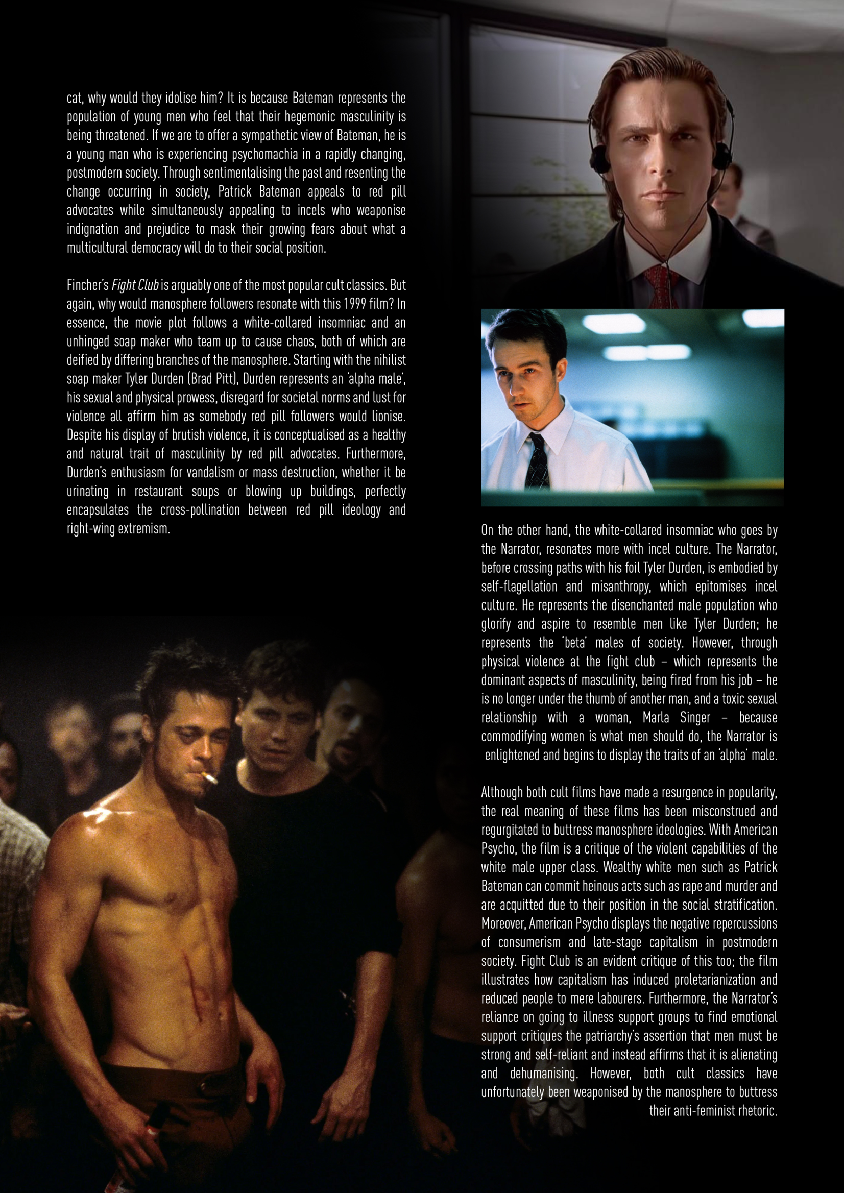
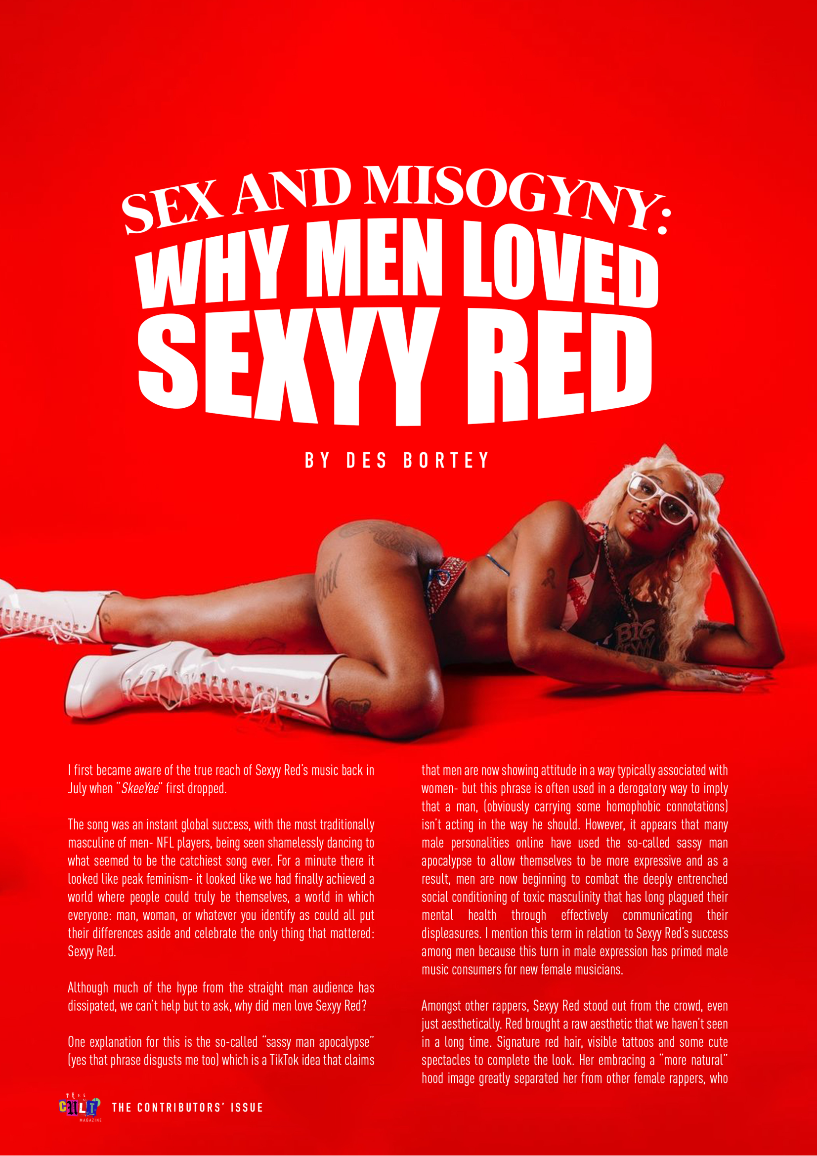
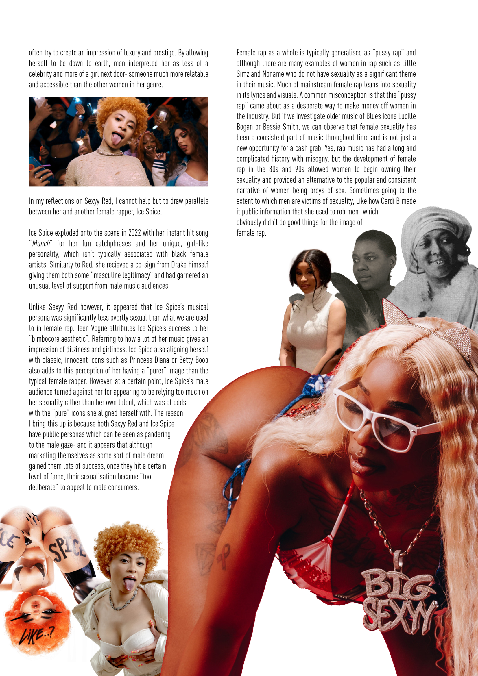
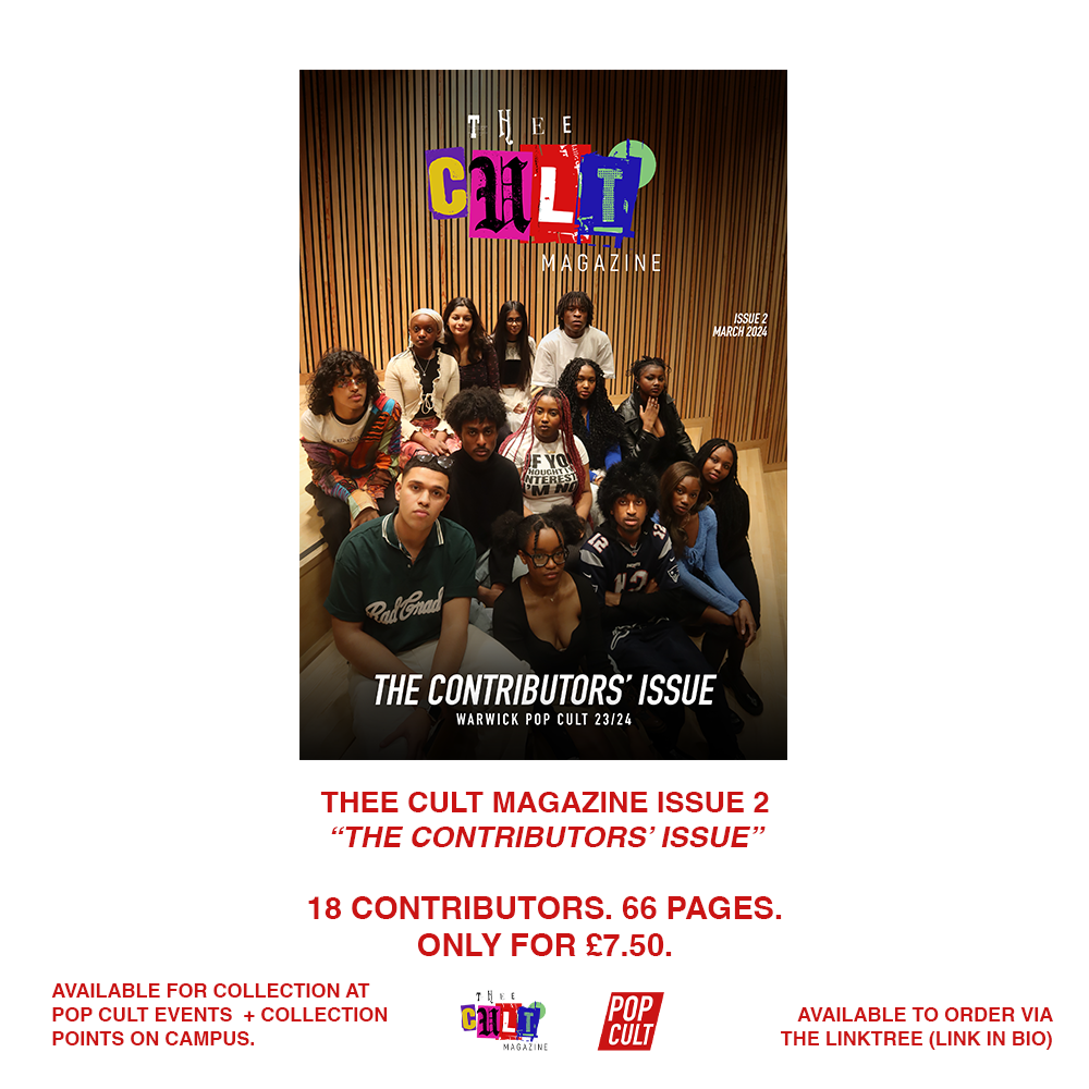
Issue 2: The Contributors Issue
For Issue 2 of Thee Cult Magazine, I led the publication through a period of expansion, operating as Creative Director and editorial lead while coordinating contributors, shaping visual direction, and managing production under accelerated timelines. The focus moved from establishing identity to sustaining participation, with emphasis placed on commissioning, communication systems, and adapting the magazine’s structure to support a growing range of voices. Design was developed collaboratively with Yasir Guerziz, alongside the integration of design education, community activations, and external brand collaboration through my role as an Adobe Student Brand Ambassador. This issue reflects a transition from foundation to operation, testing how Thee Cult could function as a living platform rather than a singular creative artefact.
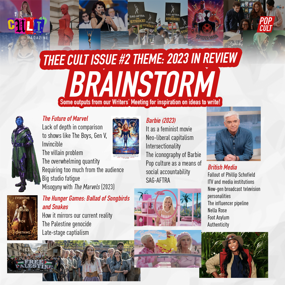
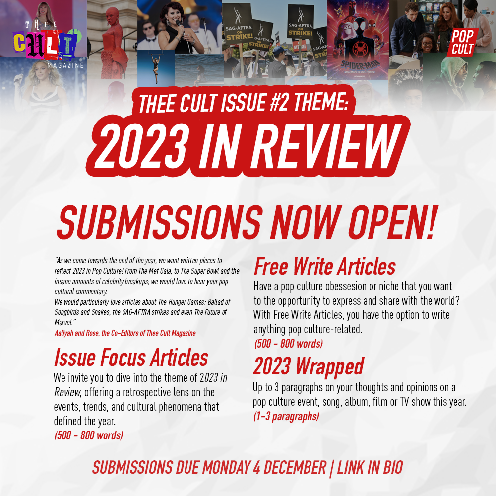
Issue 2 marked a significant shift in both scale and structure for Thee Cult Magazine. Unlike the inaugural issue, which focused on establishing identity and foundation, this issue was designed as a platform-building exercise - centred on developing contributors, testing editorial standards, and understanding what a self-sufficient pop culture publication could look like in practice.

At this stage, I operated with a more defined role as Creative Director, overseeing editorial commissioning, contributor development, visual direction and production. The issue intentionally did not follow a single overarching theme. Instead, it functioned as a calibration point, allowing a wide range of voices, subjects, and approaches to emerge organically. This approach was used to gauge interest, assess the calibre of writing on campus, and identify the editorial strengths the magazine could build on moving forward.
At this stage, the magazine operated on a single-draft model. Contributors were commissioned through clear briefs, with expectations set at the point of acceptance rather than through extended editorial revision. The emphasis was on participation, follow-through, and establishing a baseline standard of writing, rather than refinement through multiple drafts. This approach reflected both the realities of student schedules and the magazine’s priority at this stage: understanding who would commit, what voices would emerge, and how a larger contributor base could be sustained.

A central challenge during Issue 2 was maintaining effective communication within an environment where contributors were already navigating academic workloads, part-time employment, and multiple society commitments. As a result, communication systems became a core part of the creative process. Social media functioned as the primary public-facing tool for calls, updates, and momentum-building, while existing Pop Cult WhatsApp communities were used as operational spaces to coordinate contributors, share deadlines, and maintain continuity. While submission timelines occasionally shifted as contributors worked around external pressures, this period became an important learning moment in balancing flexibility with structure.

Visual communication played a key role in this process. Design assets were not treated solely as promotional material, but as tools for clarity and engagement - helping translate editorial timelines, expectations, and opportunities into formats that were easily understood and shared. This period marked an important shift in how my design practice intersected with leadership, with graphic design functioning as a means of organising people, shaping participation, and sustaining collective momentum alongside communicating brand identity.
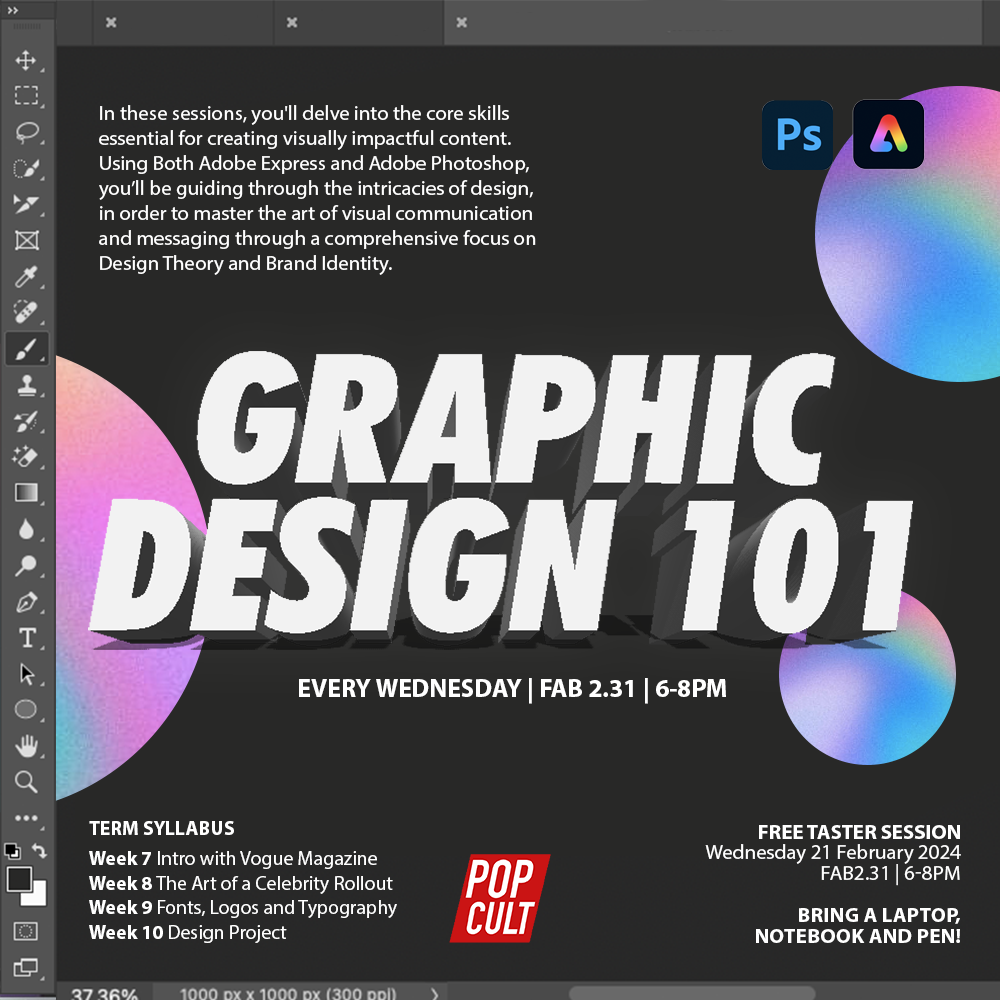
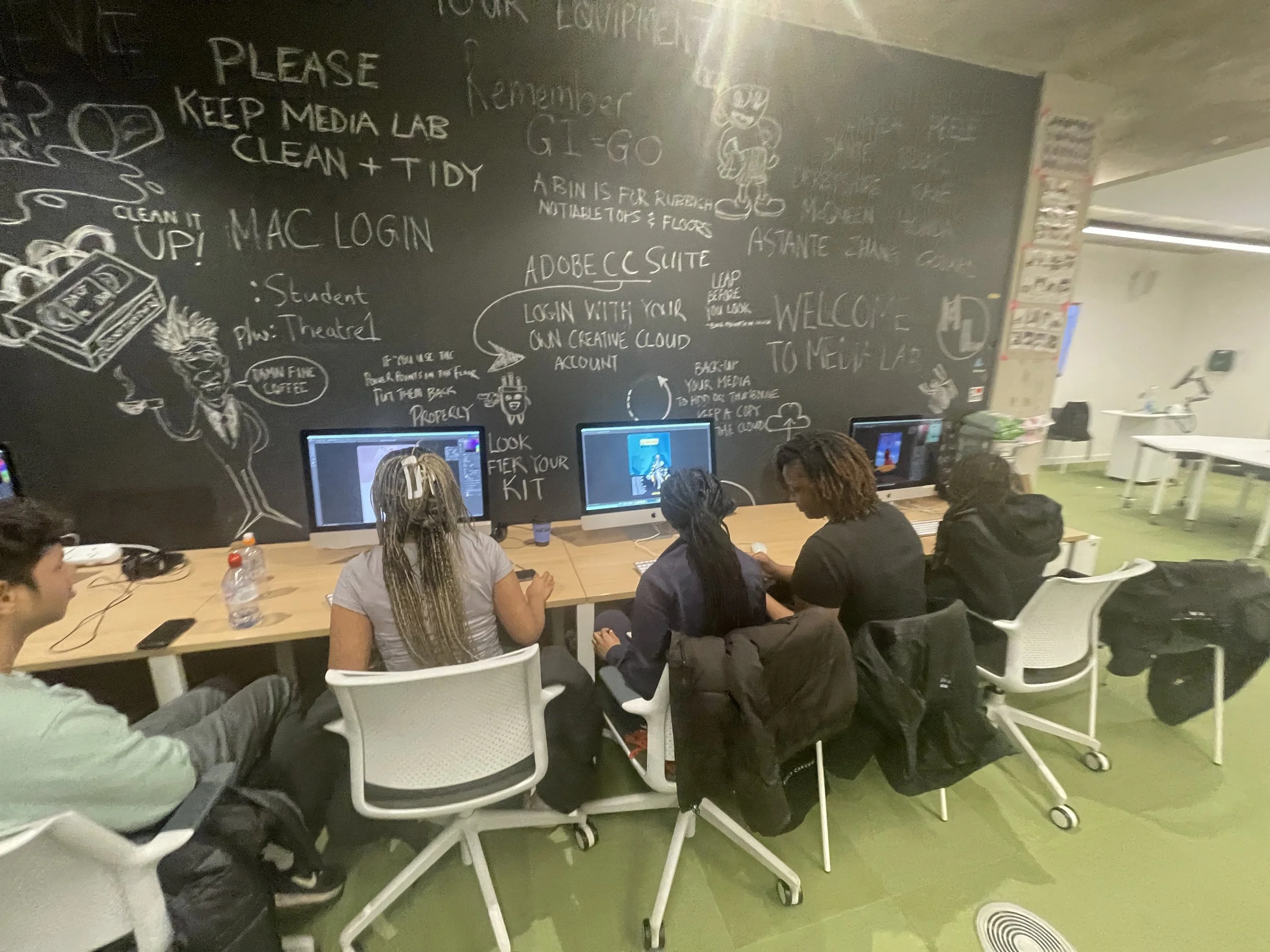
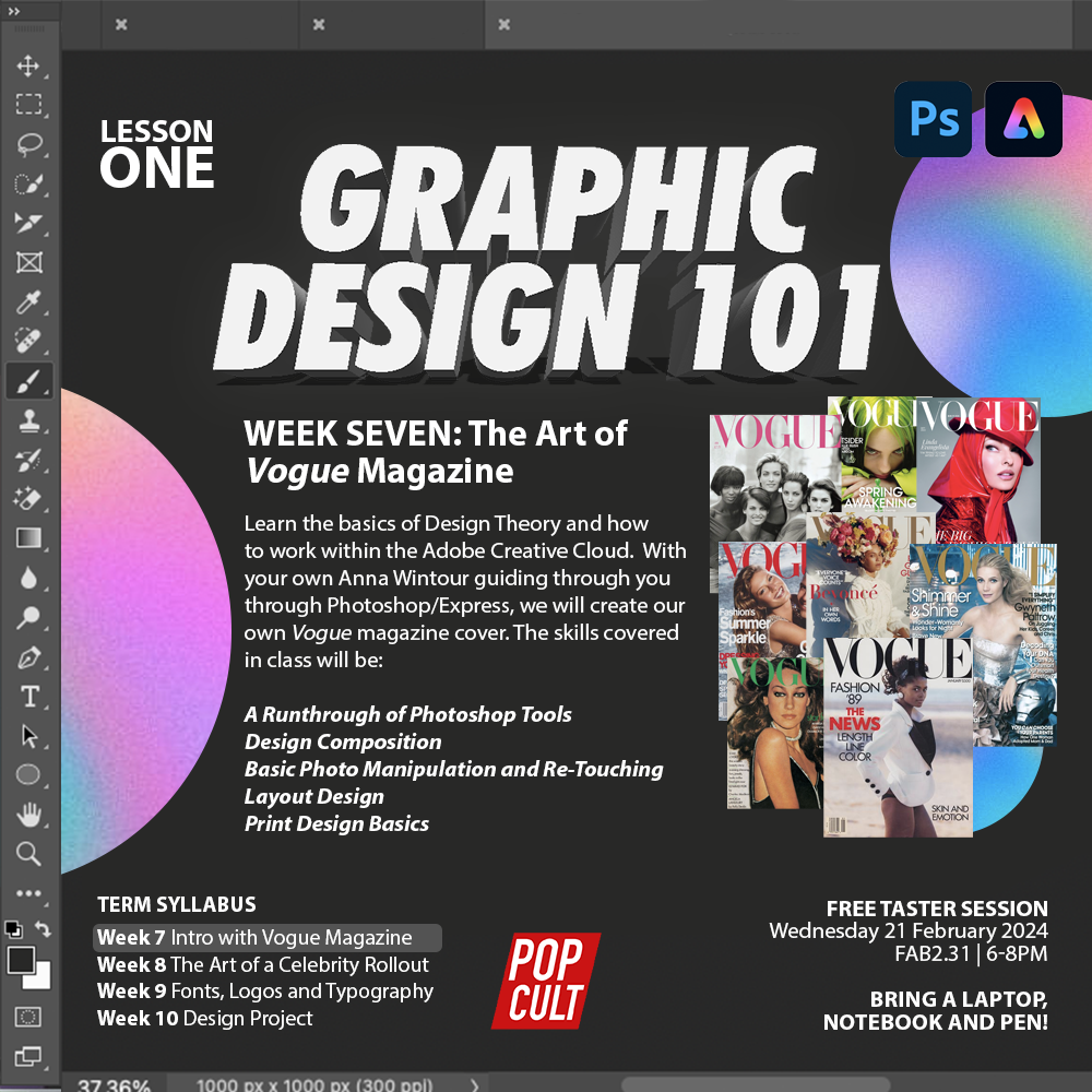
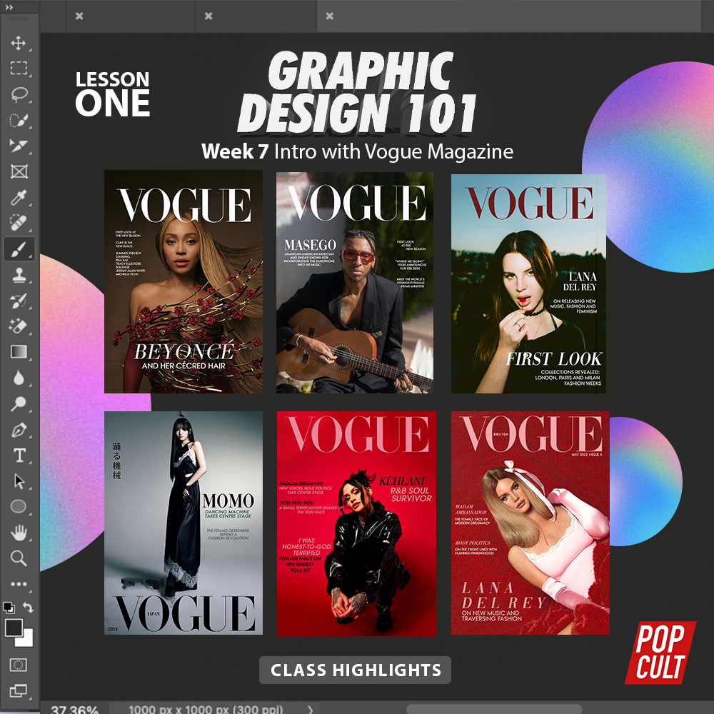
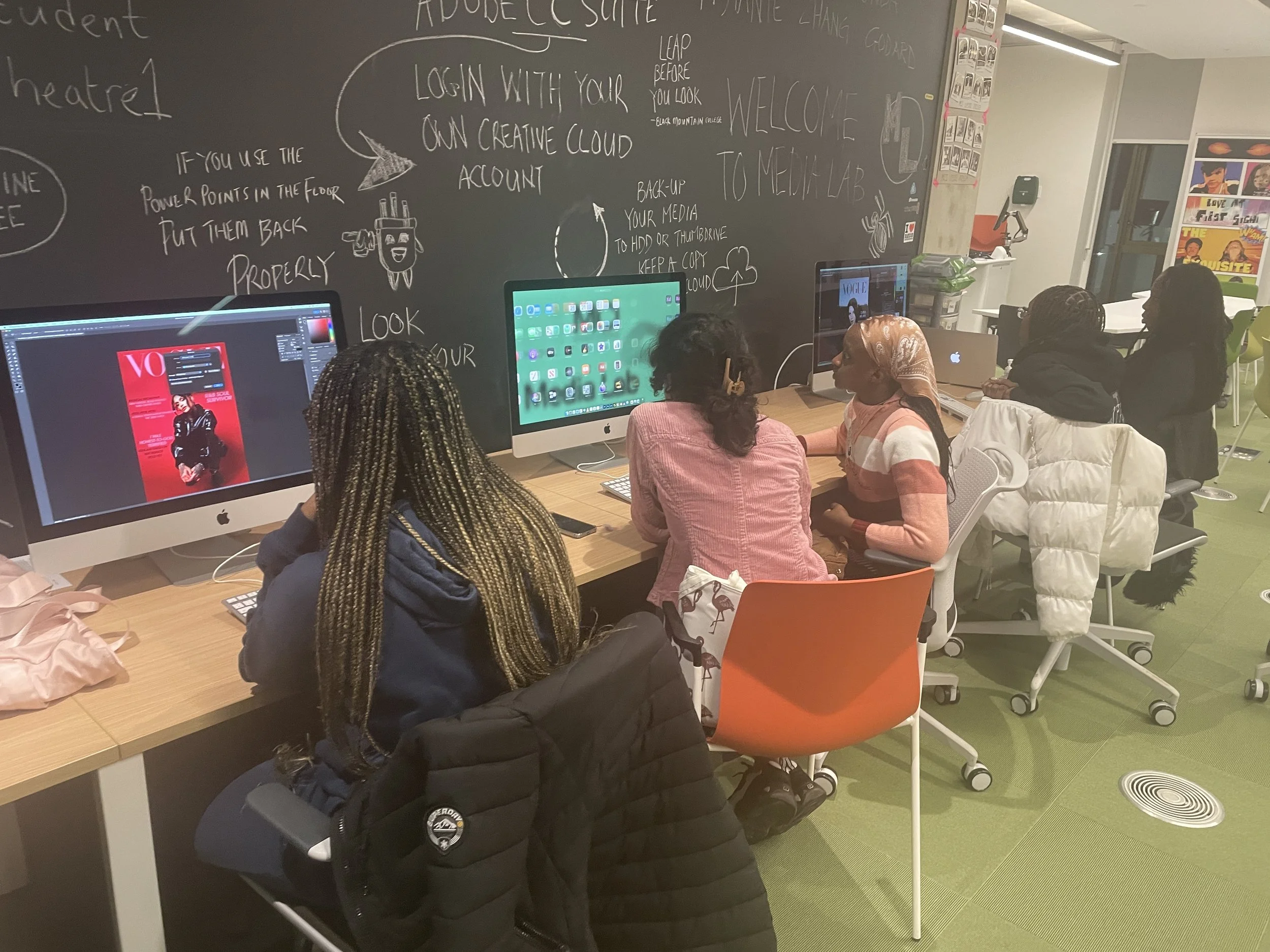
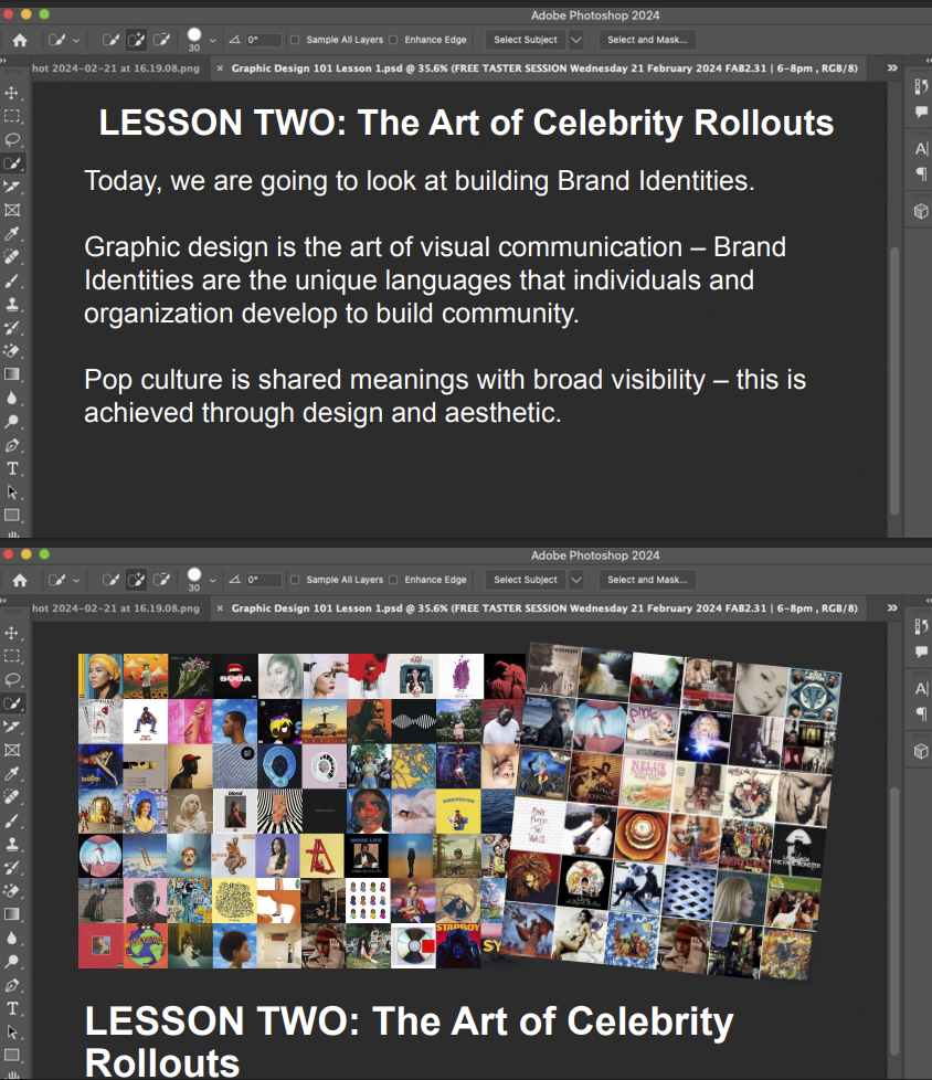
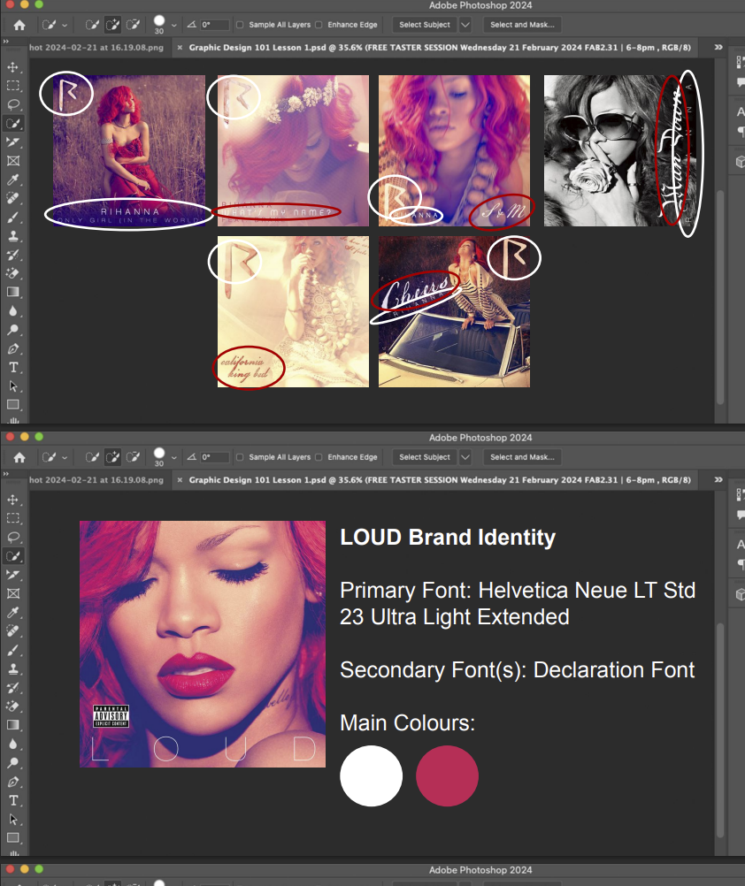
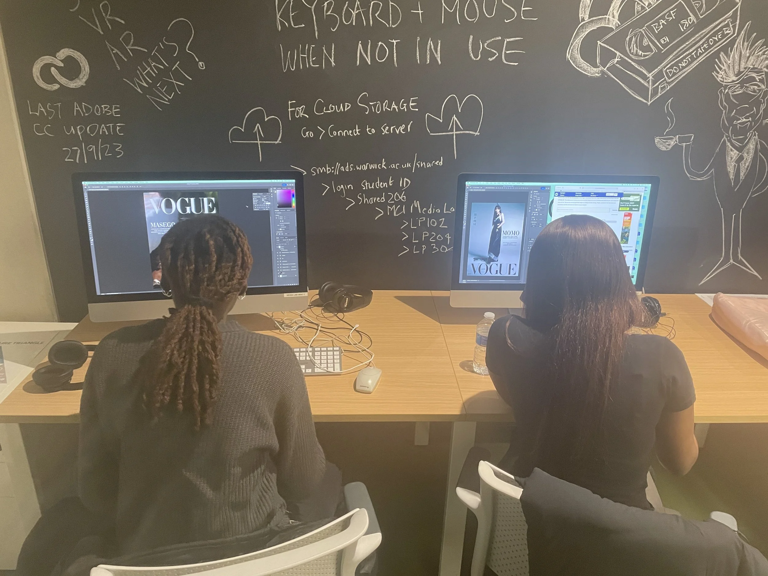
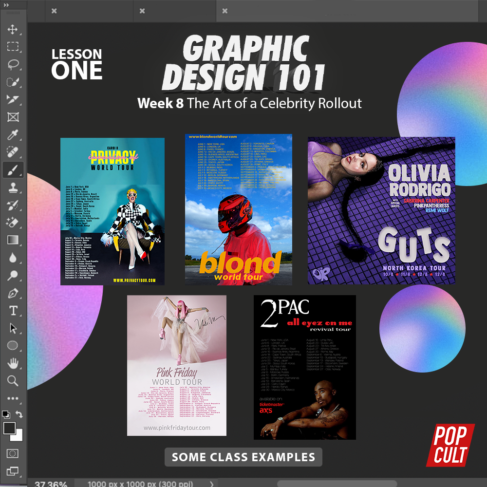
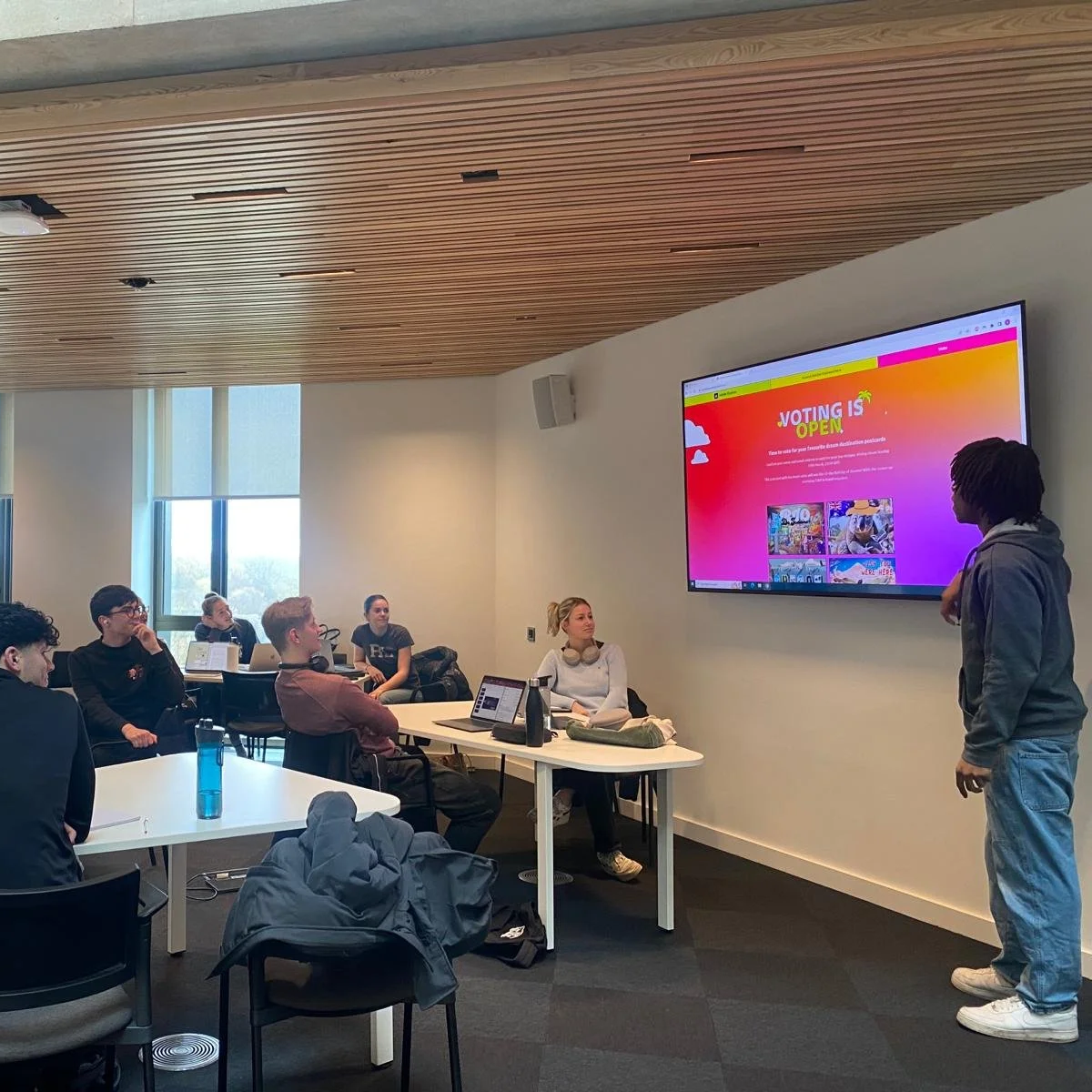
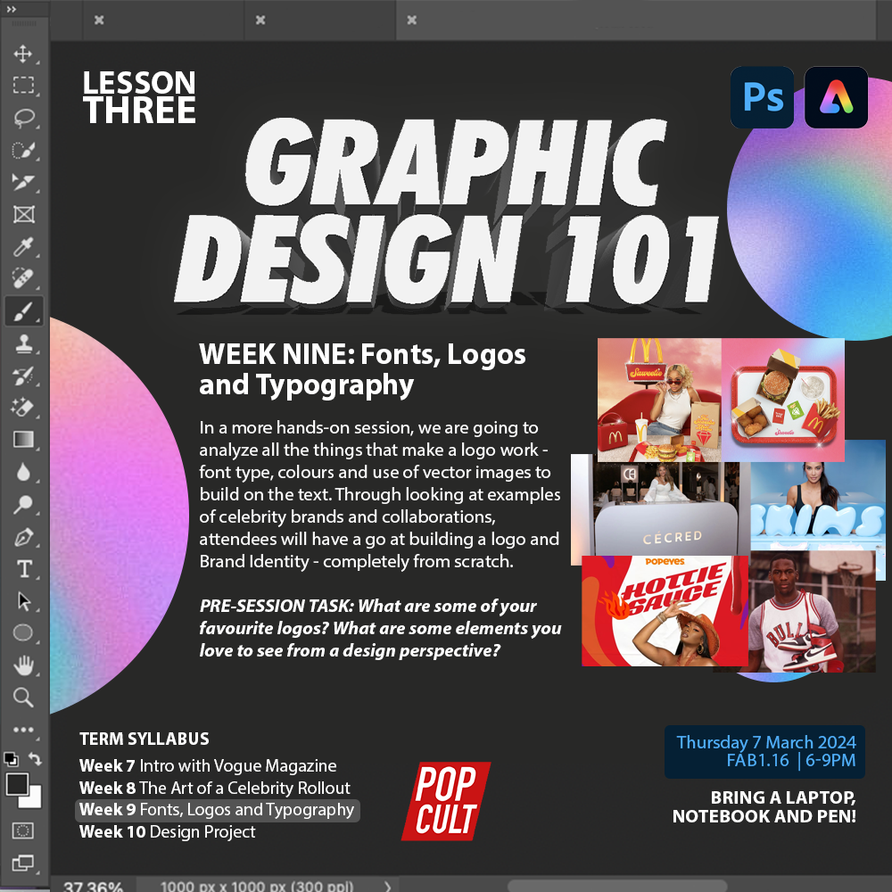
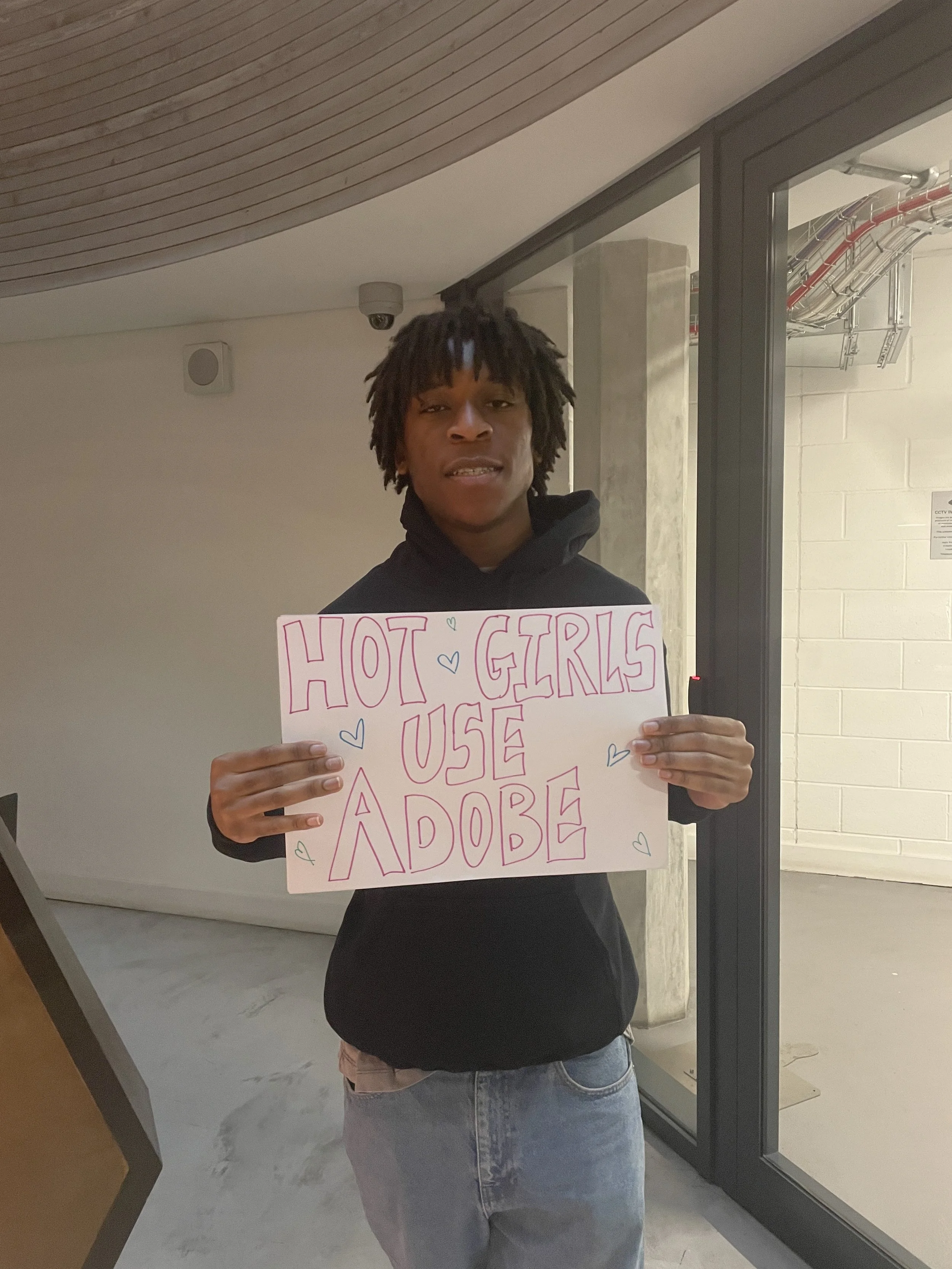
While waiting for the writing process to be fully completed and aligned across contributors, an opportunity emerged to integrate design-led activity into the production of Thee Cult Magazine. During this period, I was operating as a Student Brand Ambassador for Adobe, with responsibilities spanning both on-campus activations and the creation of digital content online. A central focus of the role was building visibility and understanding around Adobe’s newer tools, particularly Adobe Express, which was positioned as a more accessible entry point into design practice.

Rather than treating this work as separate from Pop Cult or the magazine, I identified it as an opportunity to directly support the values that Thee Cult was already developing around accessibility, participation, and creative confidence. The emphasis Adobe Express placed on lowering barriers to design aligned closely with the magazine’s direction at this stage: broadening who felt able to contribute, not only editorially but creatively. Folding this work into the magazine’s production cycle allowed design education and community engagement to intersect in a way that felt intentional rather than opportunistic.
As part of this integration, I began delivering graphic design sessions within Pop Cult, using Adobe Express and Photoshop as teaching tools. These sessions functioned on multiple levels. Practically, they introduced contributors and members to core design principles and software skills. Strategically, they increased awareness of both the Pop Cult brand and Thee Cult Magazine, reinforcing the idea that the project was not only about output, but about creative development and shared learning. Design, in this context, became a means of building confidence and participation, rather than a gatekeeping skillset.-
![]()
New List Item
-
![]()
New List Item
-
![]()
New List Item
-
![]()
New List Item
-
![]()
New List Item
-
![]()
New List Item
-
![]()
New List Item
-
![]()
New List Item
-
![]()
New List Item
-
![]()
New List Item
-
![]()
New List Item
-
![]()
New List Item
-
![]()
New List Item
-
![]()
New List Item
-
![]()
New List Item
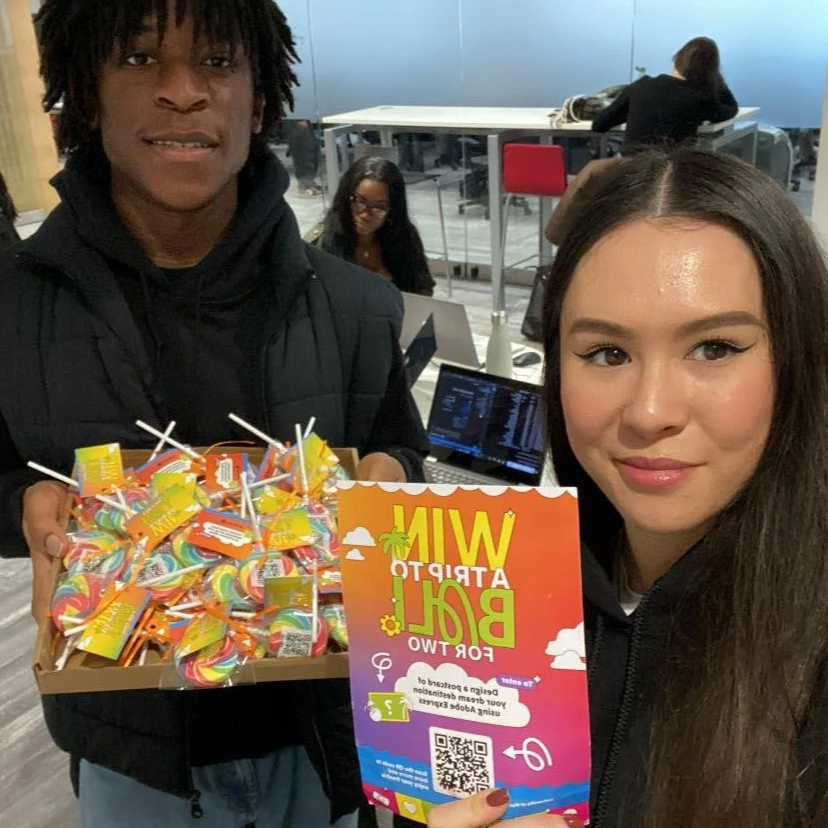
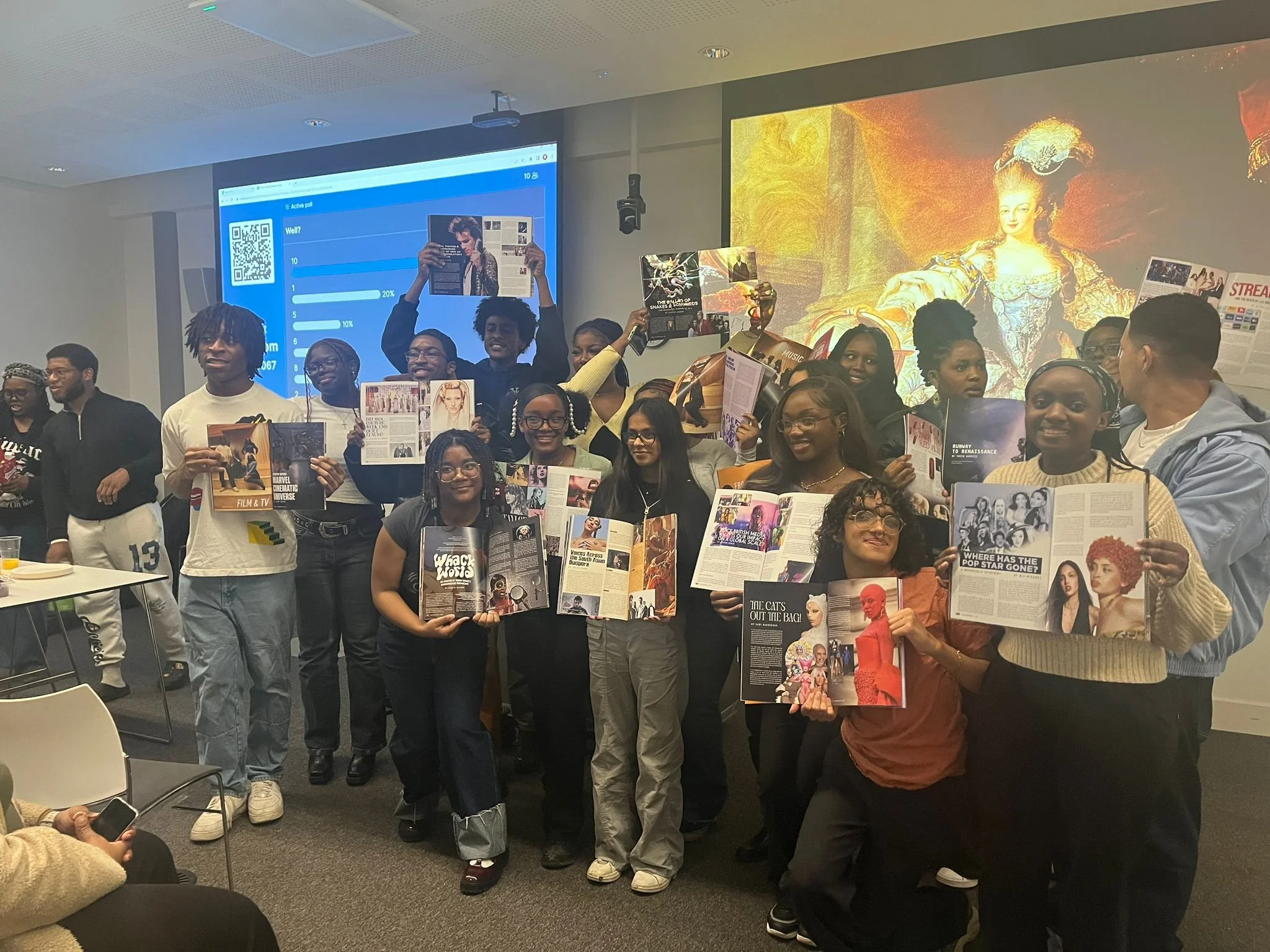
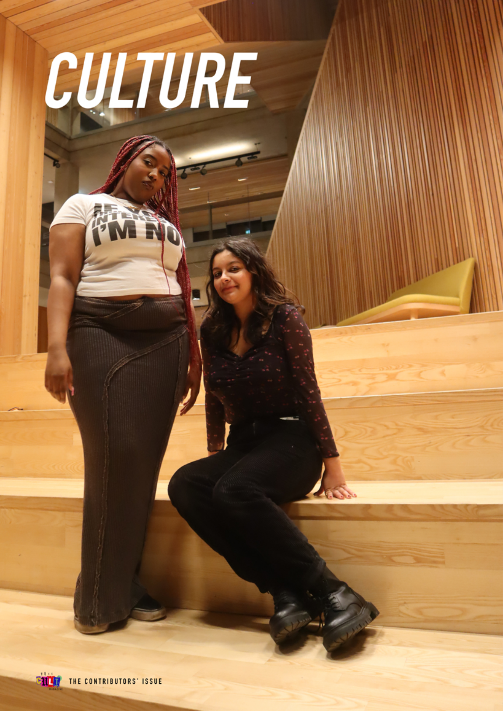
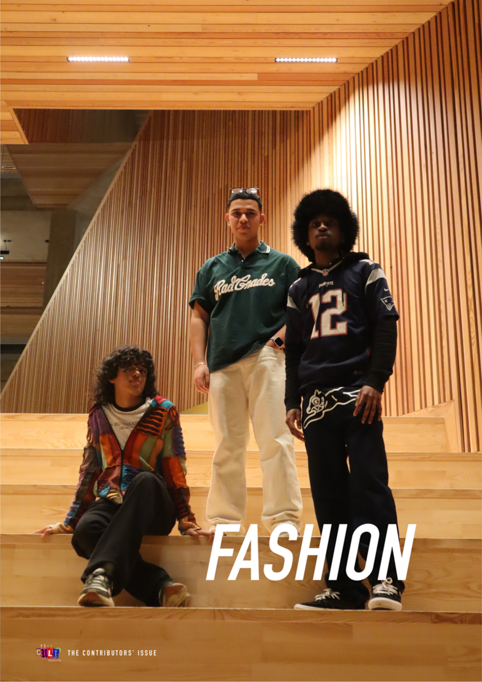
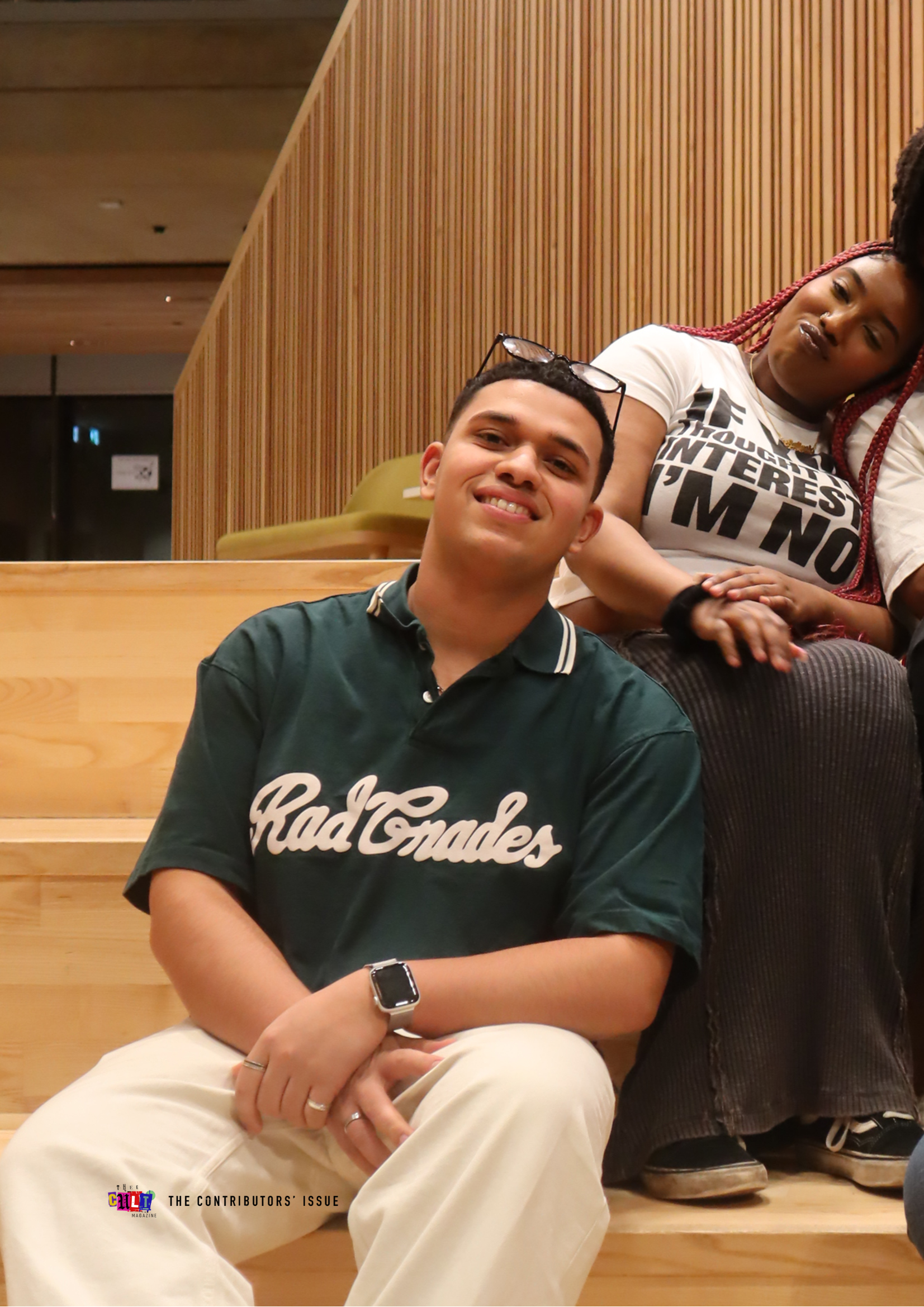
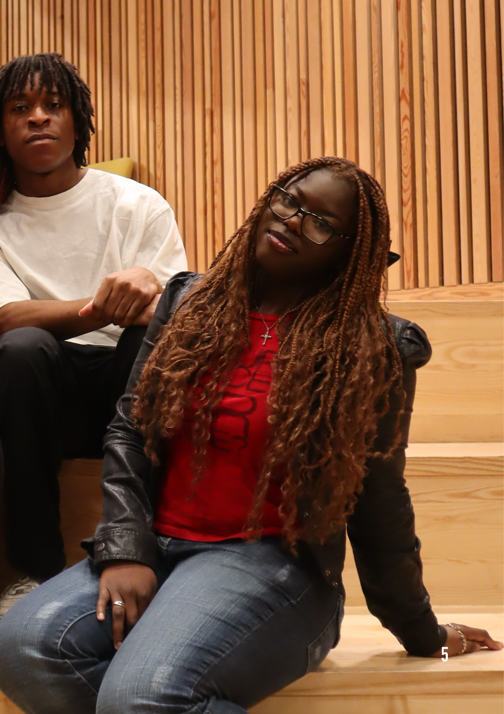
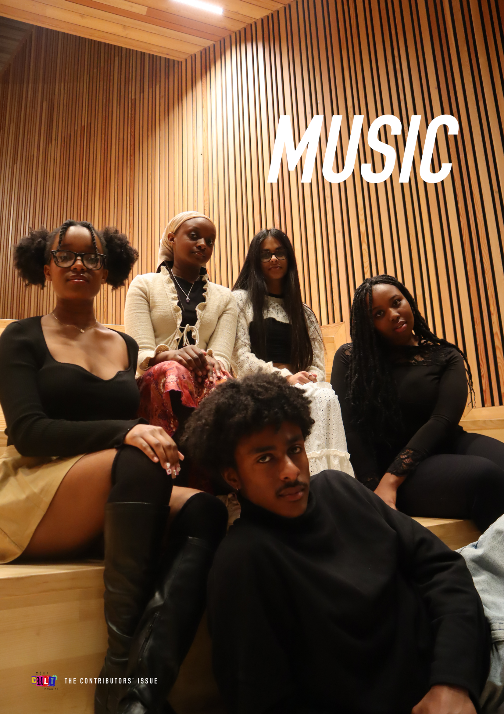
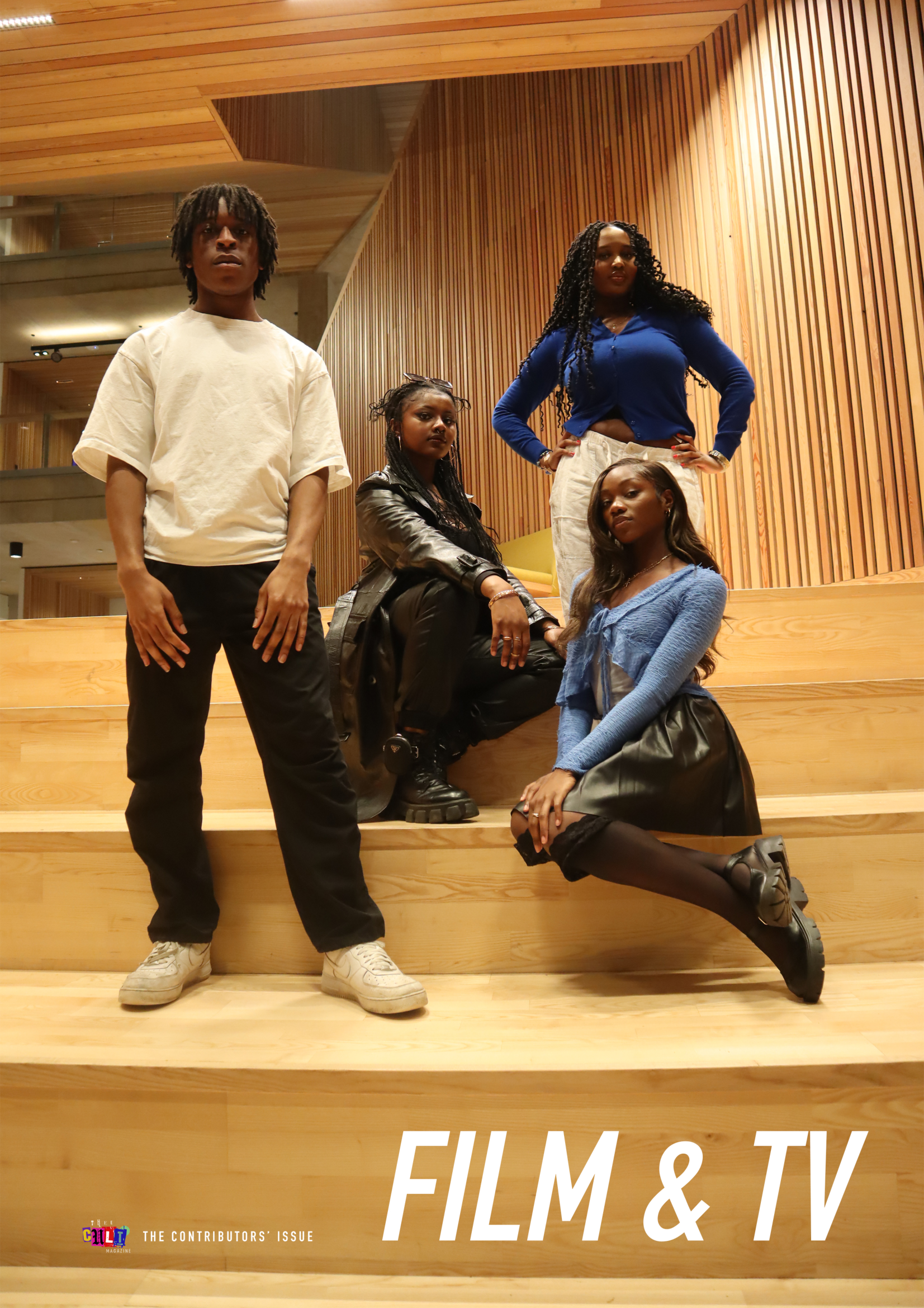
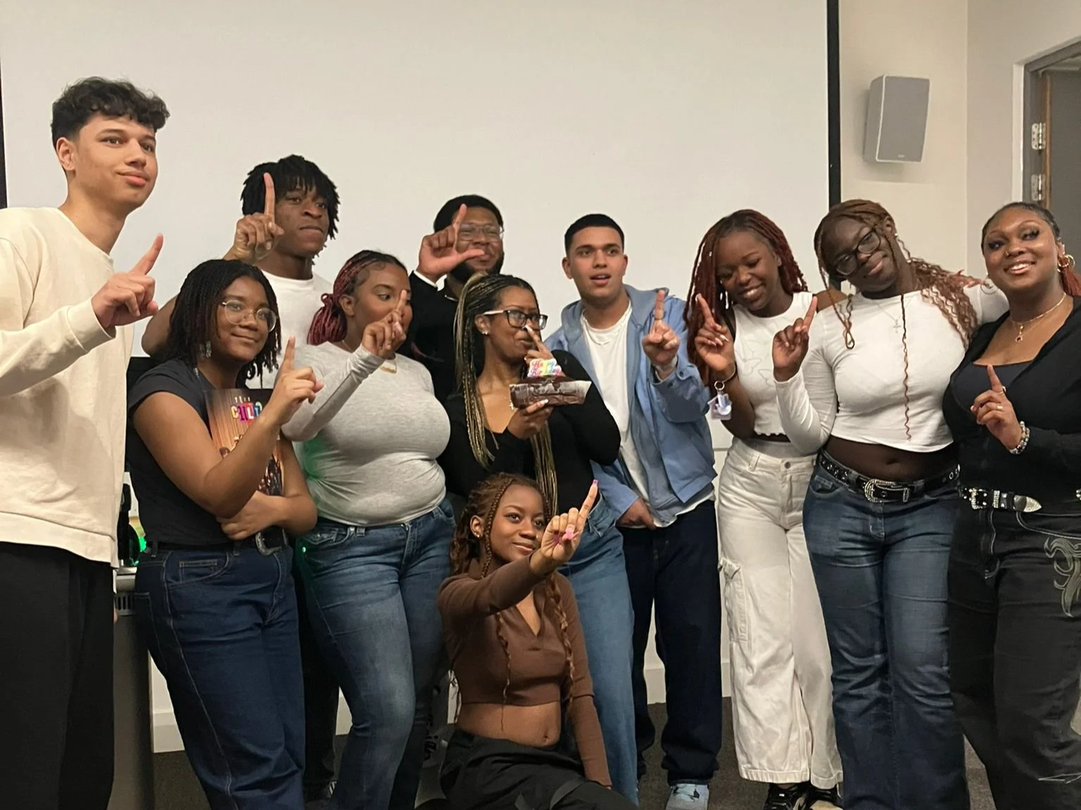
This approach also informed how the required brand activations for the Adobe ambassadorship were delivered. Rather than hosting isolated promotional events, the decision was made to align one of these activations directly with the magazine through a contributors’ dinner and photoshoot. This event operated simultaneously as an Adobe activation, a Pop Cult community moment, and a key stage in the magazine’s production. Contributors were brought together in person, design tools and processes were made visible and accessible, and the magazine’s collective identity was reinforced through shared experience.At the same time, the photoshoot also exposed clear limitations in how much could be meaningfully achieved within a single day. The shoot took place alongside the Adobe activation and contributors’ dinner, which meant that attention, energy, and preparation were necessarily split across multiple priorities. Combined with the scale of participants and my relative lack of experience directing group shoots at that point, the process became more reactive than intentional. Rather than working toward a clearly defined visual focus, much of the shoot operated on improvisation - decisions were made in the moment, with limited opportunity to refine lighting, direction, or pacing. In retrospect, this lack of singular focus is visible in the outcome. However, this experience became a key lesson moving forward, underscoring the importance of separation, preparation and clarity when producing photographic work at scale.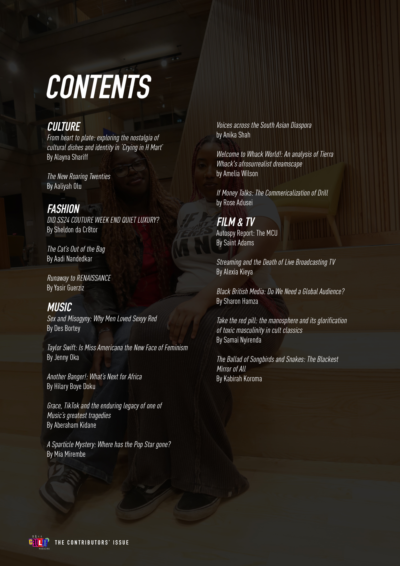
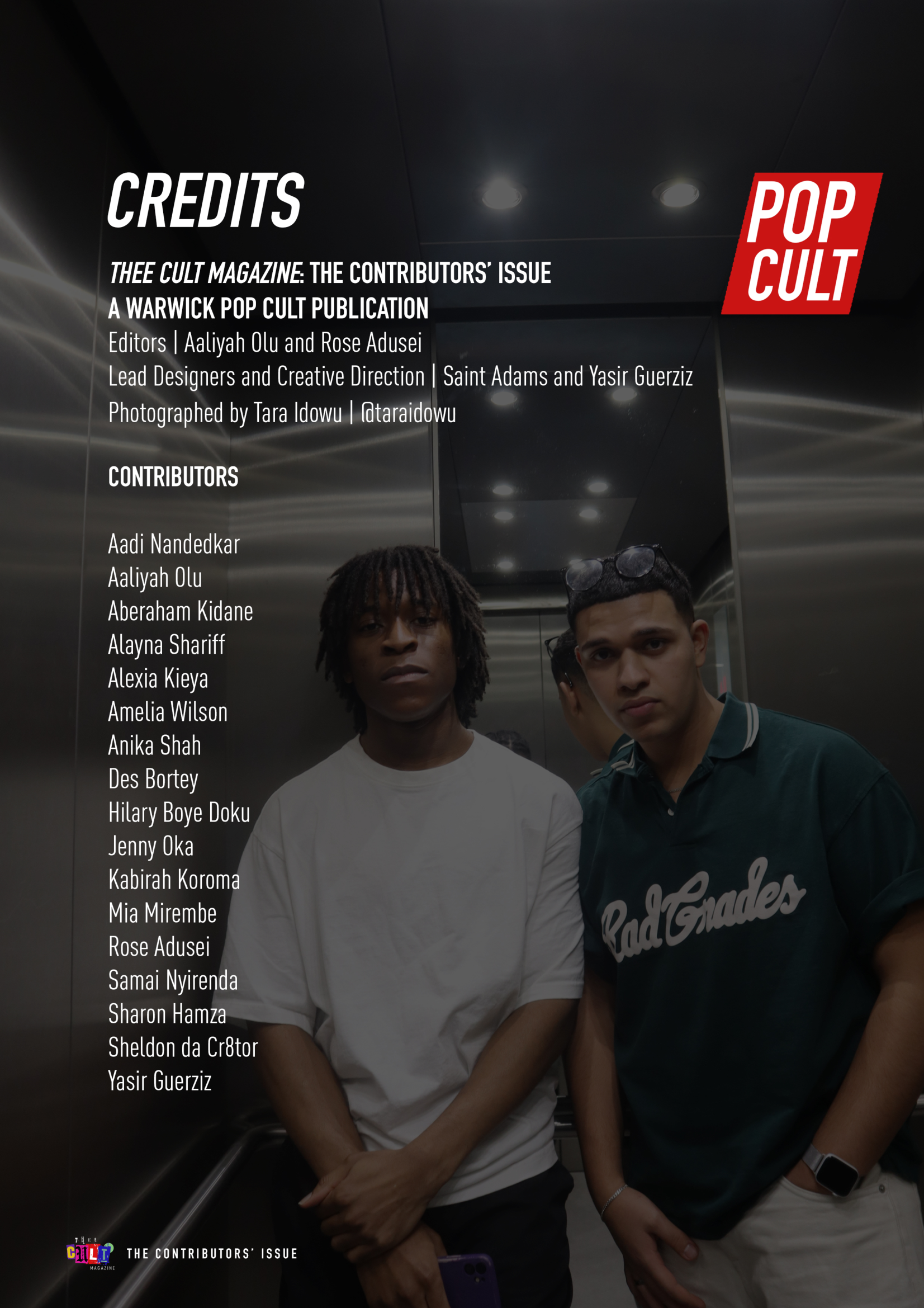
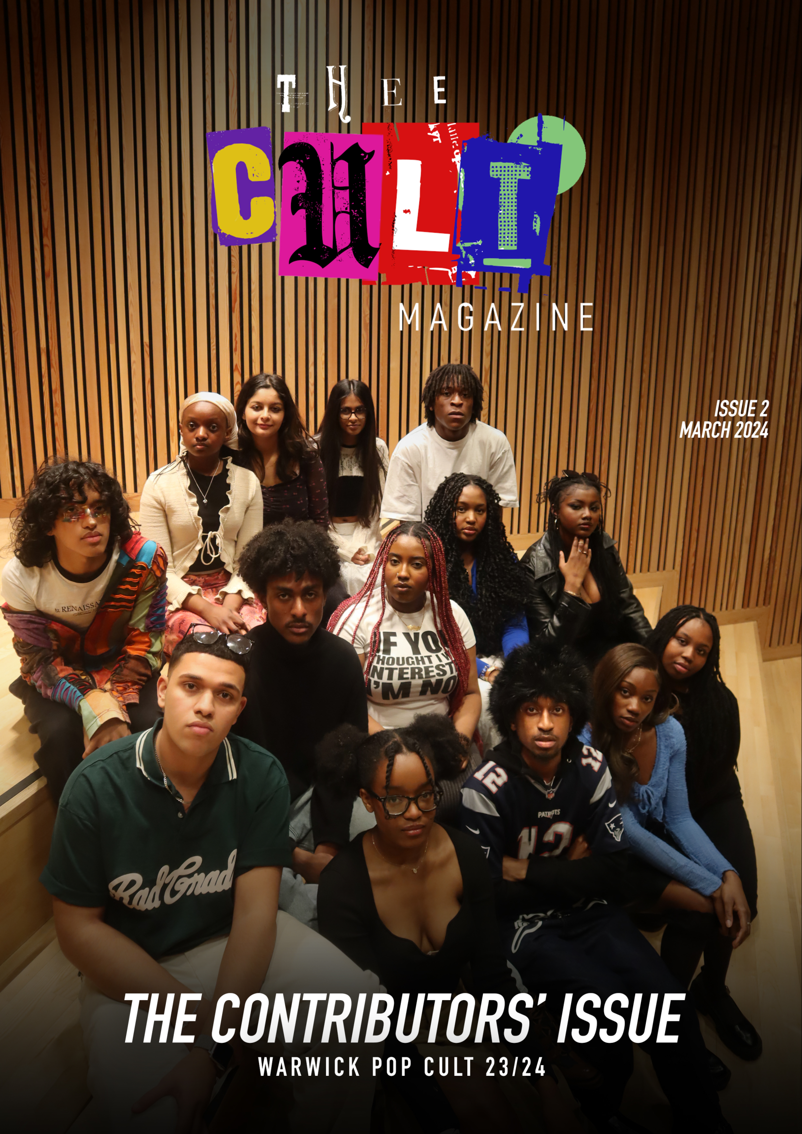
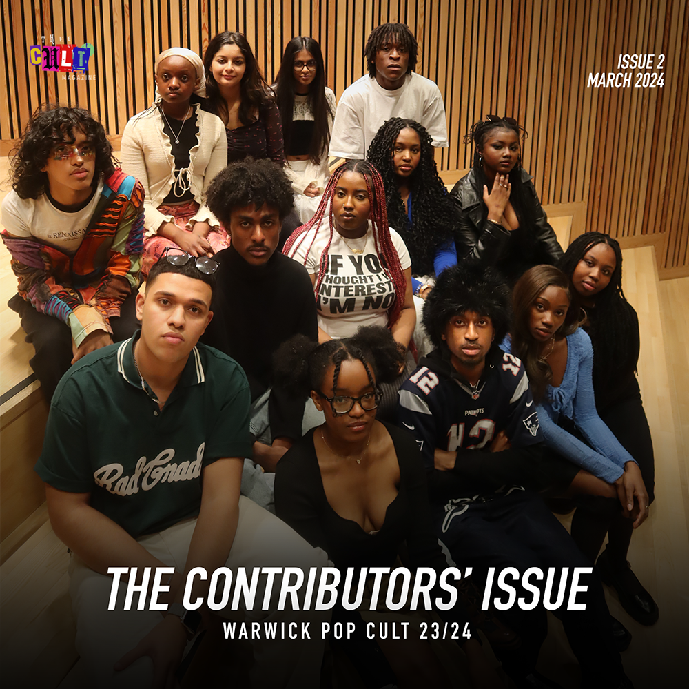
The issue was produced as a limited physical print run and distributed independently on campus. Printing was arranged through an external online service, with copies shipped directly to the team and managed in-house. Distribution took place on location, allowing the magazine to function as a physical point of contact between the project and its immediate audience.The decision to work in print was central to the project, reinforcing the importance of physical media while also providing early experience in managing production, handling, and distribution without institutional infrastructure.The integration of editorial production, design education, and brand collaboration also resulted in wider visibility for the project. The making of Thee Cult Magazine and its associated activations were featured on Adobe UK Instagram, marking a moment of external recognition for the work. This visibility extended beyond the magazine itself, highlighting contributors, creative process, and community-led production, and reinforcing the value of embedding industry-facing opportunities within a student-led cultural platform.The design of Issue 2 was done collaboratively by myself and Yasir Guerziz, with me overseeing the overall direction and pace of the issue. At this stage, Yasir was someone I had actively supported and taught in Photoshop and design, and this issue marked an early moment of collaborative production rather than sole authorship. It was also during this process that the decision was made to move fully into InDesign for layout, a shift that Yasir strongly advocated for and which became a key technical development for the magazine moving forward.The issue was produced under tight time constraints, and the design process reflected this. Rather than working toward a rigid or fully standardised system, layouts were approached pragmatically - responding to the needs of individual articles and allowing flexibility in how content was presented. This resulted in a looser, more improvisational design language, where the priority was momentum and completion rather than polish or uniformity.
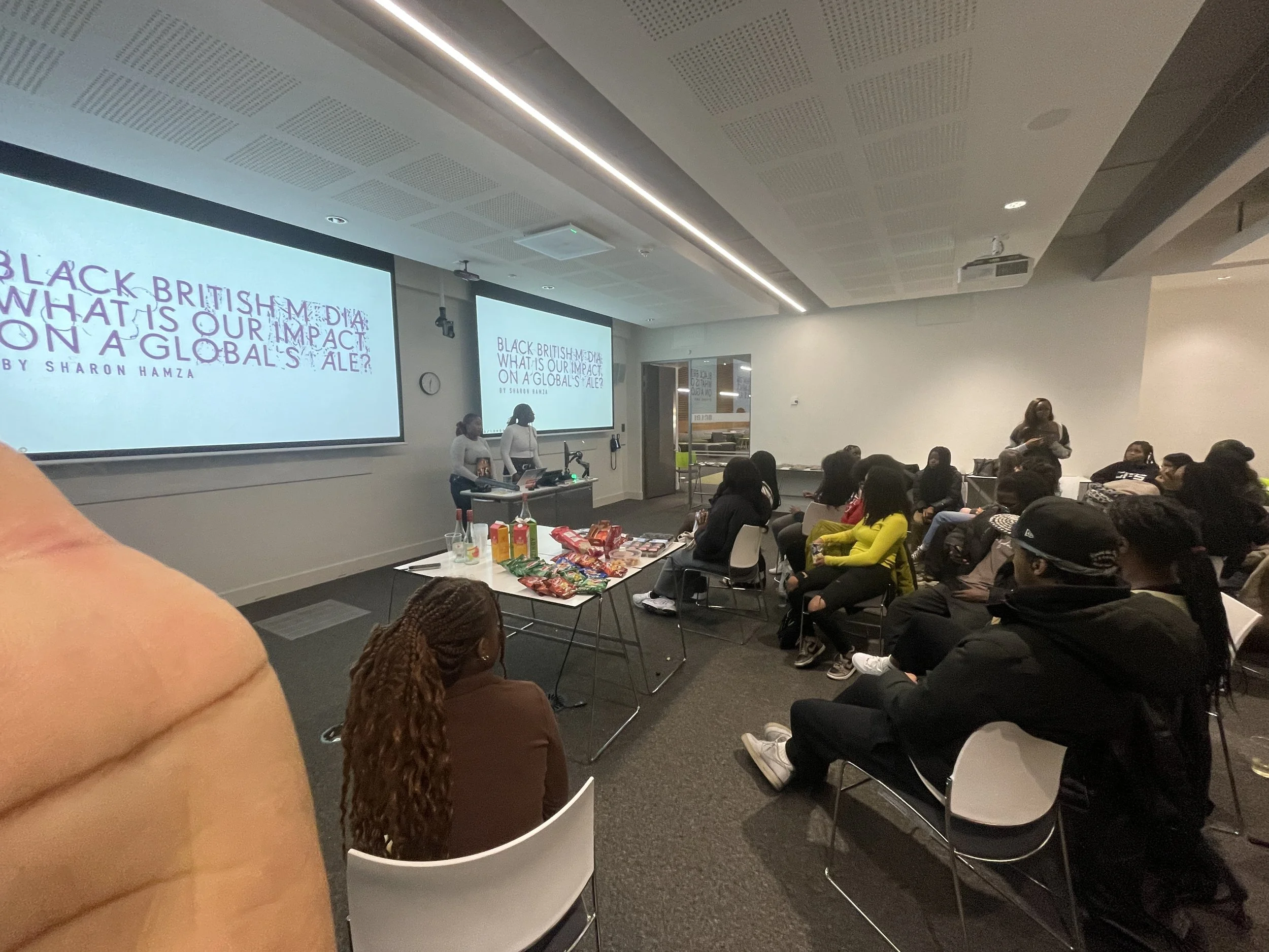
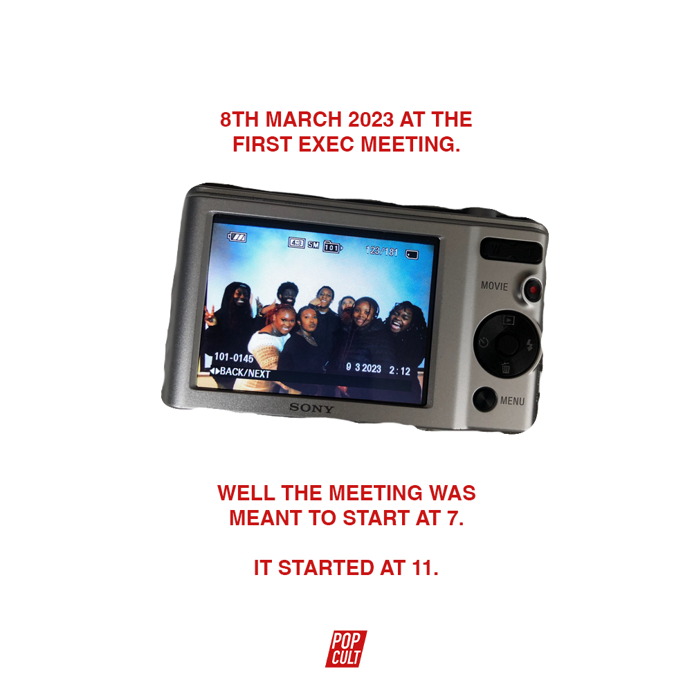
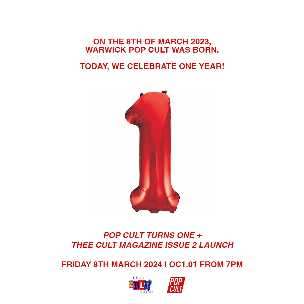
In retrospect, this approach created space for experimentation and play. Designing under pressure encouraged intuitive decision-making and a willingness to test what worked on a page-by-page basis, even if that meant inconsistency across the issue. These conditions made Issue 2 feel energetic and exploratory, while also clearly revealing the need for stronger structure. The experience directly informed the tighter design discipline and clearer visual rules introduced in subsequent issues, where lessons from this process were formalised rather than repeated.The release of Issue 2 coincided with Pop Cult’s first anniversary, giving the launch added significance as both a publication milestone and a moment of reflection. Bringing the magazine into a physical space allowed the work to be seen collectively, not just as individual articles or design decisions, but as a shared achievement built over the course of the year.The launch event brought together contributors, collaborators, and members of the wider Pop Cult community. For many contributors, it marked their first experience seeing their work published and shared in a public setting. For others, it was an opportunity to support friends and peers, reinforcing the magazine’s role as a platform rooted in community rather than individual visibility.This moment of gathering provided a tangible sense of what had been built - not only the magazine itself, but the network of people around it. Seeing the publication received in a room of engaged readers and supporters offered a sense of closure to the production cycle, while also affirming the value of creating space for emerging voices to be recognised and celebrated. In this way, the launch functioned as both an endpoint for Issue 2 and a foundation for the more structured, confident work that followed.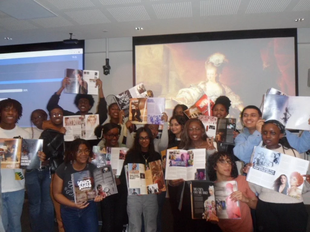
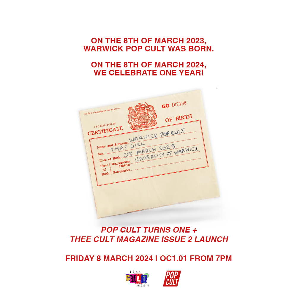
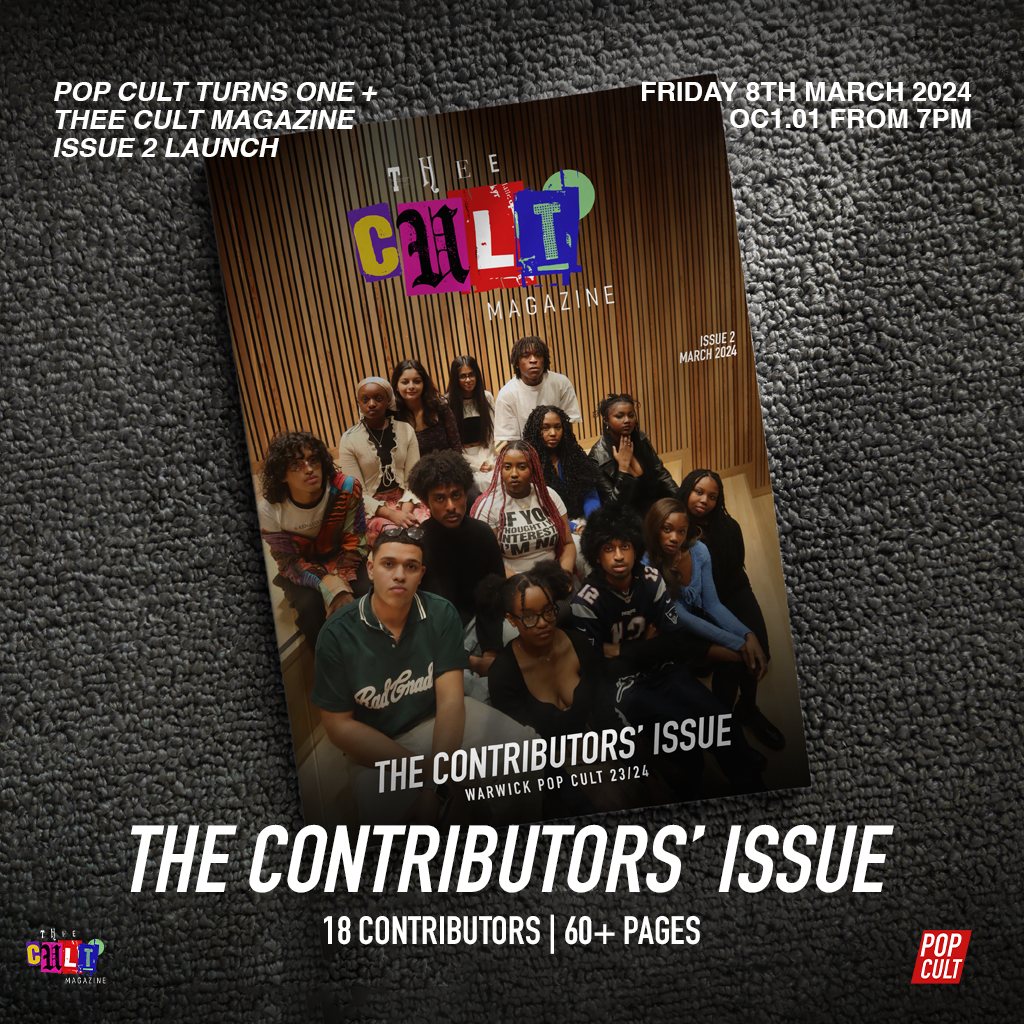
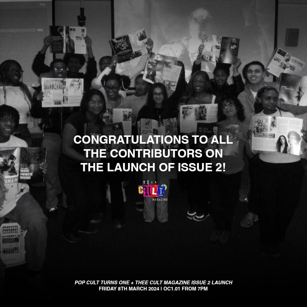
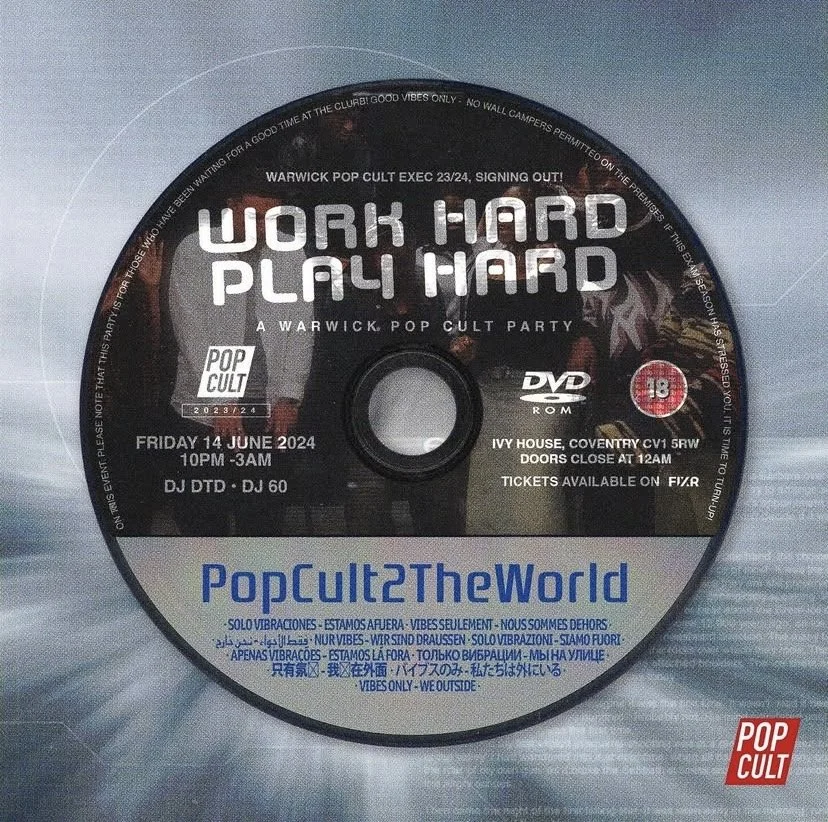
The launch of Issue 2 coincided with Pop Cult turning one, placing the magazine within a wider anniversary moment. This created an opportunity to align the publication with a broader narrative of transition. While Thee Cult Magazine continued to build on its existing visual identity, the anniversary communications introduced the “Pop Cult 2 the World” direction - marked by the use of Helvetica - signalling a new era for the organisation. It is important to note that Helvetica was used specifically within the Pop Cult 2 the World identity, functioning as a subtle but intentional indicator of this next phase, rather than replacing the magazine’s established aesthetic.
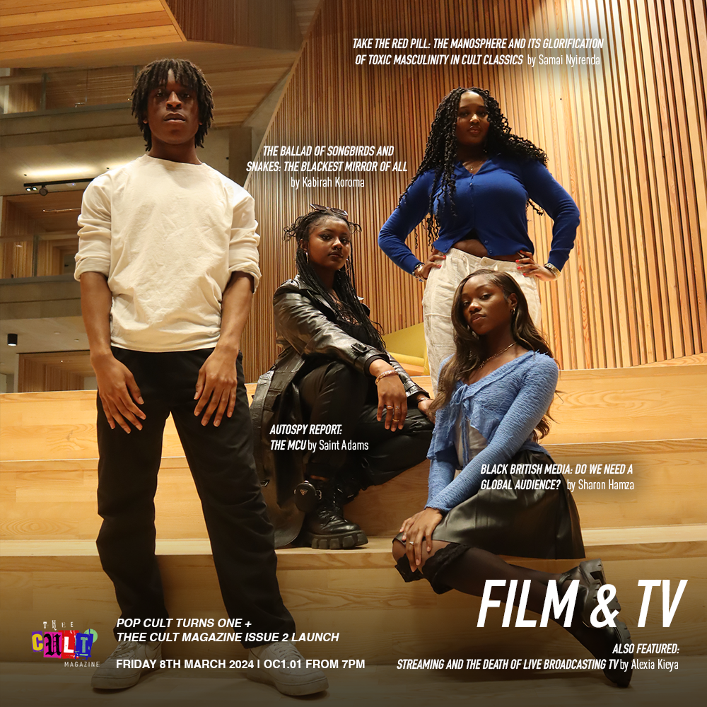
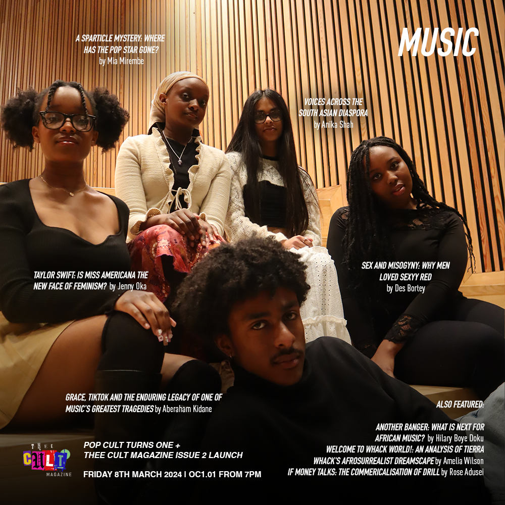
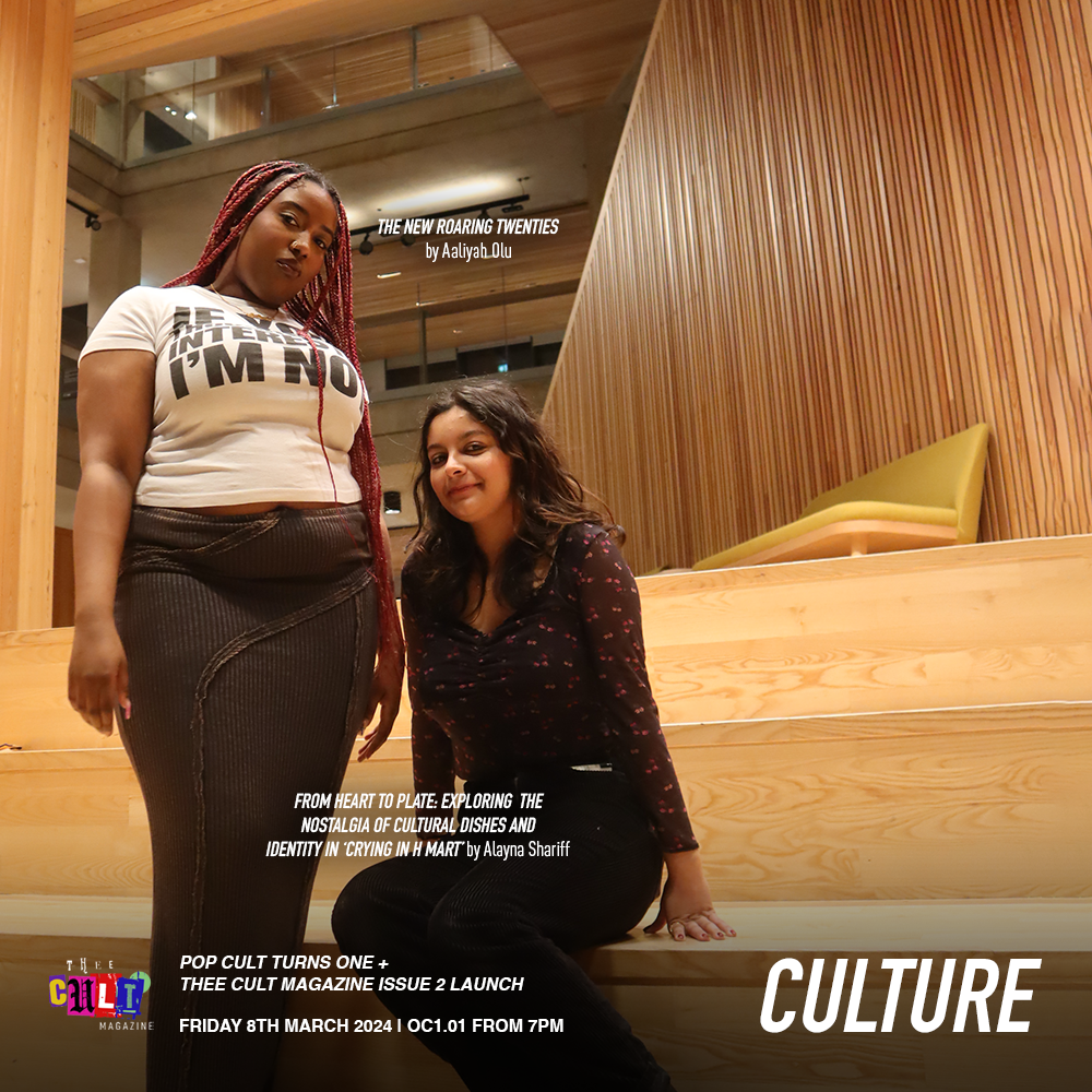
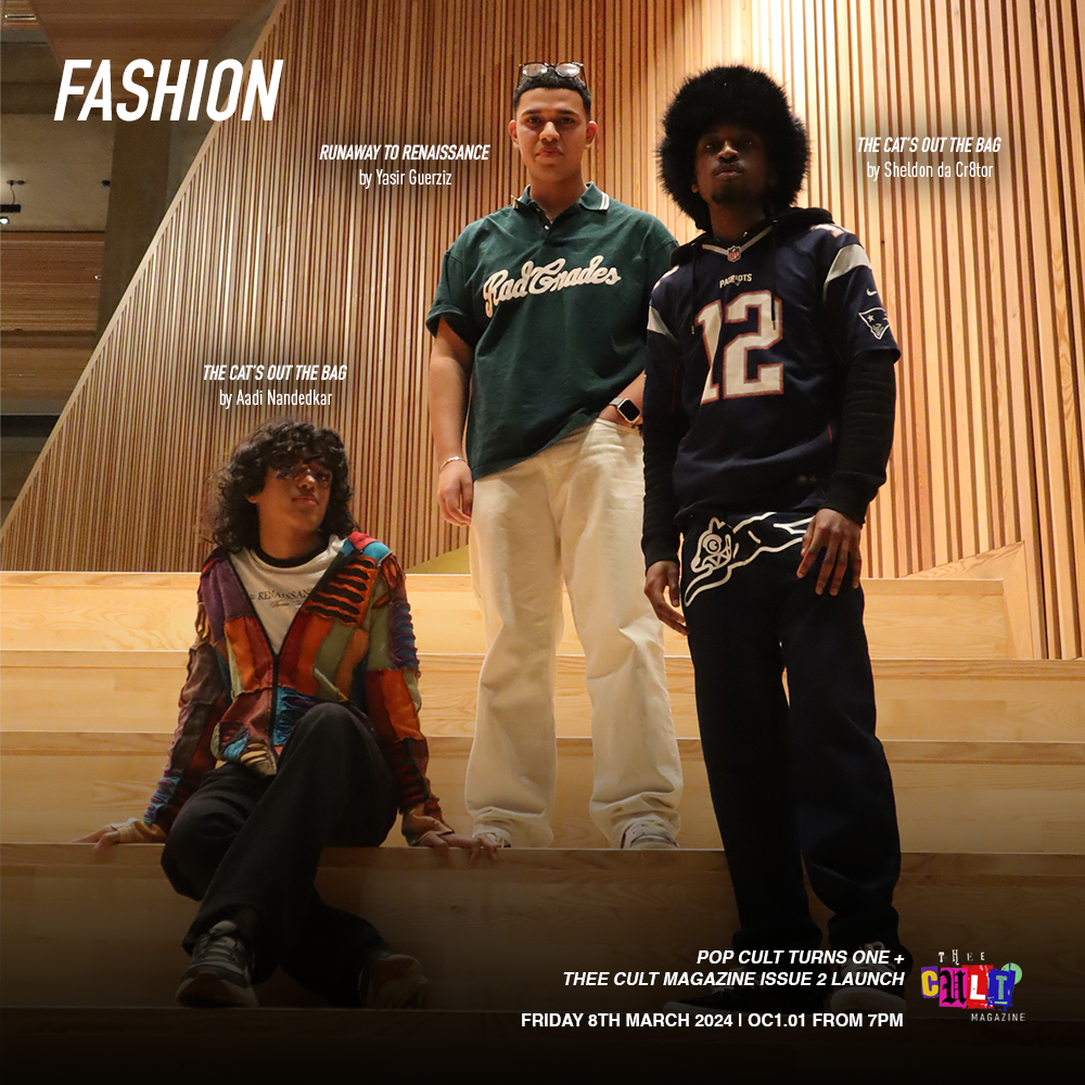
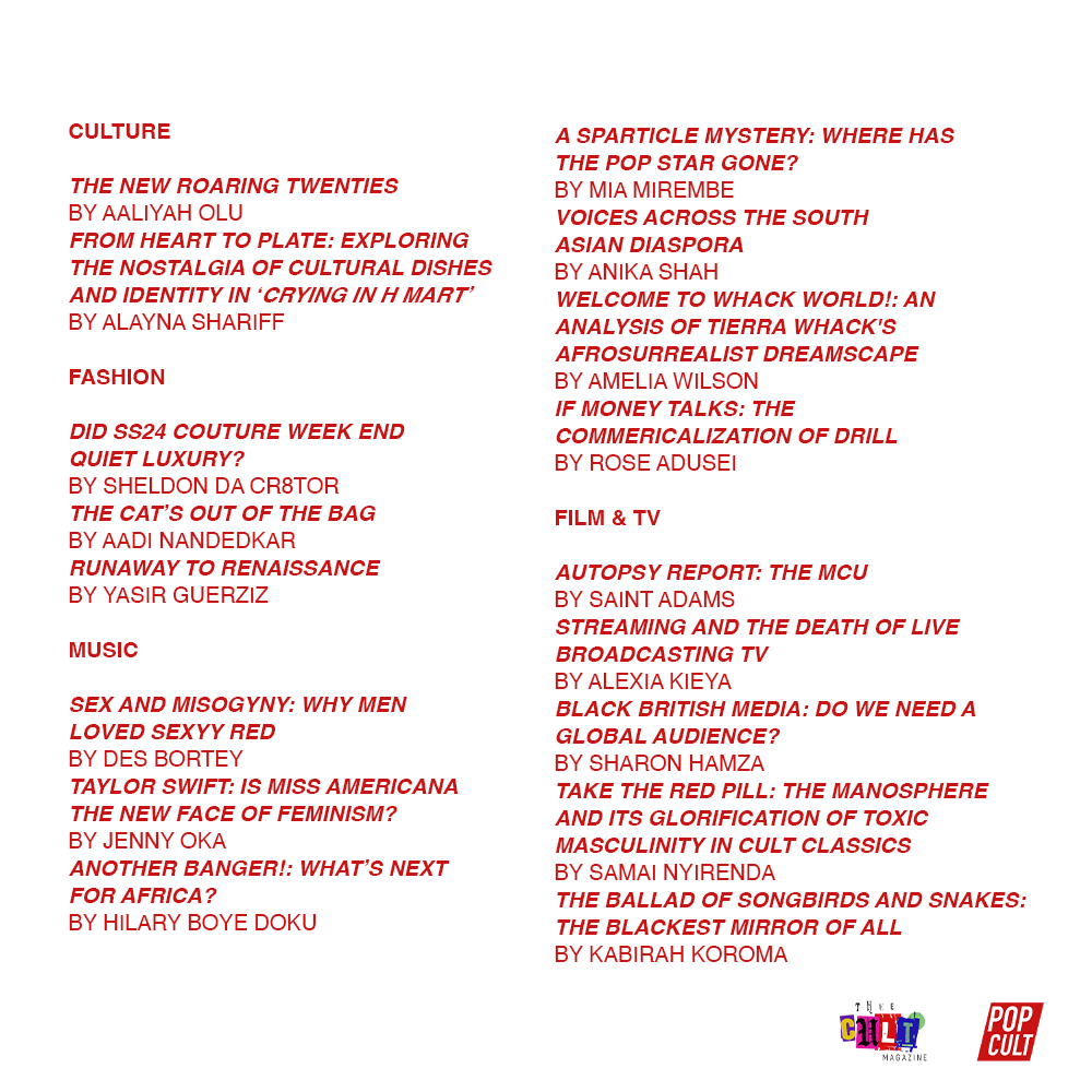
The social media assets were designed in Adobe Photoshop, building on the recognisable visual language developed in Issue 1. The aim was not to lock the magazine into a rigid identity too early in its development, but to allow its design language to evolve while remaining coherent. This period marked the beginning of distinguishing what Thee Cult Magazine could become as a publication within the larger Pop Cult story - testing how far its tone and visual direction could stretch without losing clarity.Contributor posts were structured around themed categories - Film & TV, Music, Fashion, Culture - allowing individual writers to be spotlighted within a shared visual framework. Although tied to a celebratory event, the emphasis remained on publication and community, reinforcing that the magazine functioned as a platform for collective visibility rather than a one-off anniversary product.Strategically, merging the anniversary identity with the magazine created momentum and cohesion across the brand. At the same time, it surfaced an important insight: as Pop Cult continued to grow, clearer differentiation between Pop Cult as an organisation and Thee Cult as a publication would eventually become necessary. This moment therefore sits as both an integration point and an early signal of future structural refinement.