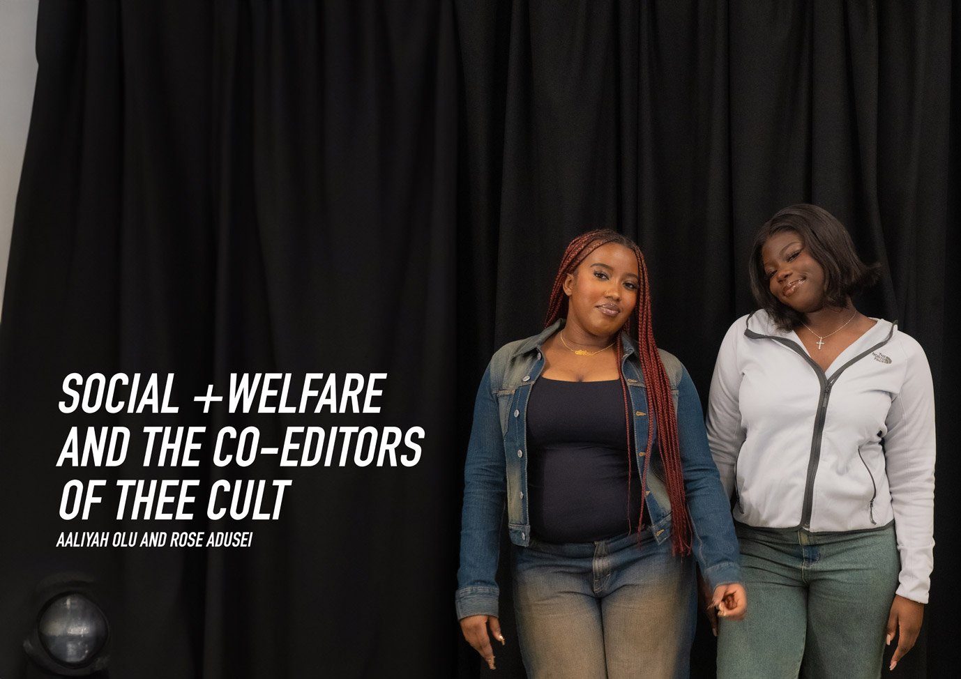
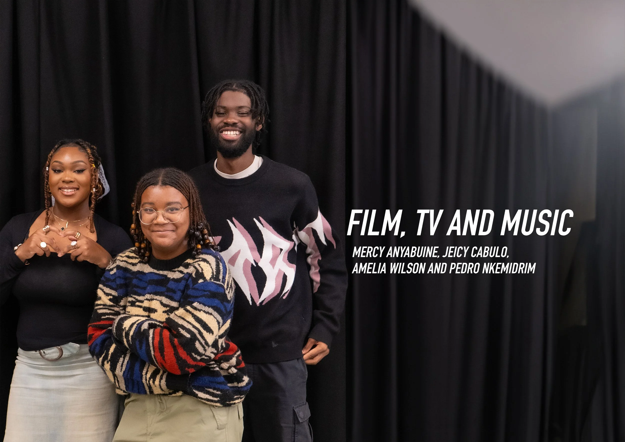
Issue 1: The Exec Issue“All Hail thee Cult”
For Issue 1 of Thee Cult Magazine, I operated across creative direction, design, editorial development, production, and brand rollout as part of the Warwick Pop Cult 23/34 exec team. My involvement spanned the full lifecycle of the project - from shaping the magazine’s visual identity and layout system, to designing the logo, developing editorial direction, producing written content, overseeing print production and distribution, and leading the initial social media rollout. This issue represents my first attempt at building and scaling a cohesive creative brand across print and digital formats, treating the magazine not as a standalone artefact, but as a foundational expression of Pop Cult’s wider identity.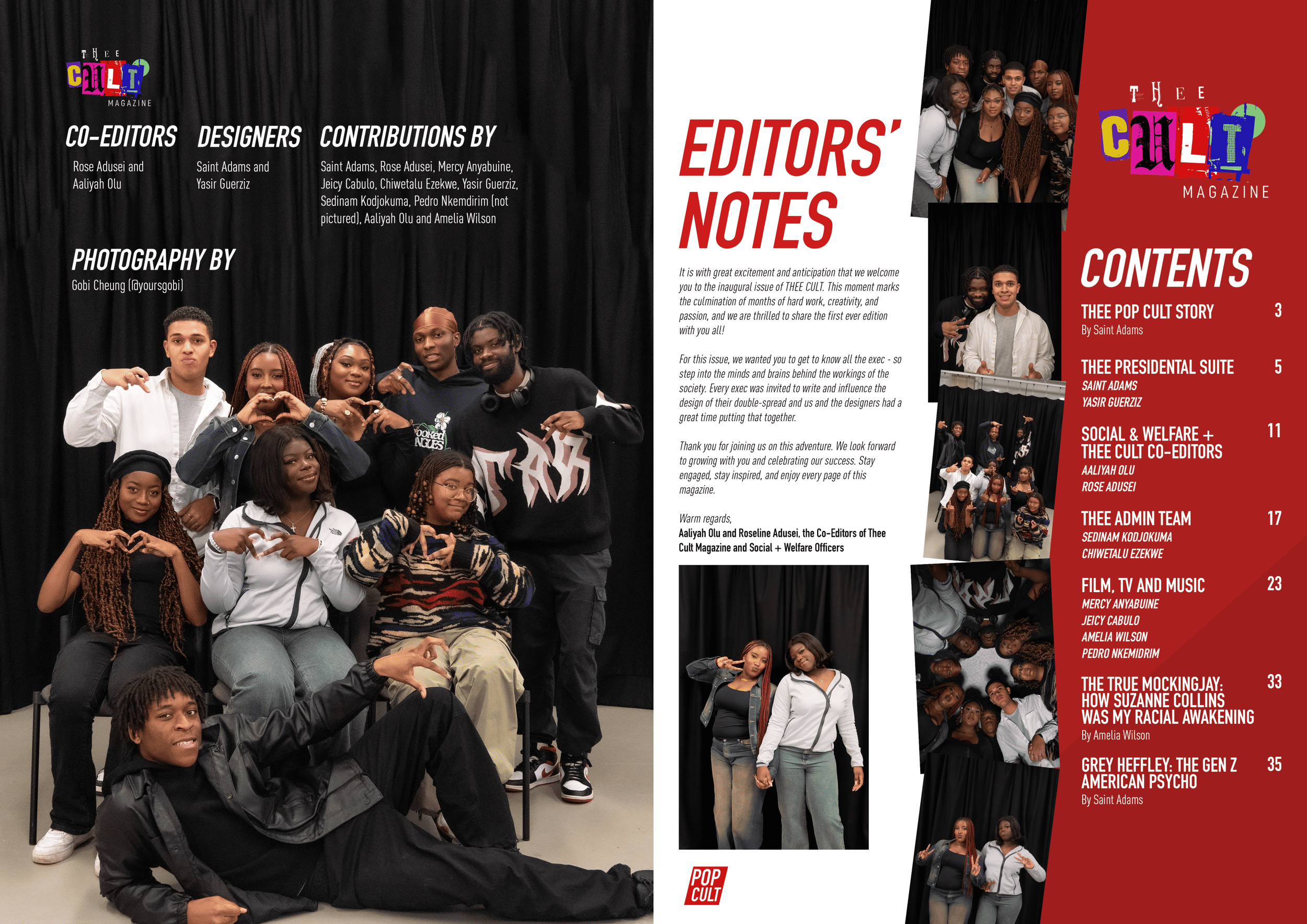
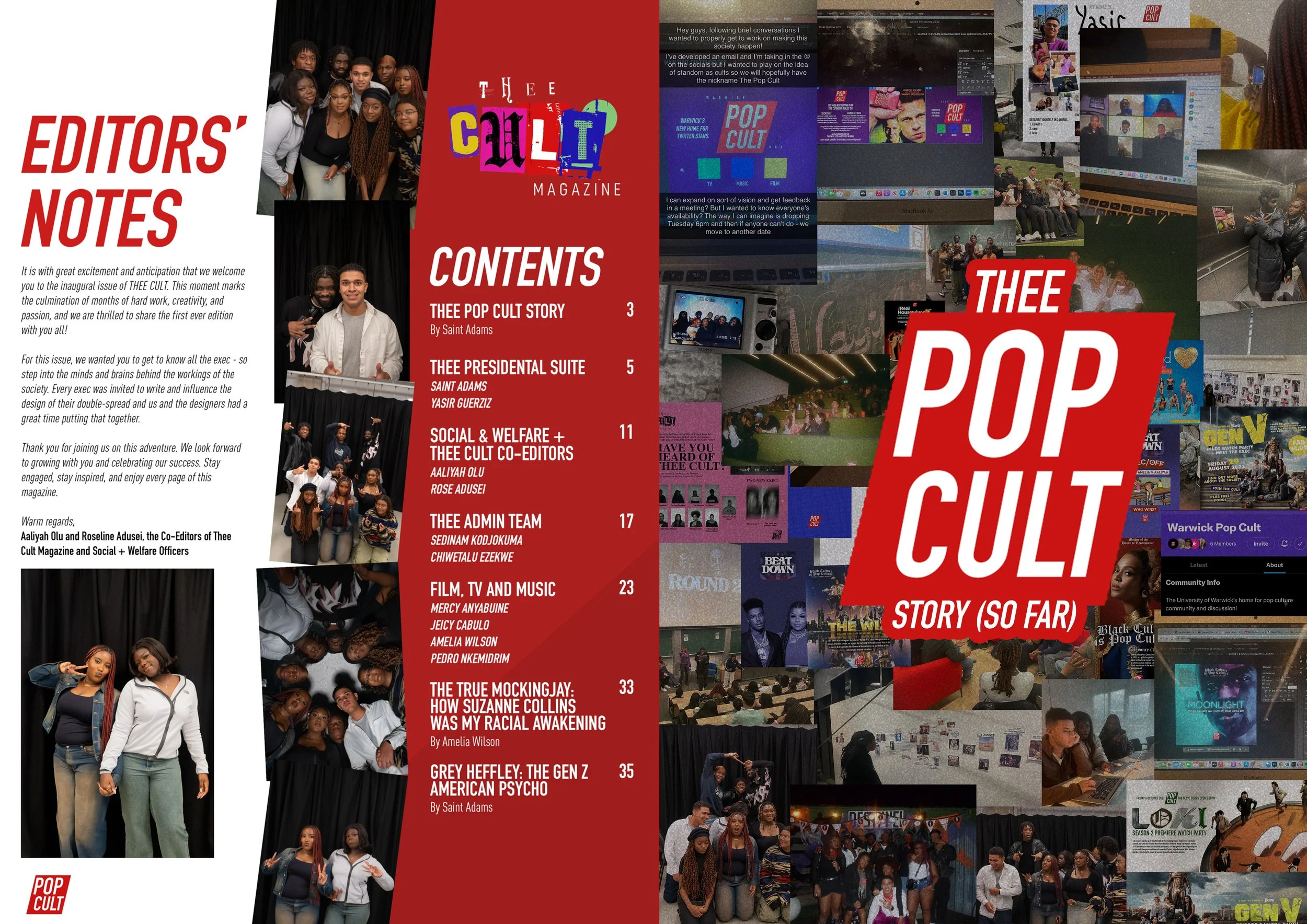
This issue of Thee Cult Magazine represents the ground floor of what would later become a much more defined editorial and creative direction. It was not designed to function as a conventional magazine in the strict sense, but rather as an executive showcase and institutional foundation - a way of introducing who we were, how we worked, and what kind of cultural space we were attempting to build. In particular, this first iteration reflects Pop Cult’s early ambition to define what its vision could look like outside a university society context. The magazine became a way of asking: what can be built from our immediate community if we think beyond the limits of the university itself? This is why the issue functions so effectively as an introduction. Within the context of a university campus, it signals an intention to operate at a scale that exceeds student media conventions - both in aesthetic ambition and in conceptual framing, laying the groundwork for a project that treats the university not as a boundary, but as a launch point.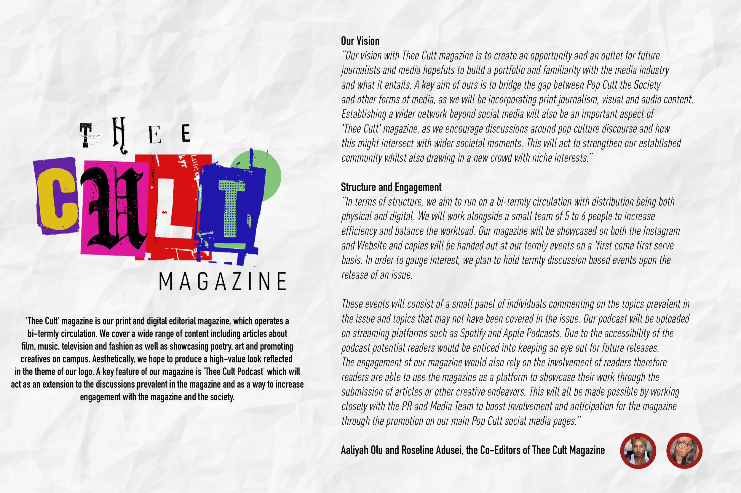
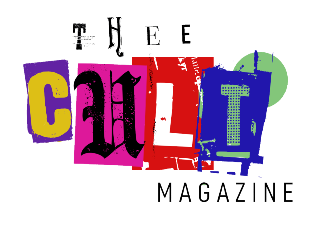
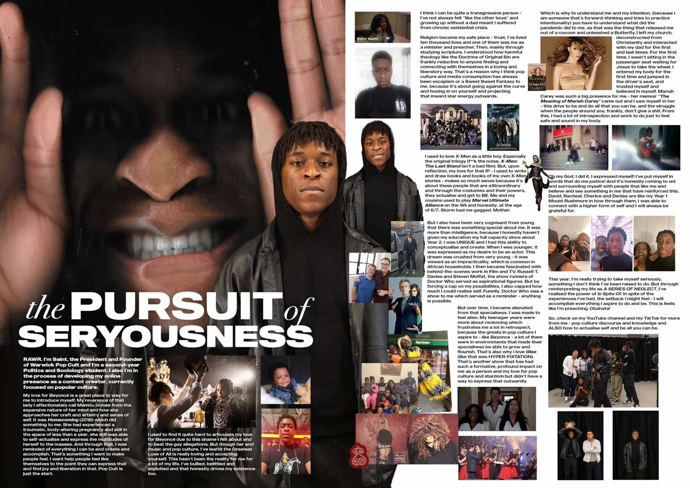
At the time of production, I was acting as the creative director and main designer, shaping the visual identity, layout system and overall tone of the magazine. My role primarily involved translating moodboards into tangible editorial layouts, establishing a visual language that could hold multiple voices and setting the aesthetic direction for the publication. The initial logo for Thee Cult Magazine was designed by me; to deliberately evoke a scrapbook-like, cut-and-paste aesthetic, drawing from the visual language of print media and zines. From the outset, we were aware that was often described as a “dying” medium, for us, print media represented something foundational and important the cultural landscape, despite the huge innovations made through digital.-
![]()
Moodboard
-
![]()
-
![]()
Moodboard
-
![]()
-
![]()
Moodboard
-
![]()
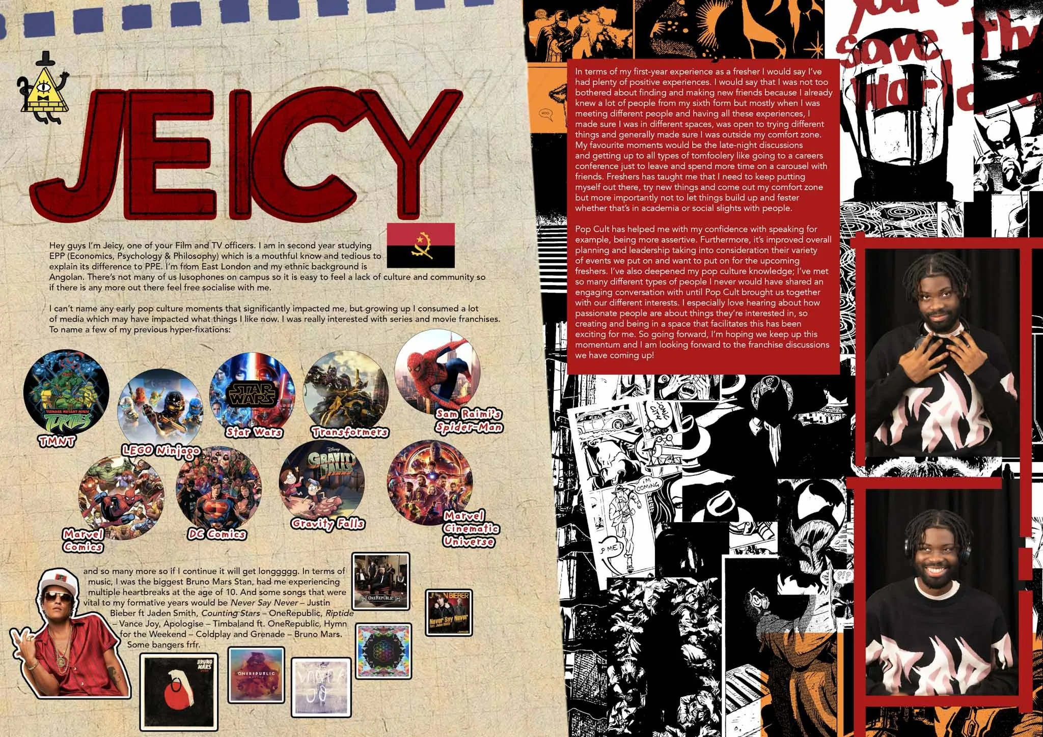
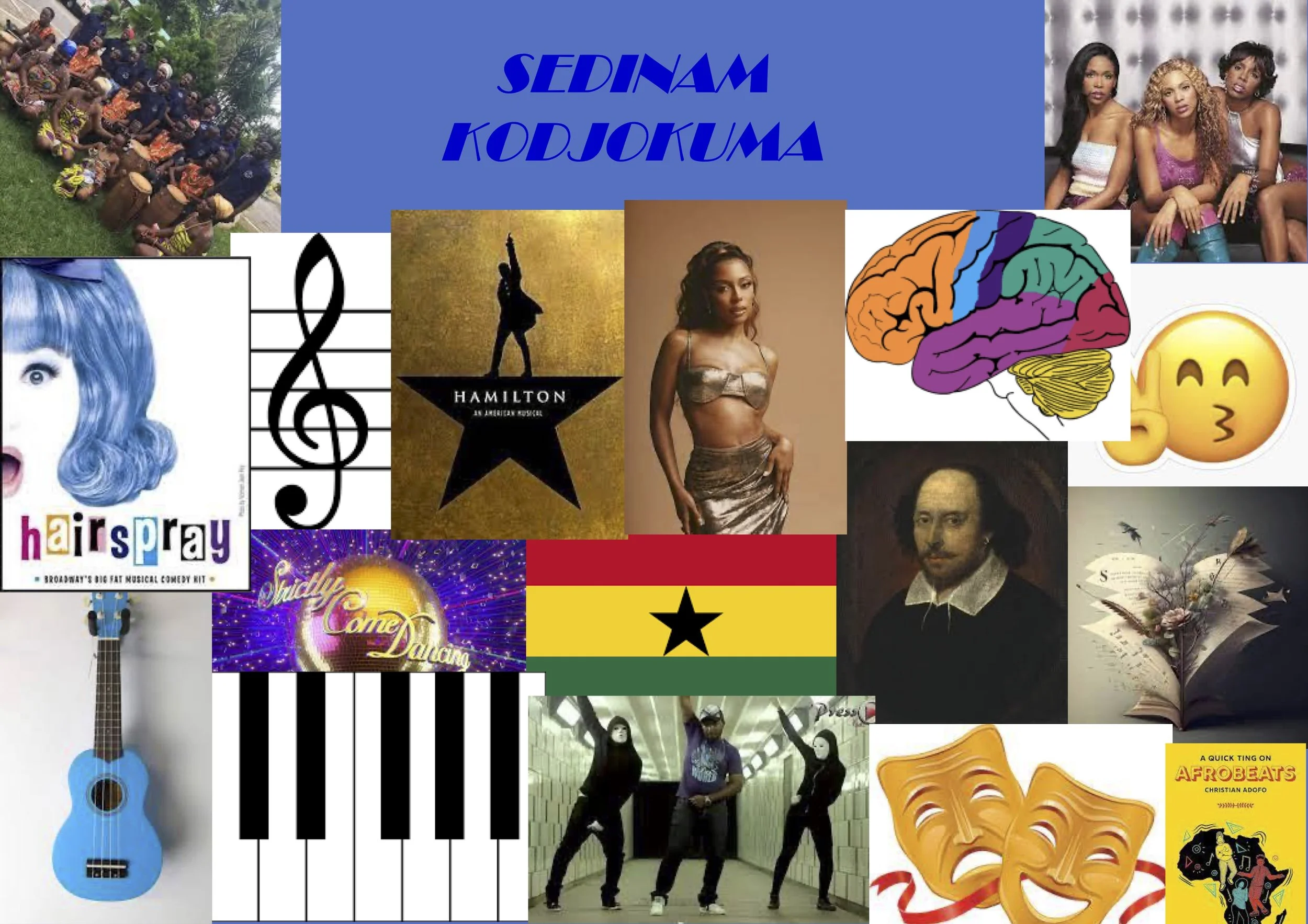
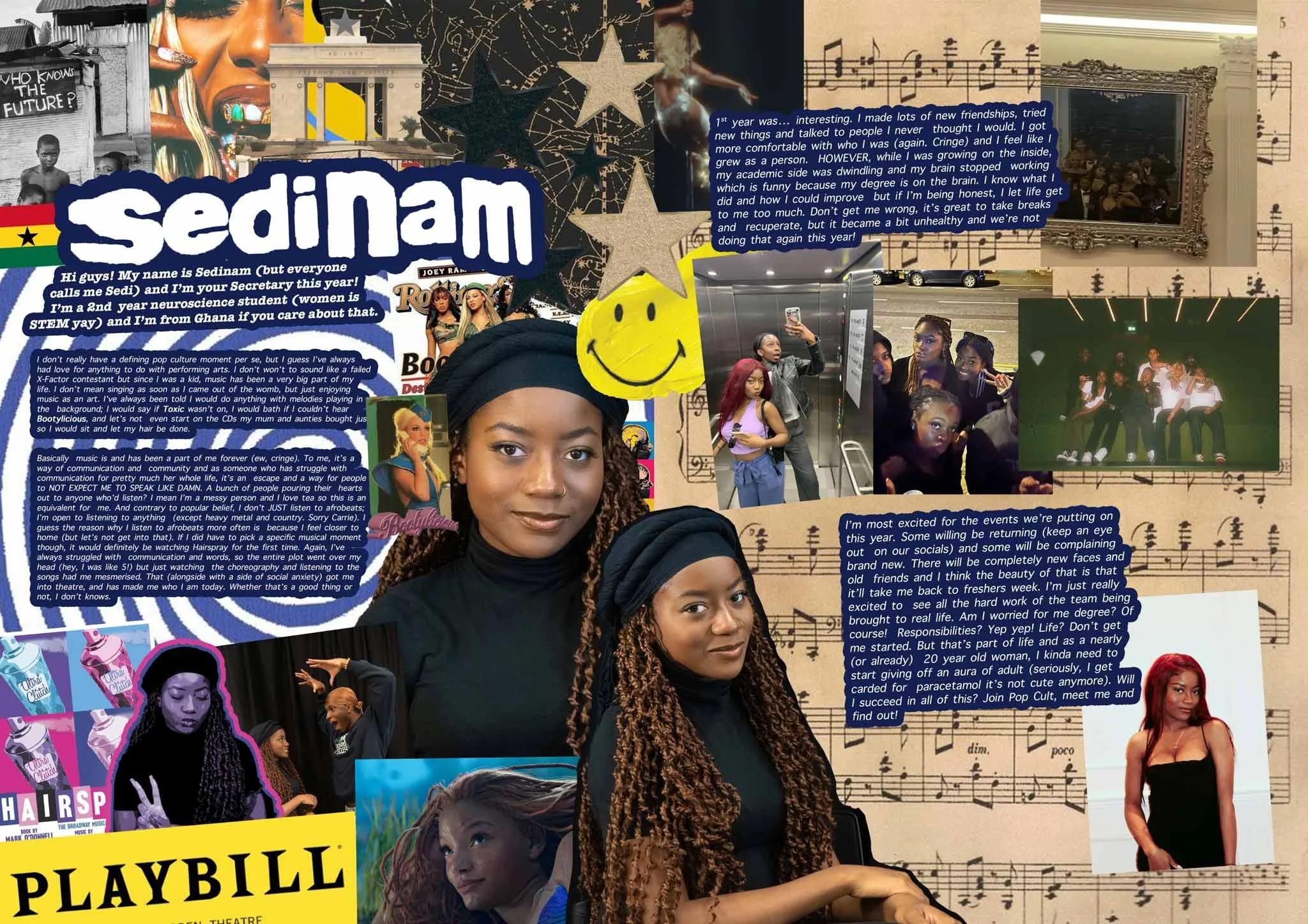
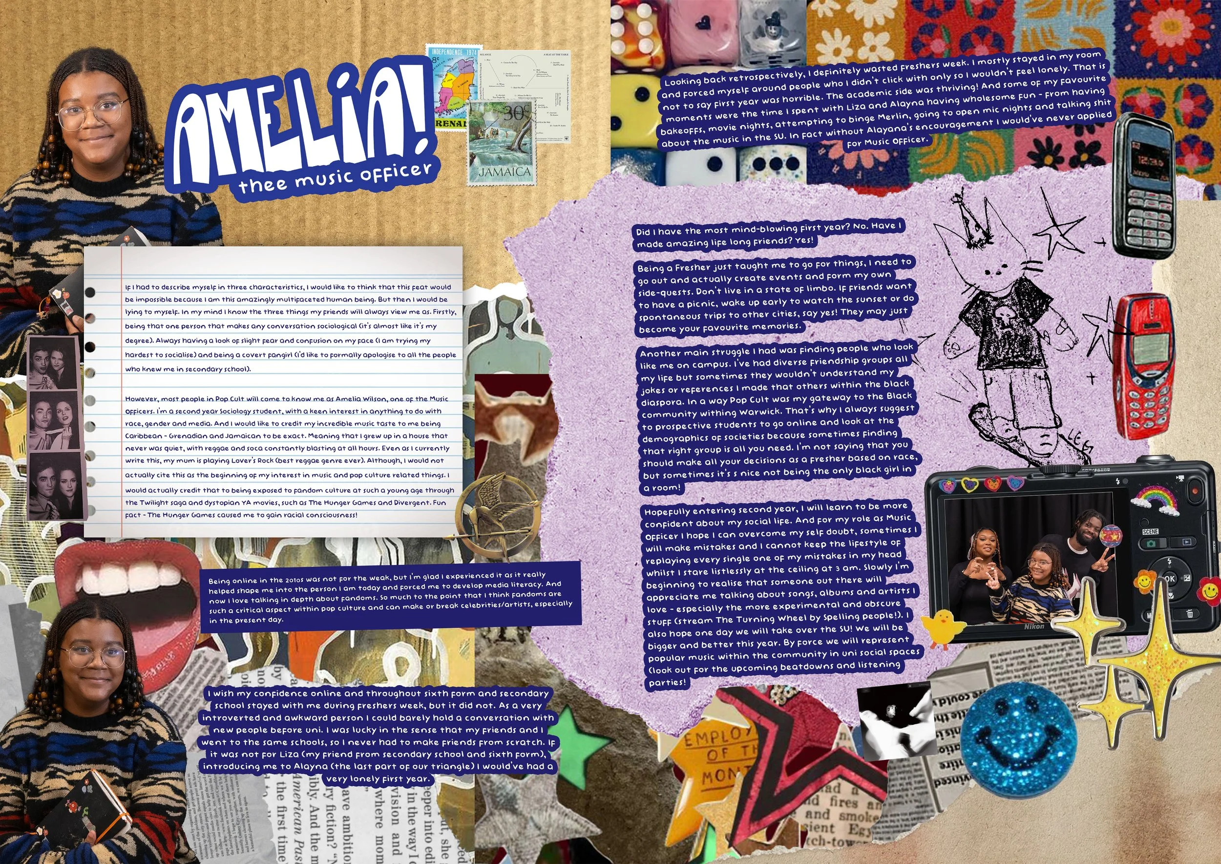
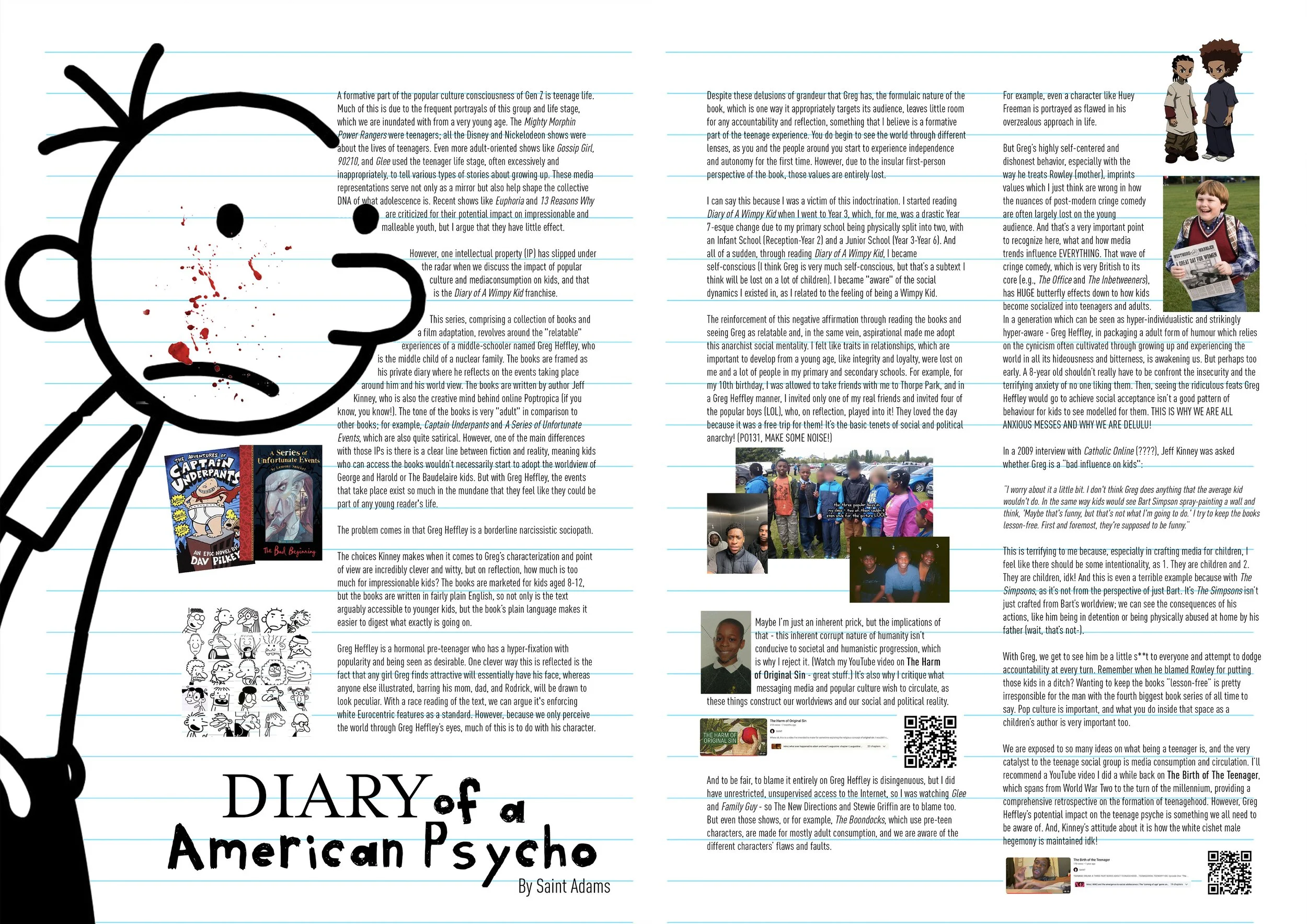
The issue also includes two written editorial pieces, introducing a more essayistic mode of engagement, addressing pop culture through personal reflection and critical framing. My written essay - Diary of an American Psycho - examines how pre-teen popular media, particularly Diary of a Wimpy Kid, normalises detachment, narcissism, and cruelty through humour, and how these traits are absorbed during formative stages of development. Using Greg Heffley as a case study, the piece blends personal reflection with cultural critique to argue that children’s media is not neutral, but actively shapes emotional behaviour, masculinity, and moral perception.
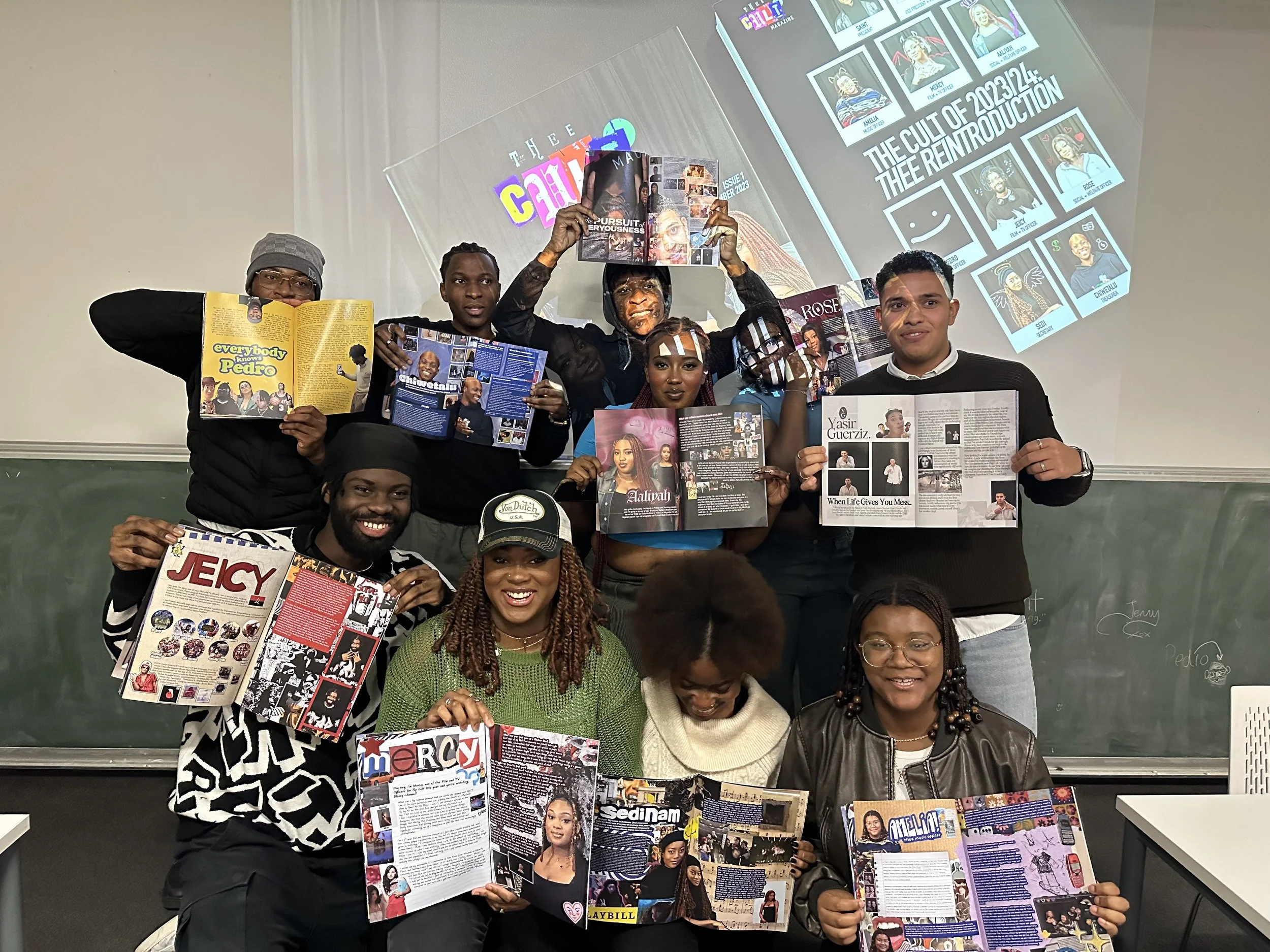
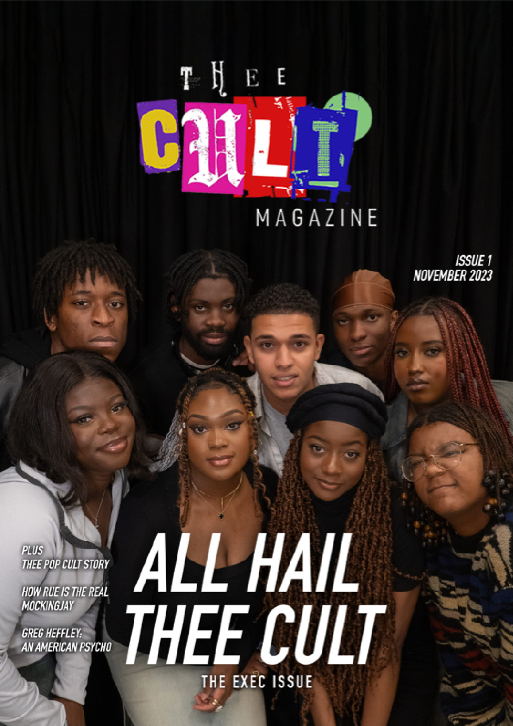
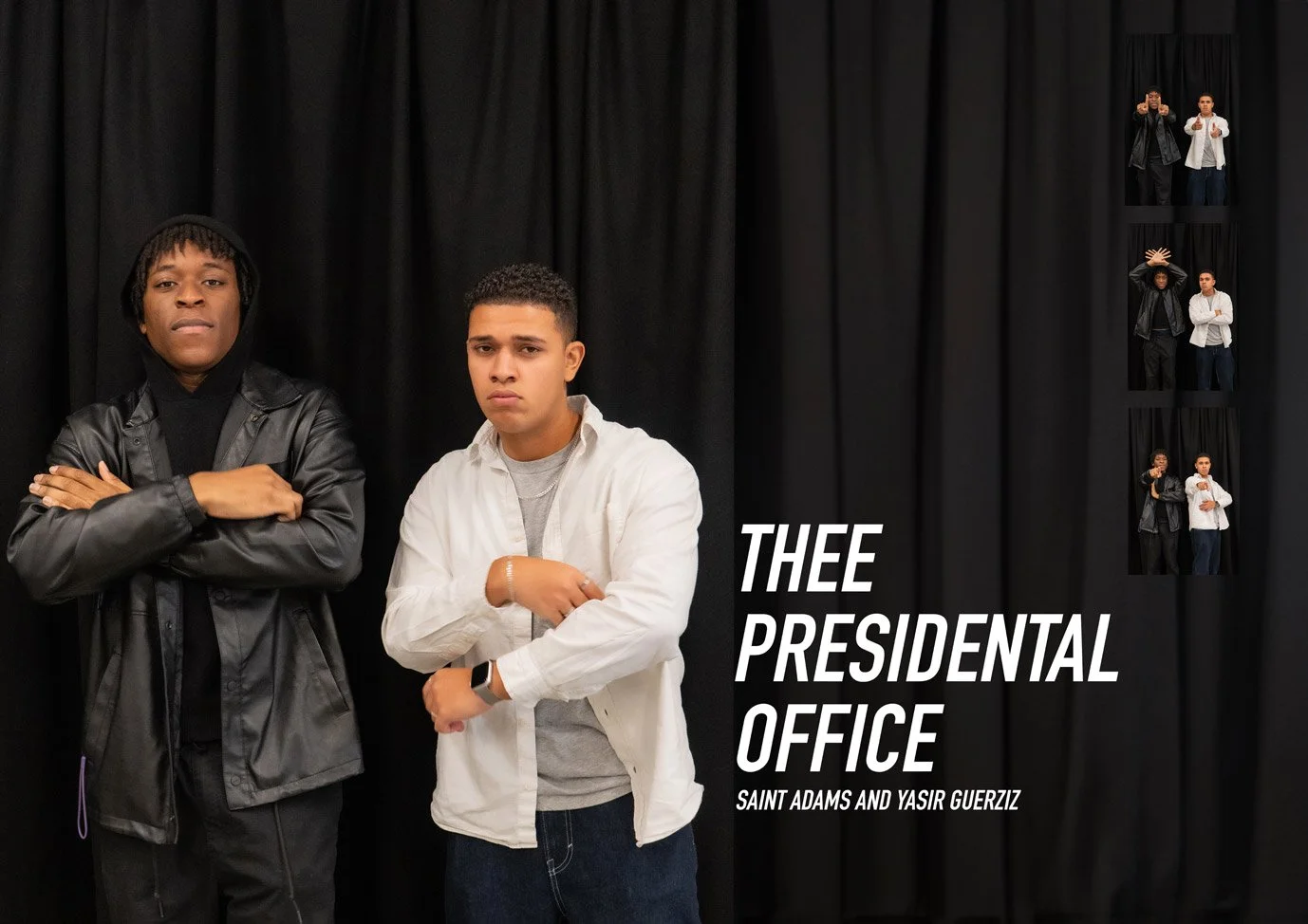
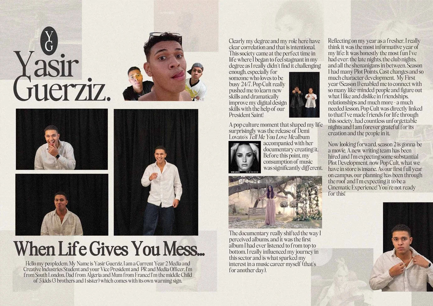
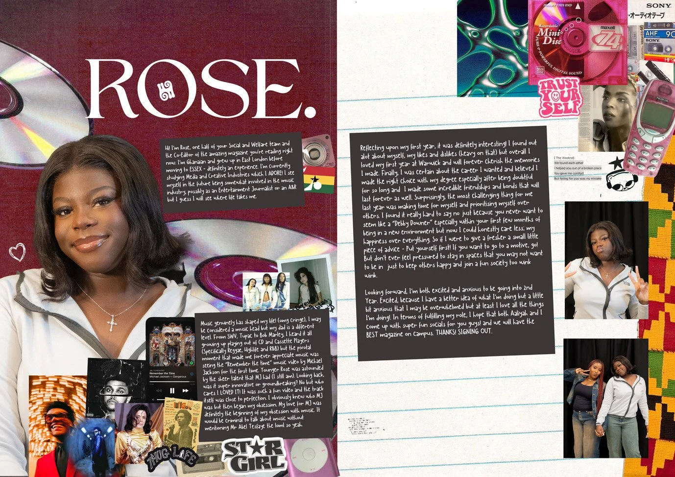
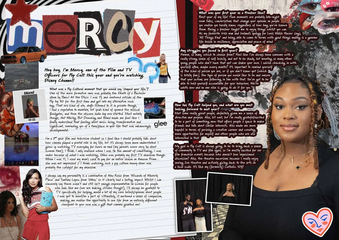
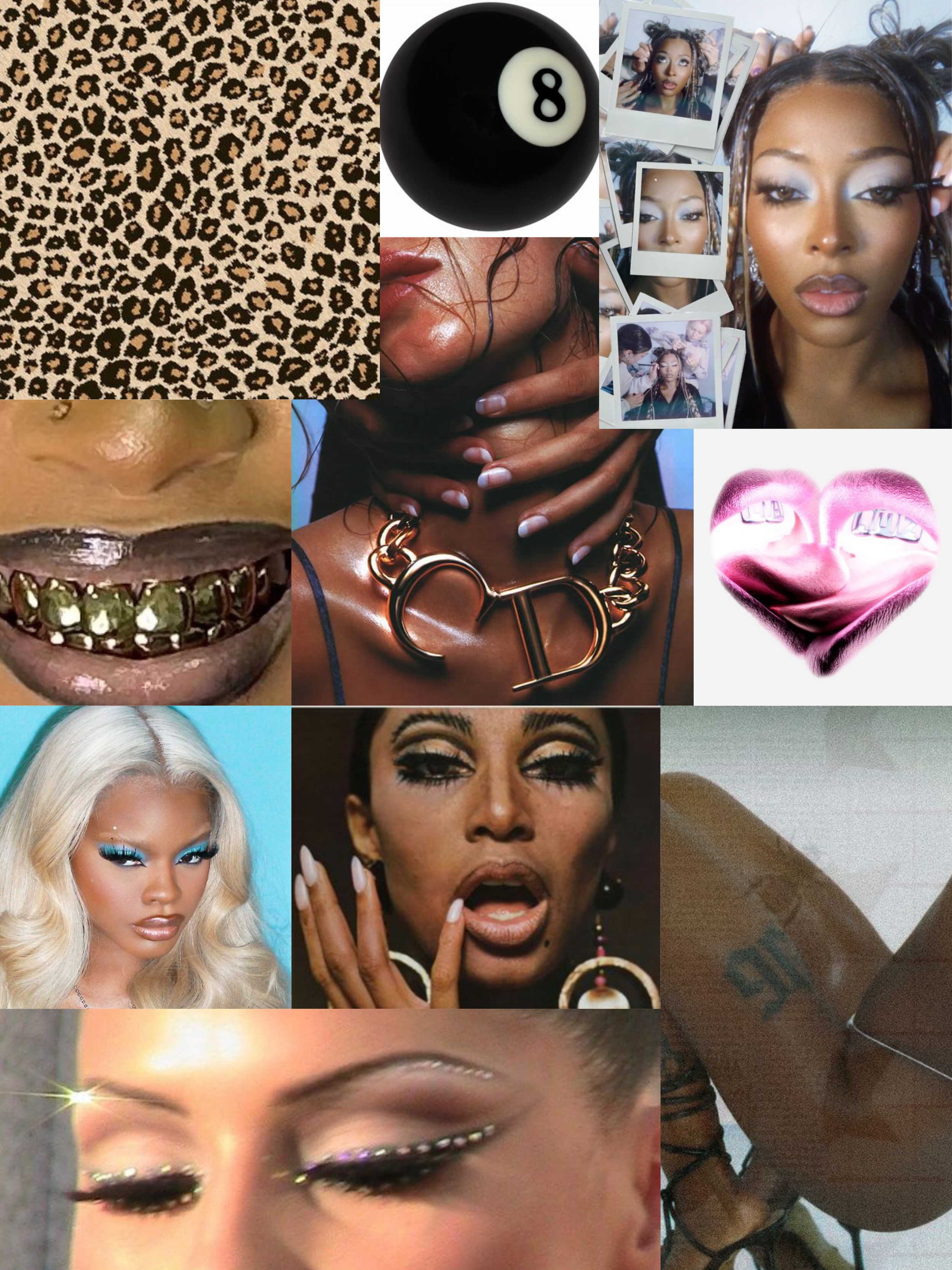
Alongside the more expressive layouts, the issue also introduced a set of standardised design elements that helped embed Thee Cult Magazine within the visual identity of Pop Cult. This included a written feature outlining Pop Cult’s ethos, as well as the use of recurring layout structures and double-page spreads that gave the publication a consistent internal rhythm. These more structured pages provided contrast to the collage-led sections of the magazine, helping to balance personality-driven content with clarity and cohesion.The issue was supported by a studio photoshoot that provided a consistent visual backbone across the publication. The imagery is used repeatedly throughout the magazine, contributing to a sense of continuity and flow, and allowing individual contributors to be presented within a shared visual framework.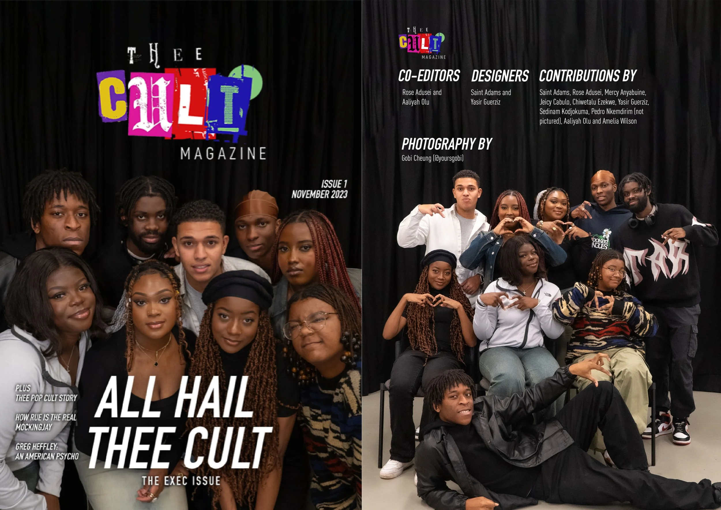
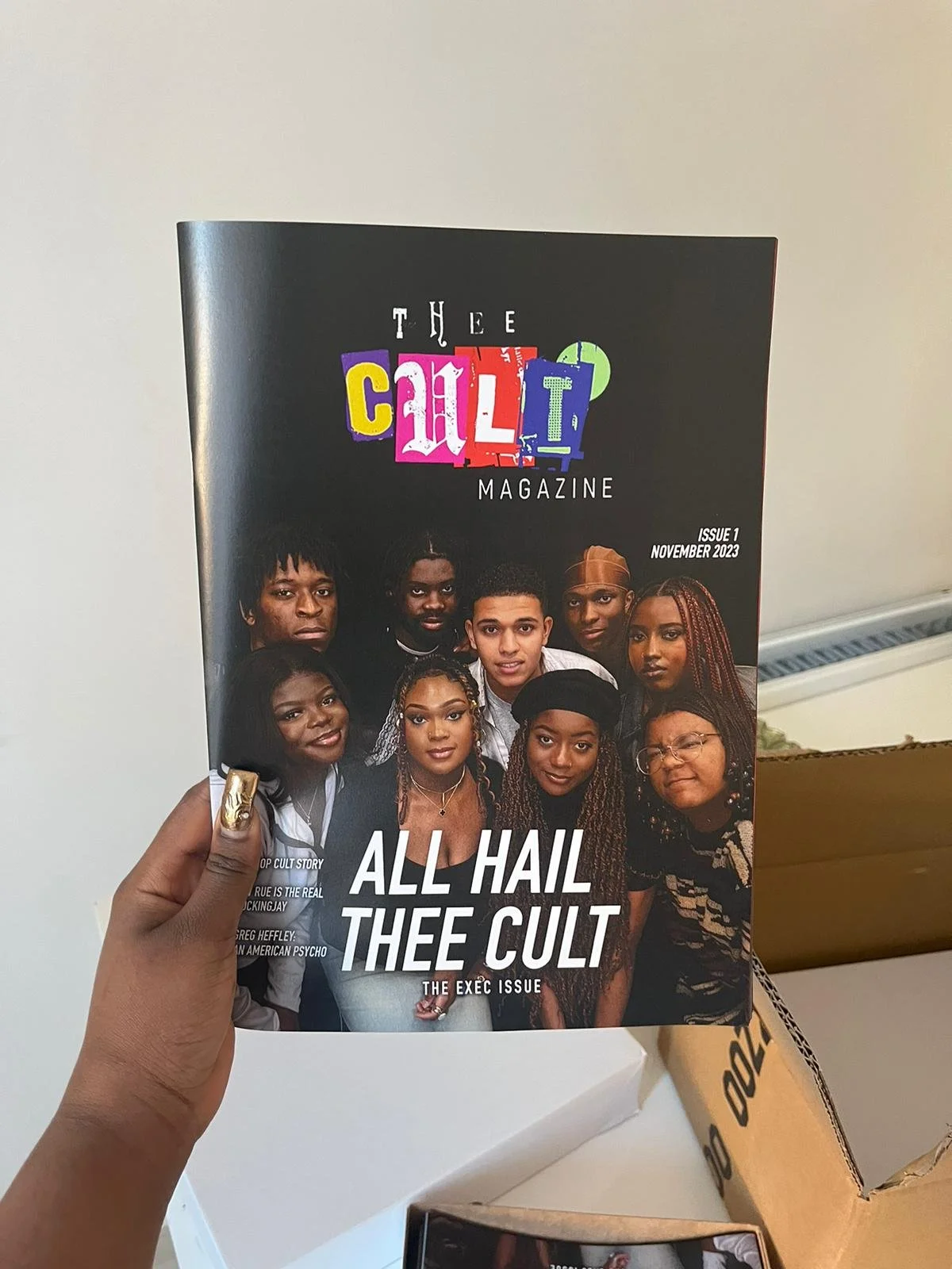
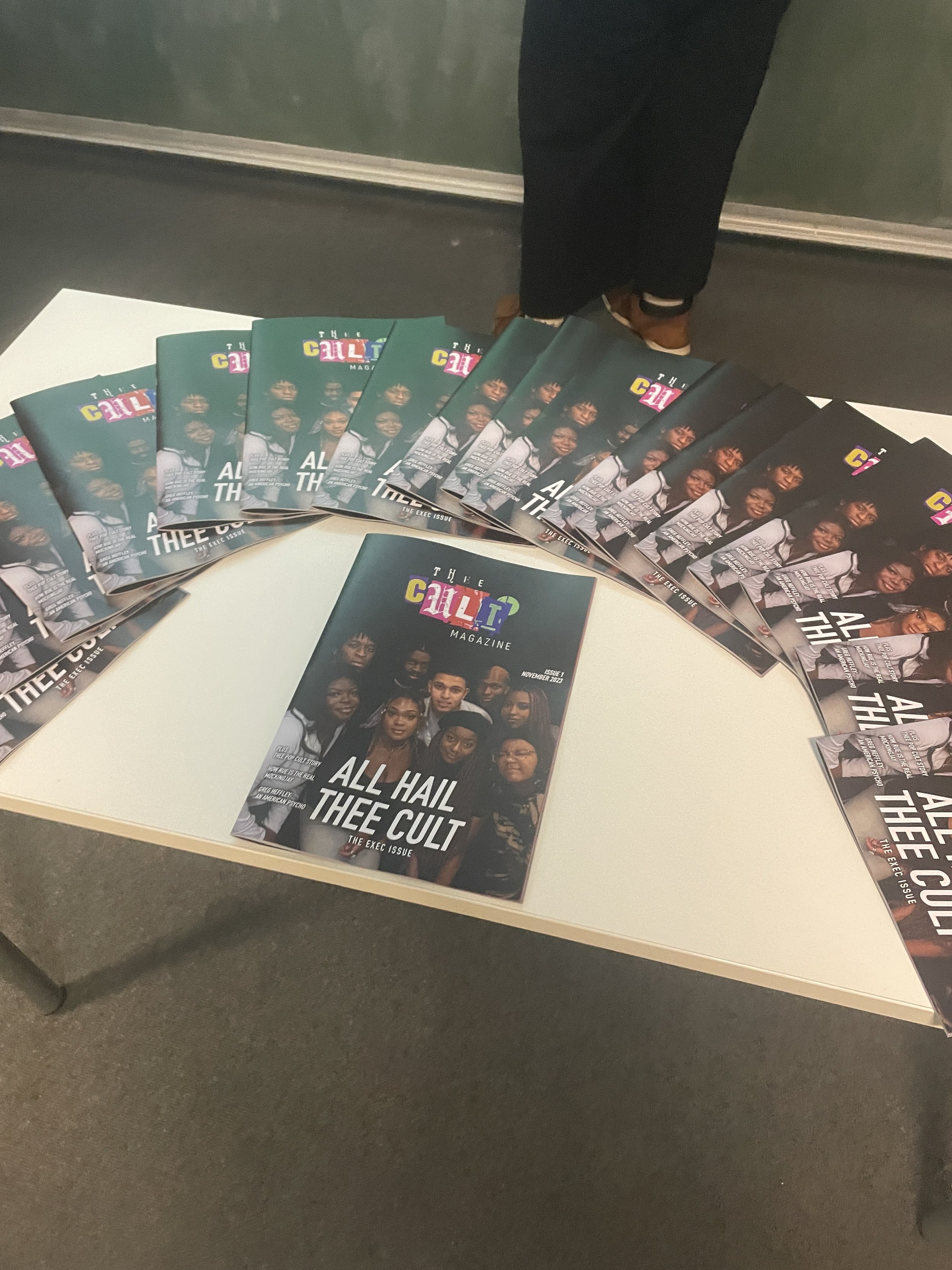
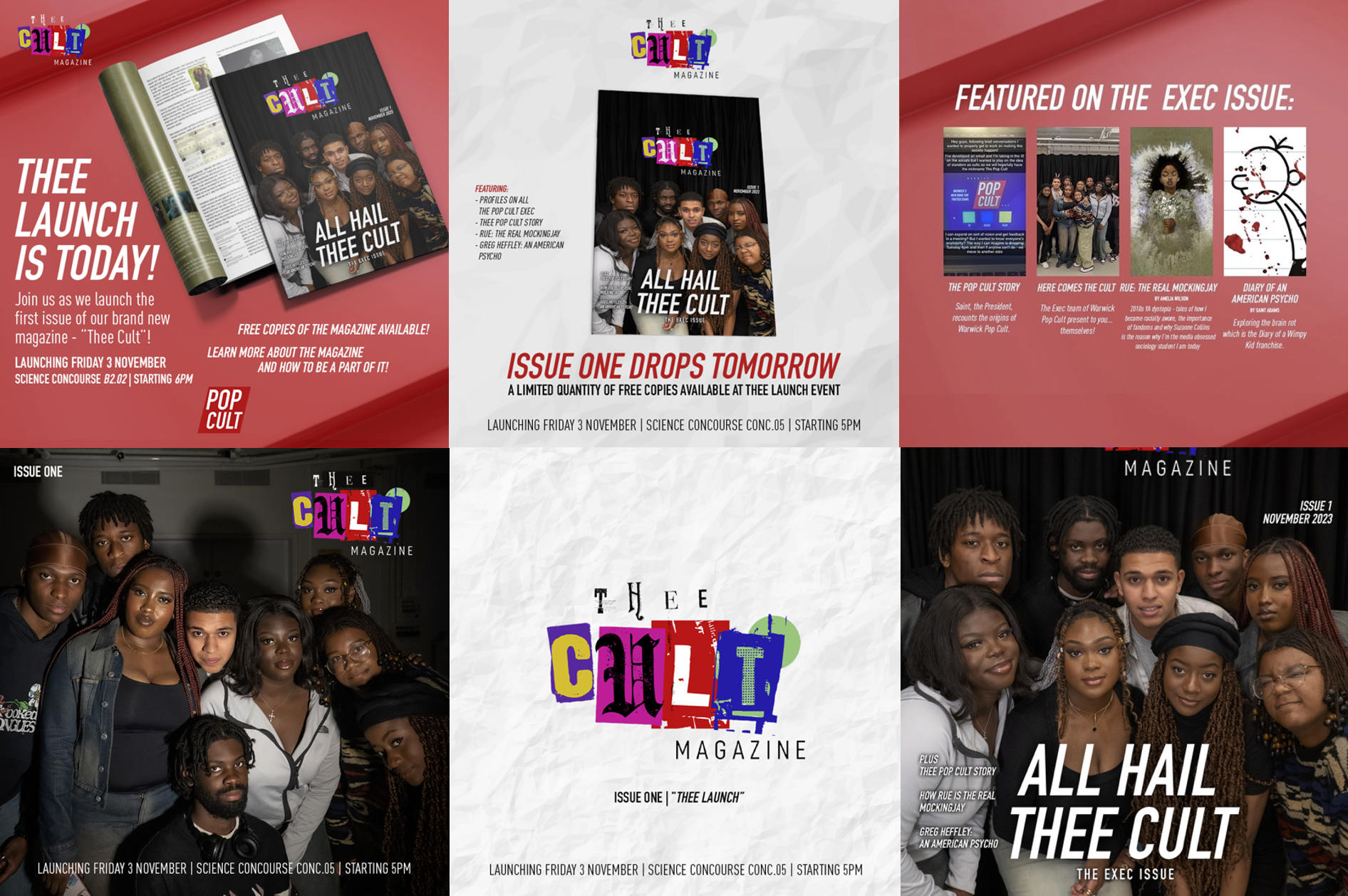
The issue was produced as a limited physical print run and distributed independently on campus. Printing was arranged through an external online service, with copies shipped directly to the team and managed in-house. Distribution took place on location, allowing the magazine to function as a physical point of contact between the project and its immediate audience.The decision to work in print was central to the project, reinforcing the importance of physical media while also providing early experience in managing production, handling, and distribution without institutional infrastructure.Alongside the physical release, I developed the initial social media rollout for Thee Cult Magazine in my role as part of the Warwick Pop Cult 23/24 executive team, where I was responsible for PR, media and brand vision and strategy. This marked an early attempt at scaling Pop Cult beyond a single context, testing how the brand could extend across platforms. The assets were designed in Adobe Photoshop and built around a flexible system rather than a fixed campaign look. Drawing from the existing Pop Cult identity - including the continued use of DIN - the rollout was treated as a modular framework, allowing the magazine’s visual language to be adapted and reinterpreted while remaining recognisably part of the same Pop Cult brand. The focus was less on repetition and more on establishing a visual logic that could support growth, variation, and future use.Social Media Assets