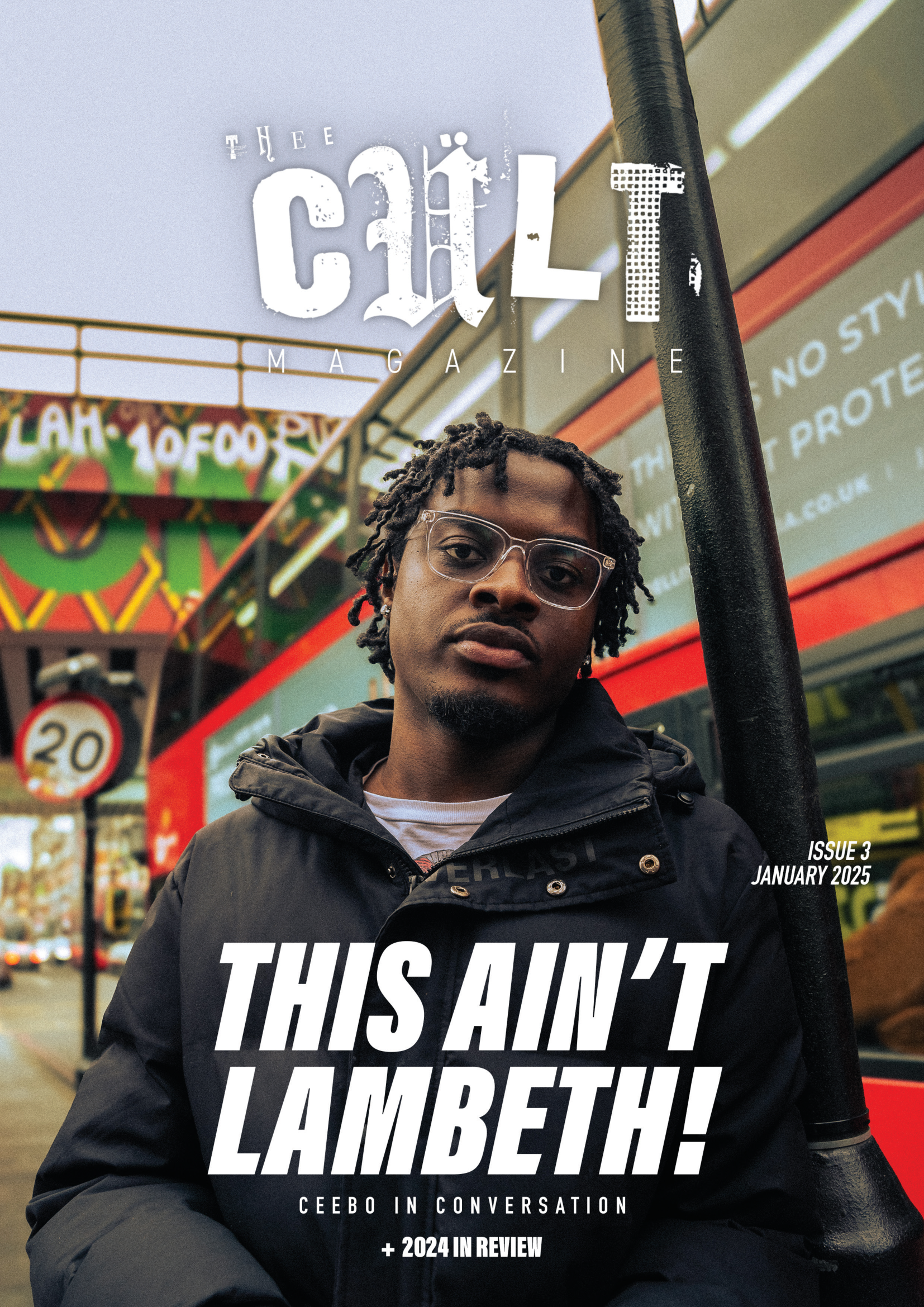
Issue 3: 2024 in Review “This Ain’t Lambeth"
For Issue 3 of Thee Cult Magazine, I led the project as Editor-in-Chief and Creative Director, overseeing the publication’s structural redesign, editorial refinement, visual identity evolution and full-scale production. This issue marked the transition from experimental student magazine to a deliberately structured editorial platform, with formalised sections, a defined cover feature and a strengthened internal review process. My role spanned commissioning and editing writers, redesigning the logo, directing photography and executing the complete layout in InDesign. Issue 3 represents the consolidation of creative ambition into systems - transforming Thee Cult from a growing project into a disciplined publication.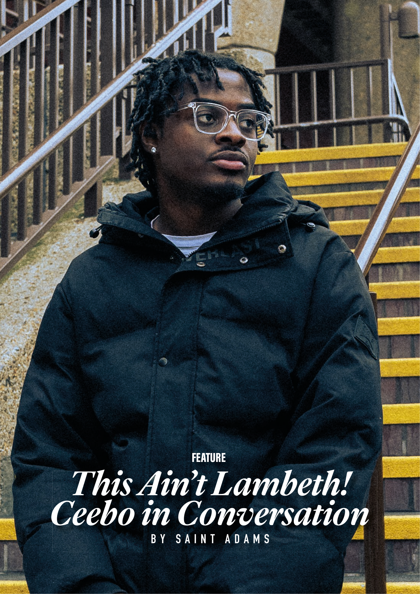
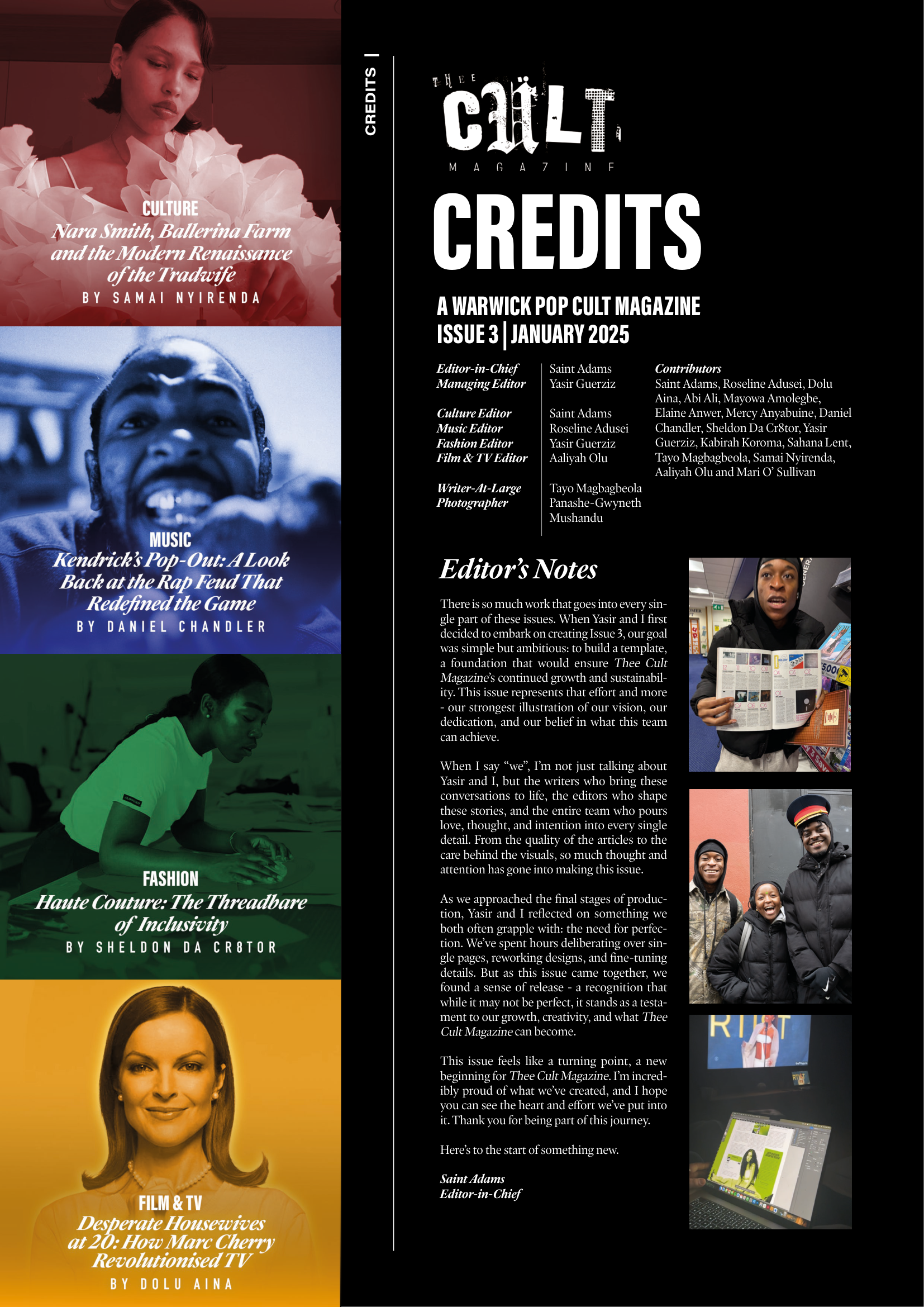
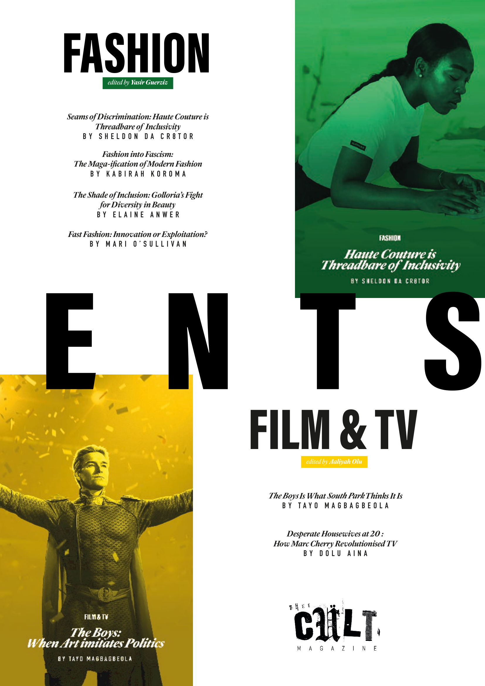
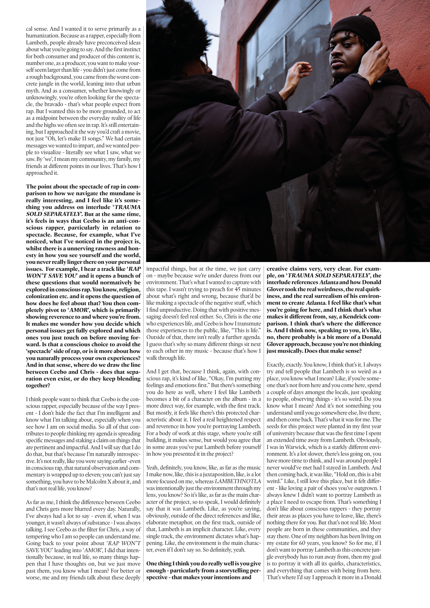
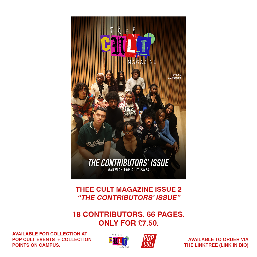
Issue 3 marked a defining shift for Thee Cult Magazine, as it established a distinct identity separate from Pop Cult and formalised the publication as a scalable editorial platform. Built around a "2024 in Review" theme - a revisited failed concept from 2024's The Contributors' Issue - the issue focused on refining both visual identity and internal structure. Central to this shift was a redesign of the magazine’s visual language, beginning with the logo. Rather than abandoning the scrapbook aesthetic established in earlier issues, we simplified and abstracted it into a more controlled, adaptable form.
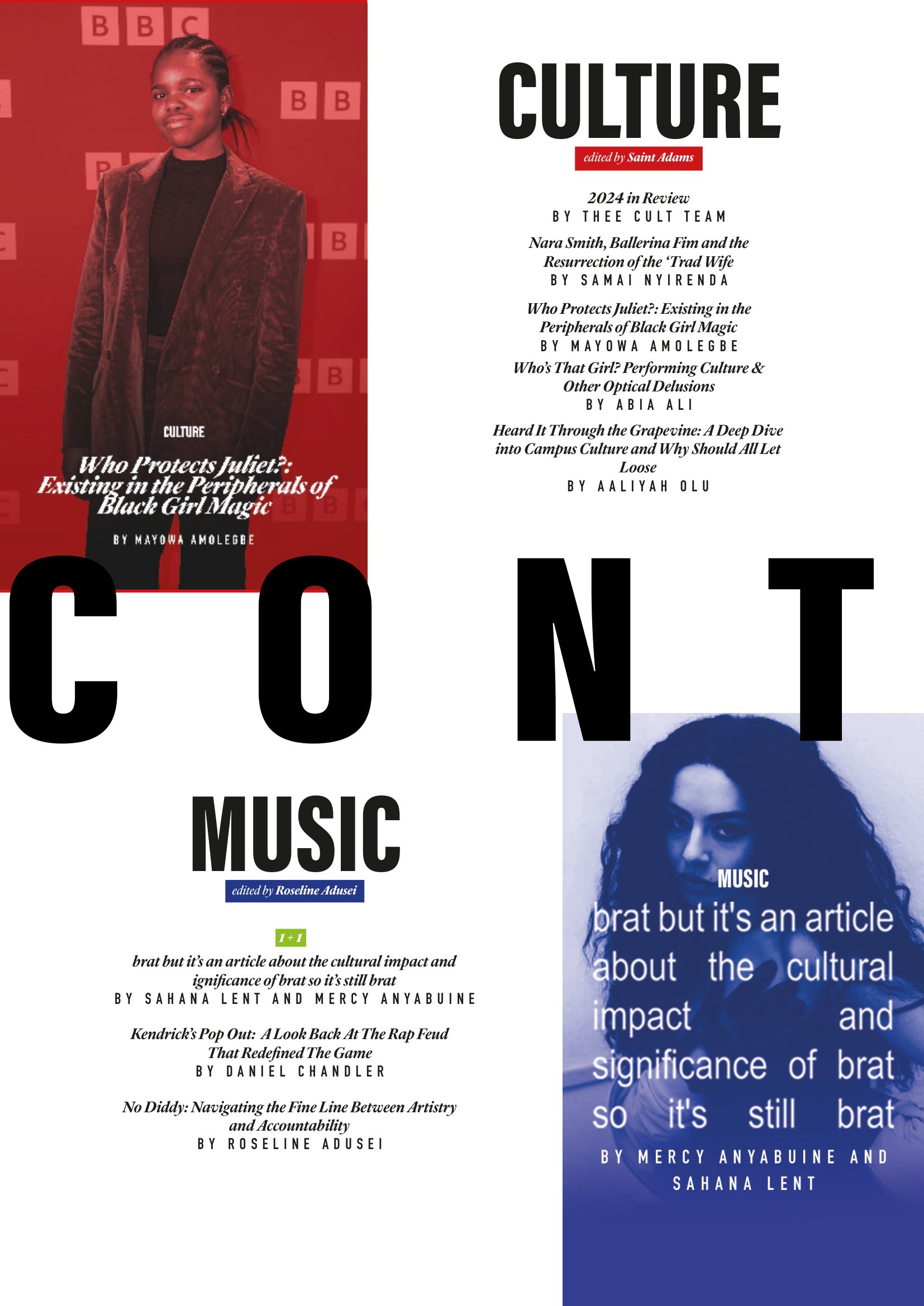
This shift was directly tied to the decision to launch a dedicated social media presence for Thee Cult. Previously, the magazine had been promoted through the Warwick Pop Cult account, but Issue 3 marked the point at which it began to operate as a distinct entity with its own platform and visual identity. The redesigned logo and simplified system allowed the brand to translate effectively across this new context, supporting a more cohesive and recognisable rollout.As Editor-in-Chief and Creative Director, I oversaw the expansion of the magazine’s sectional structure across culture, music, fashion, and film & TV, managing section editors while also operating directly as Culture Editor. I led the development of editorial direction by defining pitch briefs, often building them into fully realised concepts before guiding contributors through a structured editorial process that included written feedback and, where possible, live editing sessions.
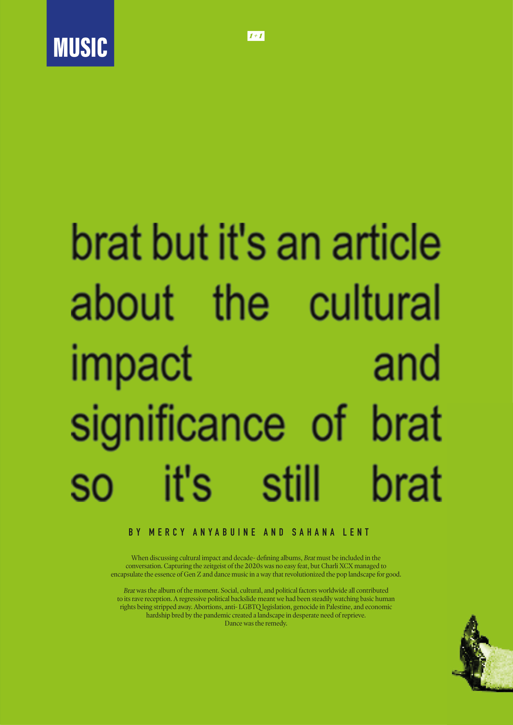
-
![]()
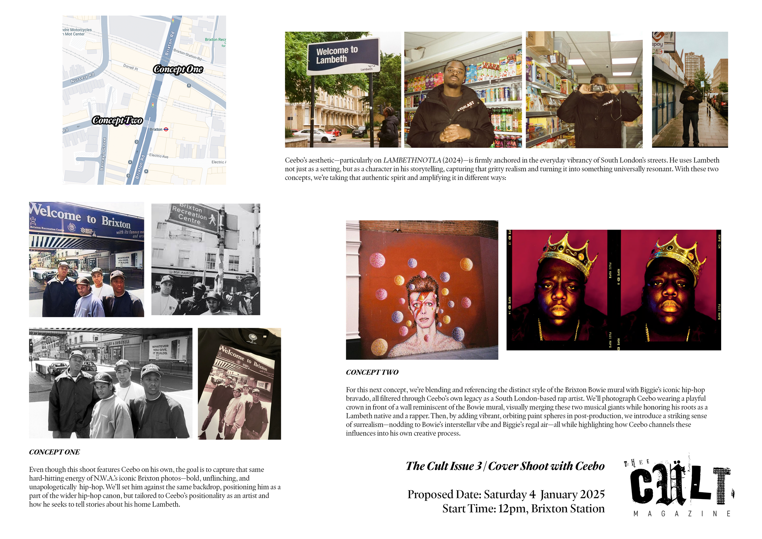
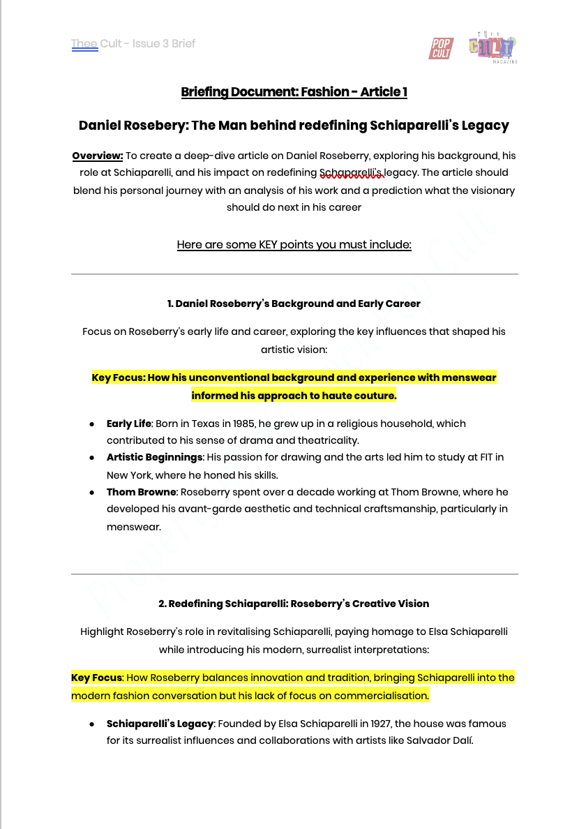
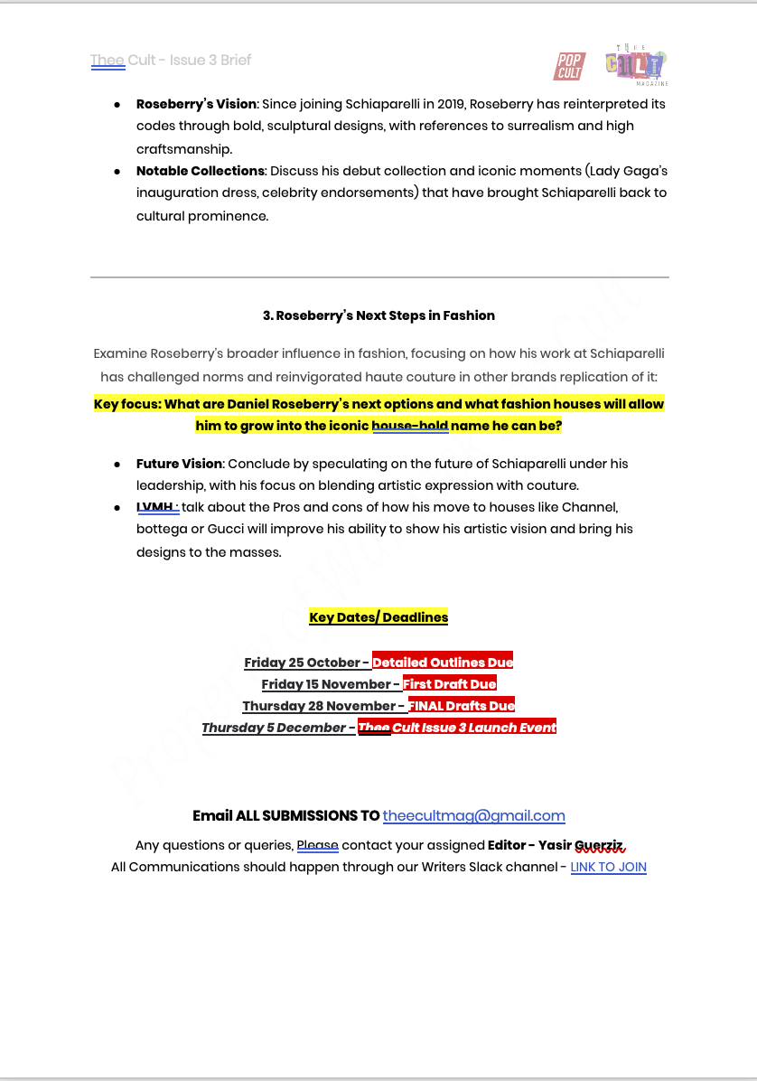
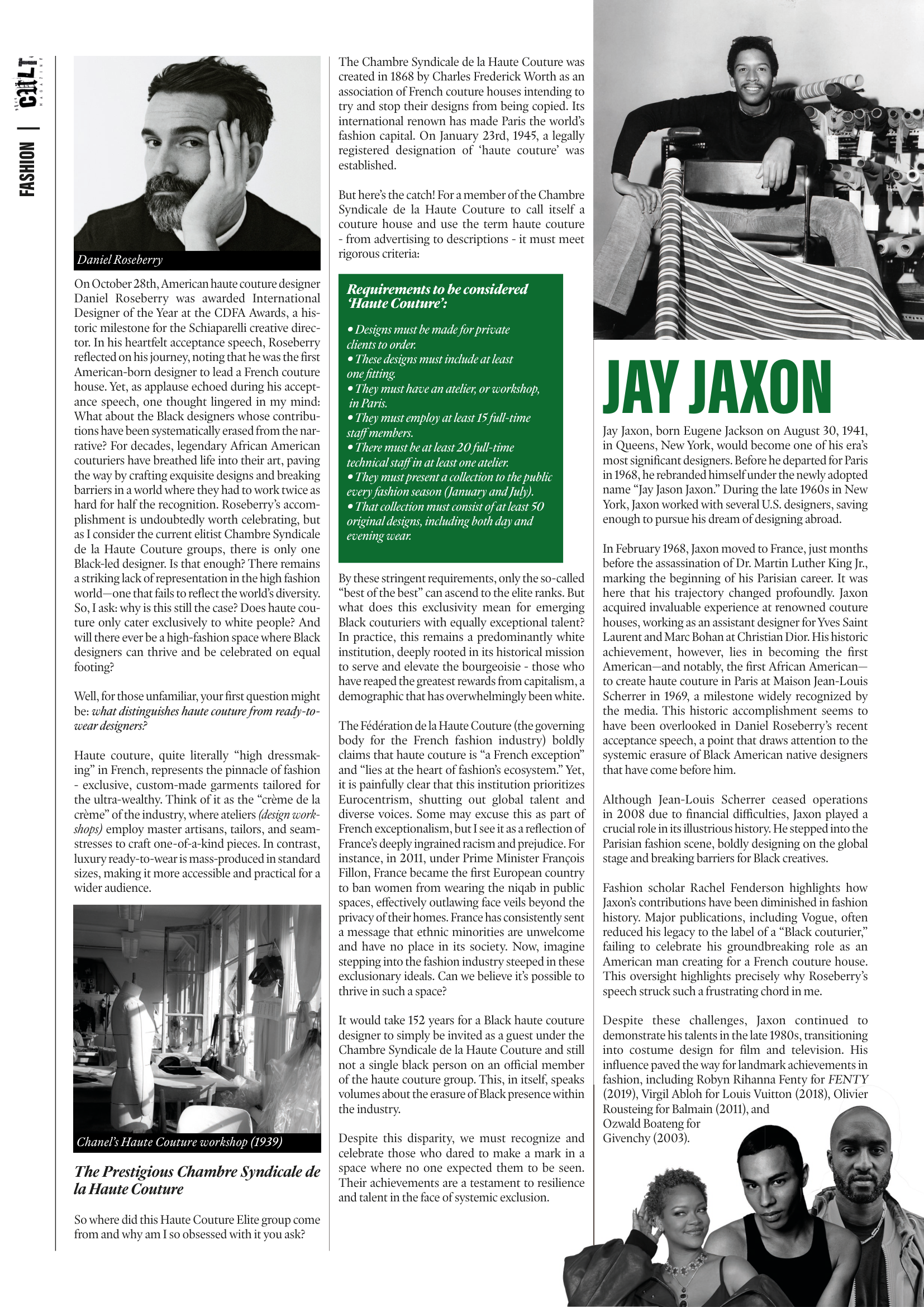
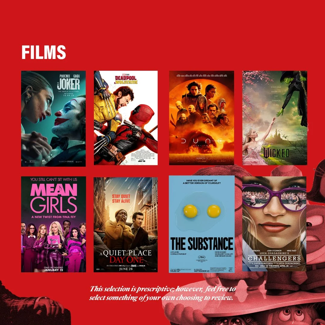
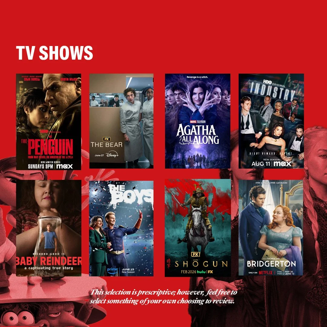
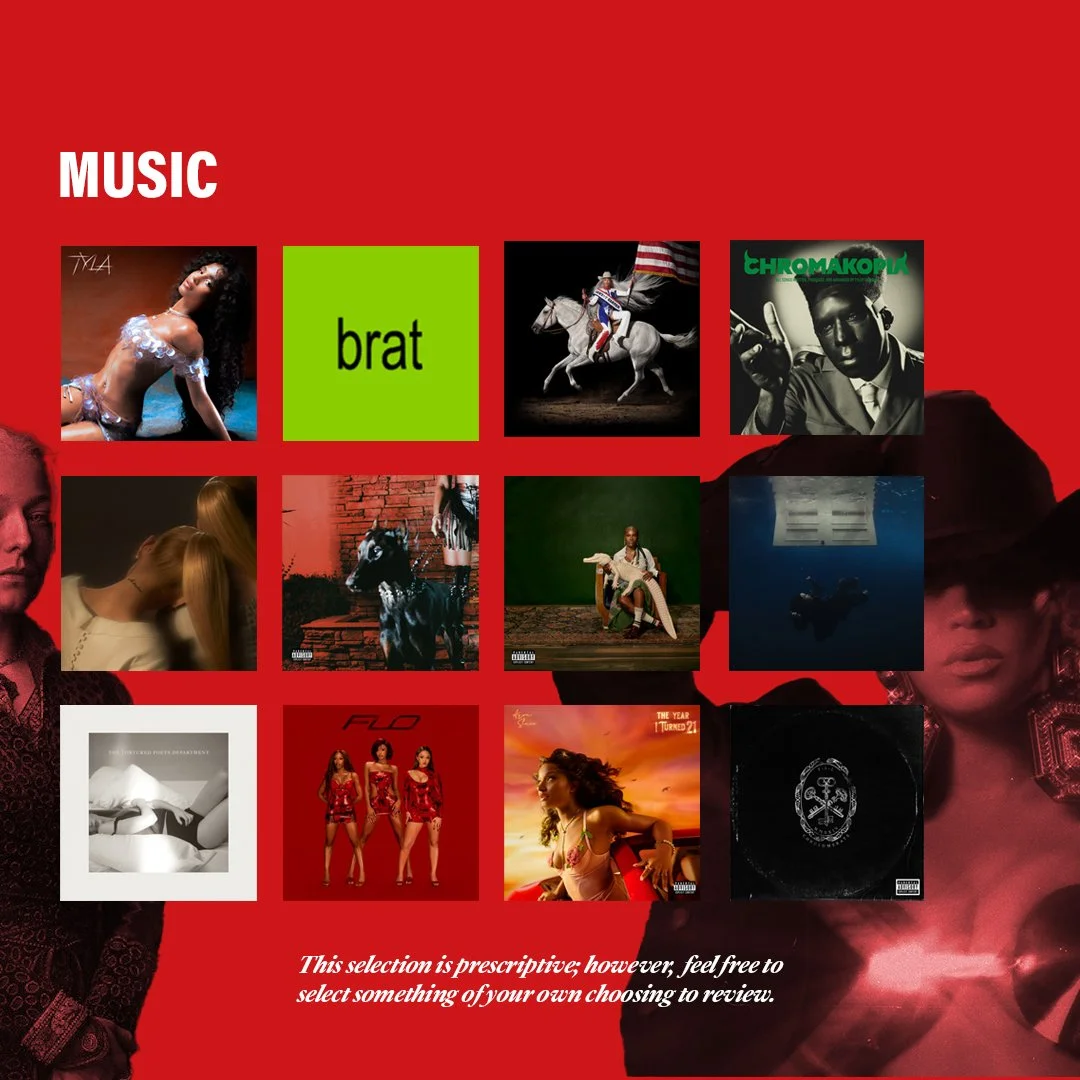
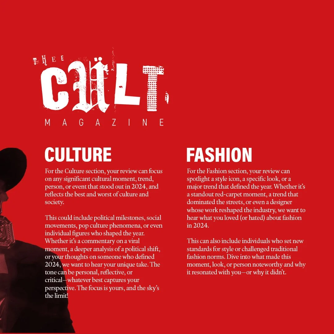
Example Briefing Document
-
![]()
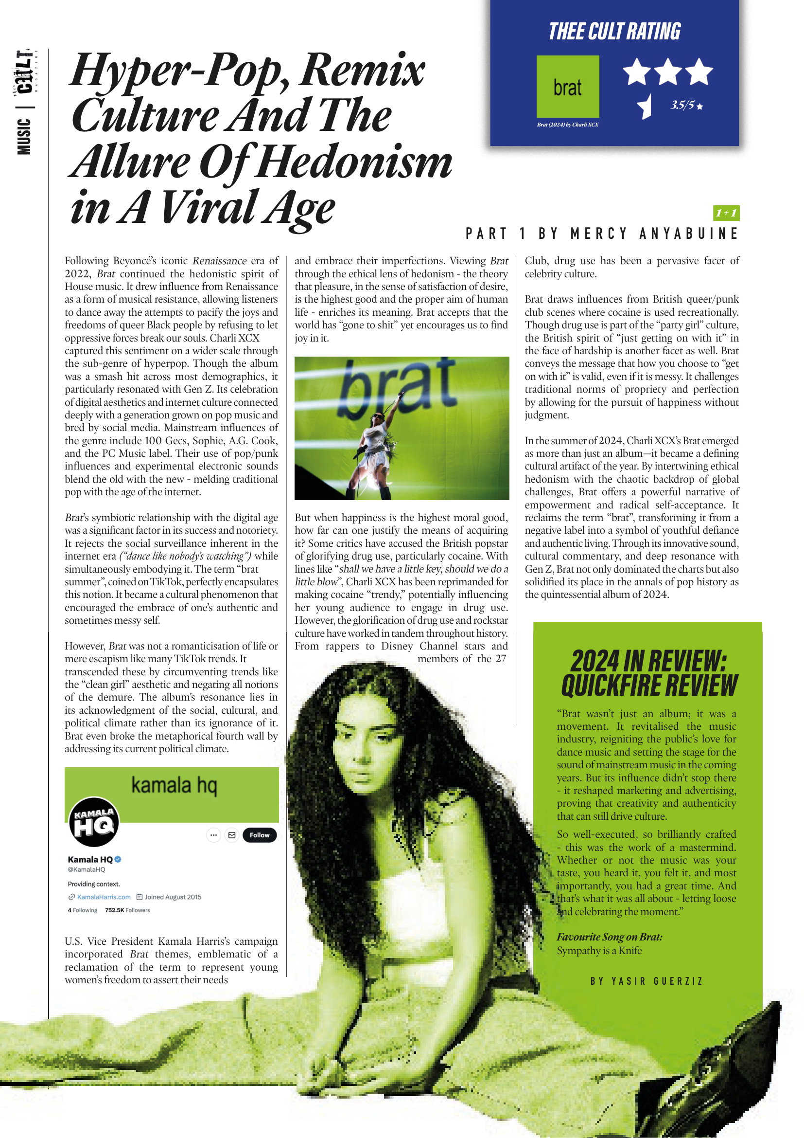
-
![]()
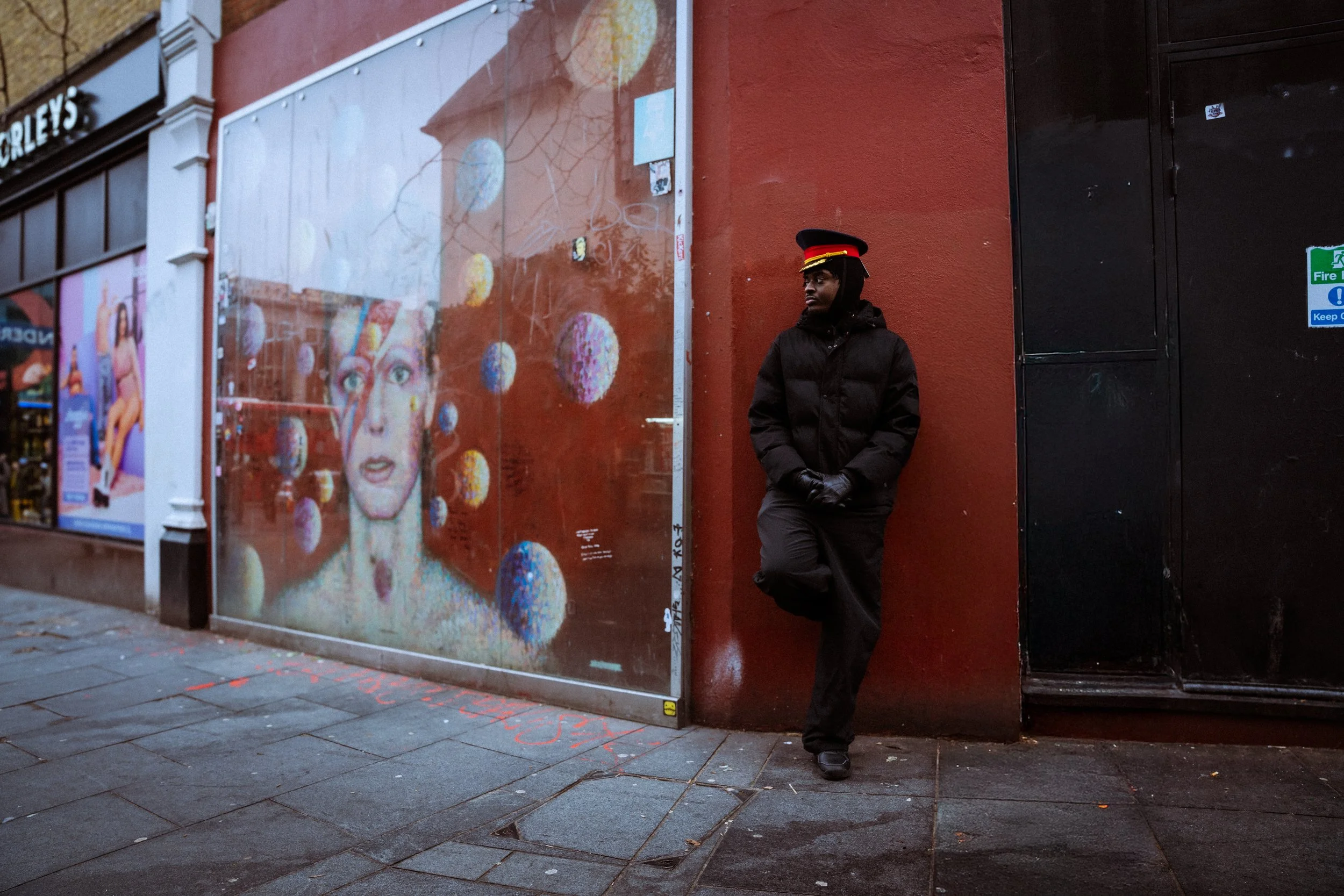
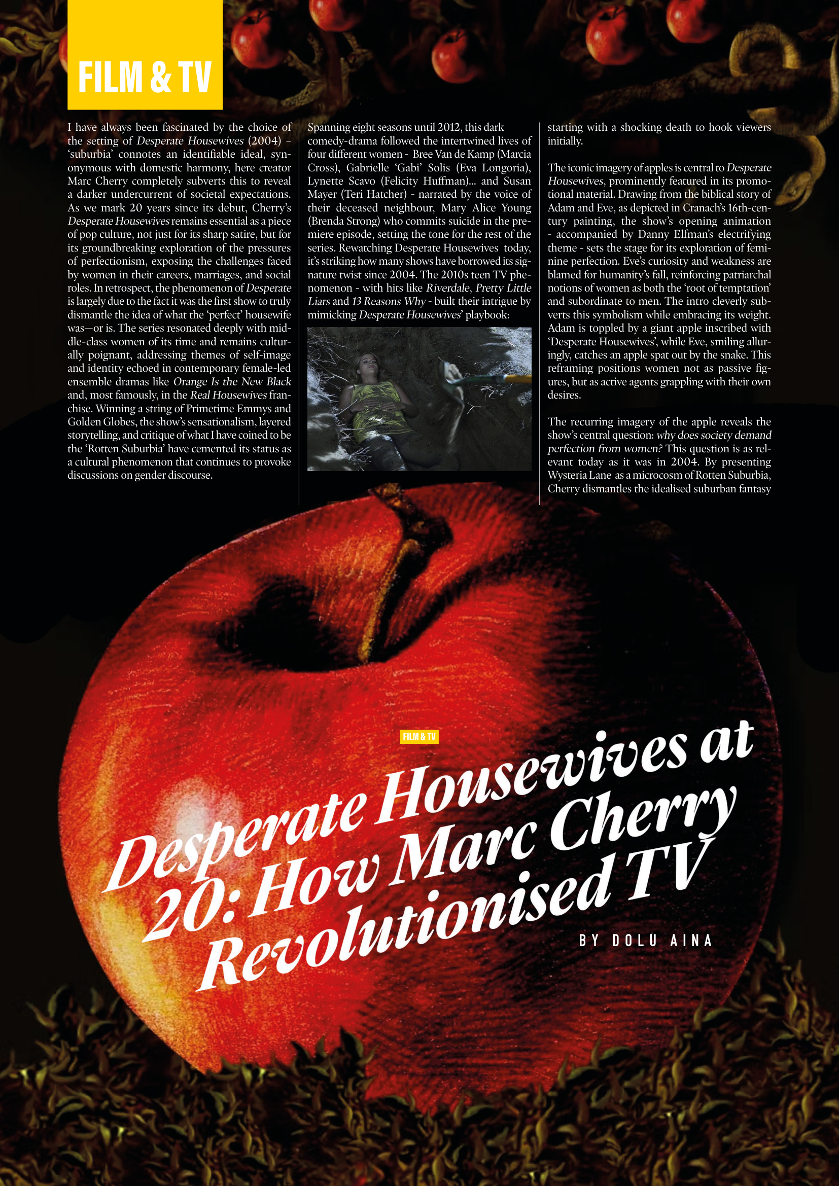
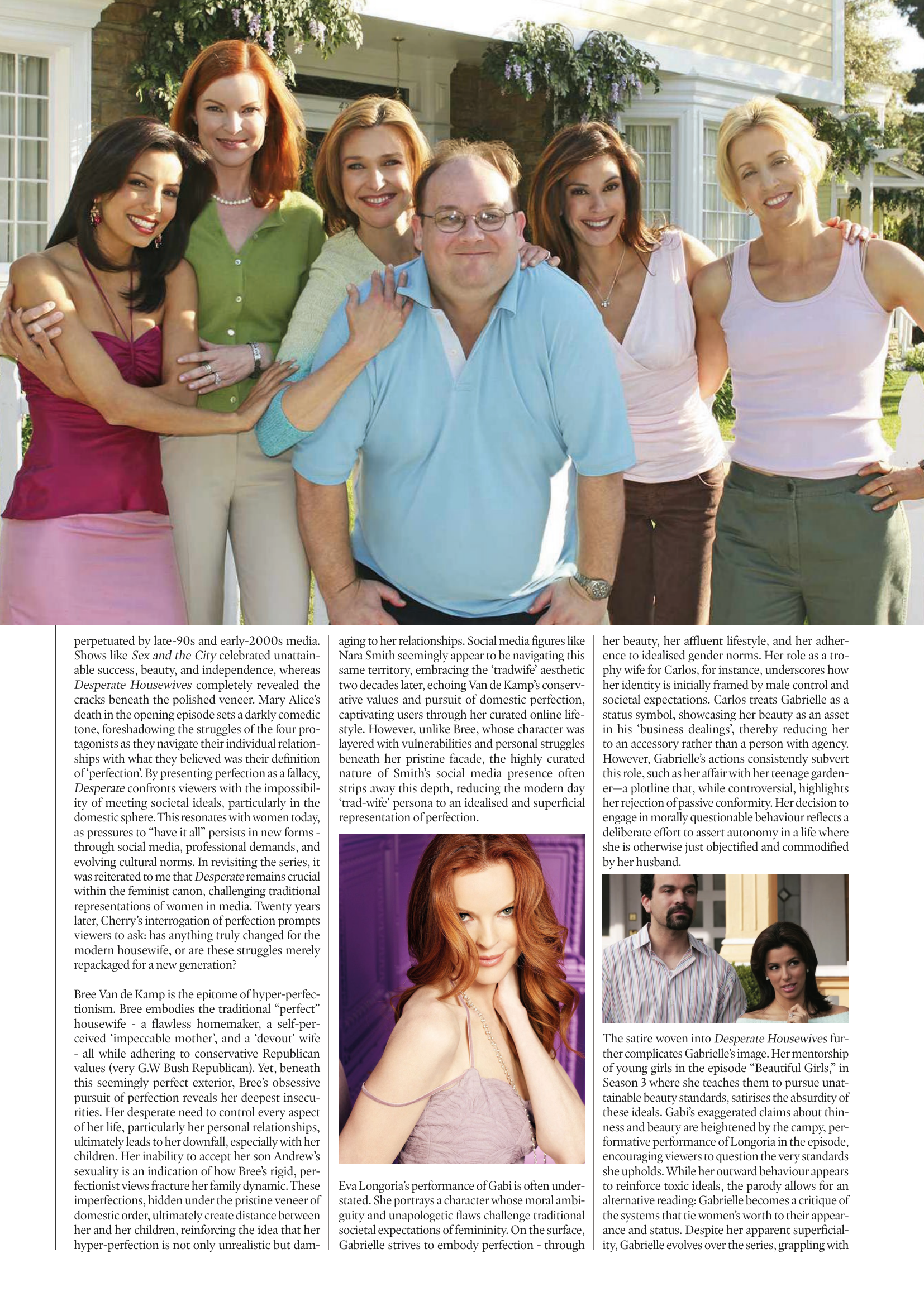
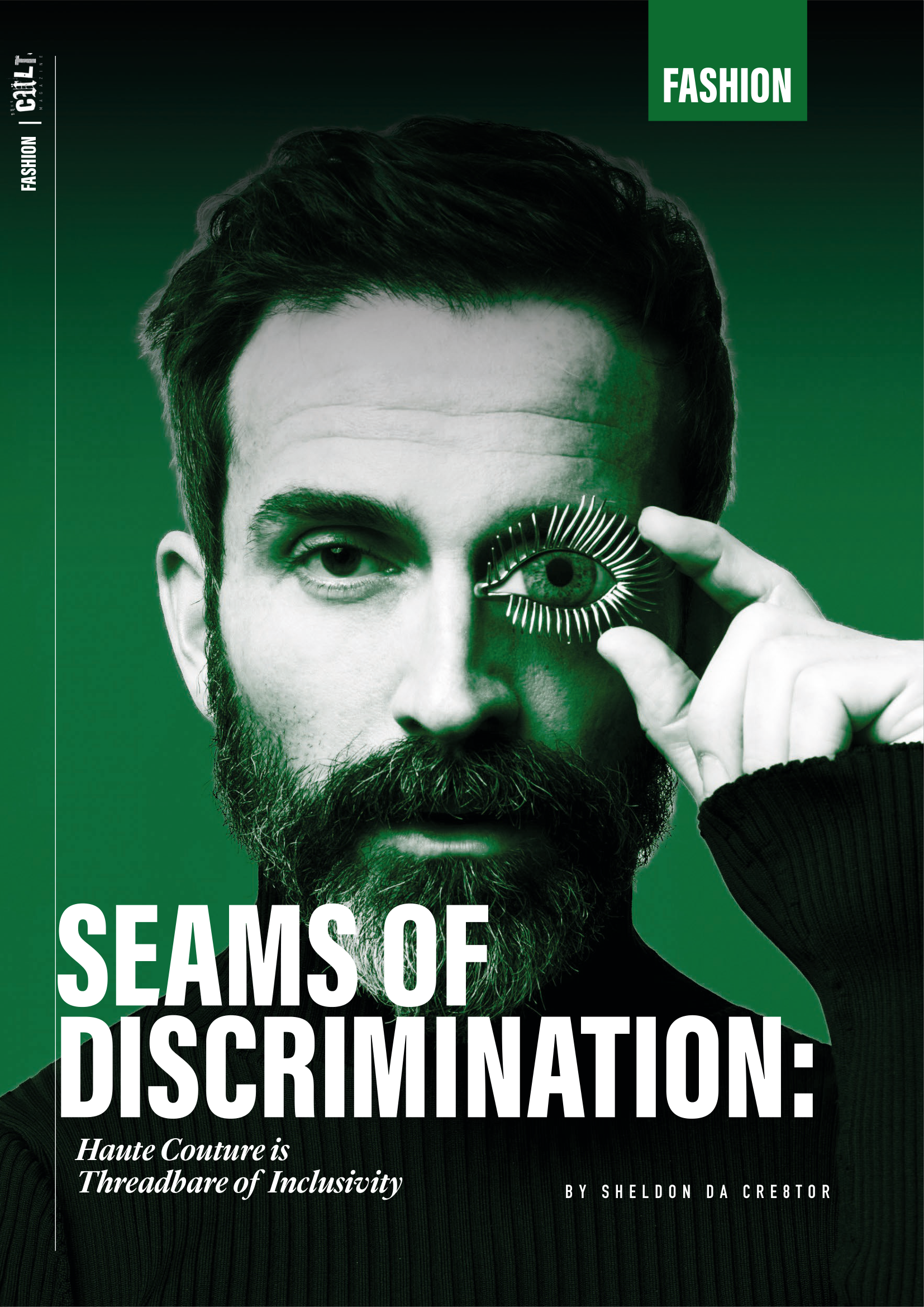
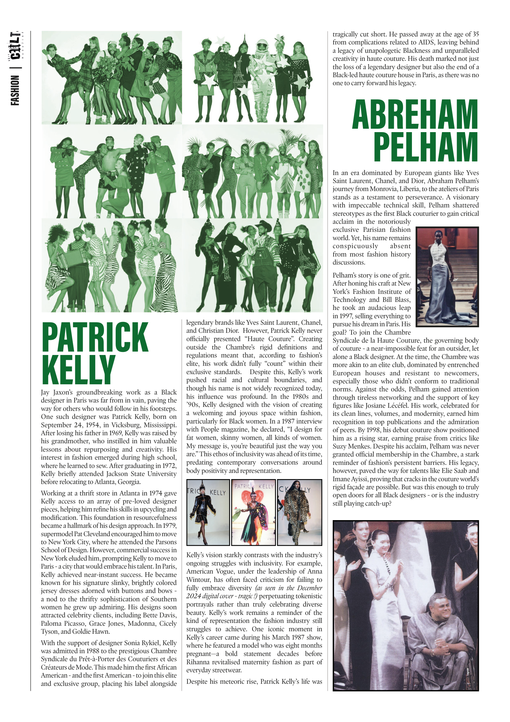
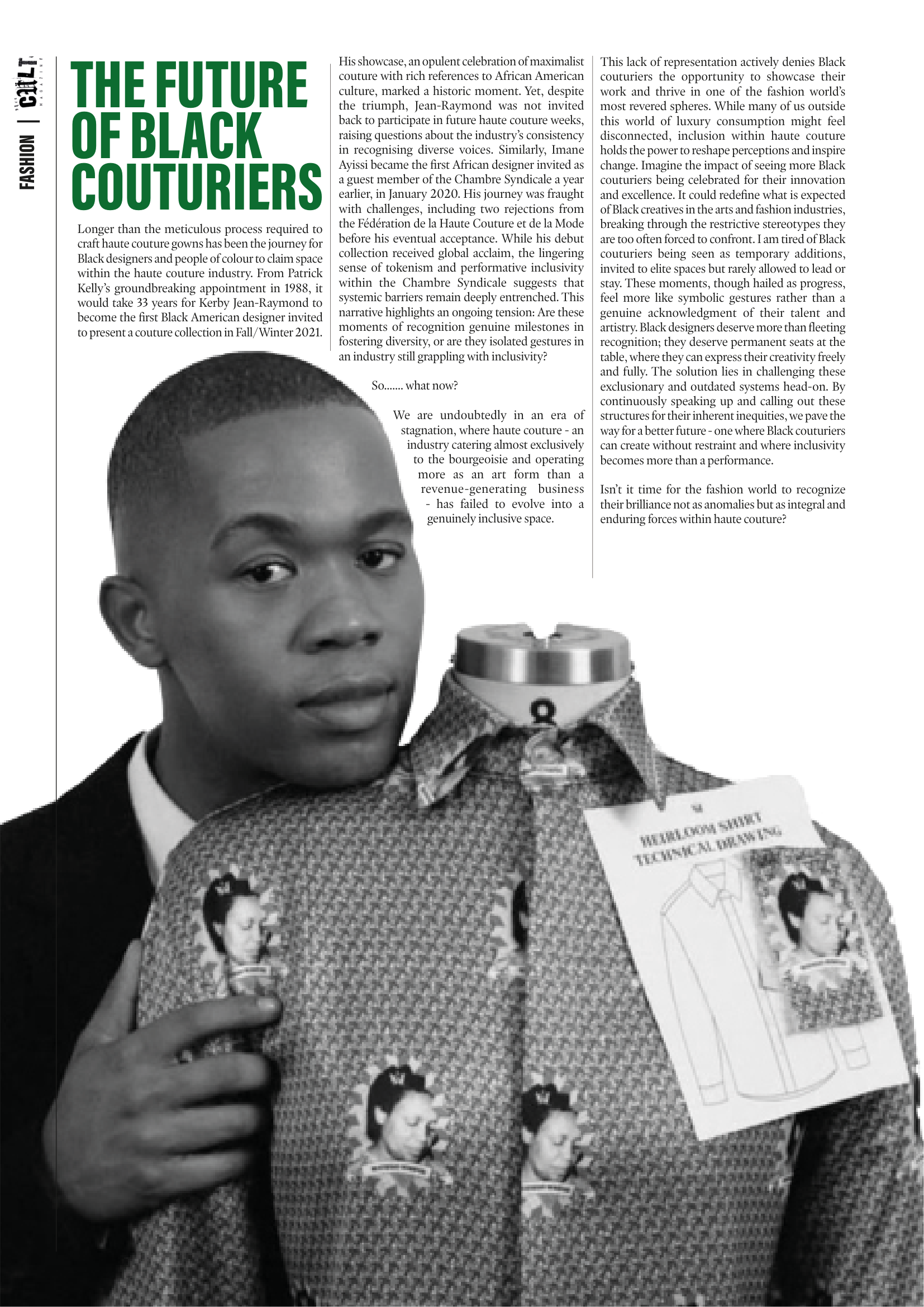
Published Article
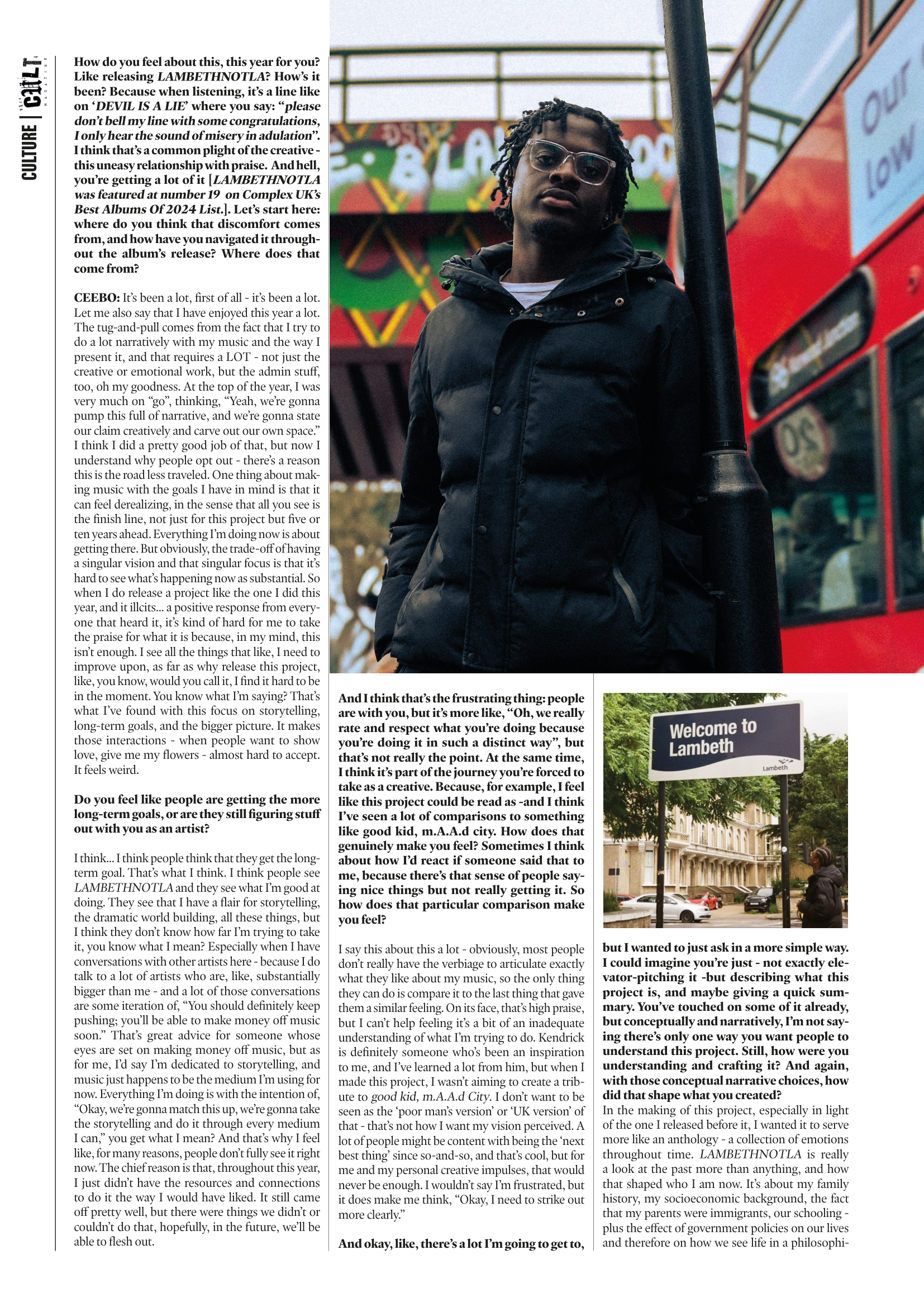
-
![]()
-
![]()
-
![]()
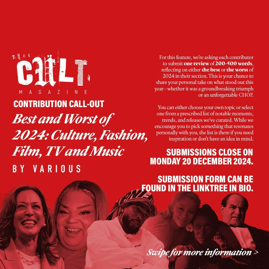
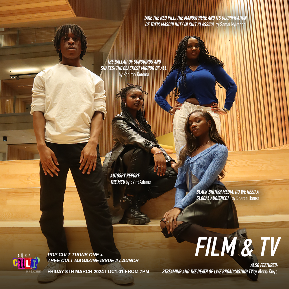
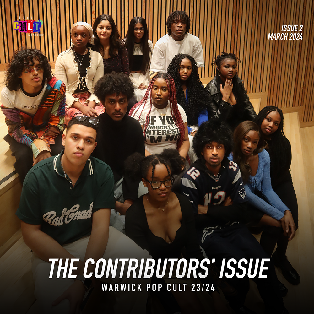
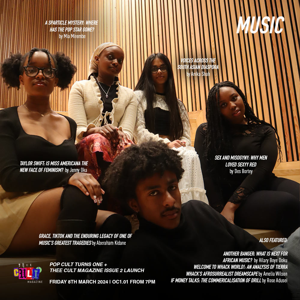
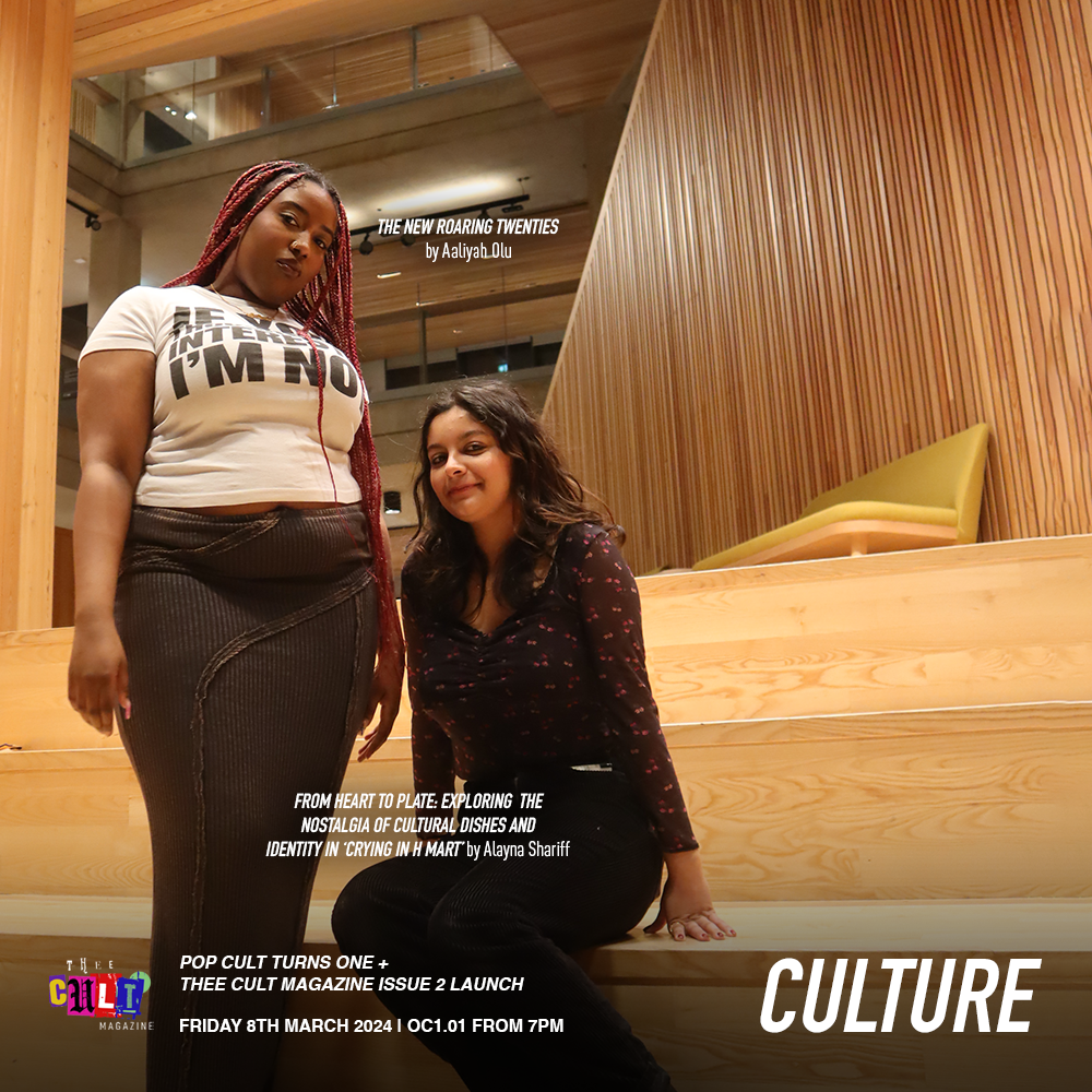
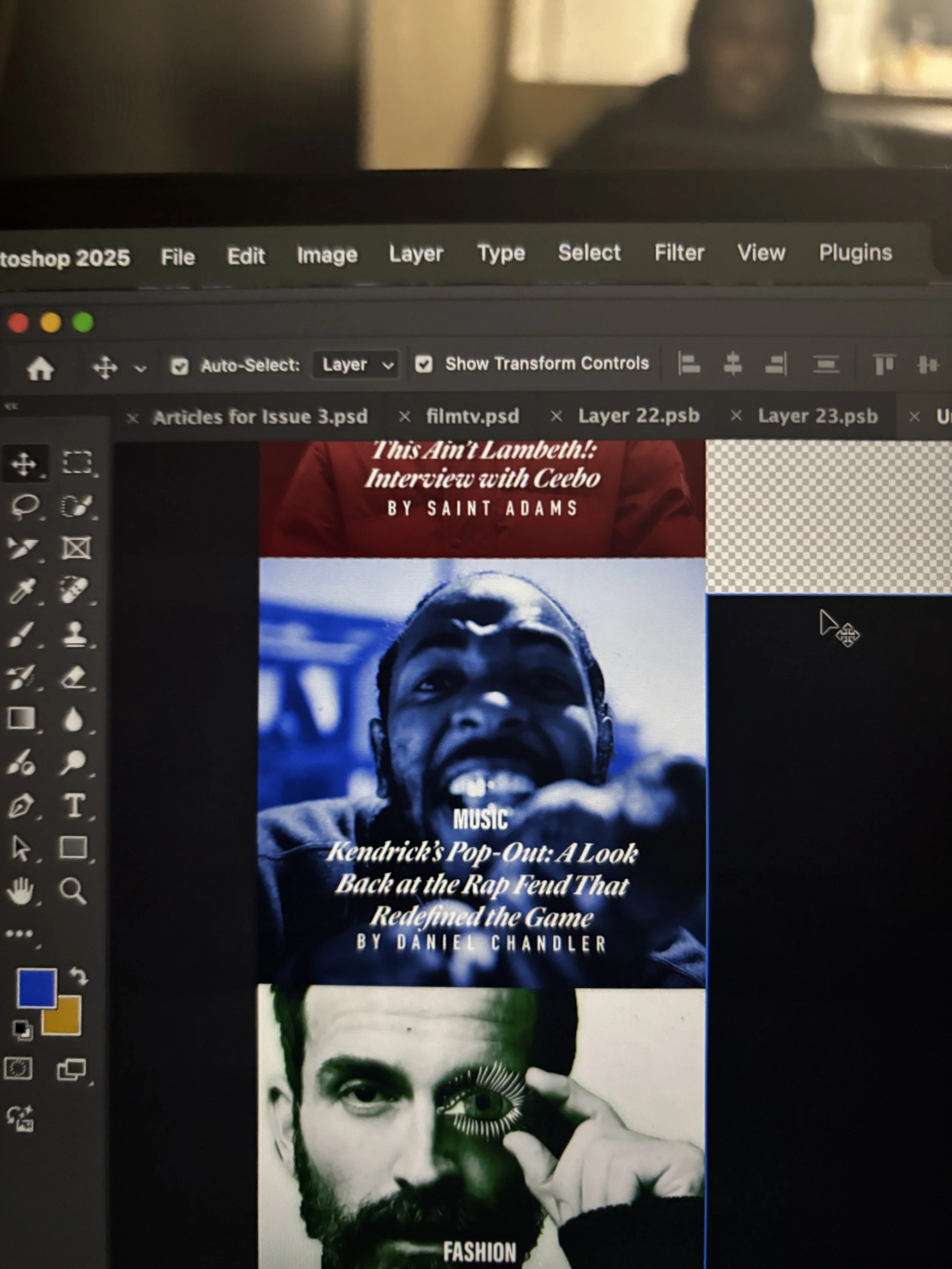
Alongside the development of a distinct visual identity, Issue 3 was supported by a more intentional social media rollout, which functioned not only as a promotional tool but as part of the magazine’s editorial workflow. With the launch of a dedicated Thee Cult platform, social media became a primary space for communicating briefs, promoting calls for submissions, and maintaining momentum across the production cycle.The assets, designed in Adobe Photoshop, were built to align with the updated visual system - balancing consistency with enough flexibility to accommodate different types of content, from contributor call-outs to feature highlights and section-specific posts. These visuals were used to guide contributors through the process, reinforce deadlines, and establish a recognisable presence as the magazine expanded beyond its original context within Warwick Pop Cult.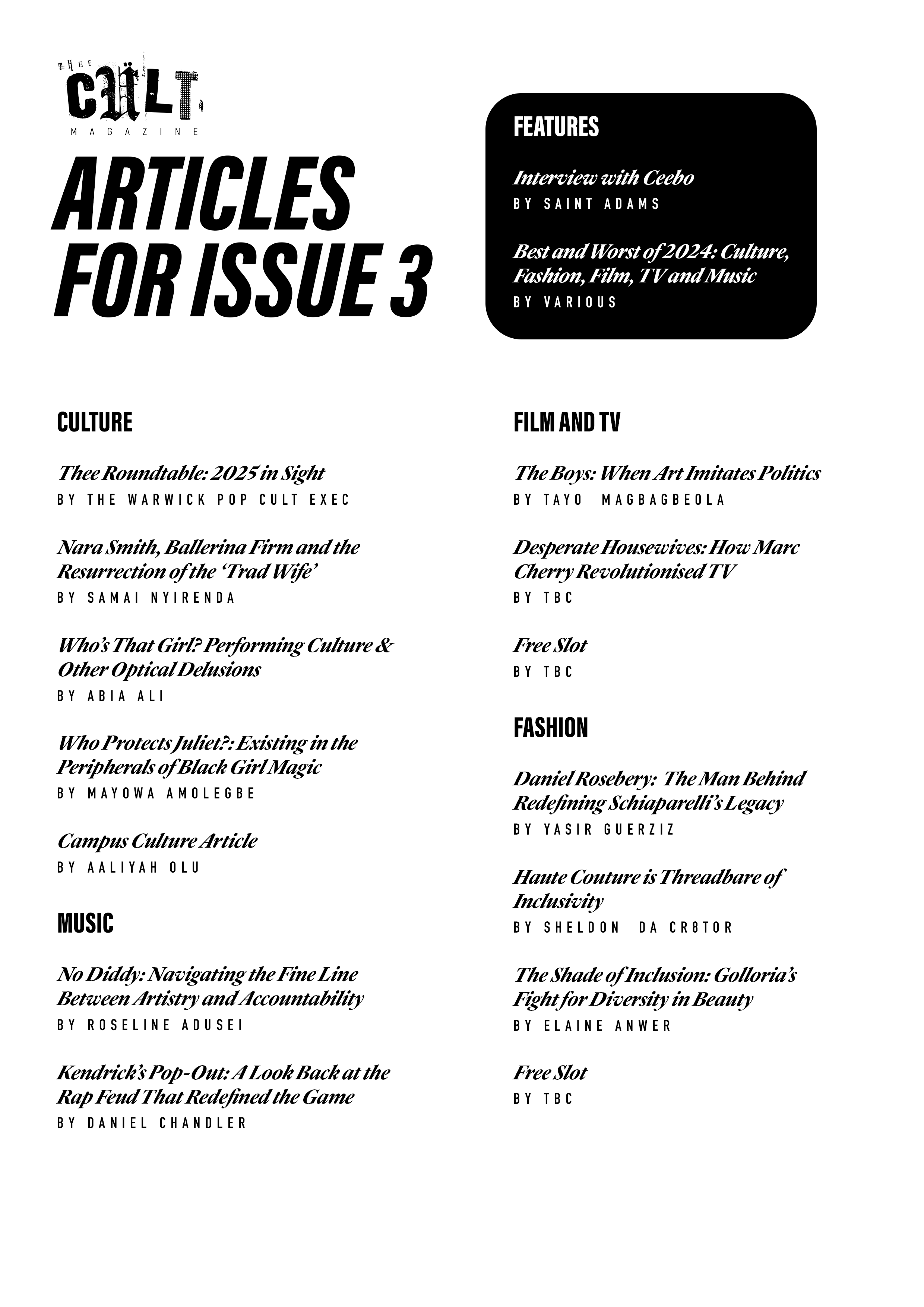
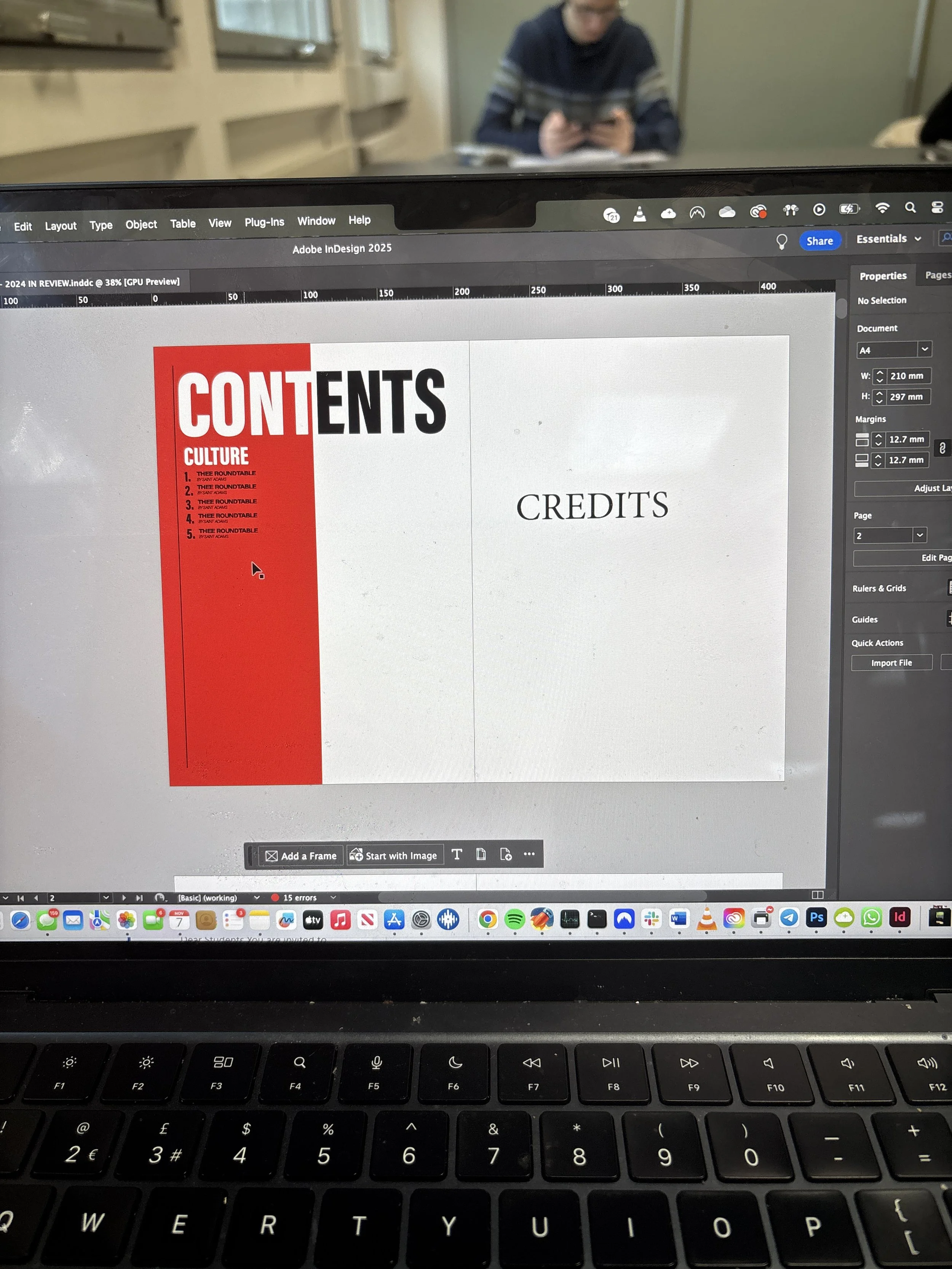
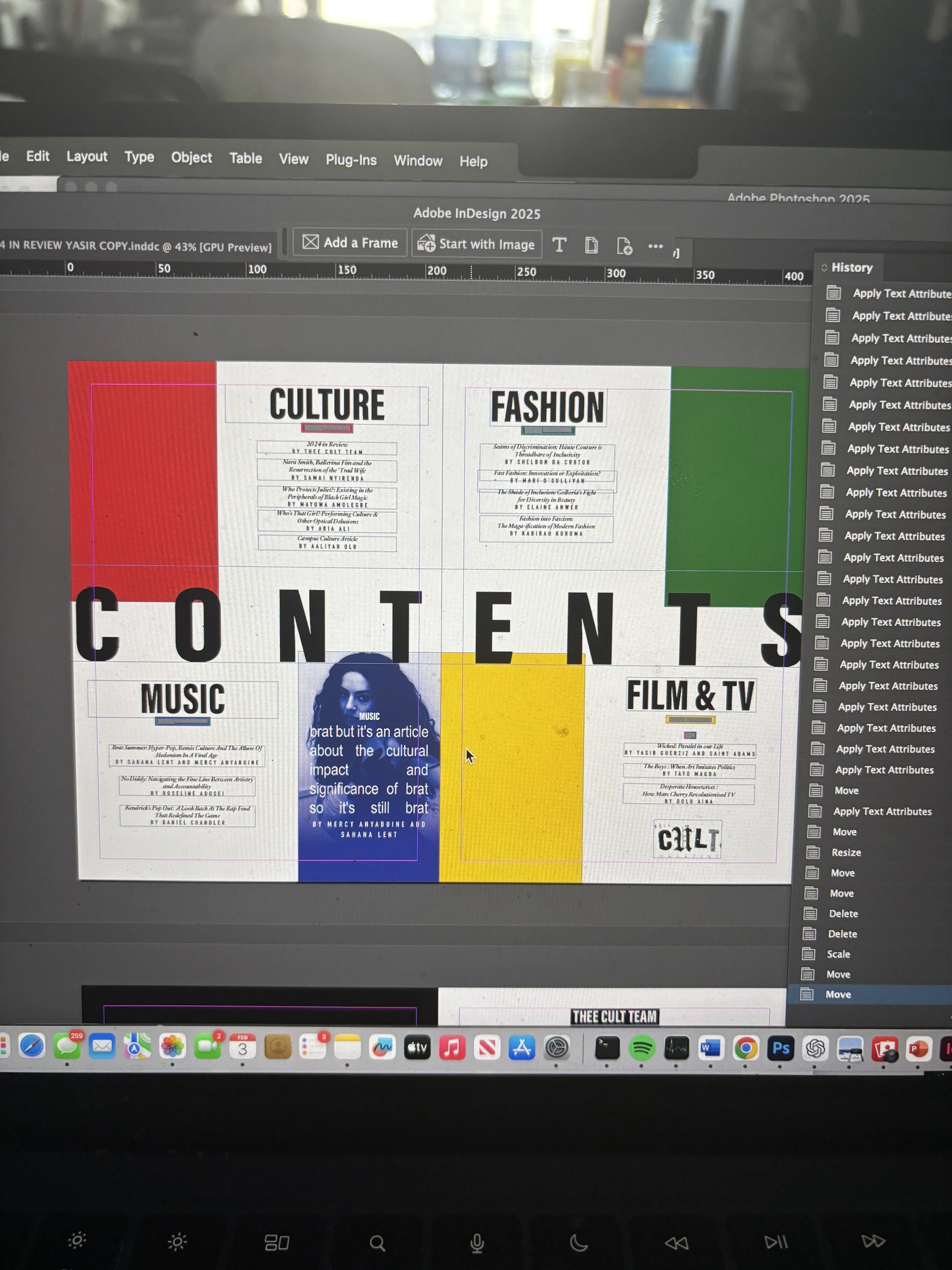
A major development in Issue 3 was the transition into Adobe InDesign, marking a shift toward more professionalised layout and production processes. Alongside Yasir Guerziz, I began learning InDesign from scratch in the months leading up to the issue (October - December 2025), translating our existing Photoshop-based approach into the more structured editorial workflow of InDesign. This period was not only about learning a new software, but about understanding how InDesign could support the construction of a scalable design system. While writing was still being commissioned and developed, we used this time to experiment with layouts, master pages, and typographic structures - establishing a foundation that could later be adapted once final content was delivered. Through working in InDesign, we defined core elements of the magazine’s visual identity, including a clear typographic hierarchy, consistent grid systems, and a simplified approach to section-based design. These decisions allowed the magazine to move toward a more cohesive and recognisable visual language, while still retaining flexibility across different articles and formats.Importantly, this phase also strengthened our confidence as designers. By building and applying these systems directly within InDesign across both editorial and promotional outputs, the visual language of Thee Cult became something we could actively operate within - akin to becoming fluent in a language. This shift extended beyond layout into creative direction more broadly. Establishing a consistent visual language allowed for greater control over how the magazine was perceived and experienced across every touchpoint, from page design to social media and aesthetic tone. As Creative Director, this meant moving from making individual design decisions to shaping a cohesive world - where typography, layout, imagery and tone all worked together to support a unified editorial identity. Through this process, design became a framework for decision making across the publication. Rather than responding to content on a case-by-case basis, the established system provided clarity on how different elements should be treated, allowing the magazine to operate with greater intention, consistency and authority.