
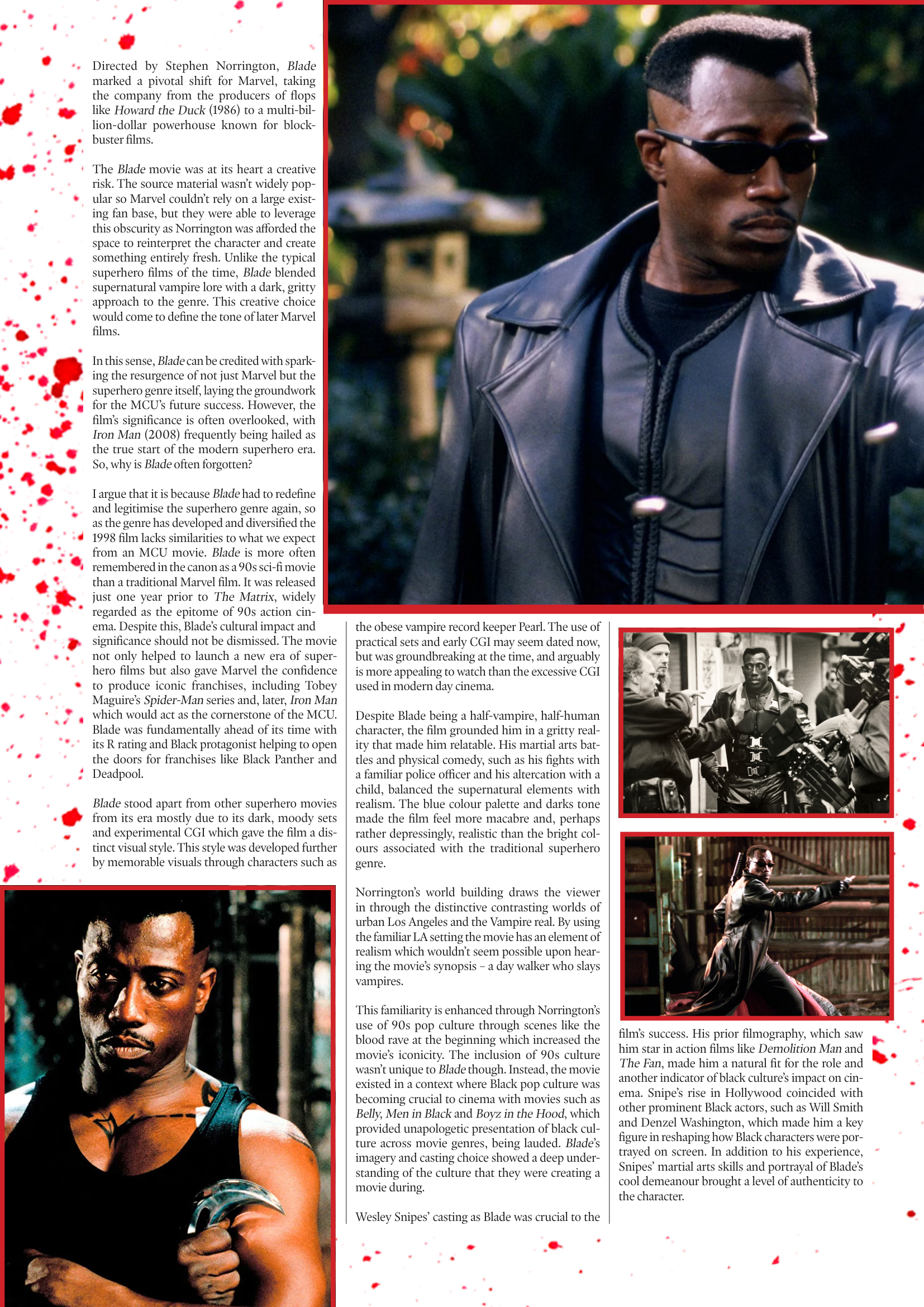
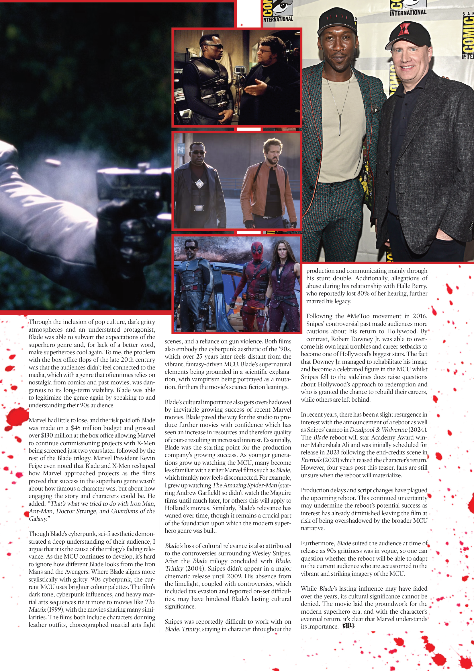
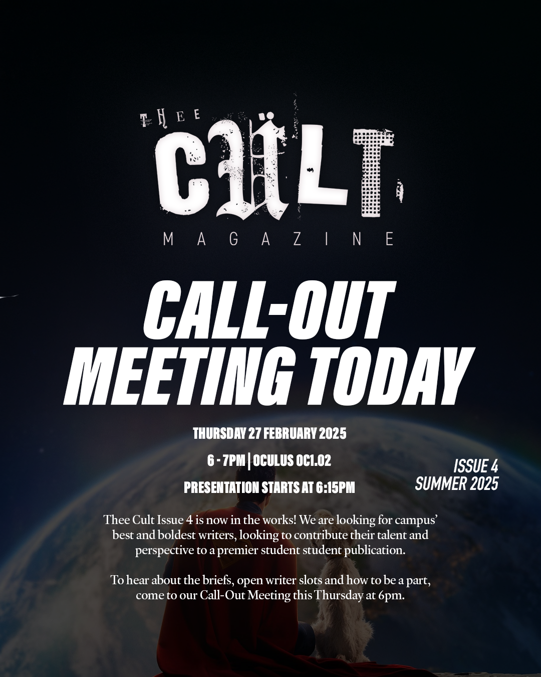
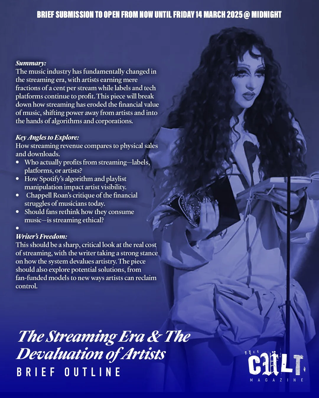
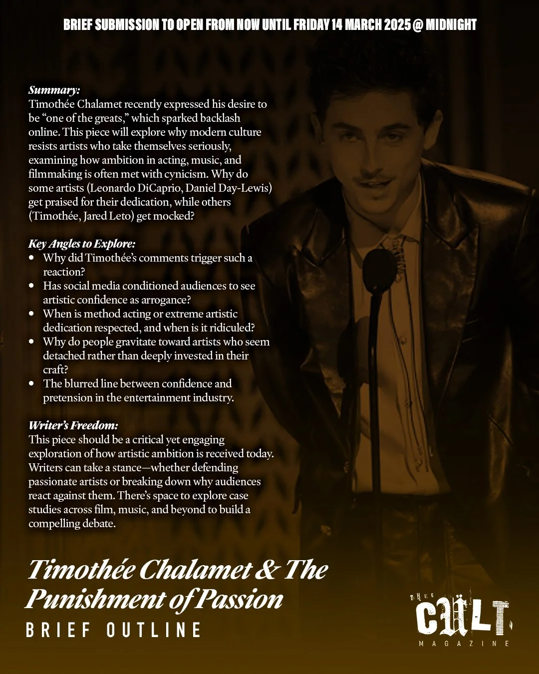
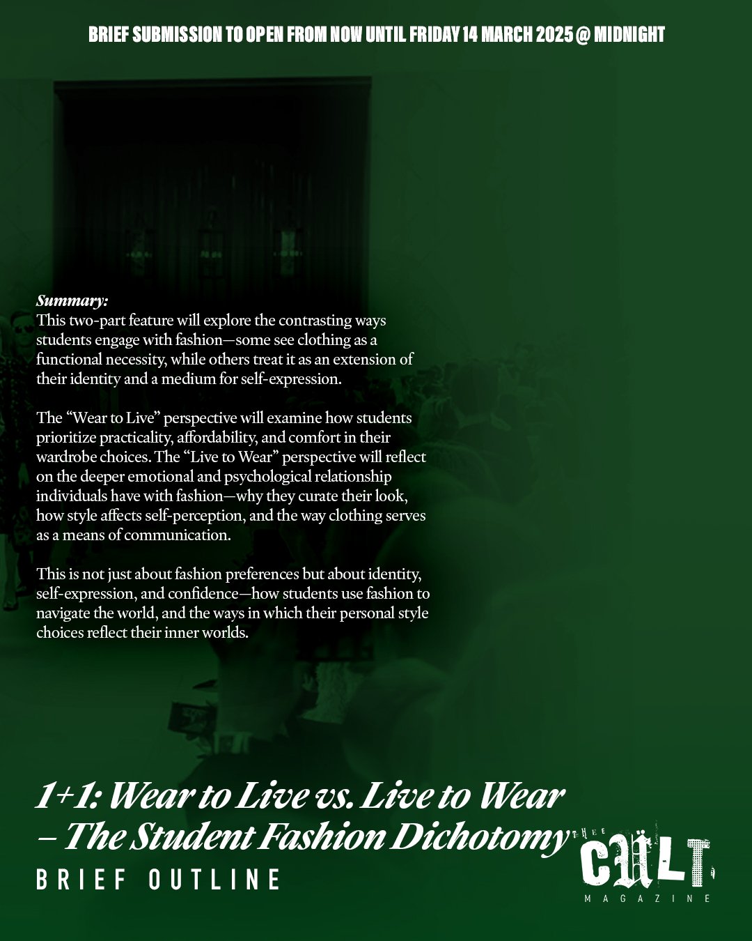
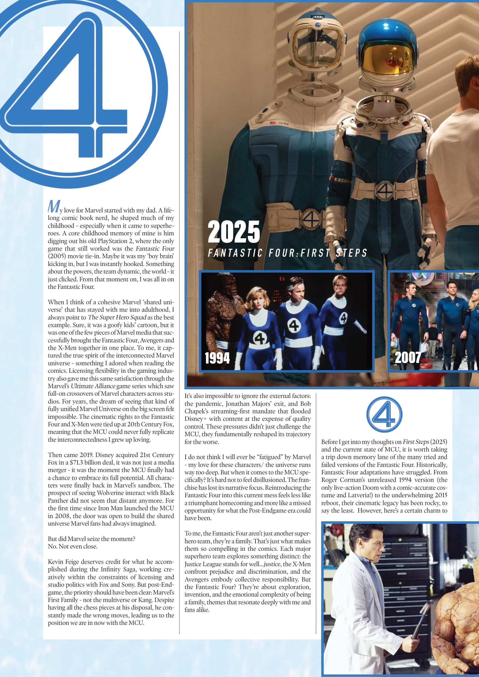
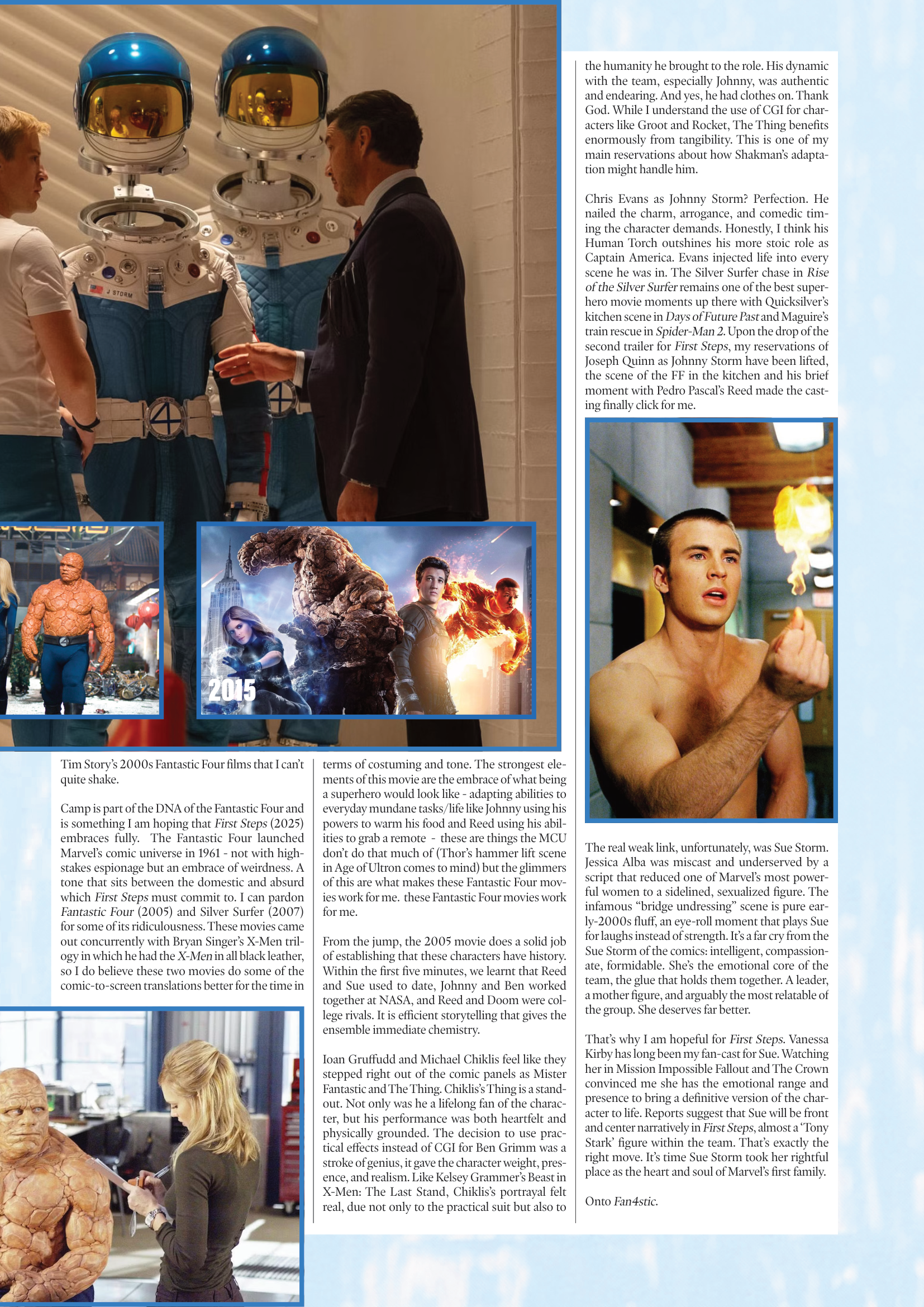
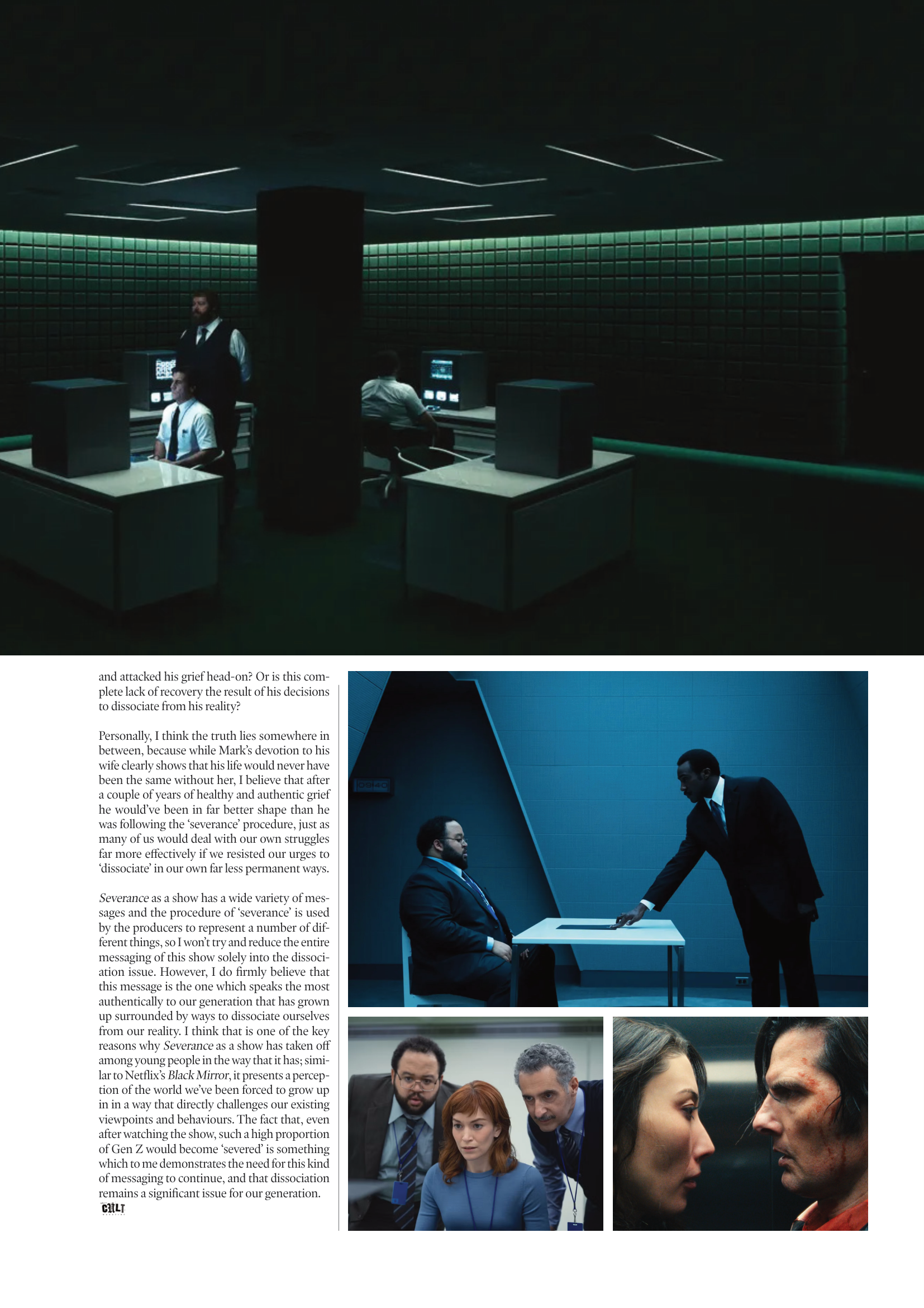
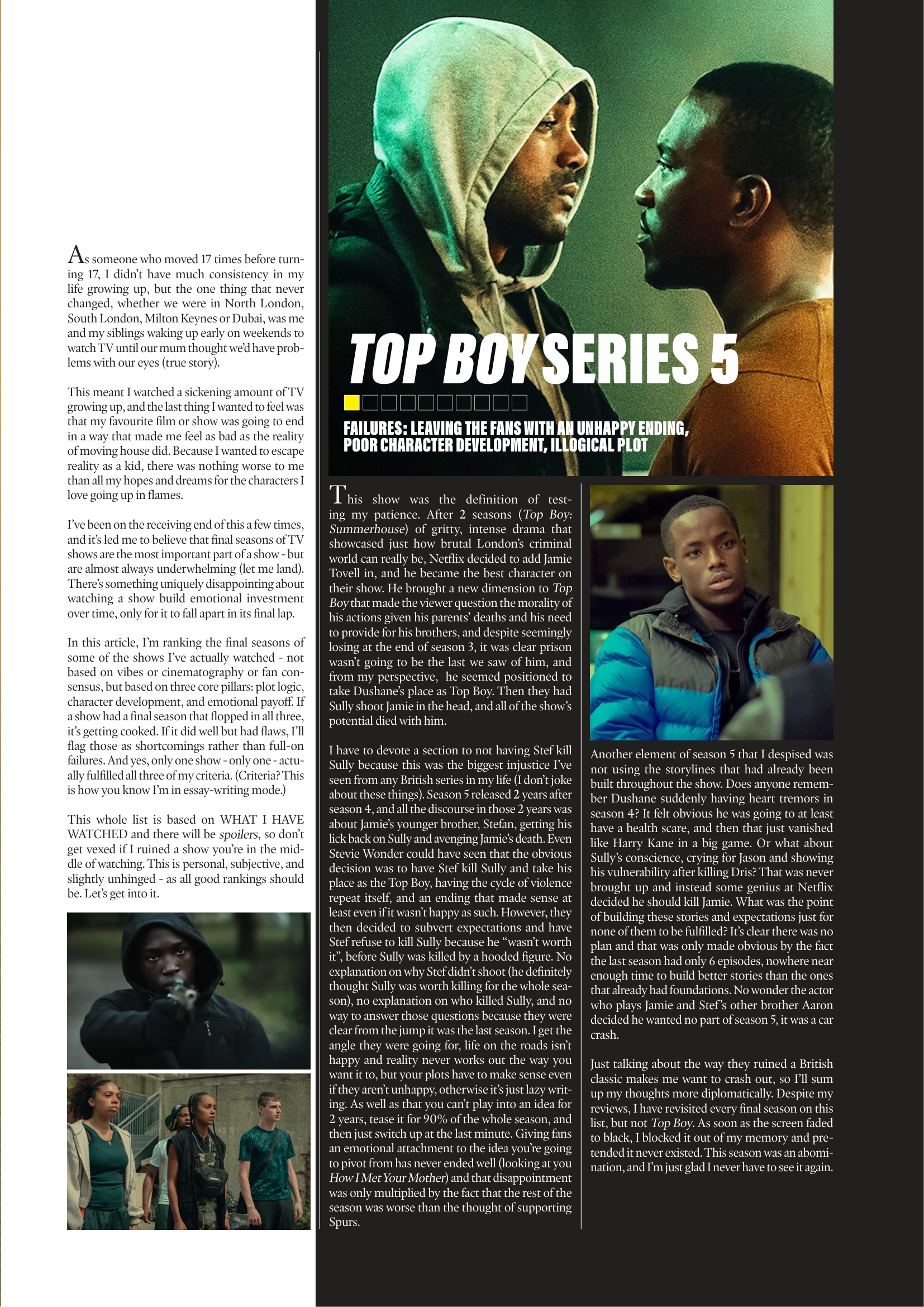
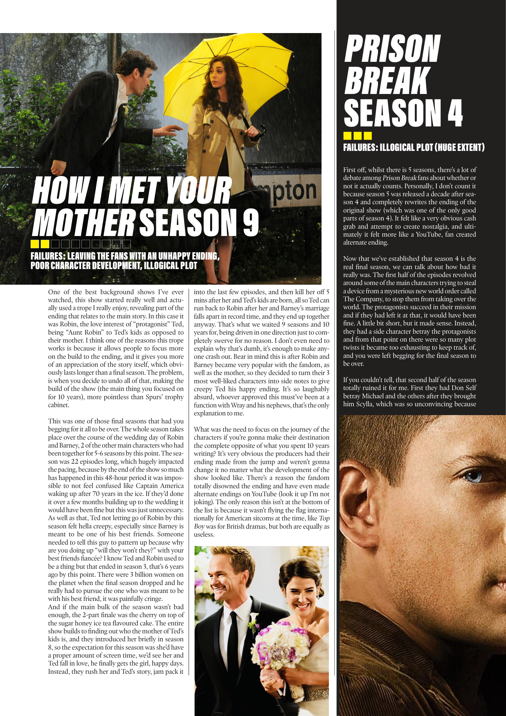
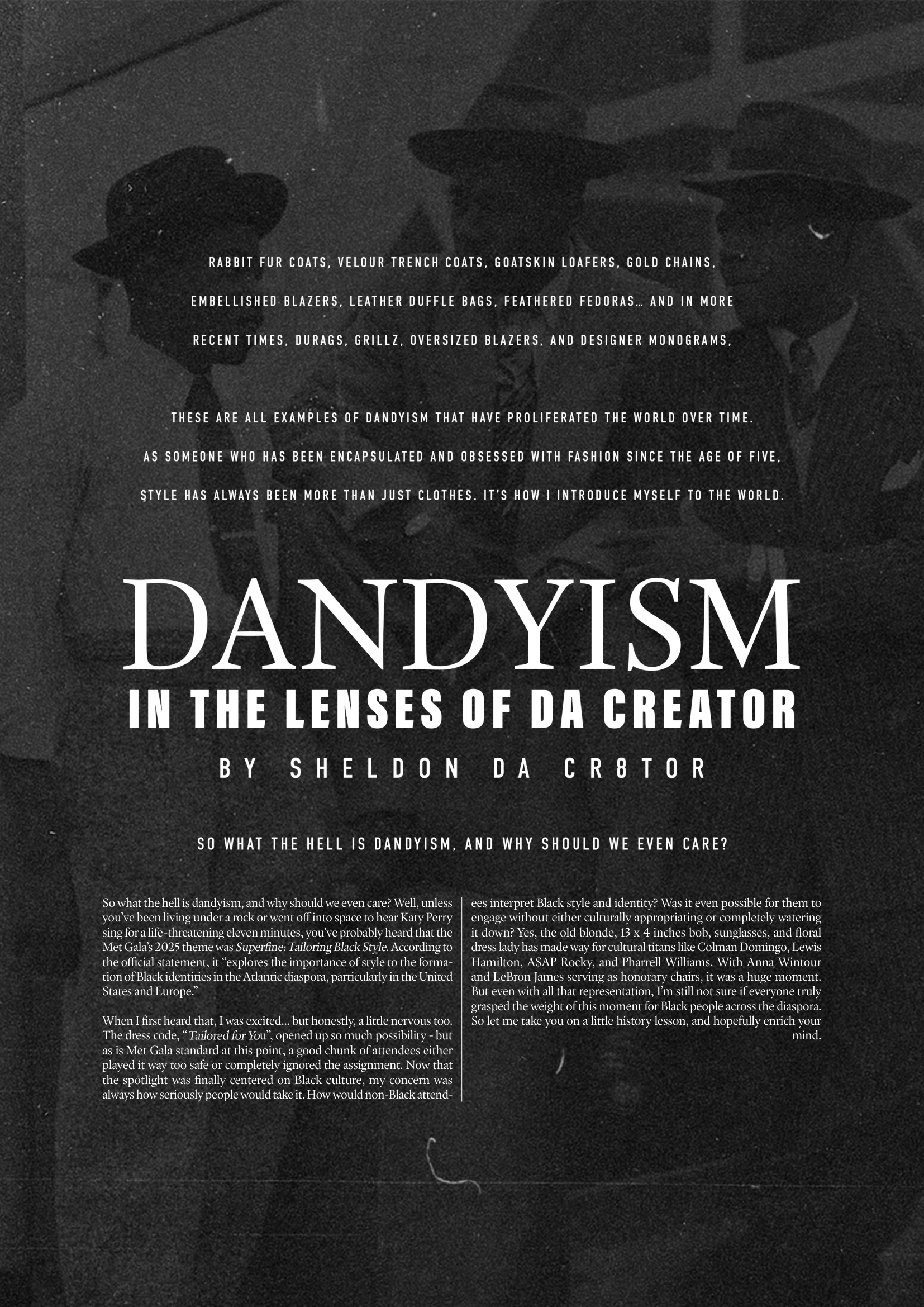
Issue 4: The Superhero Issue “Steel Here?"
For Issue 4 of Thee Cult Magazine, I led the project as Editor-in-Chief and Creative Director, overseeing the publication’s full editorial, operational and distribution process. This issue marked a shift from establishing structure to enforcing it, with a clear emphasis on workflow, discipline and consistency across all stages of production. My role spanned managing all commissioned writing, directing contributors through deadlines and revisions, overseeing social media rollout, and maintaining editorial coherence across the issue. All content and design decisions were guided through a centralised process, ensuring consistency from development through to final output.

Alongside this, I led the creative direction of the issue, constructing its visual world through original image-making. I directed and co-shot the editorial photography, and carried out post-production and colour grading, developing a consistent visual language across the magazine. This marked a shift toward a more authored aesthetic, where imagery, design and editorial worked together as a unified system.

In addition to editorial and creative leadership, I oversaw key aspects of production, including selected page design, print management and the expansion of the magazine’s digital infrastructure. This issue also introduced a transition to an online, order-based distribution model, for which I managed the full system - from website updates to fulfilment.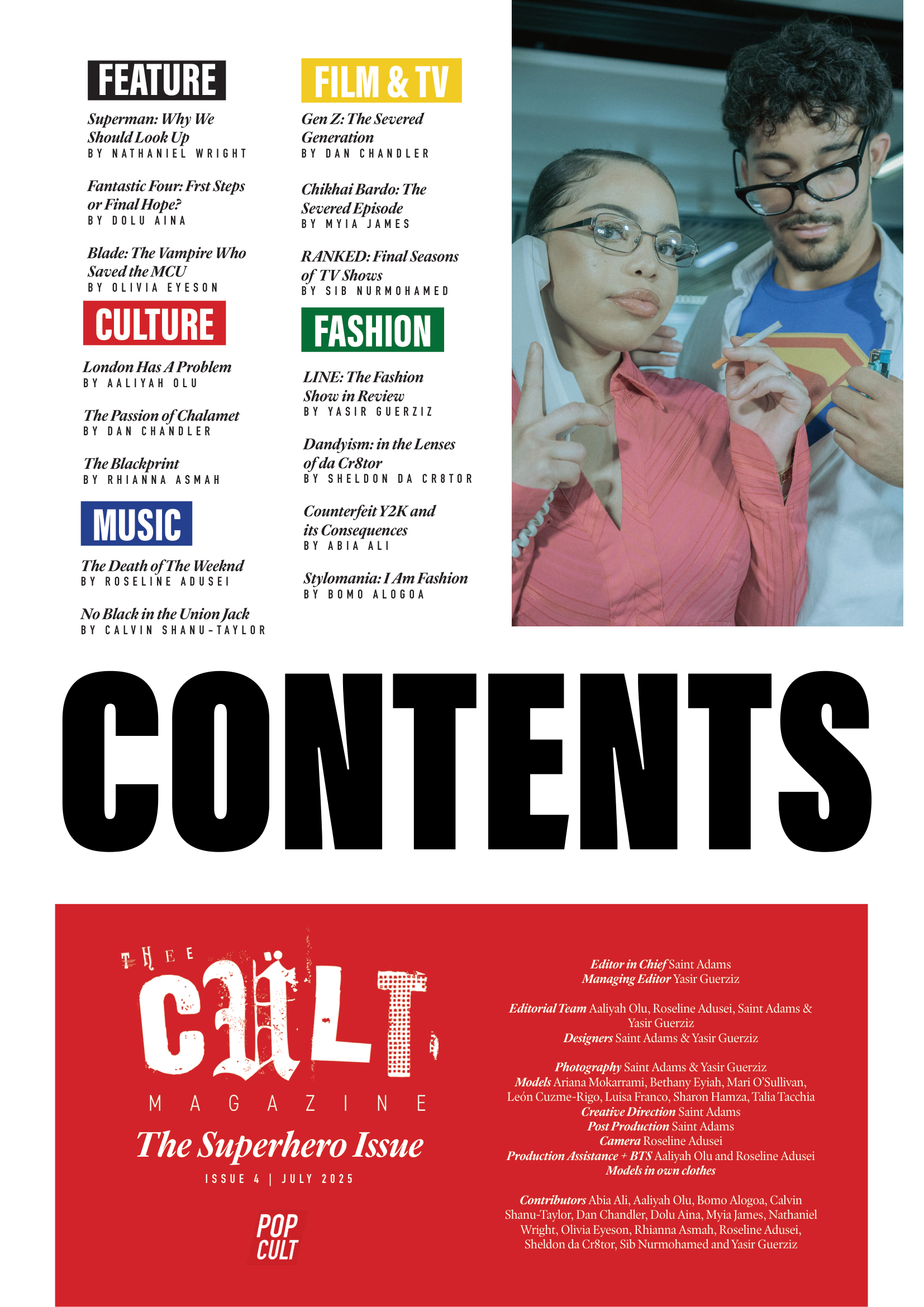
Issue 4 was less about shifting direction and more about testing the systems established in Issue 3. Rather than rethinking the magazine, the focus was on applying and extending what had already been built - pushing the editorial structure, visual identity and production process further to see how they could hold at scale. This issue operated as a pressure point: a way of developing the magazine into something closer to a professional-grade publication through really honing down on process and execution. The emphasis was on maintaining consistency, refining standards and expanding the scope of what the magazine could handle - treating the process itself as something to be worked through, stressed, and ultimately clarified.
Following the systems established in Issue 3, the production of Issue 4 was able to operate with far greater structure and clarity. Processes around social media rollout, contributor onboarding, and editorial timelines were no longer being figured out in real time, but applied as a working framework - allowing the focus to shift from building the system to refining it. The editorial process itself became more intentional, with the introduction of an additional check-in stage designed to improve the quality of writing and give contributors more time to develop their work. This structure was defined clearly at the start of production, ensuring expectations, timelines, and deliverables were understood from the outset. In practice, this resulted in a more hands-on and rigorous editorial approach. Over the course of a week, I conducted one-to-one sessions with each contributor, working through drafts in detail to strengthen clarity, argument, and overall quality. 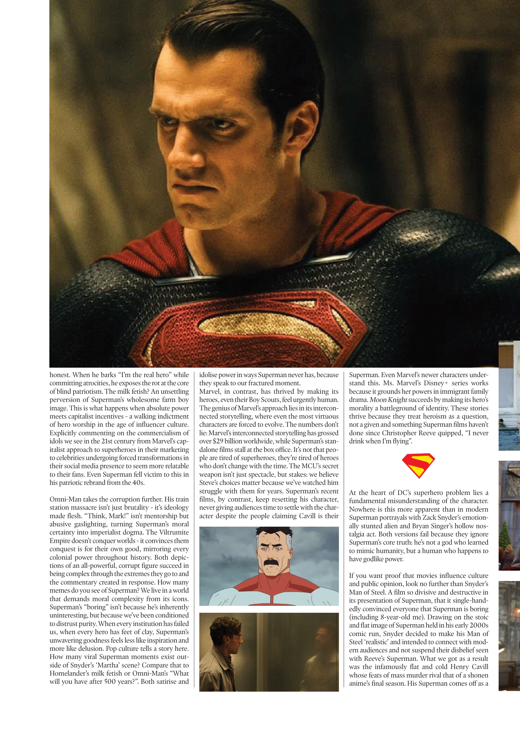
As a result, the final body of writing reflects a more developed and consistent editorial standard across the issue. Rather than a mix of approaches, the work sits within a clearer framework - with stronger alignment in tone, structure, and critical depth across contributors. This progression is visible not only in individual pieces, but in how the issue reads as a whole. The combination of structured commissioning, defined timelines, and sustained editorial input allowed the magazine to move closer to a cohesive publication, rather than a collection of separate contributions.
At the same time, this process relied heavily on sustained input at every stage, requiring a level of involvement that extended beyond initial system-building into continuous oversight and refinement. While the workflow itself was more established, maintaining it at this scale required ongoing adjustment and personal input throughout production. At the same time, the scale of production meant that design decisions were often made within constraint. While the overall structure was stronger, refinement at a granular level - such as spacing, alignment, and consistency across spreads - was not always fully resolved. This tension between structure and capacity became visible within the layouts themselves, where a clearer system exists, but is still being pushed and stabilized in practice.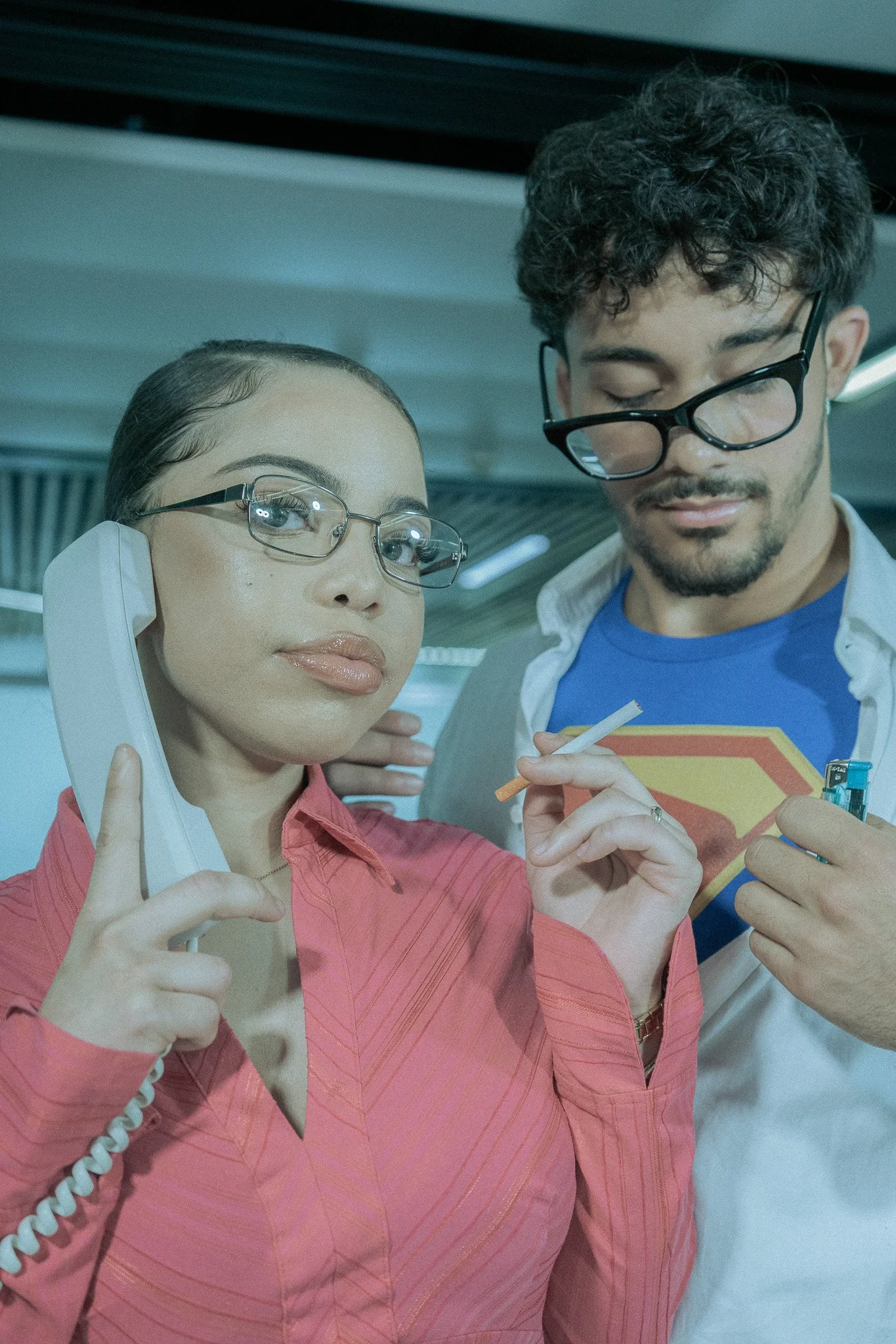

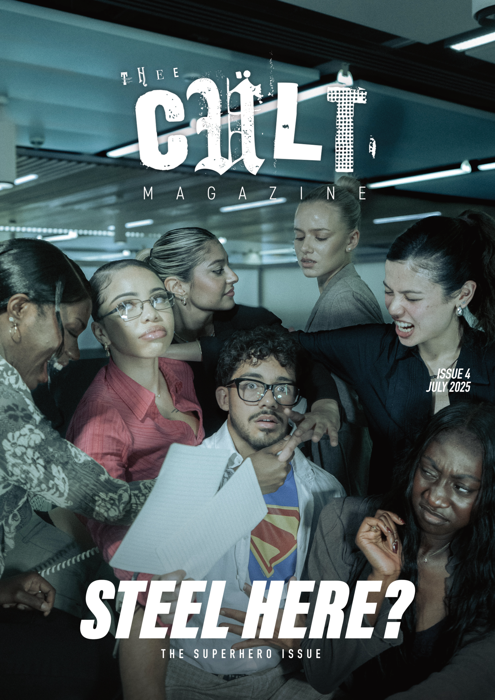
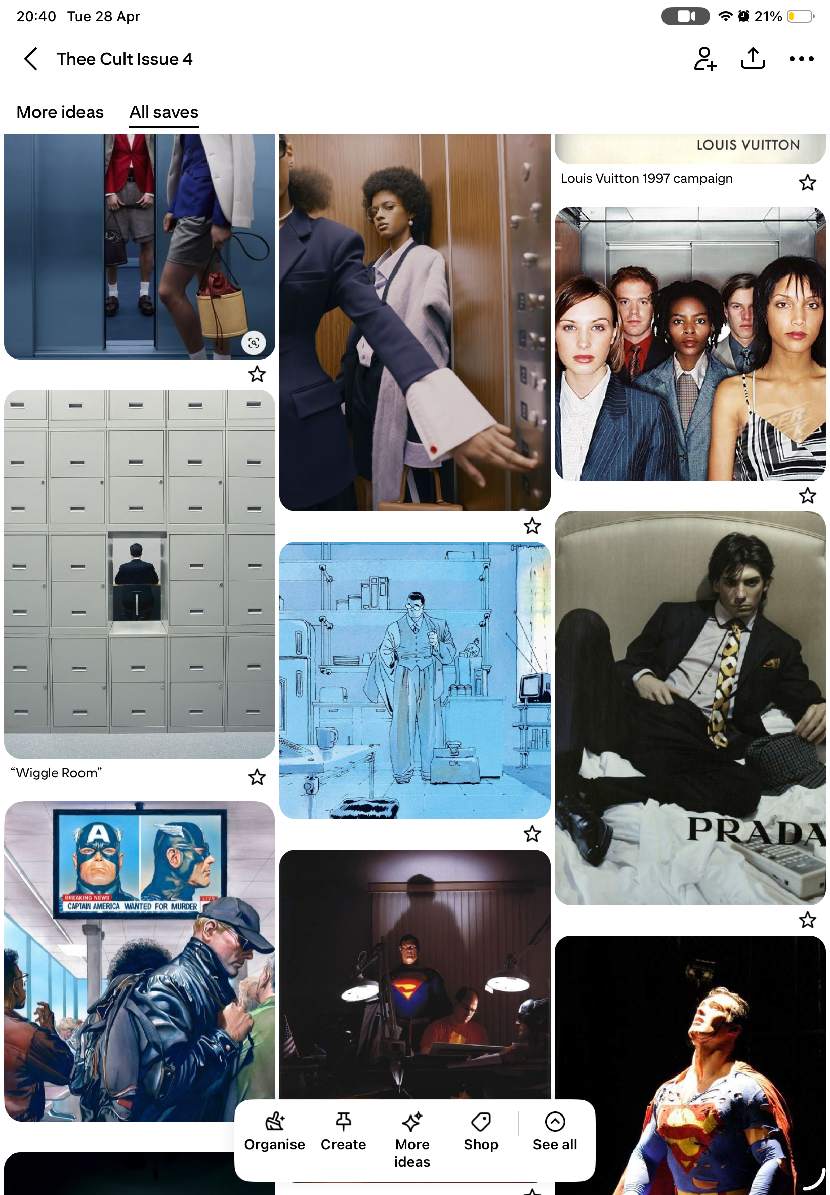
The visual direction for Issue 4 was developed around James Gunn’s Superman (2025) as the central thematic reference point for the issue’s feature section. Unlike previous issues, where imagery often operated more as a supporting layer to the editorial and design, this issue approached image-making as a core part of the magazine’s identity and world-building. The intention was not simply to respond to an upcoming release, but to use Superman as a broader cultural symbol through which the magazine could explore heroism, spectacle, mythology, optimism, and performance. In this sense, the issue was not structured around fandom alone, but around the visual and emotional language that superhero media occupies within popular culture.
This also marked an important shift in the magazine’s creative process. Following Issue 3 - which established a stronger editorial and visual foundation - Issue 4 became an opportunity to move beyond referencing existing imagery and into constructing original visual language for the publication itself. The magazine was no longer only designing around culture; it was beginning to actively produce its own iconography. This was particularly significant in relation to the feature section, where the editorial ambition of the issue required imagery that could feel distinct to Thee Cult rather than derivative of existing entertainment marketing or press photography.
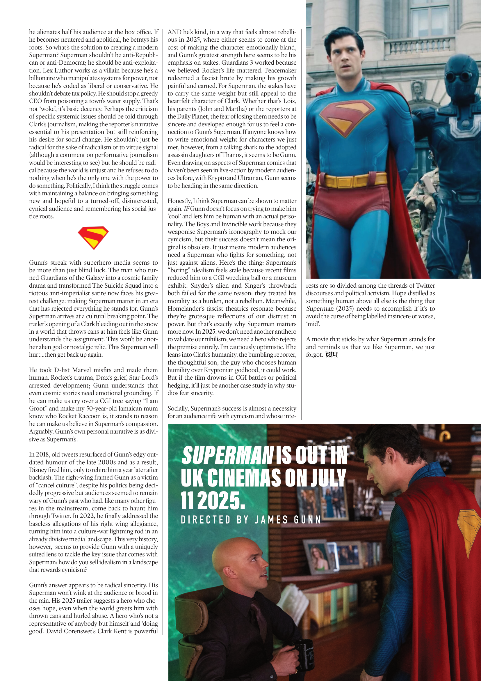
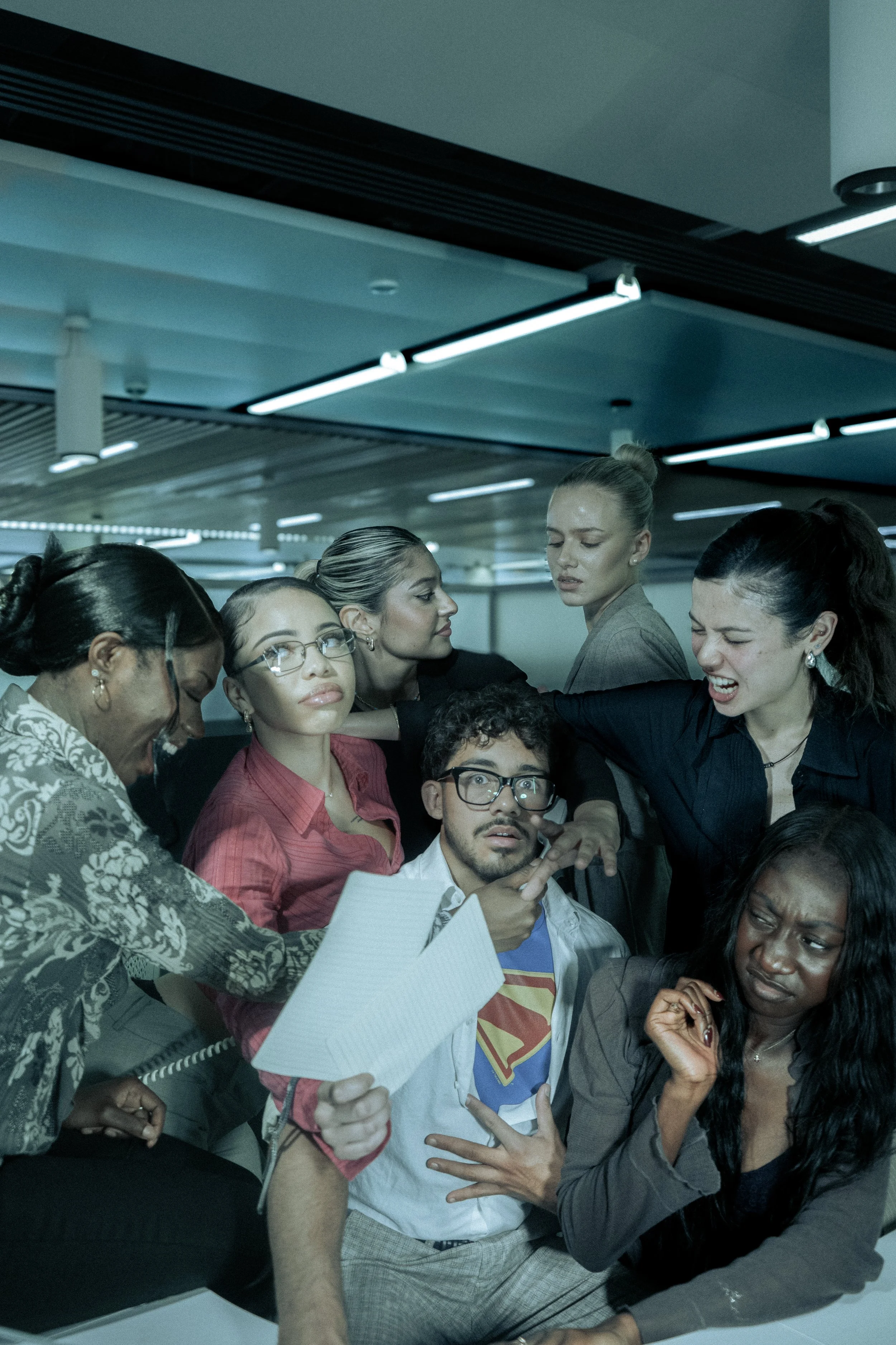
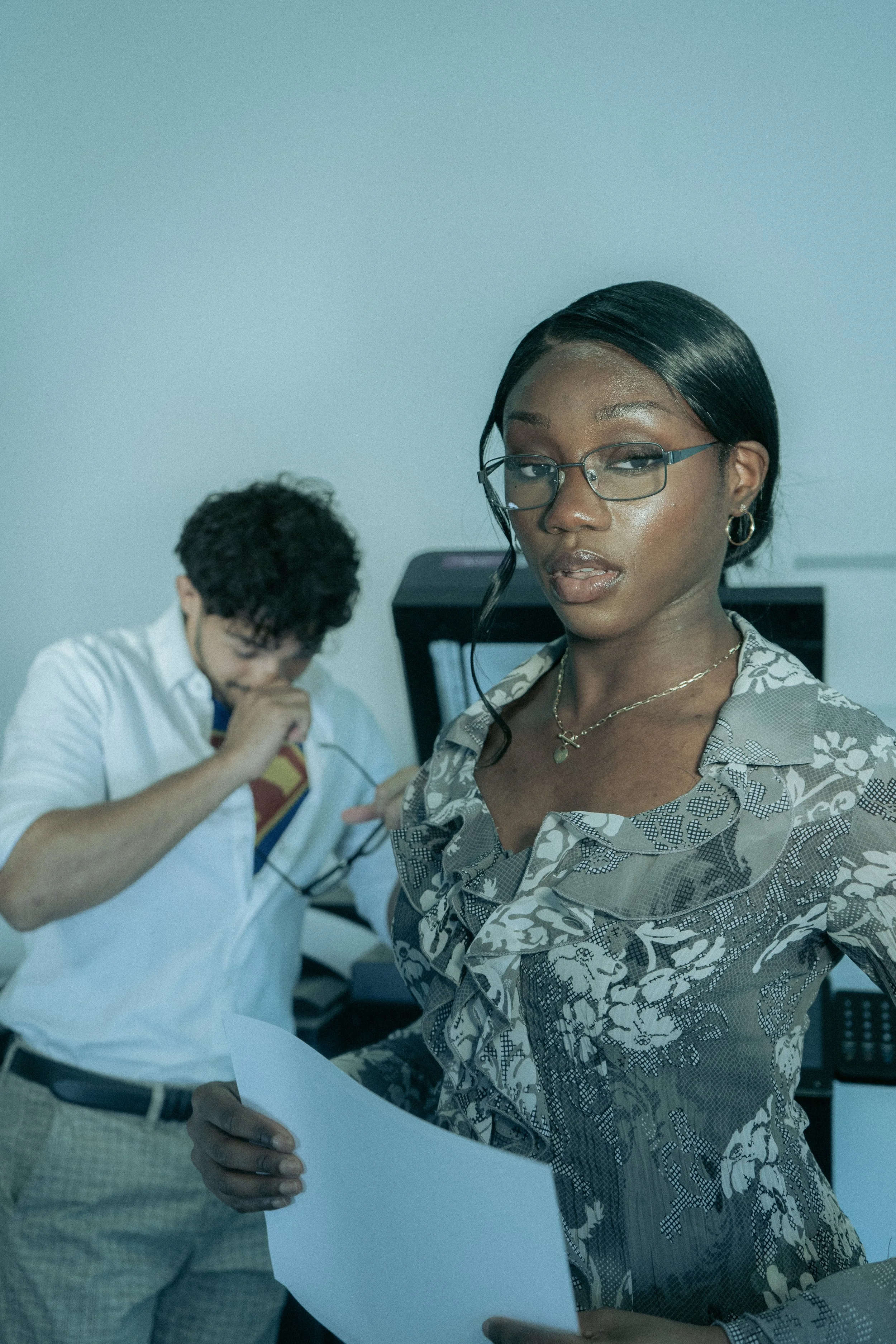
The cover shoot and accompanying feature imagery became one of the central creative focuses of the issue. While the shoot was co-shot with Yasir Guerziz, I led the overall creative direction, developing the visual concepts, planning the editorial framing, directing the photography on the day, and later handling post-production and colour grading. Unlike previous shoots, where experimentation often emerged more reactively, the visual world of Issue 4 was approached with a much clearer sense of intention from the outset. I began actively thinking about how the magazine could create images that felt editorially authored - not simply “good photos,” but images that communicated a specific atmosphere, cultural perspective and relationship to the themes of the issue itself.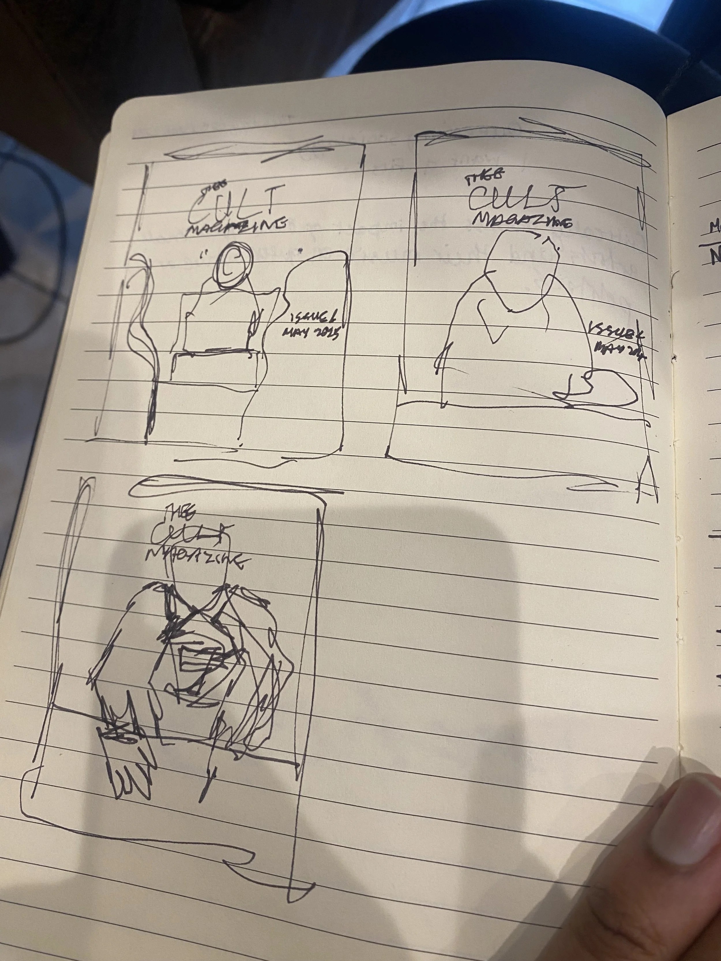
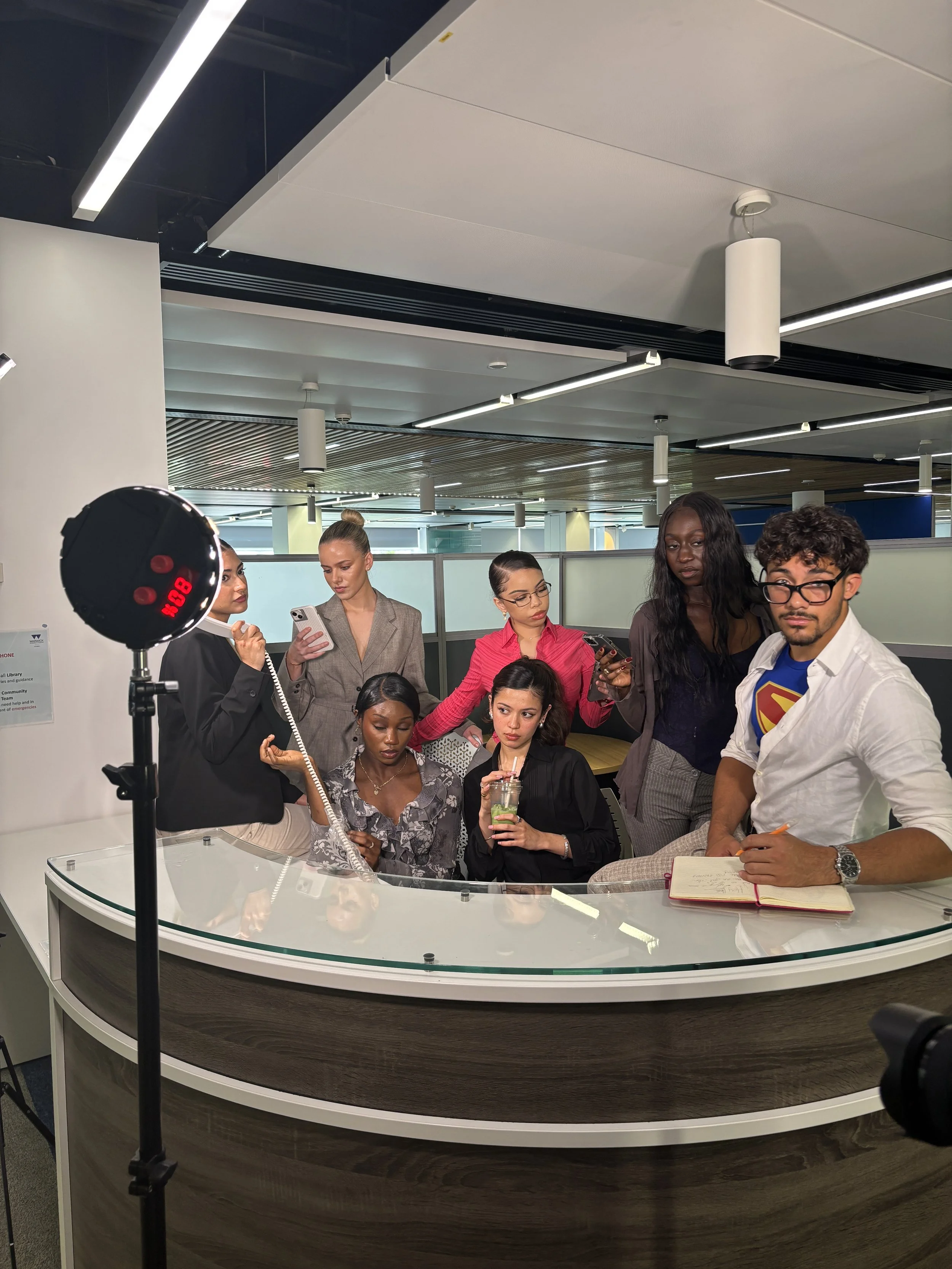
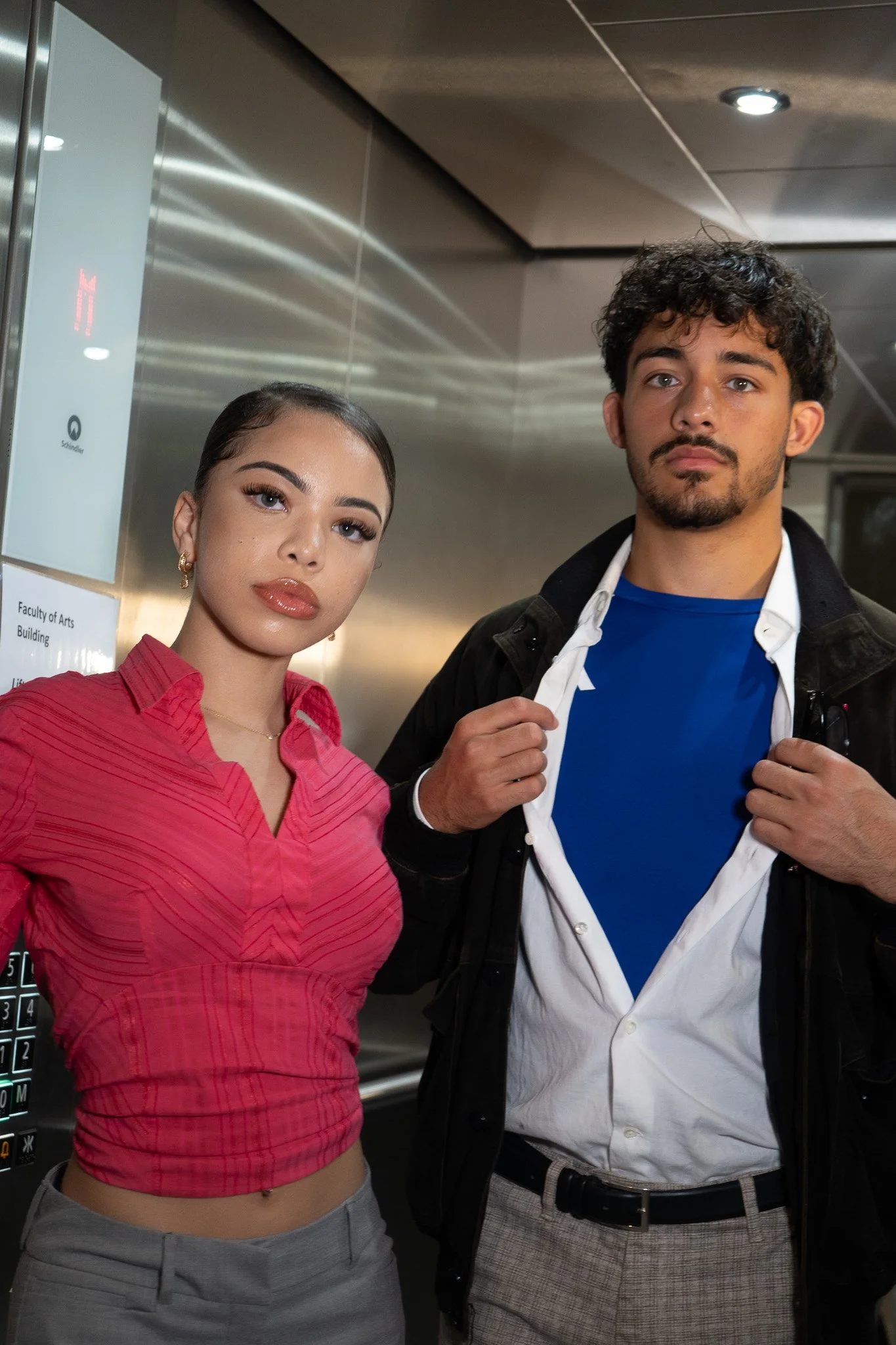
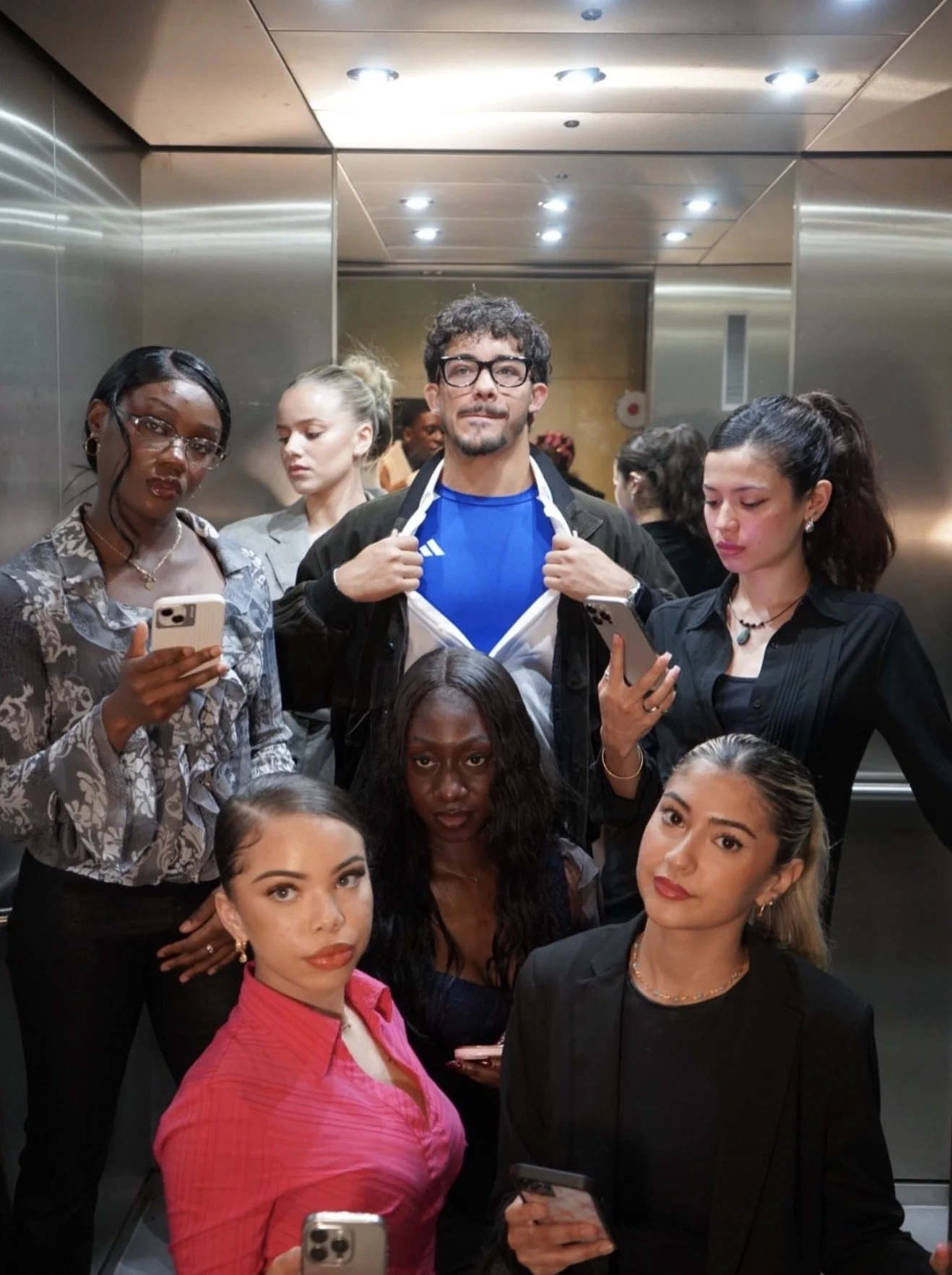
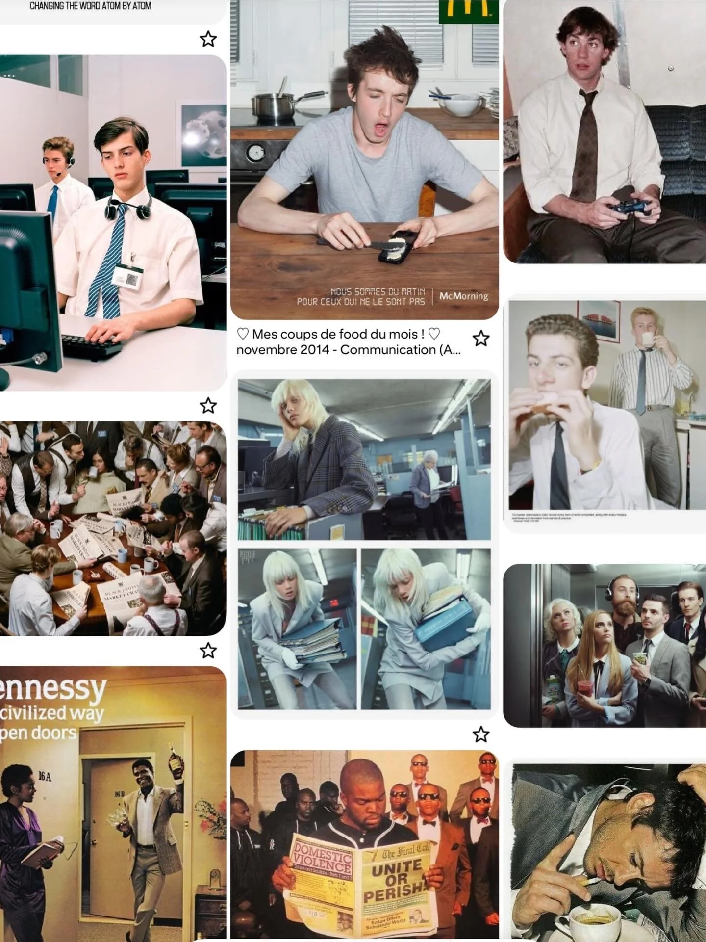
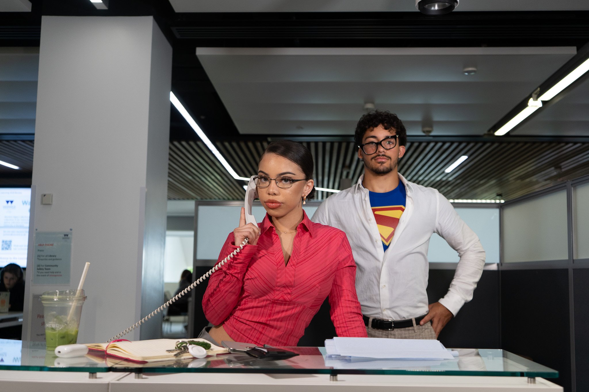
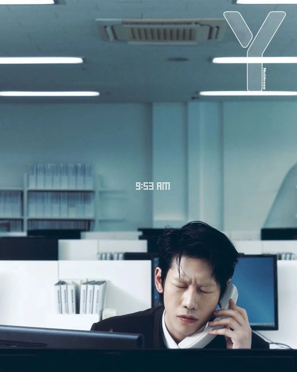
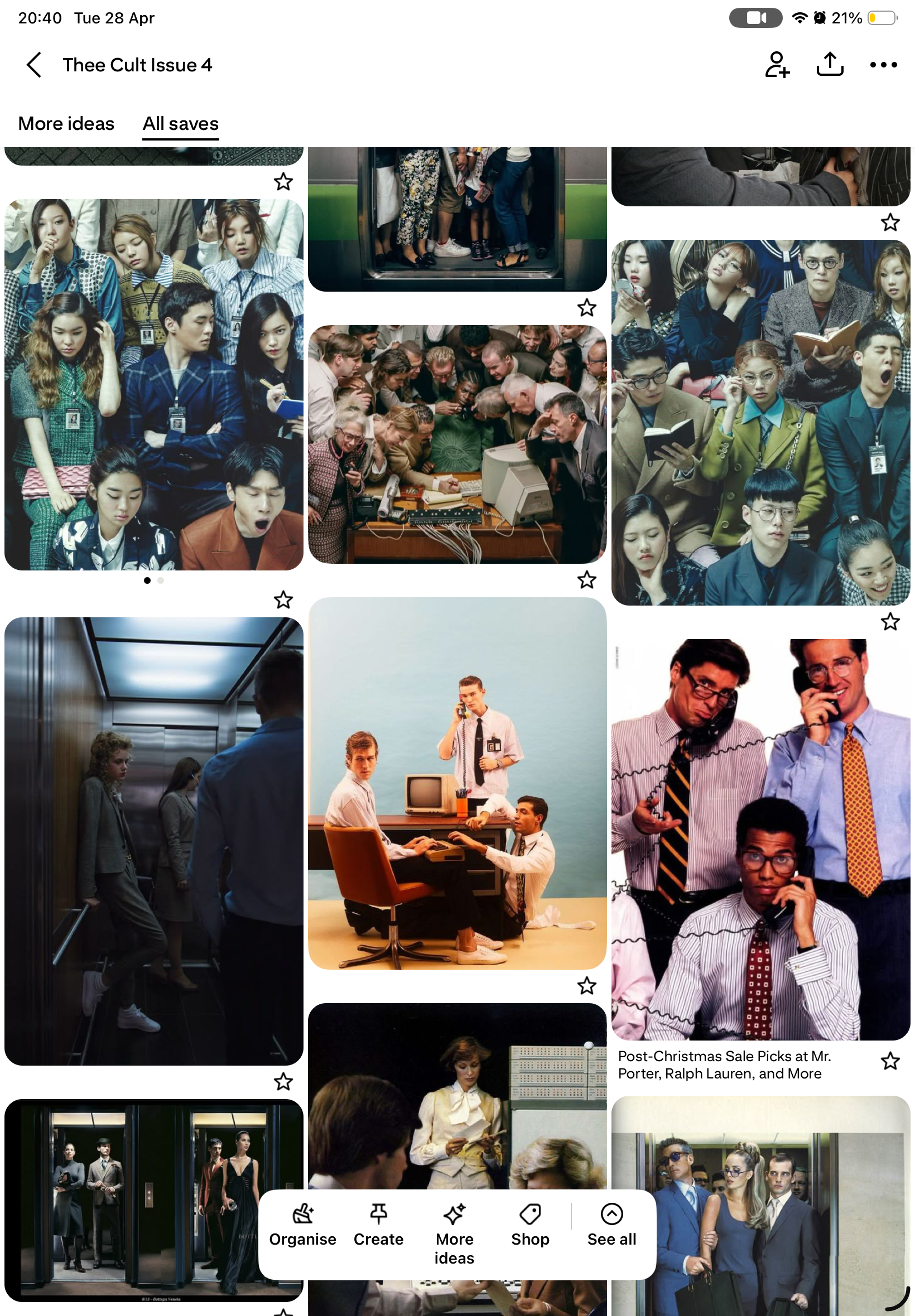
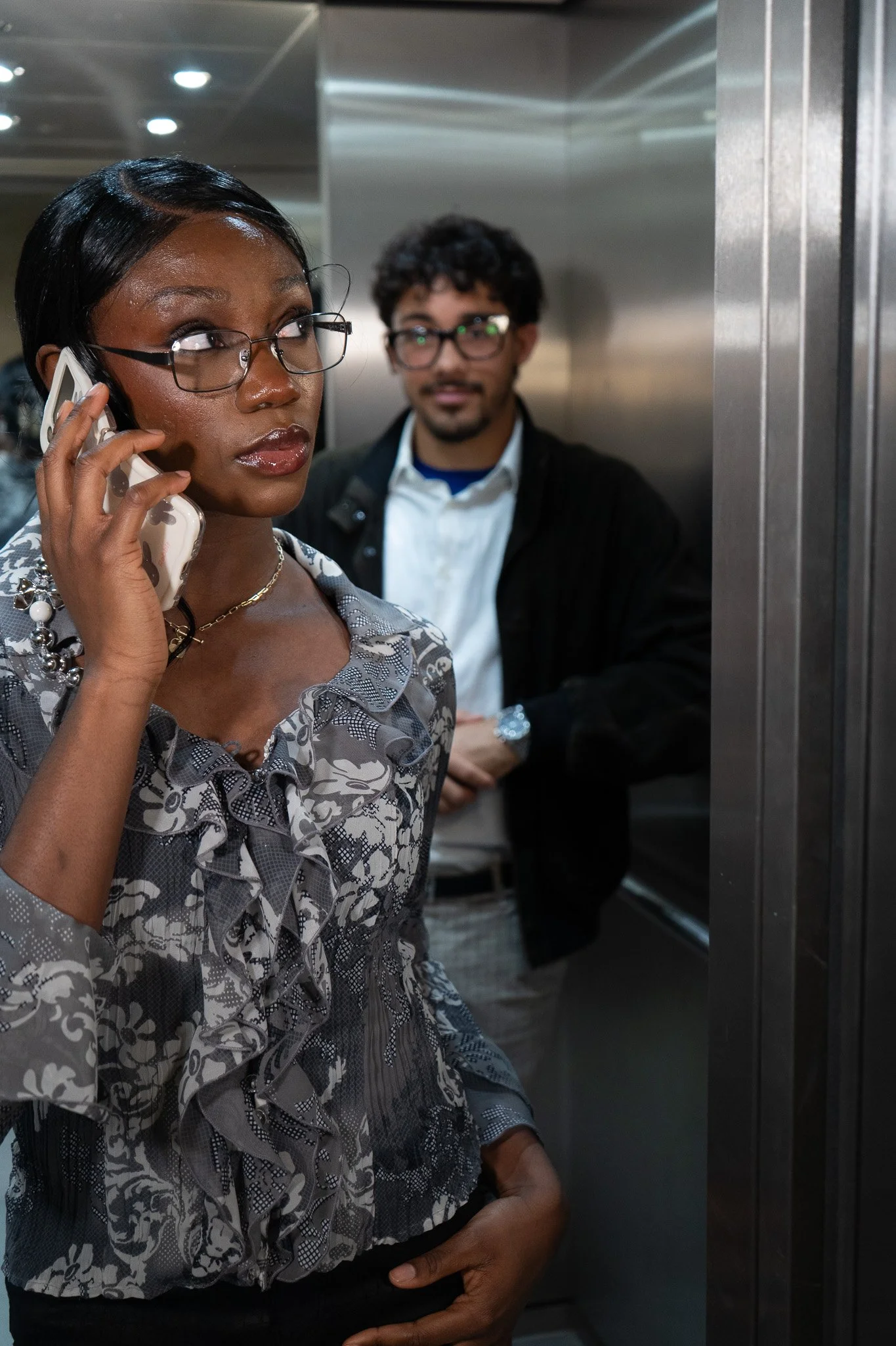
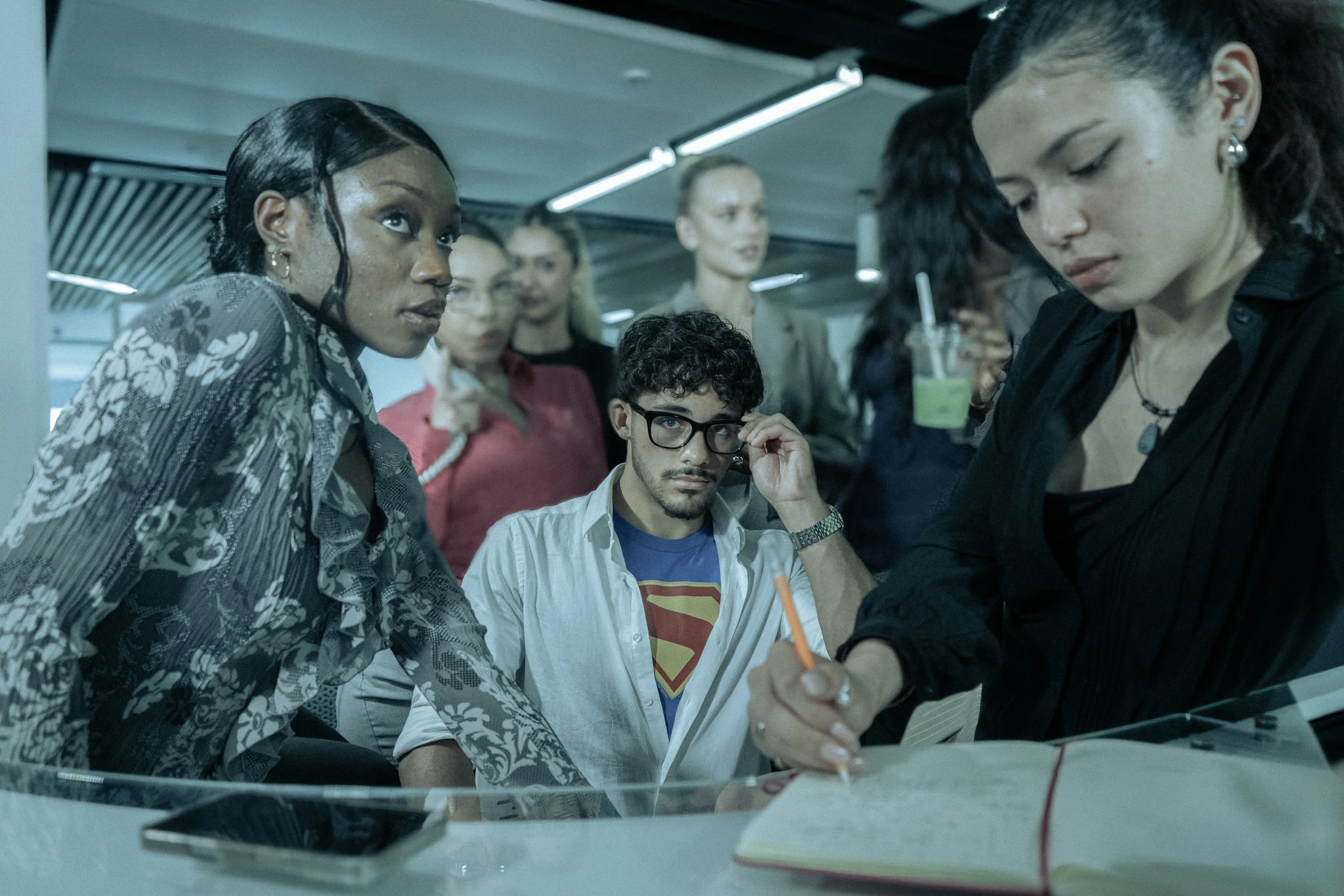
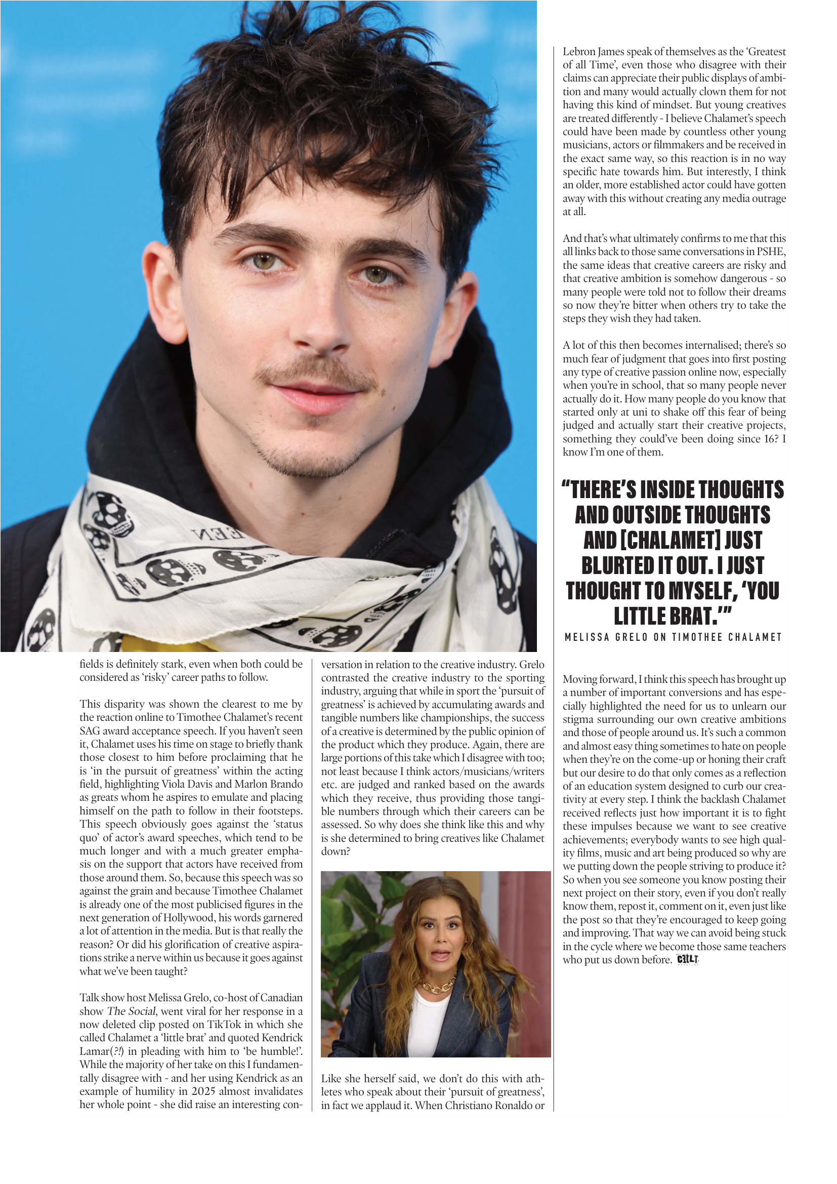
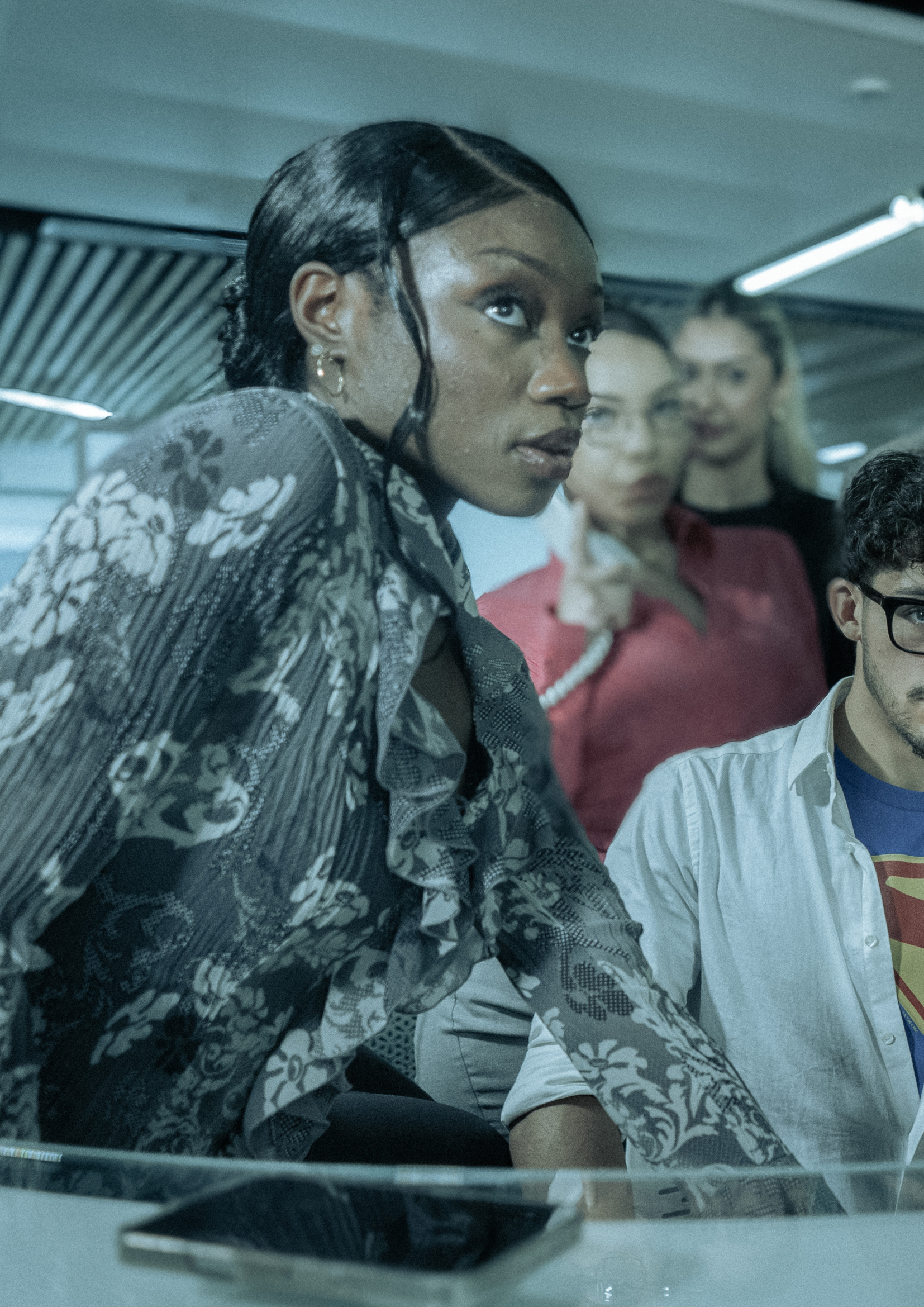
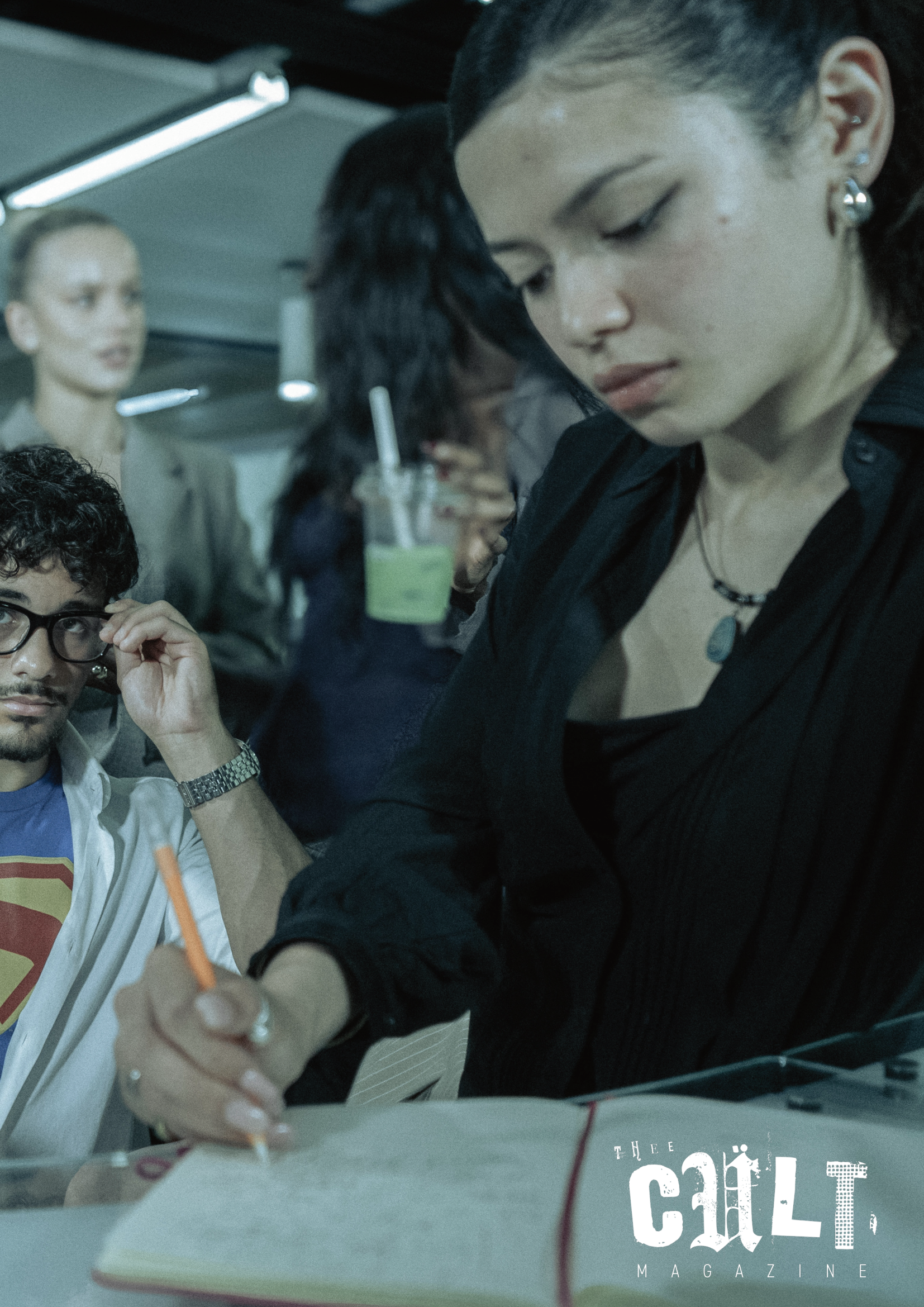
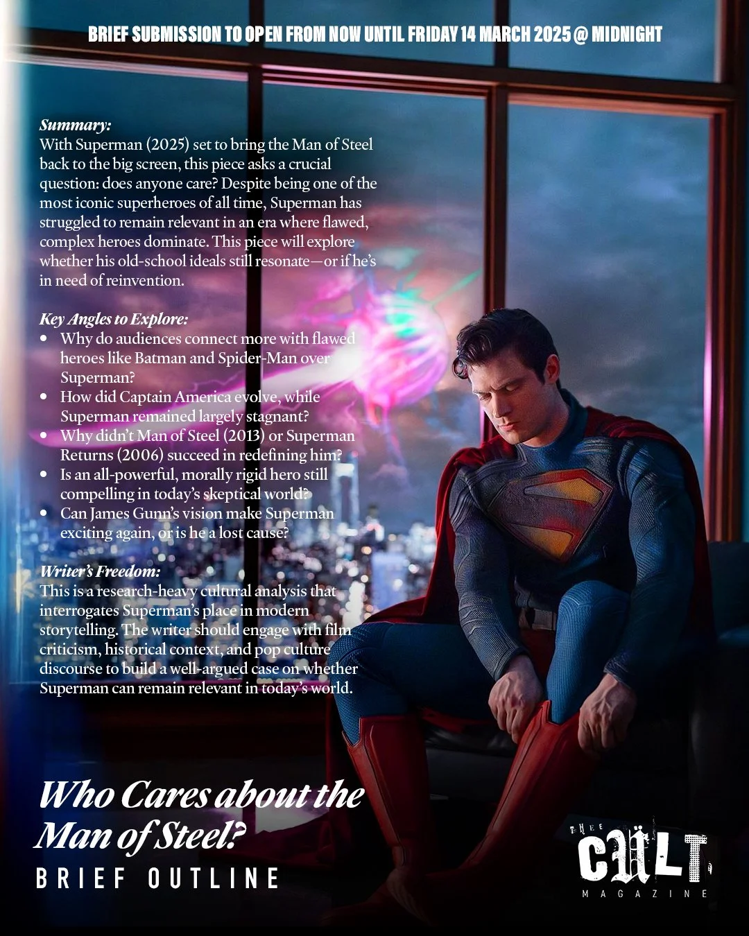
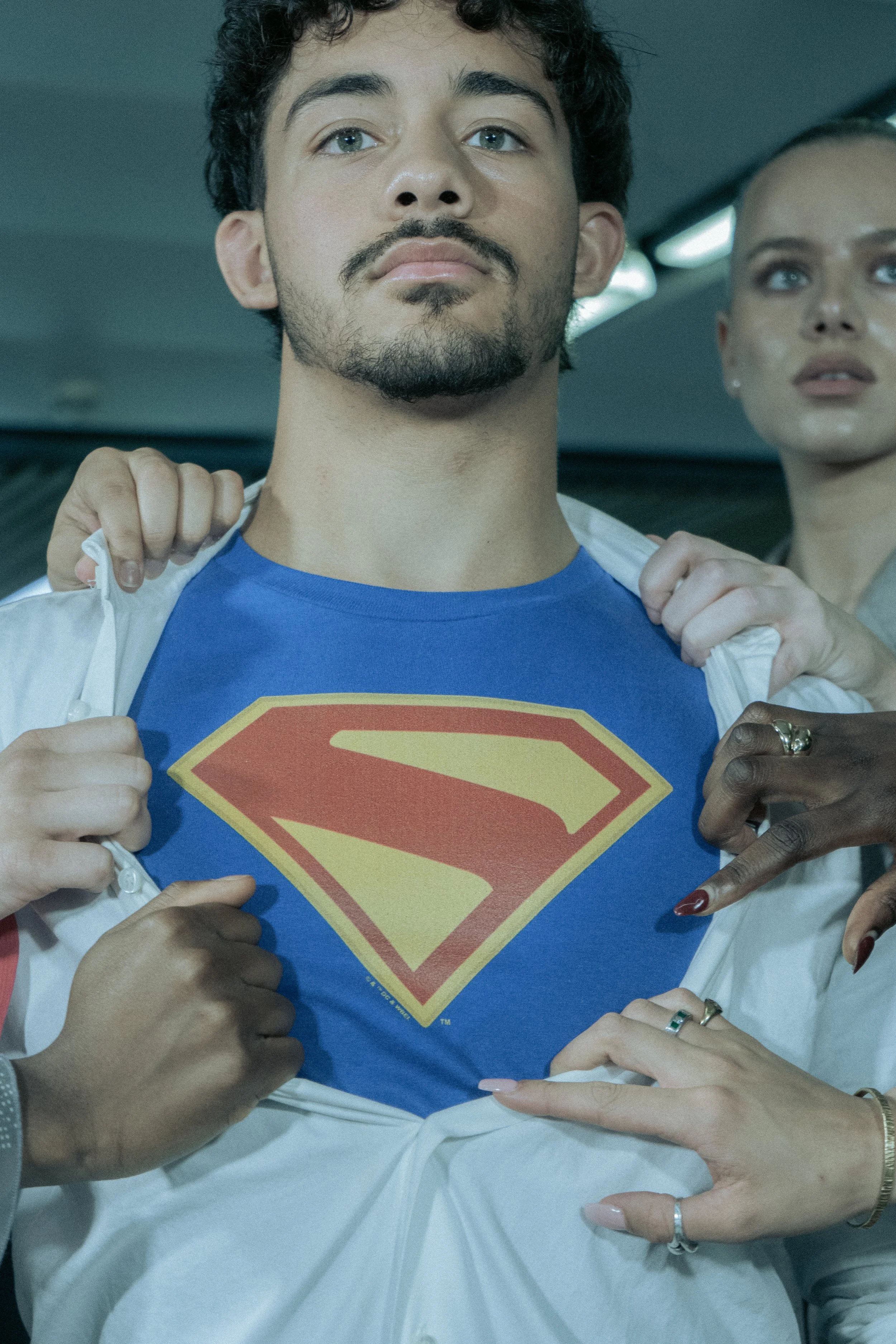
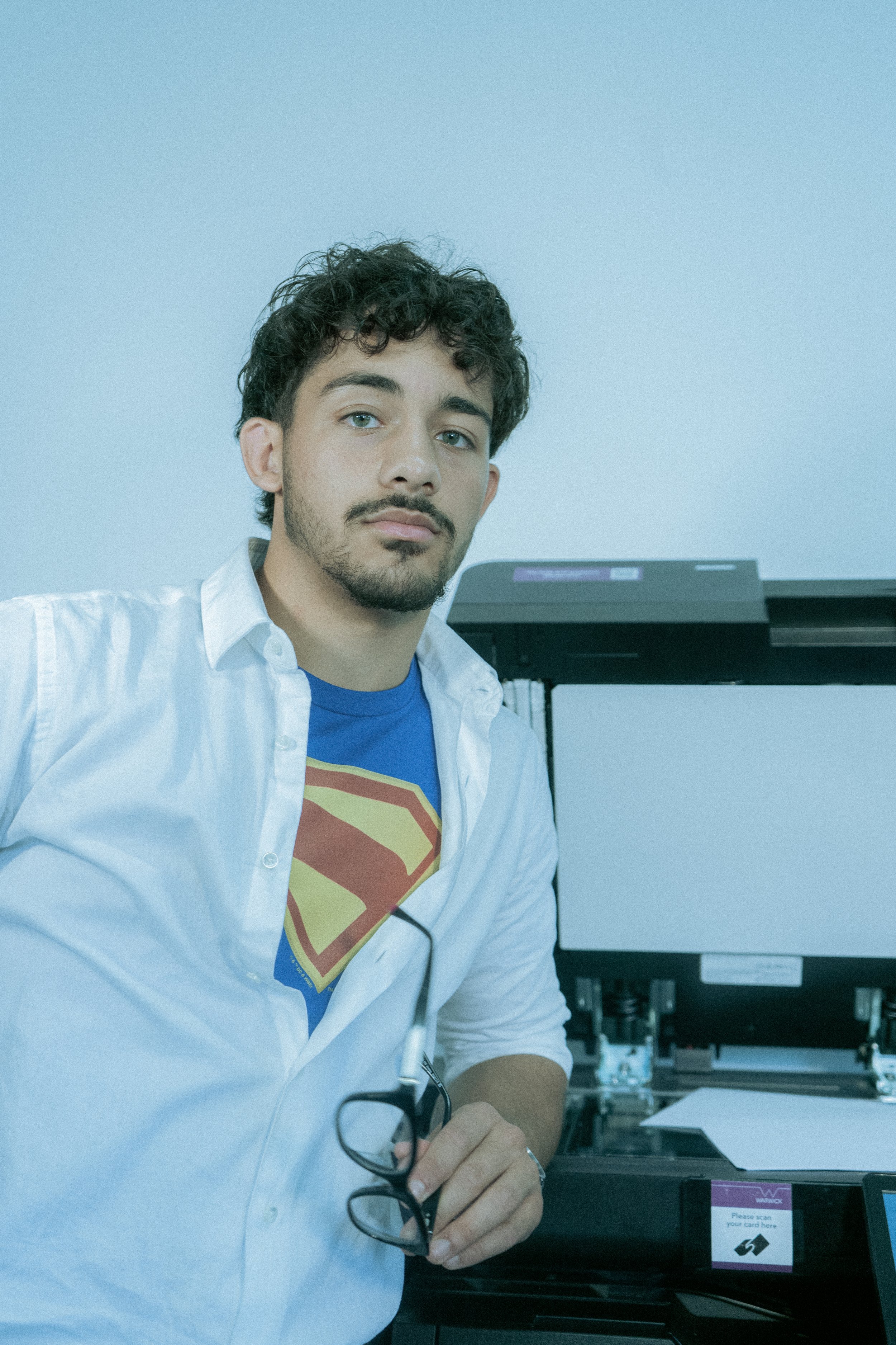
A major part of the creative direction centred on questioning Superman’s contemporary cultural relevance altogether. Rather than approaching the character as an inherently exciting or universally resonant figure, the issue became interested in the opposite question: does Superman still actually mean anything within modern pop culture, and if not, why? This sat particularly in relation to James Gunn’s Superman, which at the time represented another attempt to reintroduce the character to a contemporary audience despite the growing perception that Superman, compared to other superheroes, struggles to fully embed himself within the current pop-cultural zeitgeist. The feature section therefore became less about celebrating the mythology of Superman and more about interrogating his place within culture, entertainment, and public imagination. This questioning directly informed the visual language of the shoot. Rather than constructing images around spectacle, action, or fantasy, the creative direction intentionally leaned into stillness, mundanity, and even a certain level of drabness. Drawing from office photography and contemporary editorial imagery, the shoot was designed to feel subdued and strangely restrained - a world of fluorescent lighting, office spaces, desks, paperwork, and routine. The intention was to create imagery that initially appeared almost unremarkable, forcing intrigue to emerge elsewhere. The question became not “how do we make Superman look exciting?” but rather “what happens when Superman is absorbed into ordinary life?”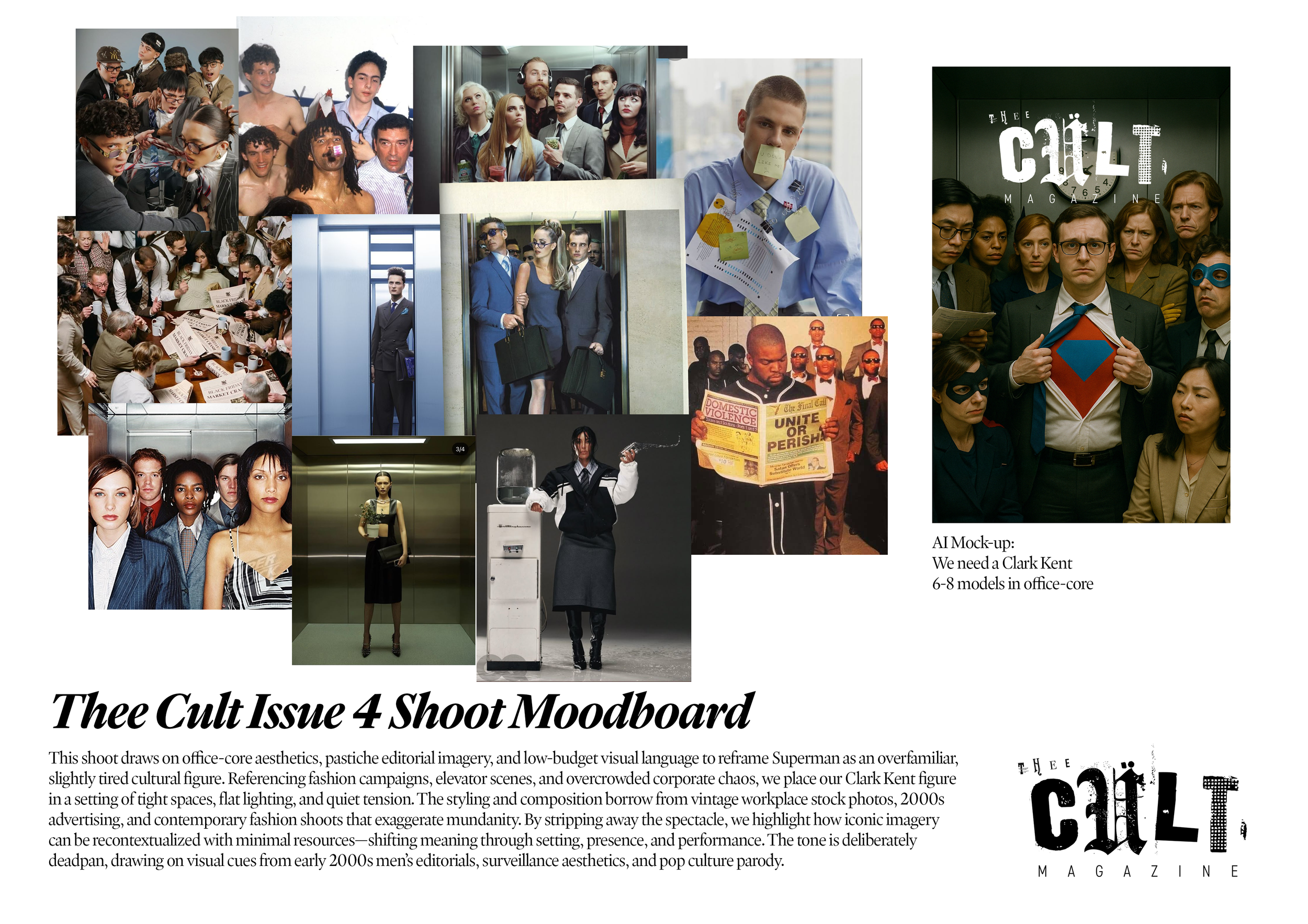
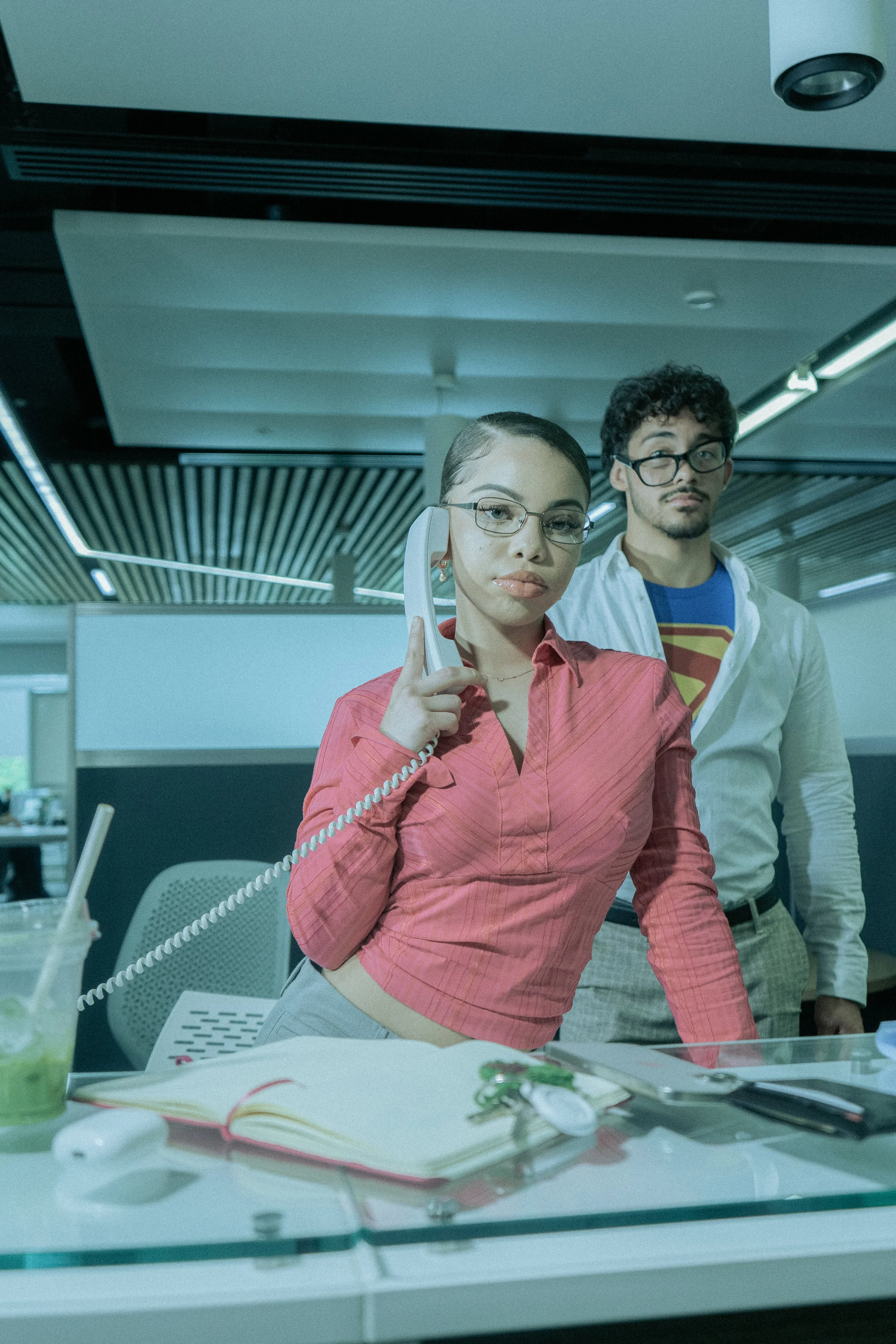
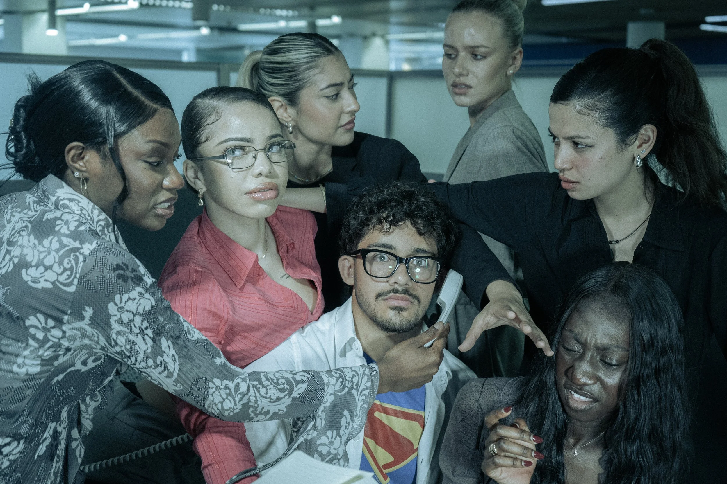
In this sense, the imagery became less interested in Superman as a heroic spectacle and more interested in Clark Kent as a social and emotional figure - someone whose mythology is fundamentally built around concealment, performance, awkwardness, and the attempt to pass unnoticed within ordinary life. By placing Superman within environments associated with office culture, administration, repetition, and corporate routine, the shoot intentionally stripped the character of the cinematic scale usually attached to him. The result was a version of Superman that felt strangely flat, restrained and overly human - not absent of power, but disconnected from the environments where that power is traditionally legible. What emerged from this approach was a tension that felt subtly sensual and psychologically loaded. Rather than presenting Superman as dominant or aspirational in a straightforward way, the imagery positioned him as slightly displaced within the world around him - awkwardly existing within systems, relationships, and performances that seemed to operate independently of his symbolic status. There is a deliberate passivity to the figure throughout the shoot, where much of the intrigue comes not from Superman himself, but from how other people move around him, look at him, or remain emotionally unaffected by his presence. In many of the images, Clark almost functions less like a powerful central figure and more like an object being observed, tolerated, or quietly negotiated within the social atmosphere of the office.

This became particularly important in the way the women within the shoot were framed. Rather than functioning as secondary figures orbiting around Superman, they often appear more composed, self-aware, and socially in control than he does. The energy of the images therefore comes less from overt reversals of power and more from emotional imbalance - a sense that Superman, despite his mythology, is unable to fully command the environments he occupies. The office setting intensifies this further, because it transforms the fantasy of heroic masculinity into something bureaucratic, performative, and faintly pathetic, while still allowing traces of desire, intrigue and attraction to remain present underneath the surface. This ambiguity became central to the visual identity of the shoot. The images intentionally sit between sincerity and irony, glamour and banality, aspiration and discomfort. They are not mocking Superman outright, nor fully romanticising him. Instead, they attempt to explore what happens when a figure historically presented as culturally definitive is placed into a contemporary emotional landscape where certainty, dominance, and symbolic authority feel less stable than they once did. In this sense, the imagery was ultimately less concerned with asking whether Superman is “cool” again, and more interested in examining why the idea of Superman still lingers culturally at all - particularly in moments where he appears most ordinary, vulnerable or socially out of place.
This thematic approach also allowed the creative direction to connect directly back into the editorial structure of the issue itself. Across the feature section, articles repeatedly questioned how cultural symbols sustain meaning over time, whether through reinvention, nostalgia, political resonance or emotional identification. The visual world of the shoot therefore did not operate separately from the writing, but as an extension of the same editorial argument. Rather than simply illustrating the themes of the issue, the imagery became another way of exploring them - using composition, styling, atmosphere, and performance to ask whether Superman still functions as a compelling cultural figure, and if so, what aspects of him still remain recognisable within contemporary life.