
Issue 3: 2024 in Review “This Ain’t Lambeth" (January 2025)
For Issue 3 of Thee Cult Magazine, I led the project as Editor-in-Chief and Creative Director, overseeing the publication’s structural redesign, editorial refinement, visual identity evolution and full-scale production. This issue marked the transition from experimental student magazine to a deliberately structured editorial platform, with formalised sections, a defined cover feature and a strengthened internal review process. My role spanned commissioning and editing writers, redesigning the logo, directing photography and executing the complete layout in InDesign. Issue 3 represents the consolidation of creative ambition into systems - transforming Thee Cult from a growing project into a disciplined publication.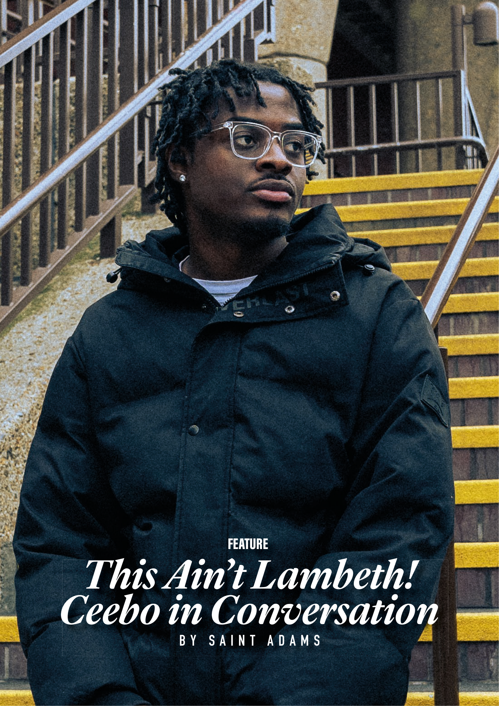
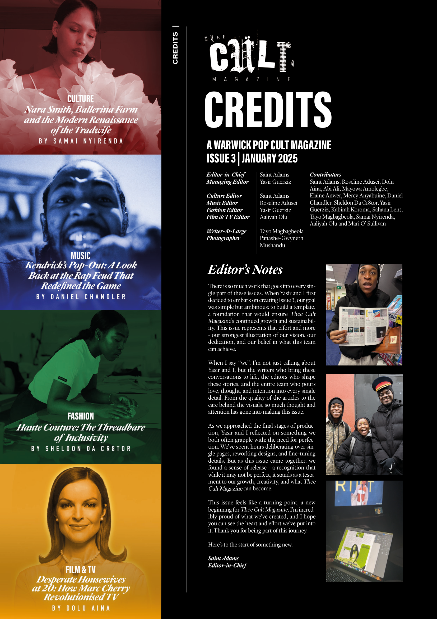
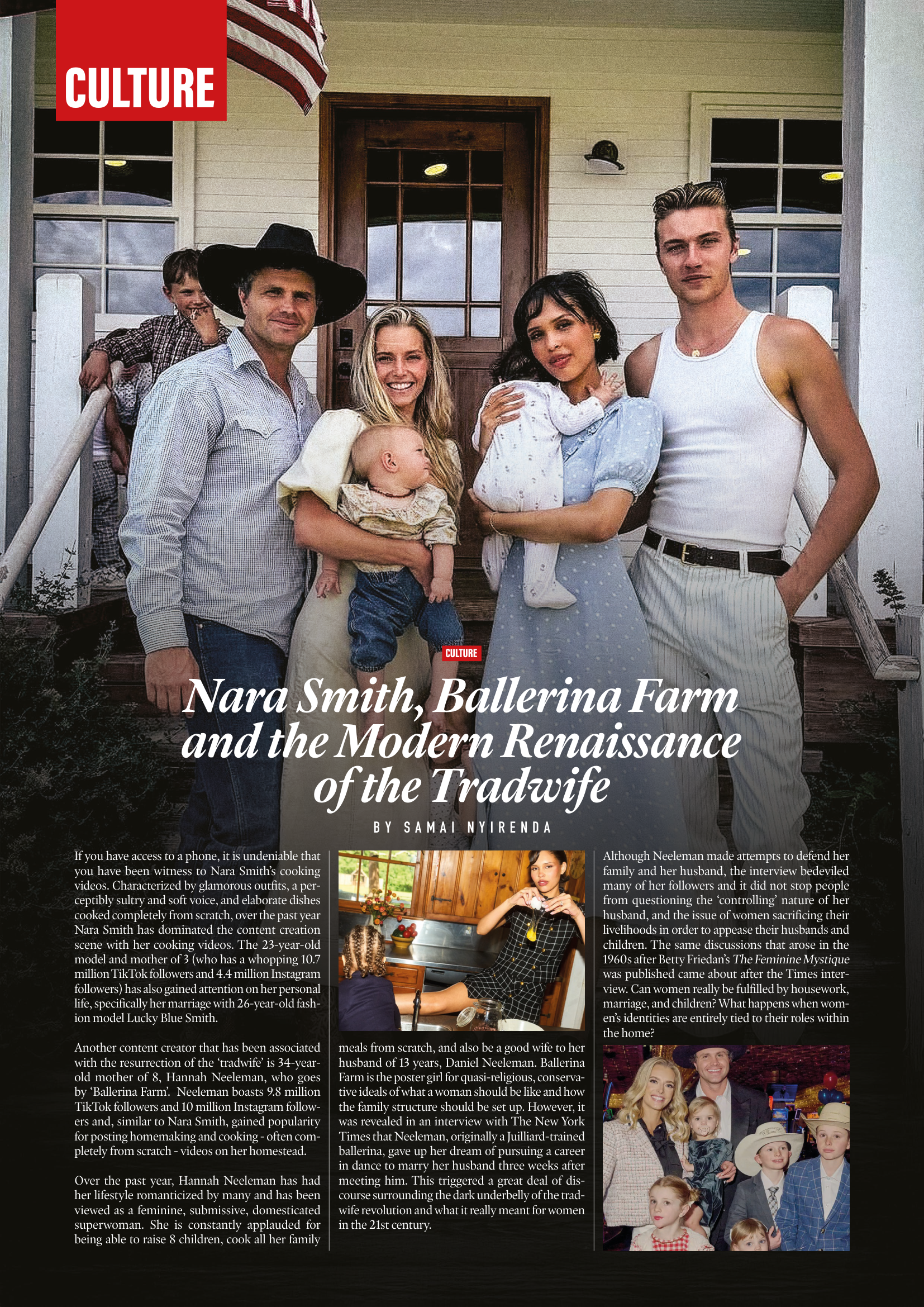
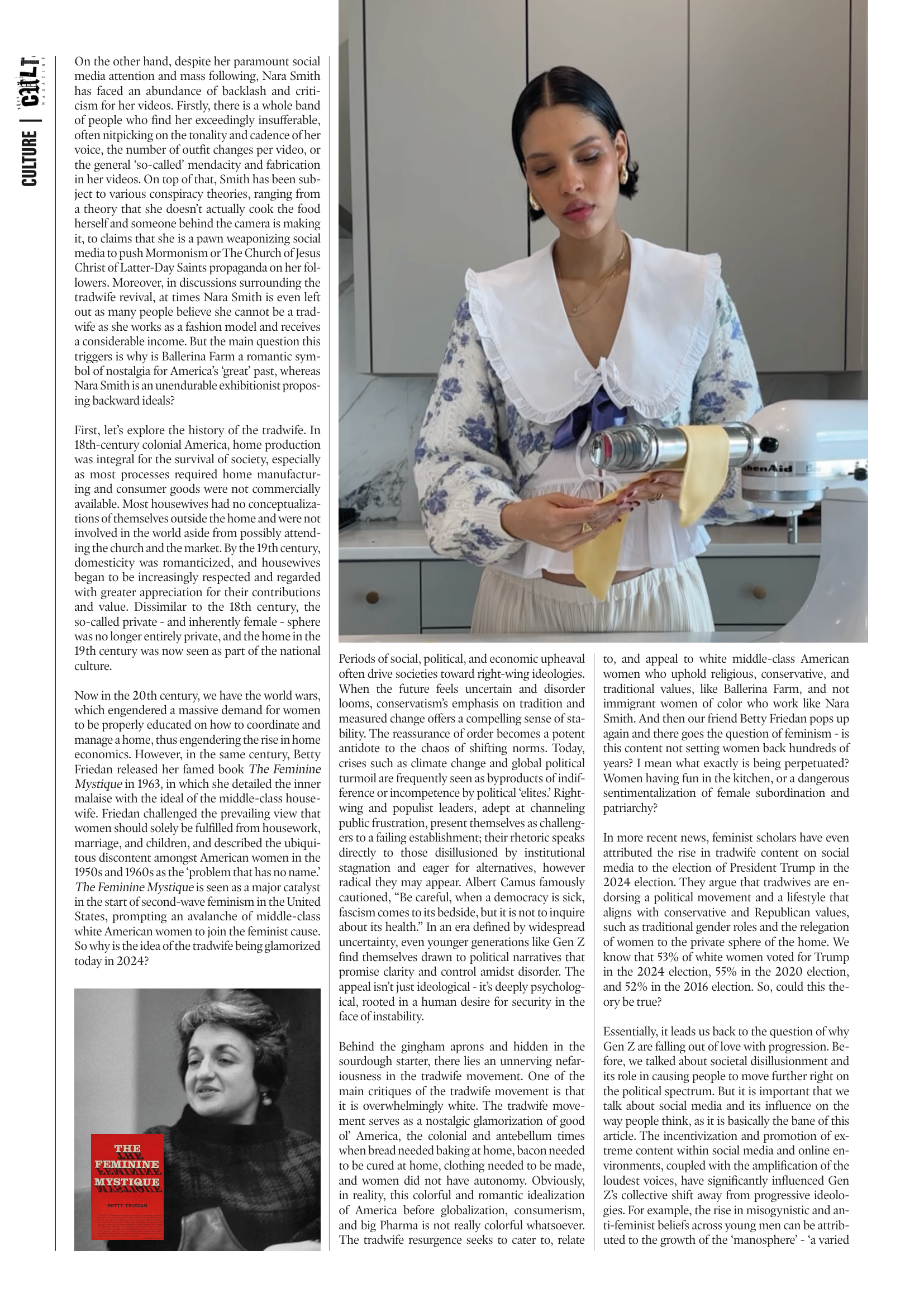
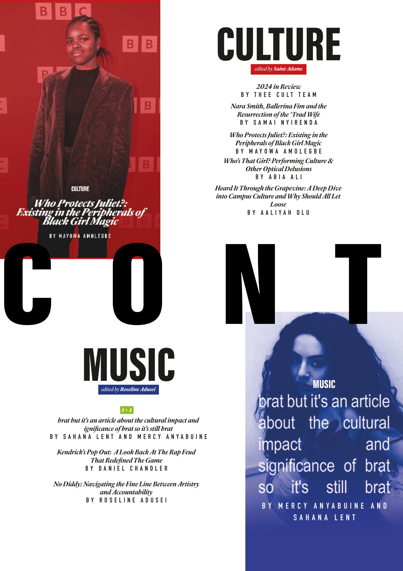
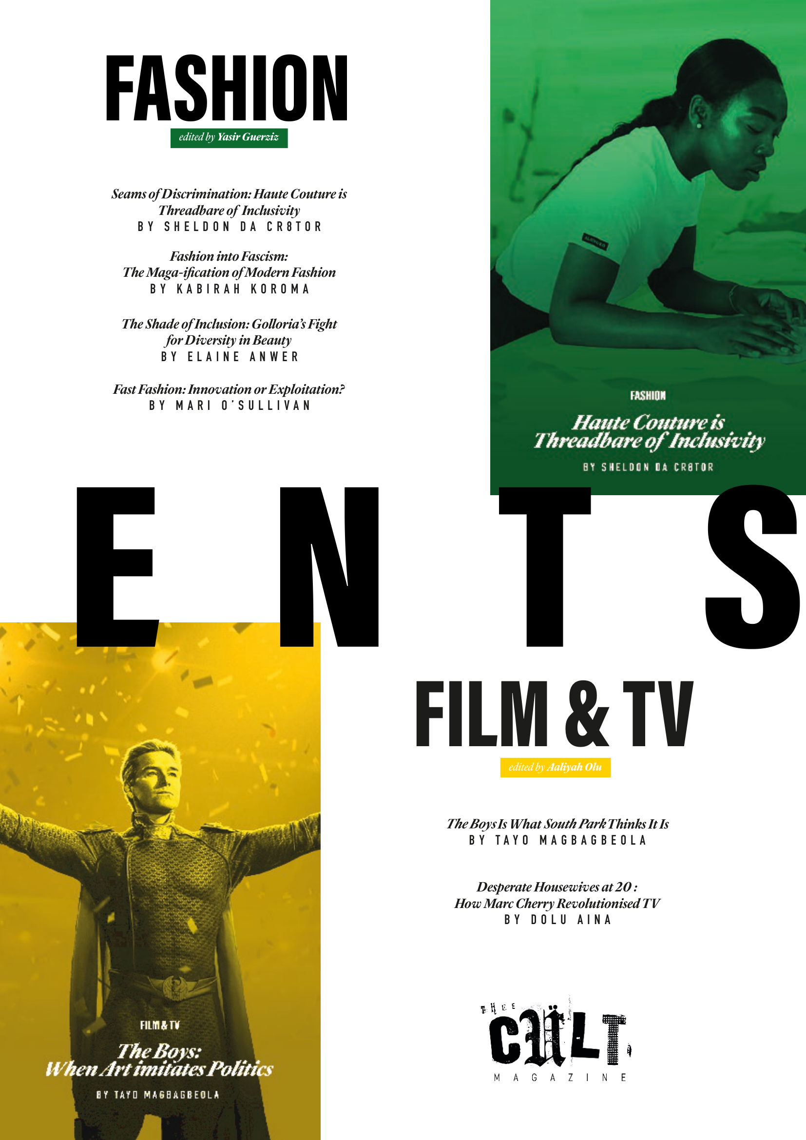
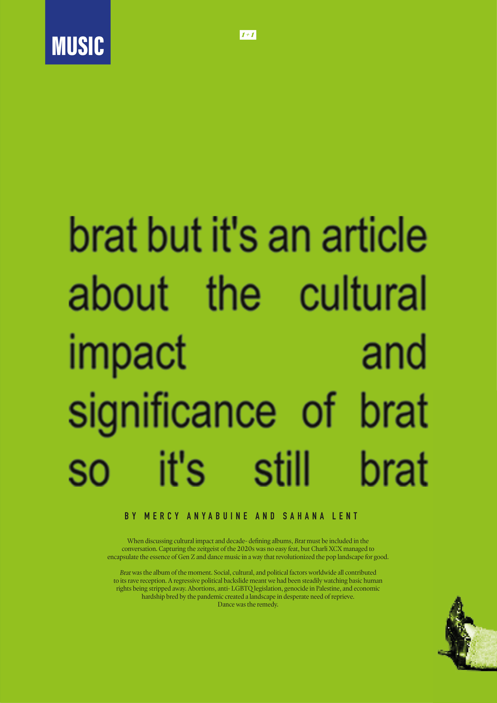
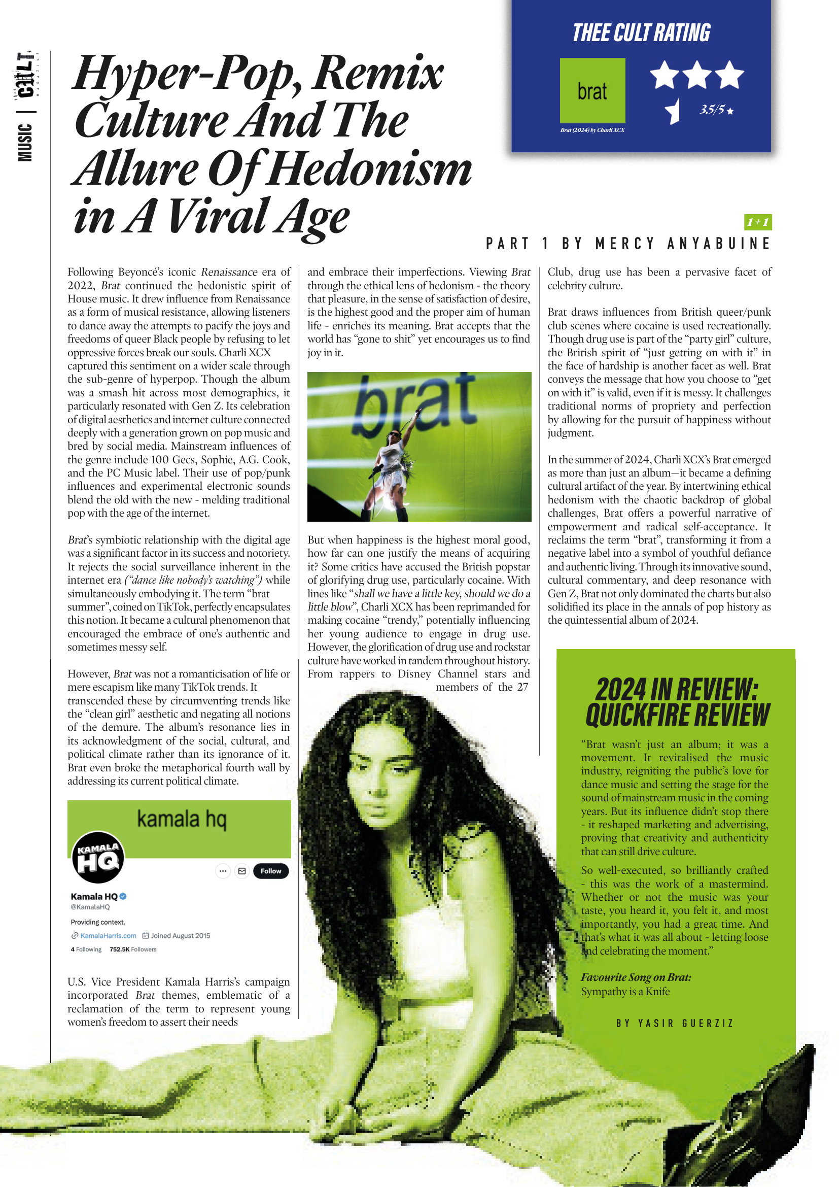
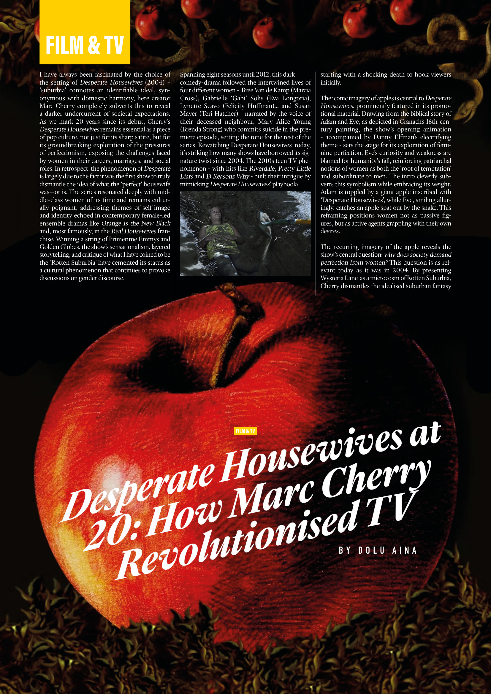
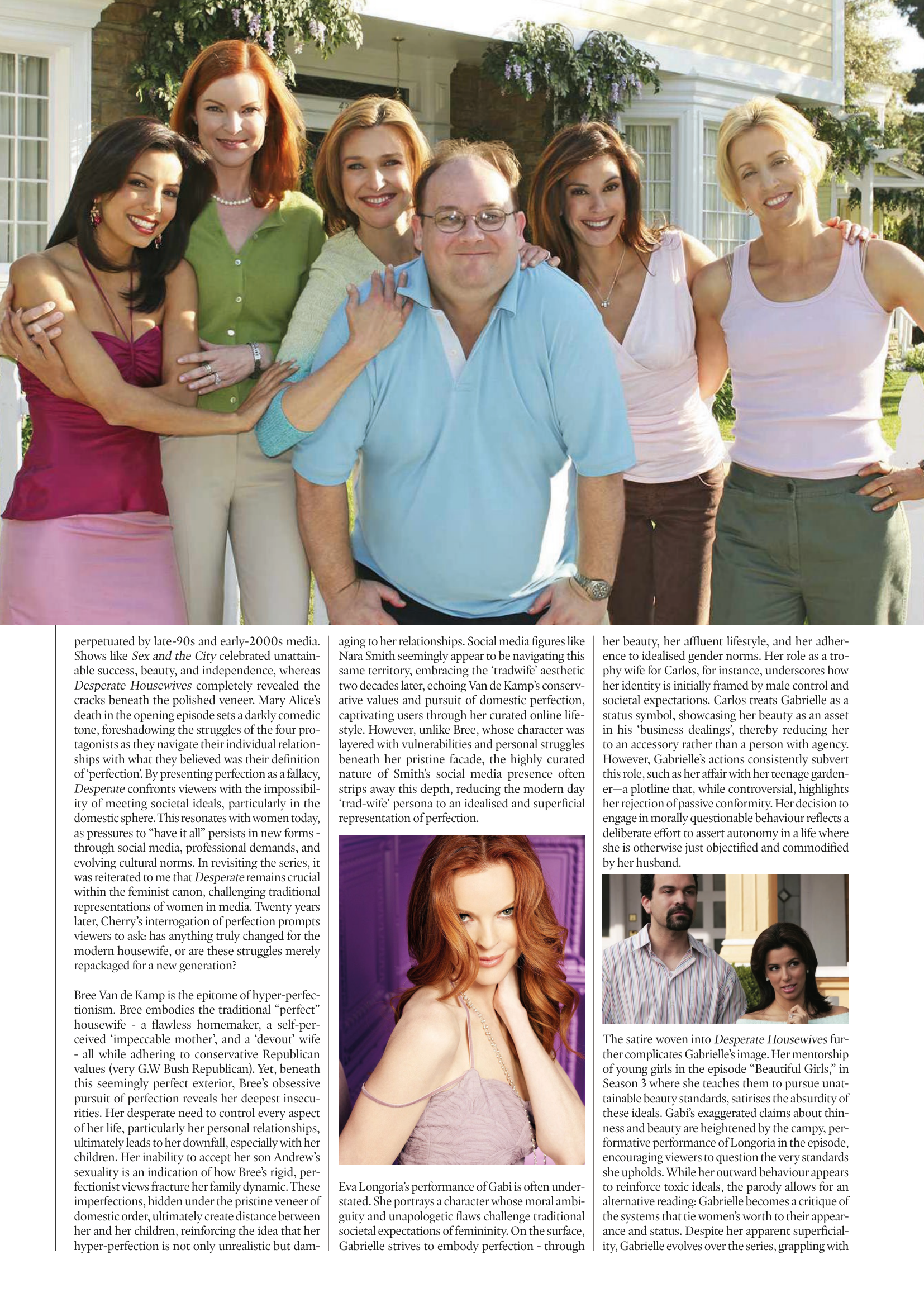
Issue 3 marked a defining shift for Thee Cult Magazine, as it established a distinct identity separate from Pop Cult and formalised the publication as a scalable editorial platform. Built around a "2024 in Review" theme - a revisited failed concept from 2024's The Contributors' Issue - the issue focused on refining both visual identity and internal structure. Central to this shift was a redesign of the magazine’s visual language, beginning with the logo. Rather than abandoning the scrapbook aesthetic established in earlier issues, we simplified and abstracted it into a more controlled, adaptable form.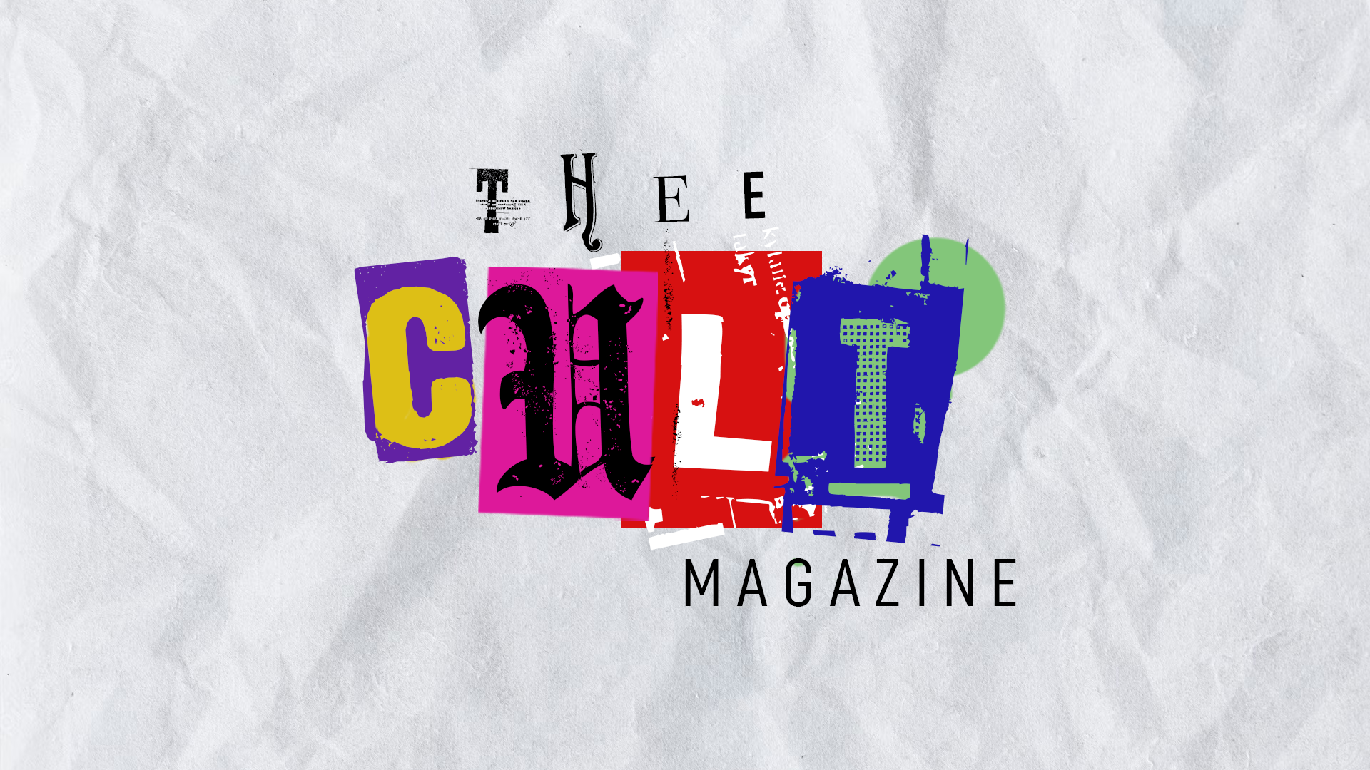
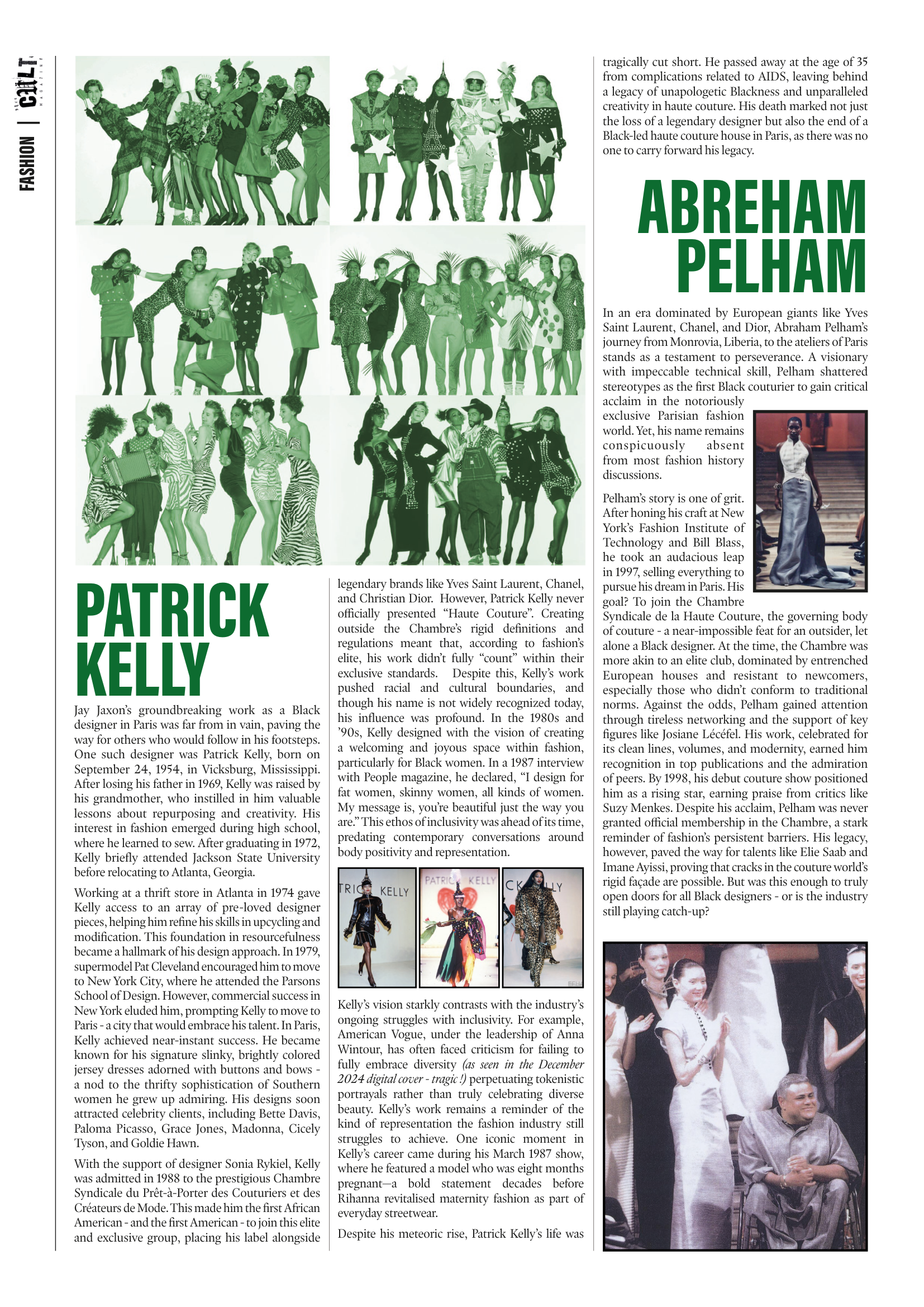
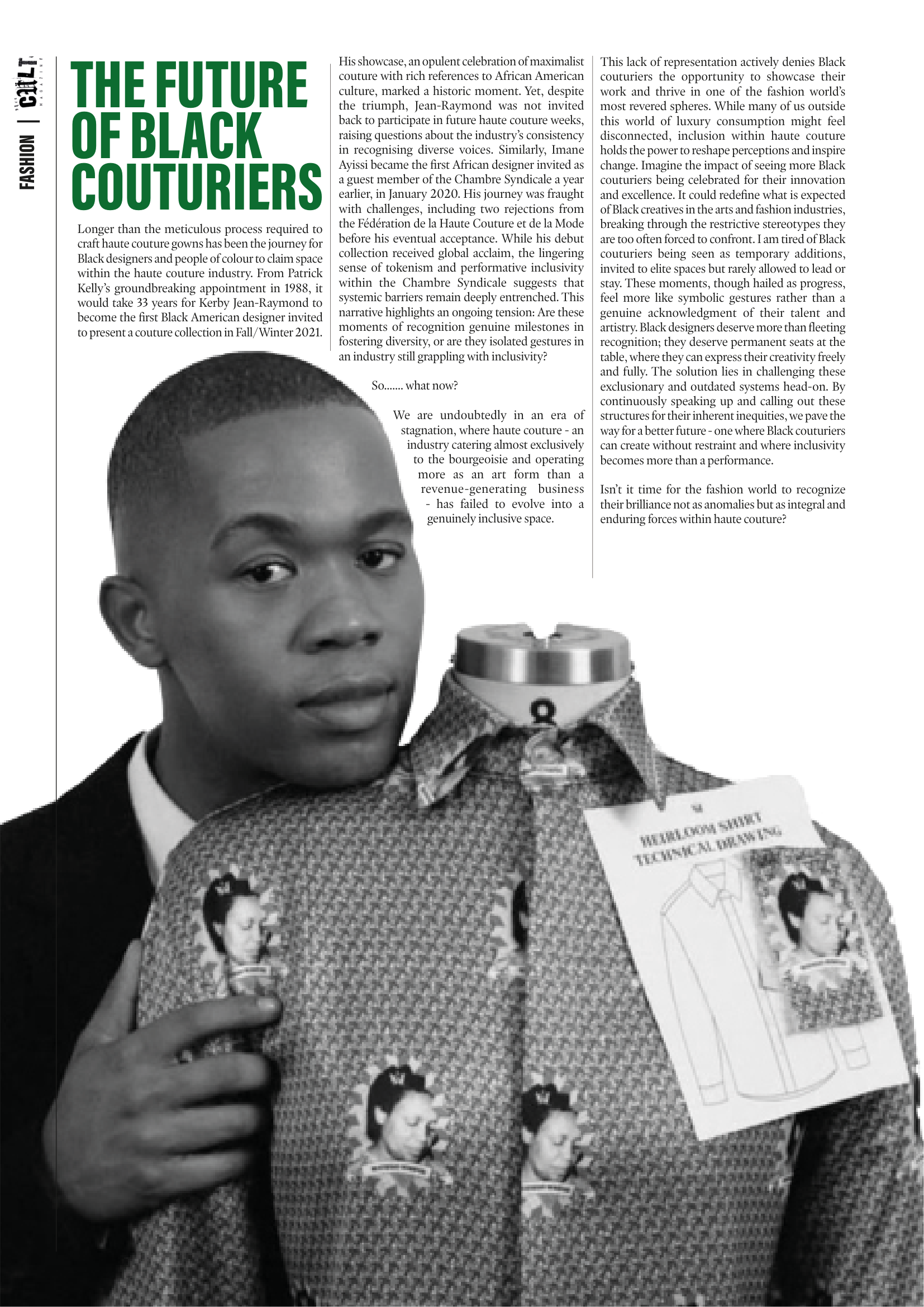
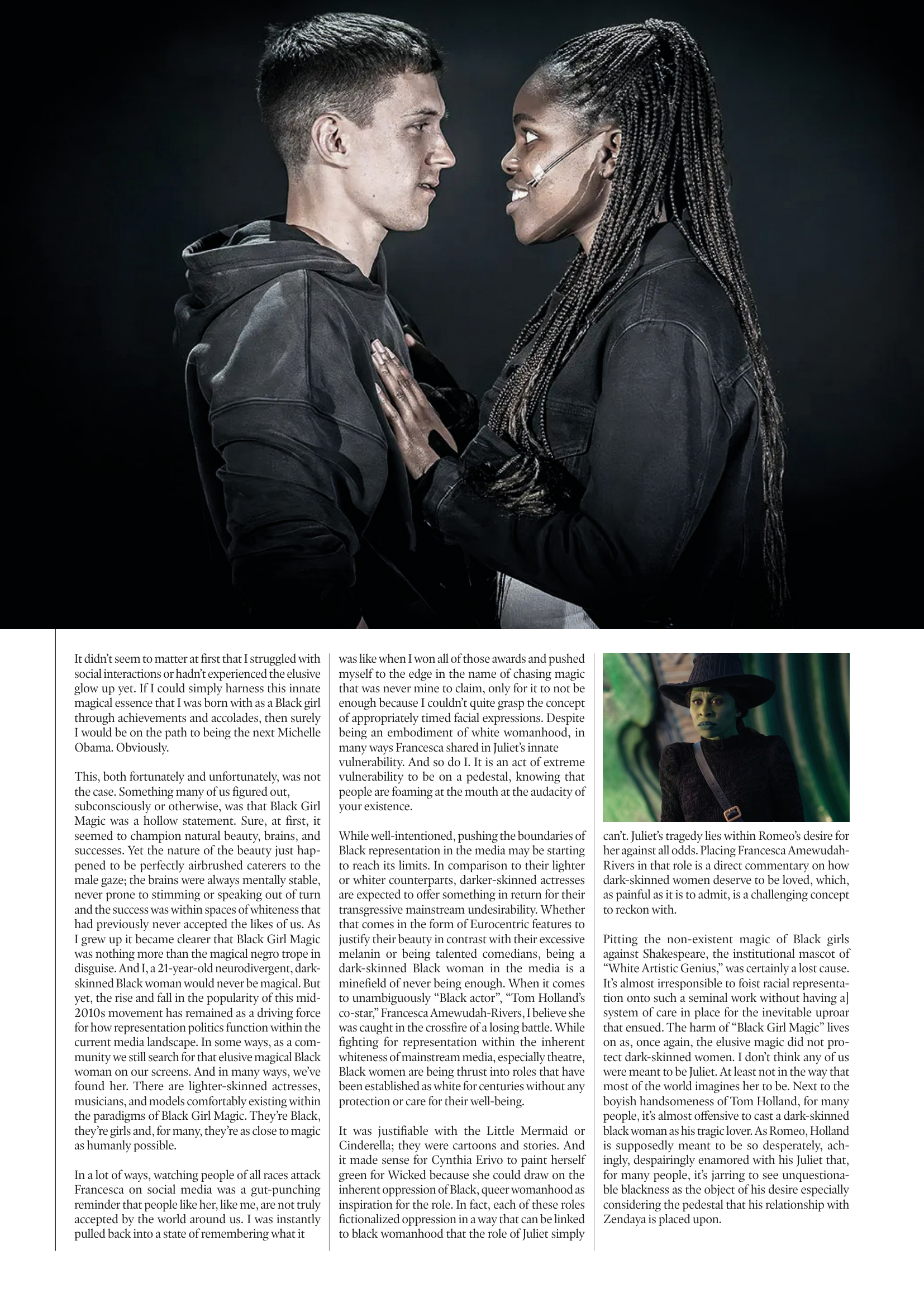
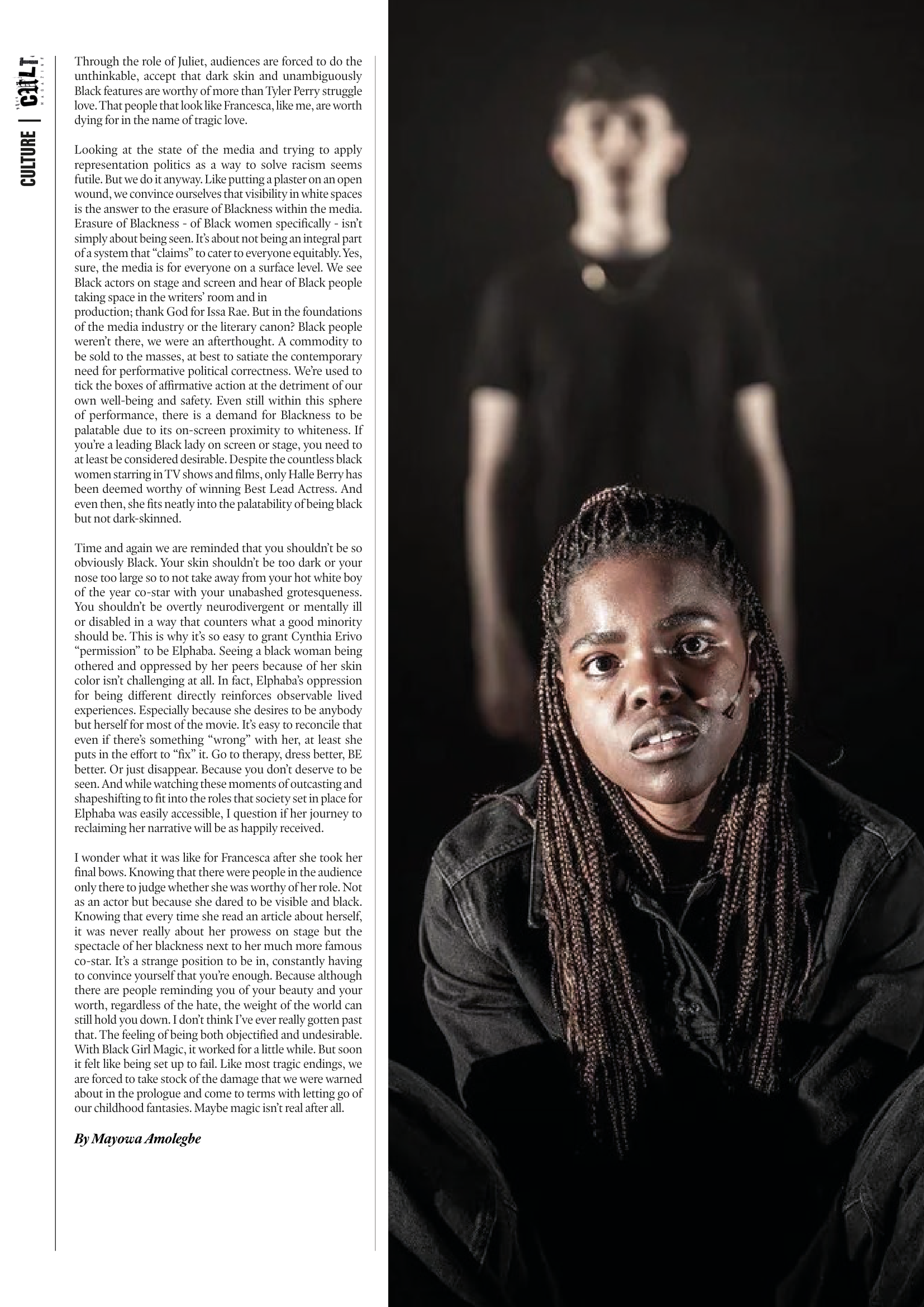
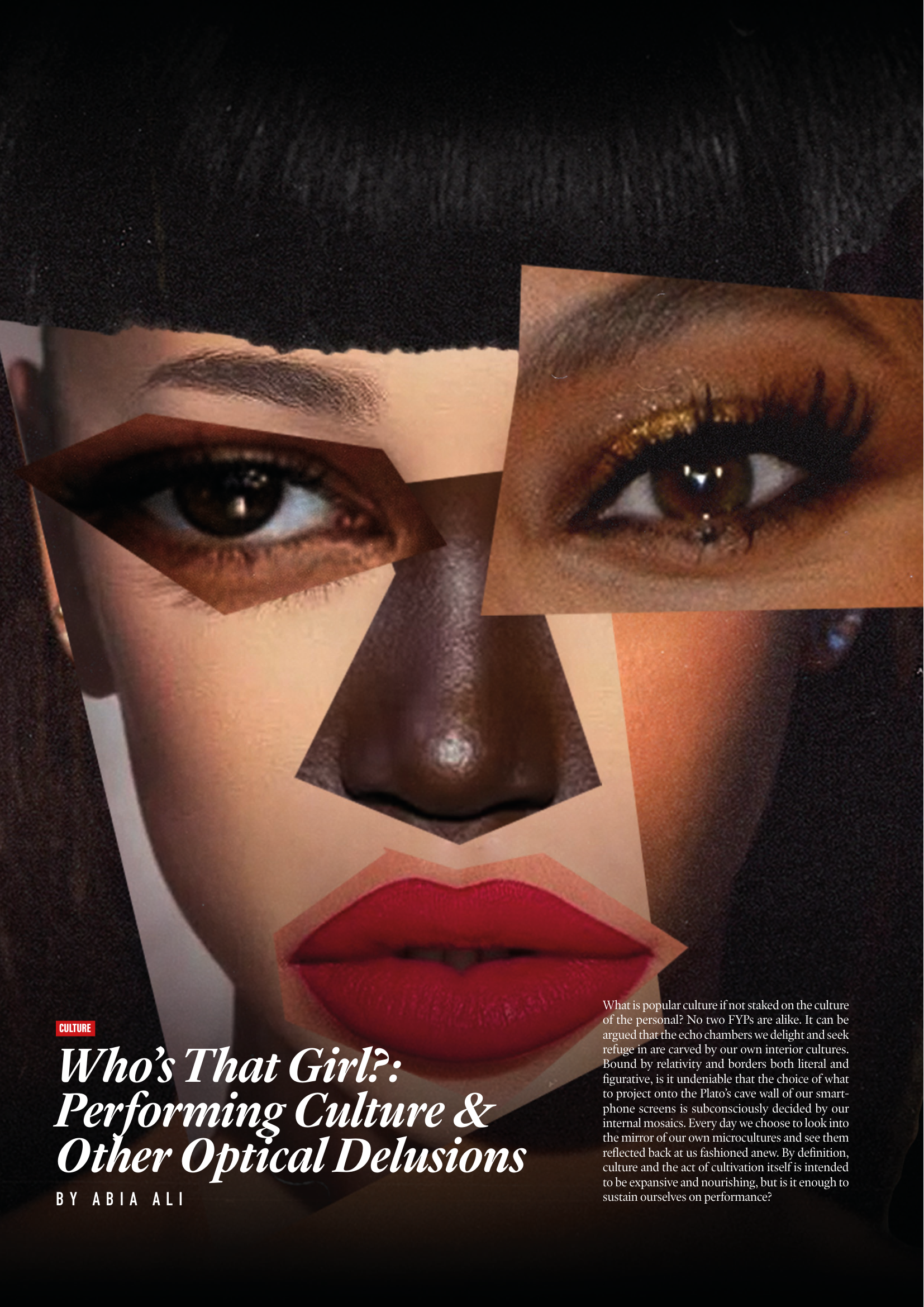
This shift was directly tied to the decision to launch a dedicated social media presence for Thee Cult. Previously, the magazine had been promoted through the Warwick Pop Cult account, but Issue 3 marked the point at which it began to operate as a distinct entity with its own platform and visual identity. The redesigned logo and simplified system allowed the brand to translate effectively across this new context, supporting a more cohesive and recognisable rollout.As Editor-in-Chief and Creative Director, I oversaw the expansion of the magazine’s sectional structure across culture, music, fashion, and film & TV, managing section editors while also operating directly as Culture Editor. I led the development of editorial direction by defining pitch briefs, often building them into fully realised concepts before guiding contributors through a structured editorial process that included written feedback and, where possible, live editing sessions.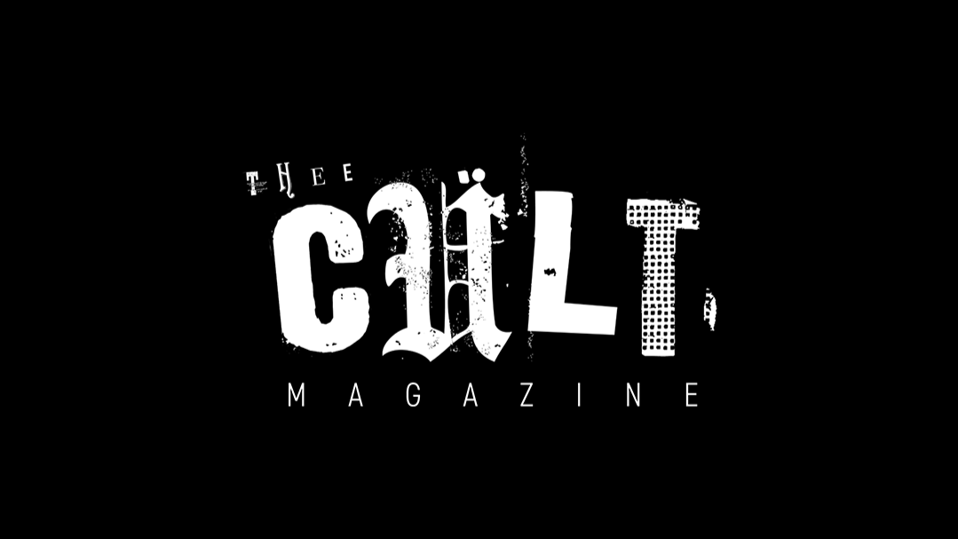
-
![]()
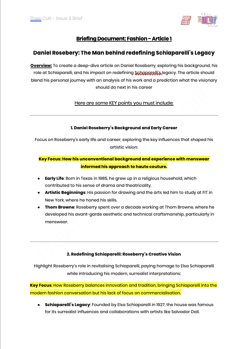
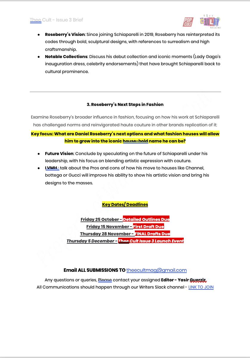
Example Briefing Document
-
![]()
-
![]()
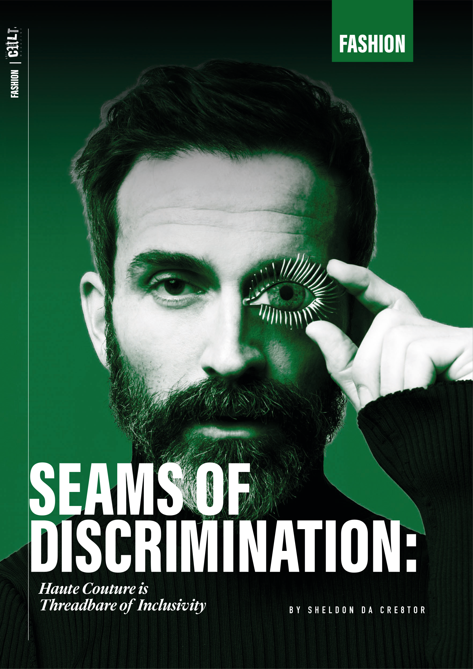
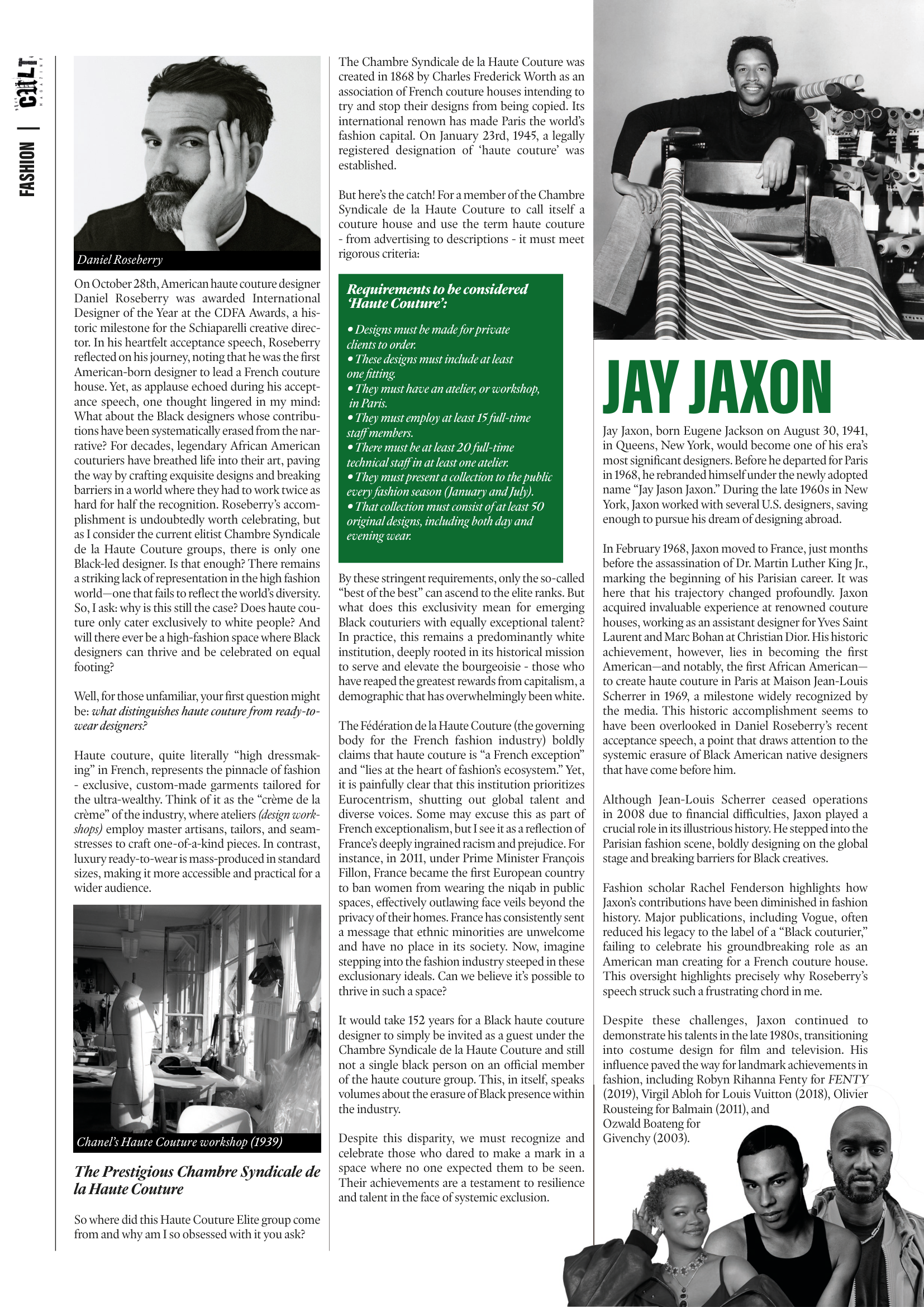
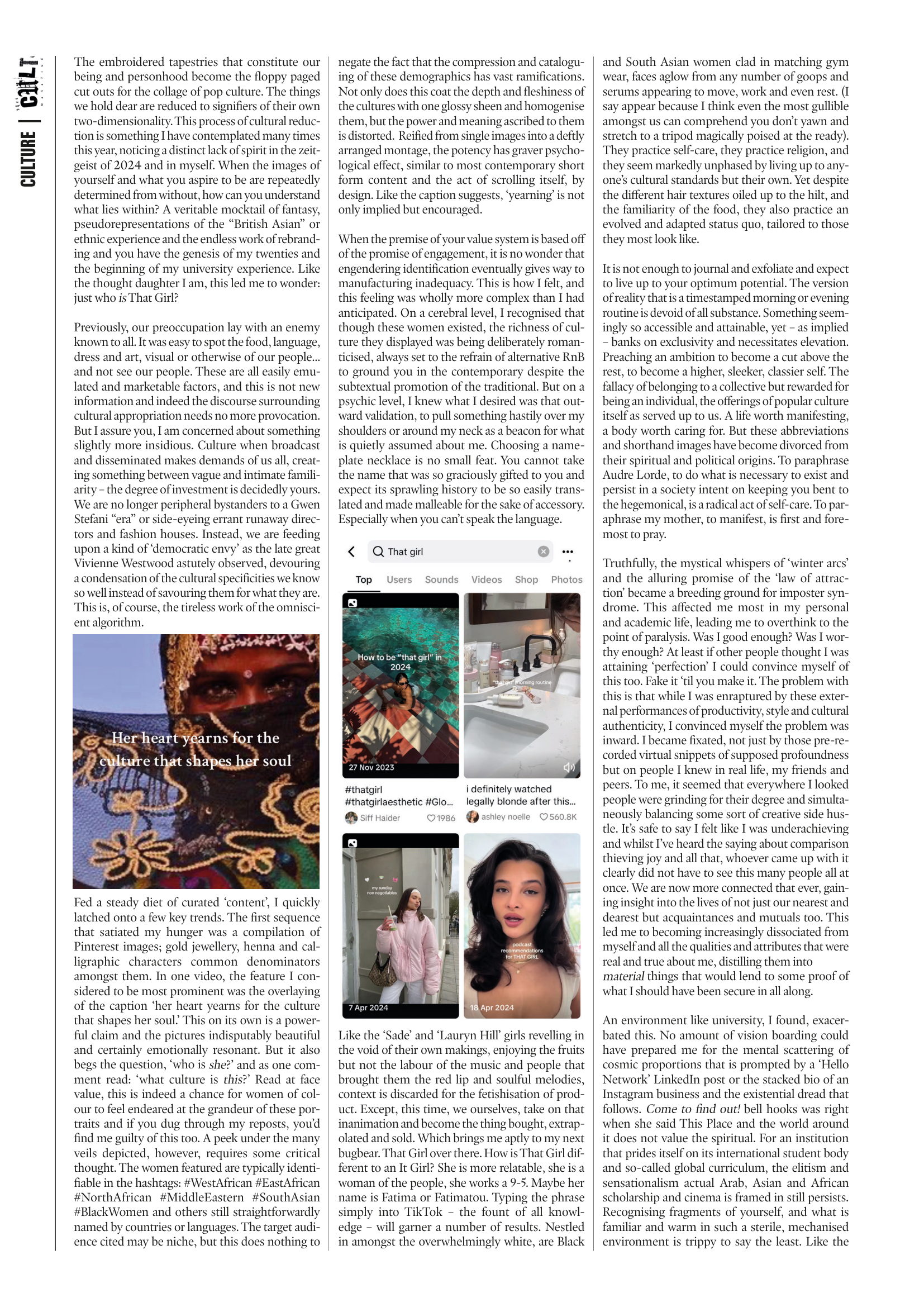
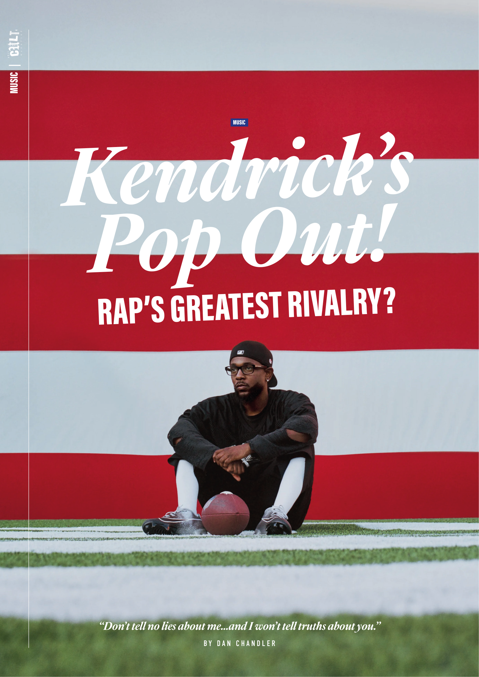
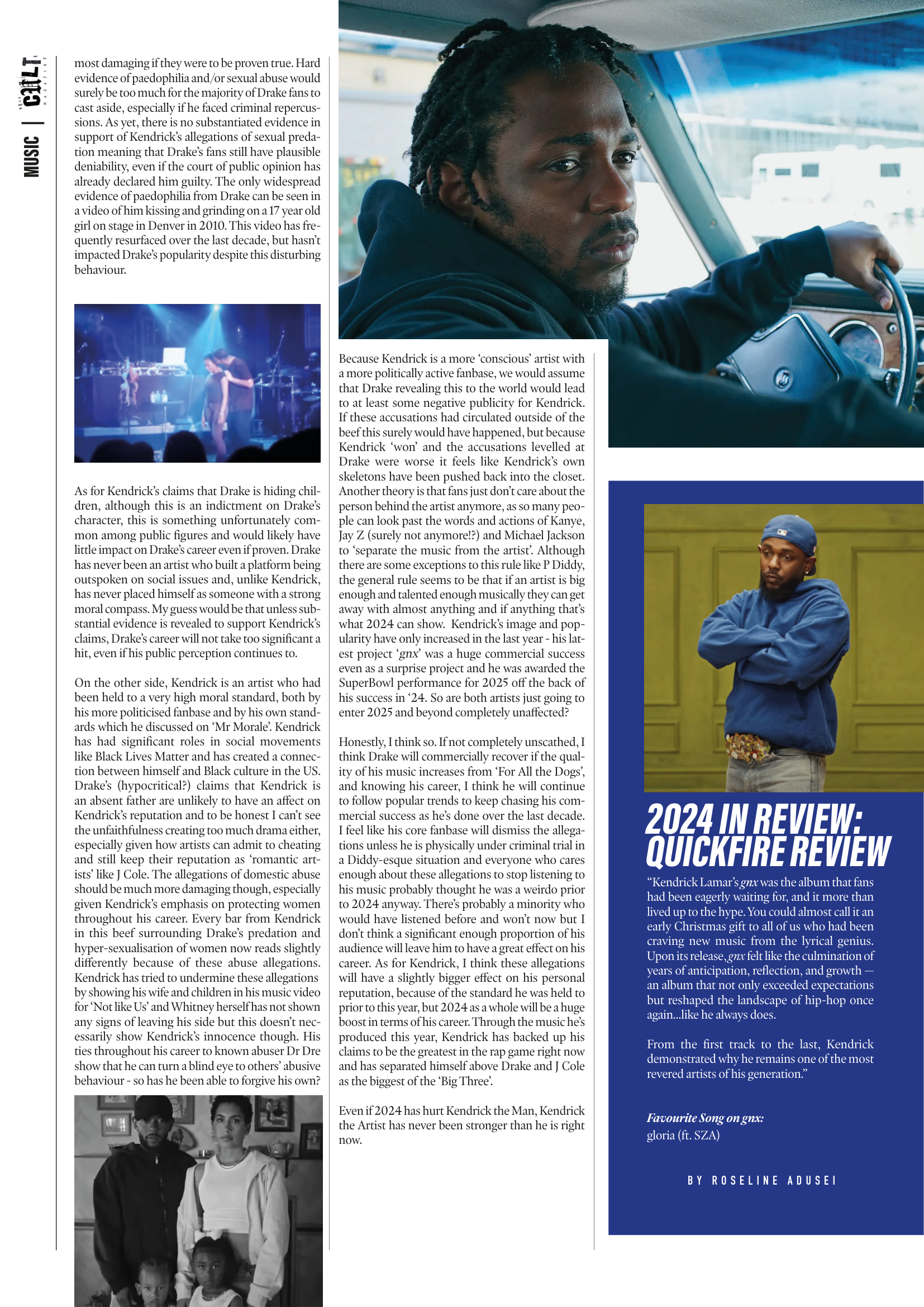
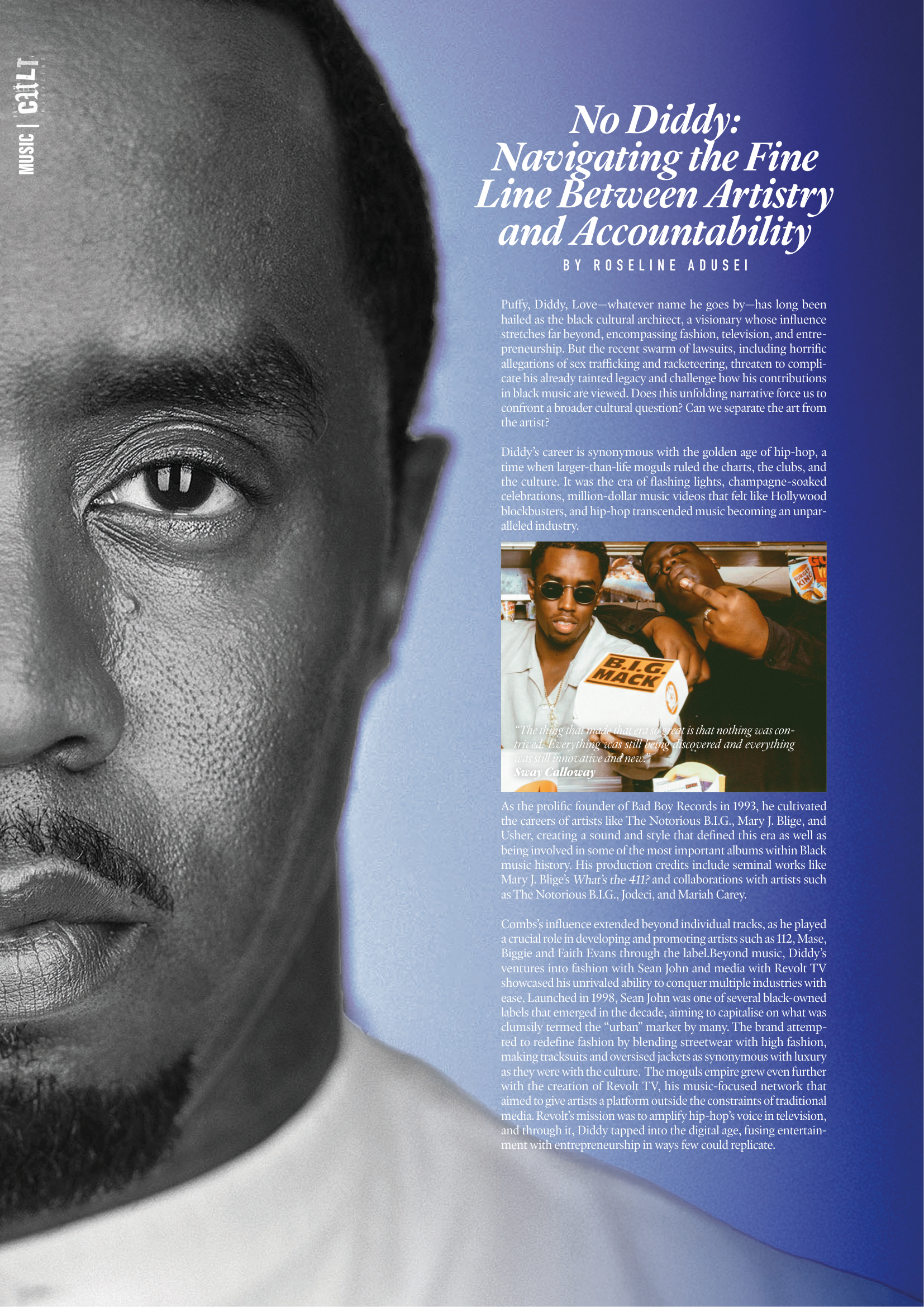
Published Article
-
![]()
-
![]()
-
![]()
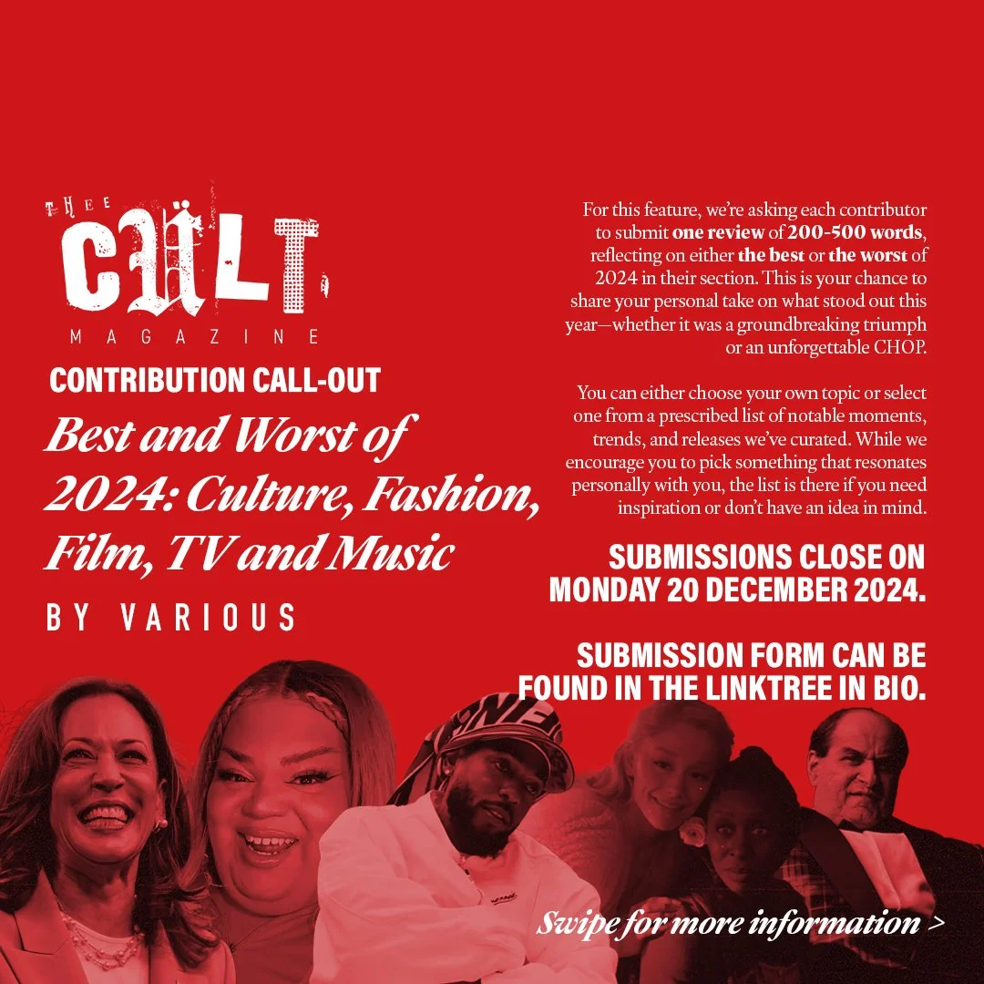
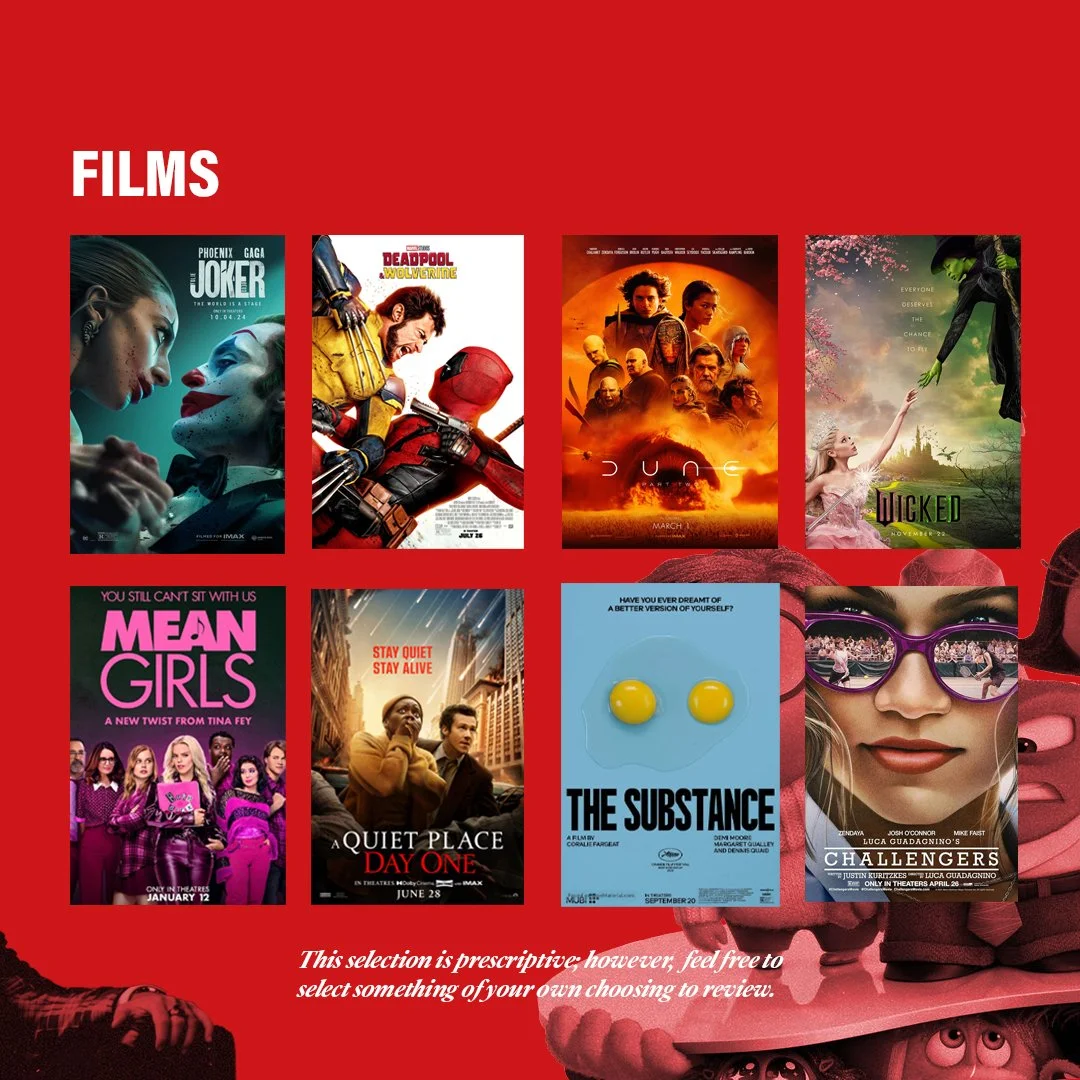
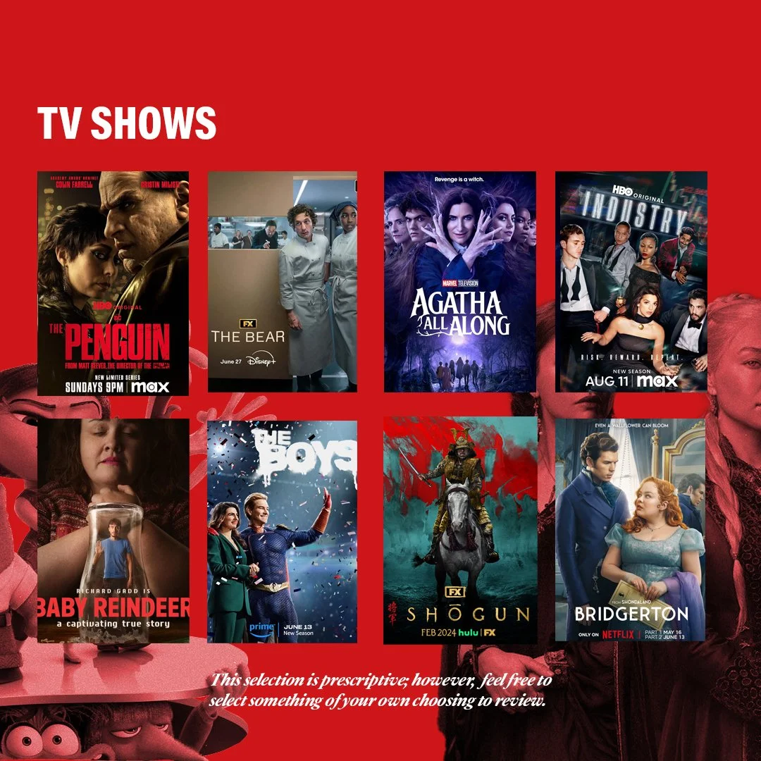
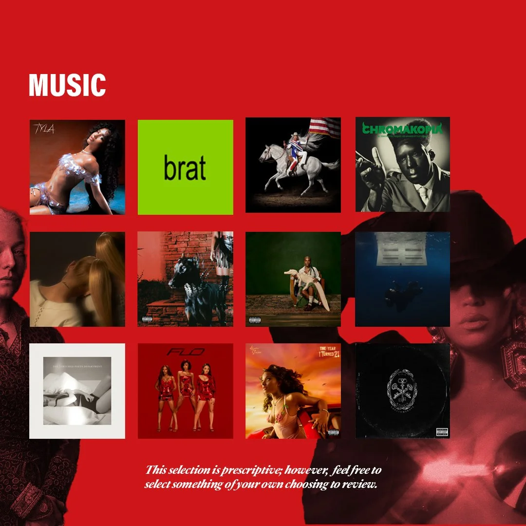
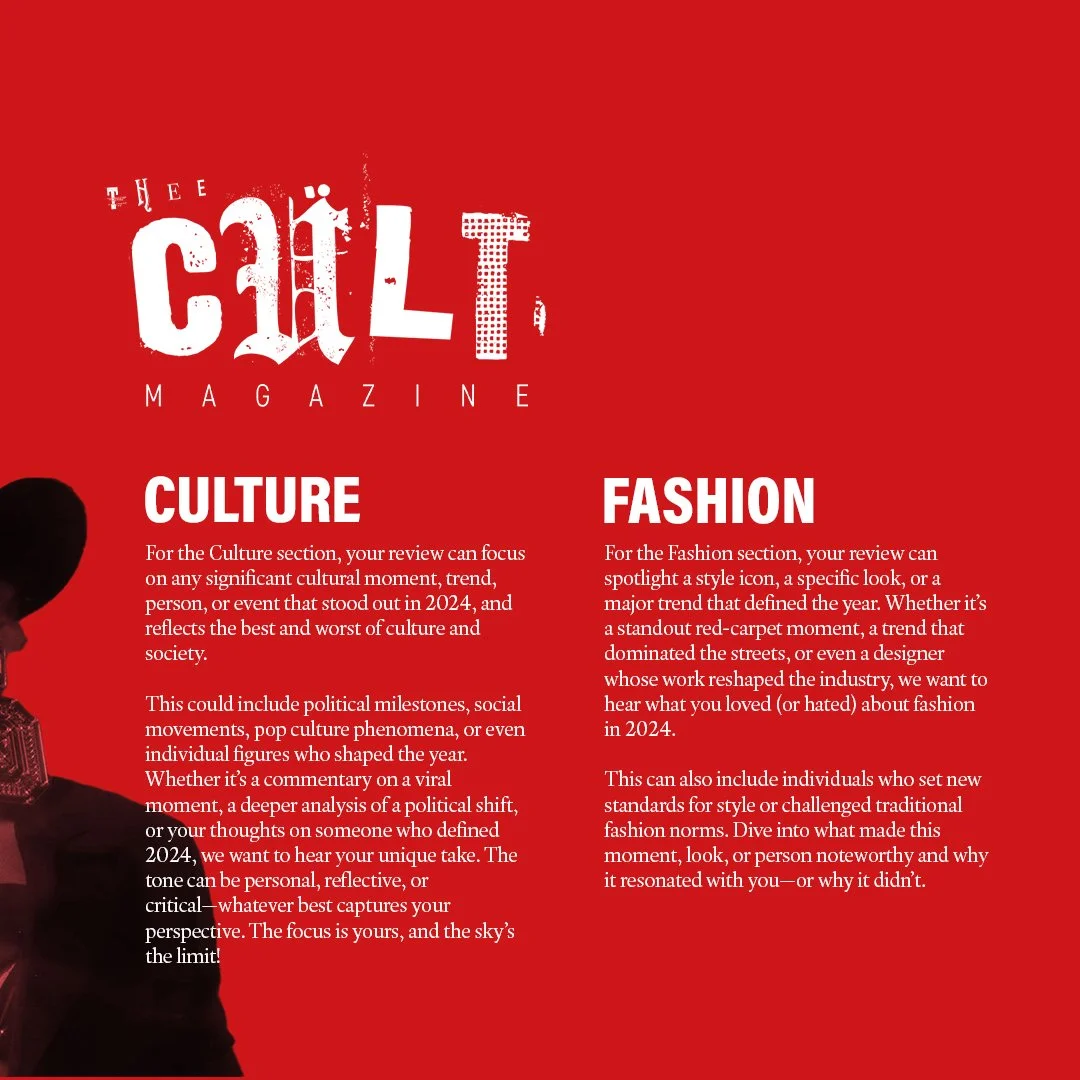
Alongside the development of a distinct visual identity, Issue 3 was supported by a more intentional social media rollout, which functioned not only as a promotional tool but as part of the magazine’s editorial workflow. With the launch of a dedicated Thee Cult platform, social media became a primary space for communicating briefs, promoting calls for submissions, and maintaining momentum across the production cycle.The assets, designed in Adobe Photoshop, were built to align with the updated visual system - balancing consistency with enough flexibility to accommodate different types of content, from contributor call-outs to feature highlights and section-specific posts. These visuals were used to guide contributors through the process, reinforce deadlines, and establish a recognisable presence as the magazine expanded beyond its original context within Warwick Pop Cult.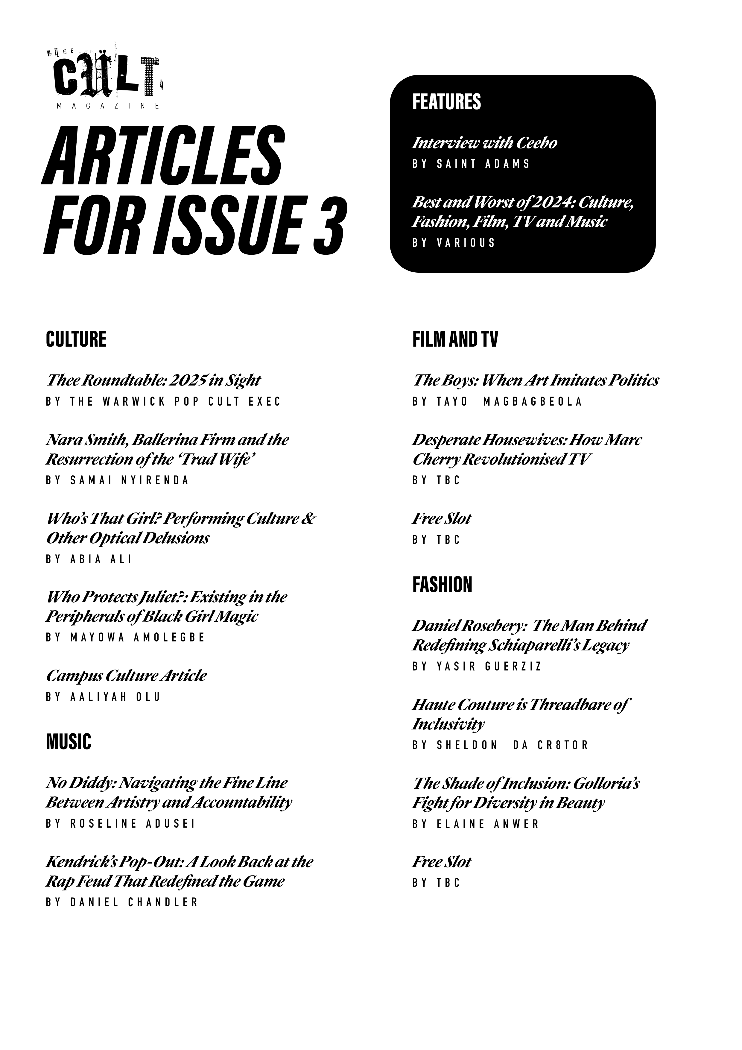
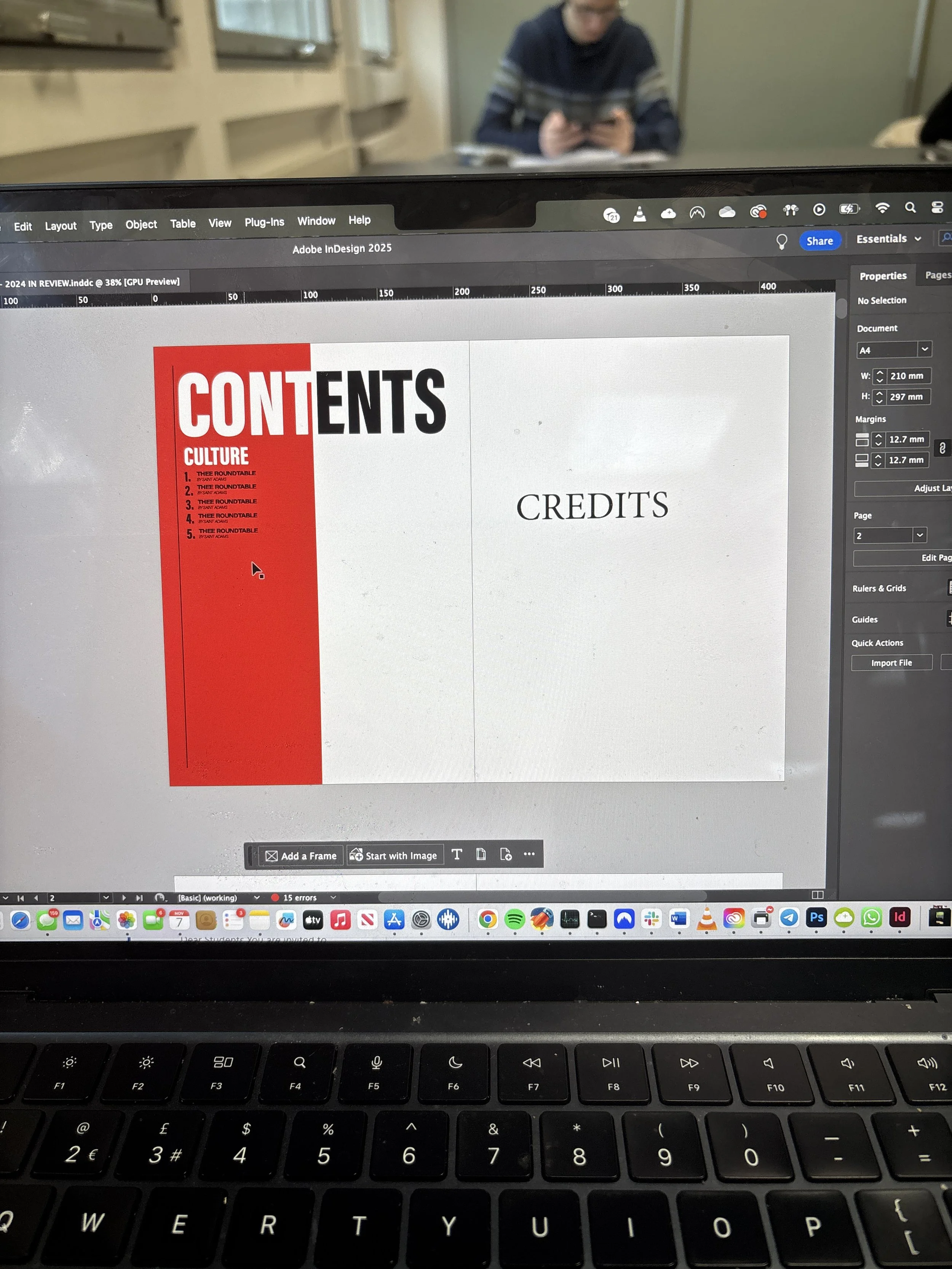
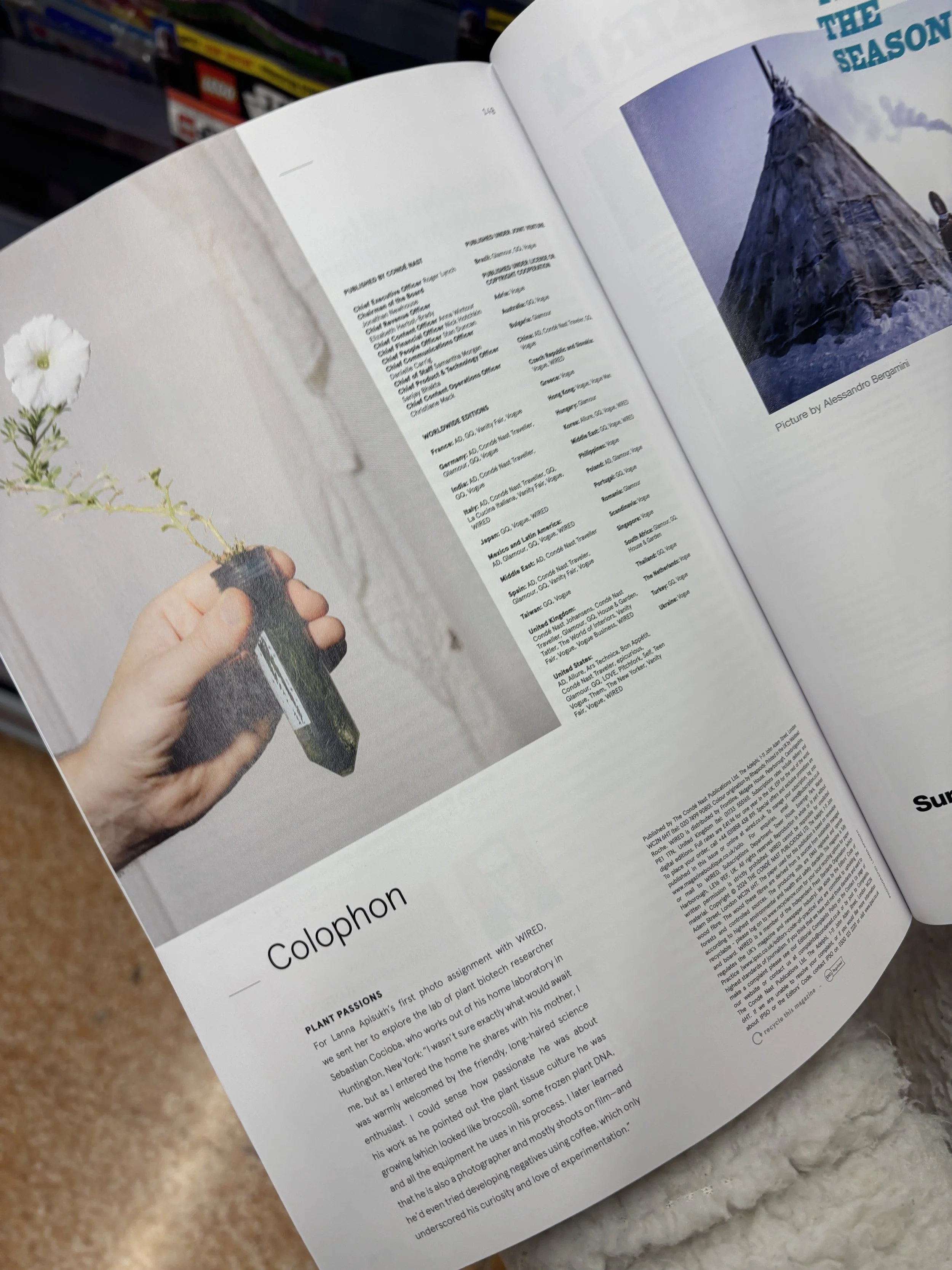
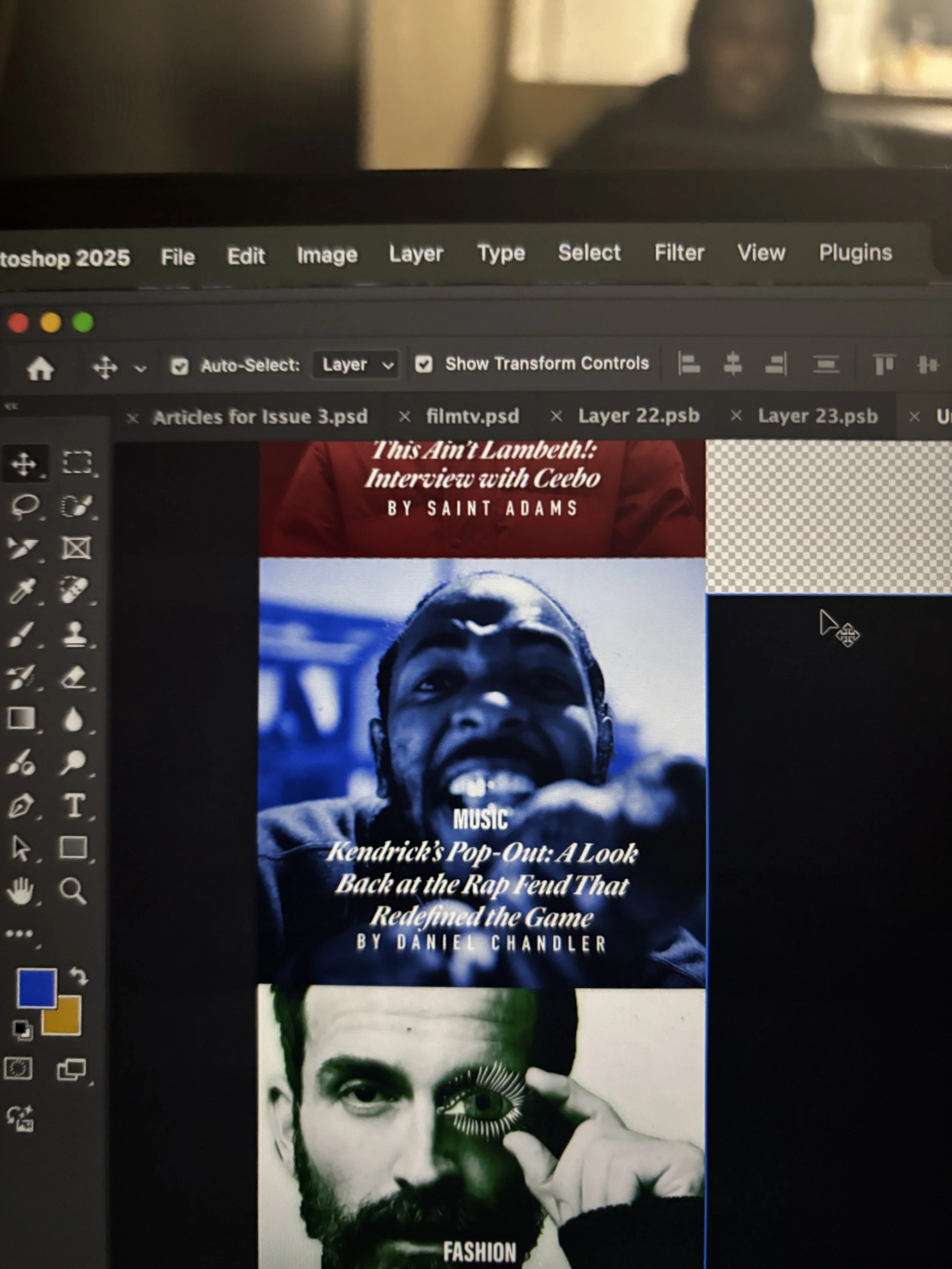
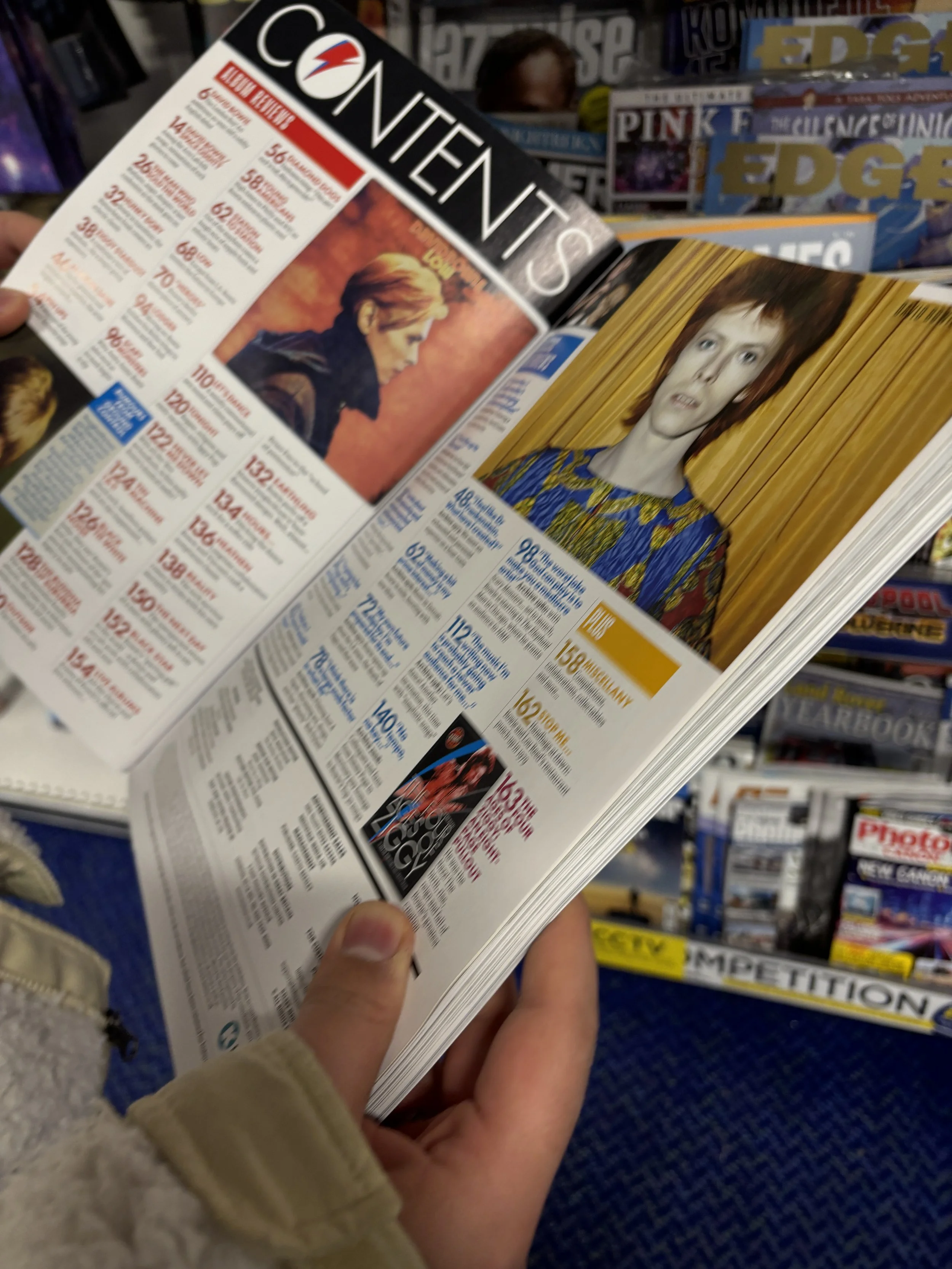
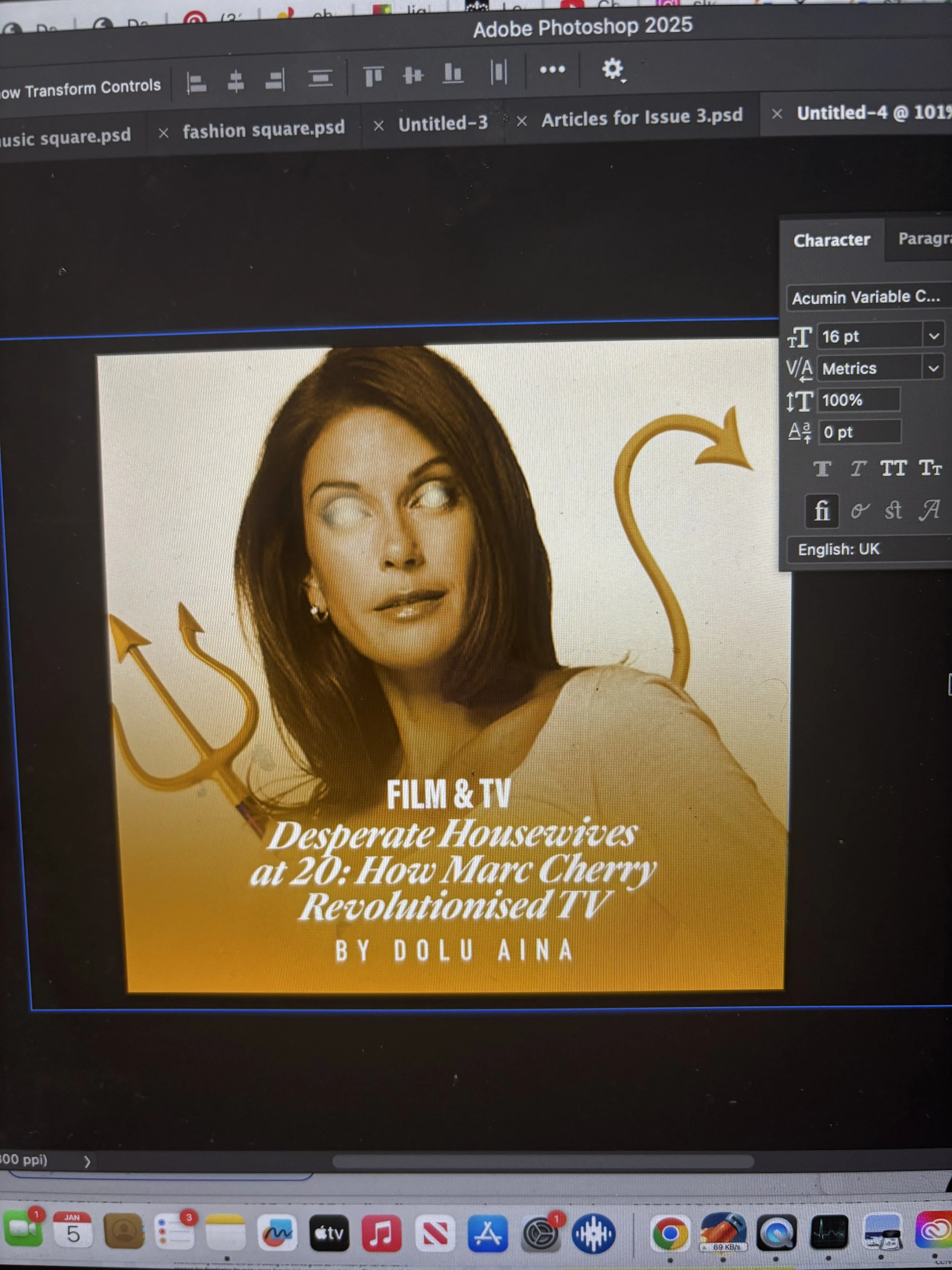
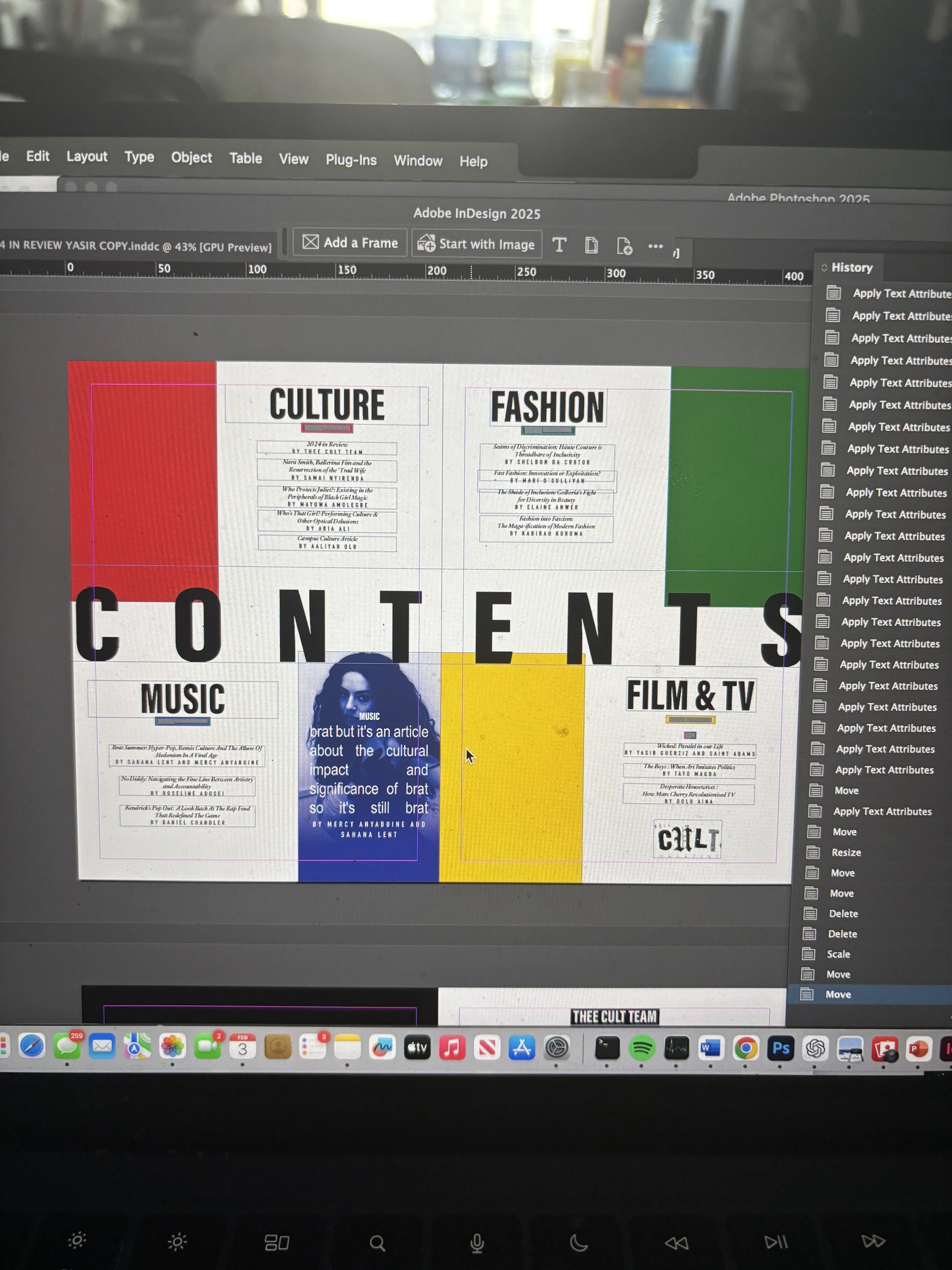
A major development in Issue 3 was the transition into Adobe InDesign, marking a shift toward more professionalised layout and production processes. Alongside Yasir Guerziz, I began learning InDesign from scratch in the months leading up to the issue (October - December 2025), translating our existing Photoshop-based approach into the more structured editorial workflow of InDesign. This period was not only about learning a new software, but about understanding how InDesign could support the construction of a scalable design system. While writing was still being commissioned and developed, we used this time to experiment with layouts, master pages, and typographic structures - establishing a foundation that could later be adapted once final content was delivered. Through working in InDesign, we defined core elements of the magazine’s visual identity, including a clear typographic hierarchy, consistent grid systems, and a simplified approach to section-based design. These decisions allowed the magazine to move toward a more cohesive and recognisable visual language, while still retaining flexibility across different articles and formats.Importantly, this phase also strengthened our confidence as designers. By building and applying these systems directly within InDesign across both editorial and promotional outputs, the visual language of Thee Cult became something we could actively operate within - akin to becoming fluent in a language. This shift extended beyond layout into creative direction more broadly. Establishing a consistent visual language allowed for greater control over how the magazine was perceived and experienced across every touchpoint, from page design to social media and aesthetic tone. As Creative Director, this meant moving from making individual design decisions to shaping a cohesive world - where typography, layout, imagery and tone all worked together to support a unified editorial identity. Through this process, design became a framework for decision making across the publication. Rather than responding to content on a case-by-case basis, the established system provided clarity on how different elements should be treated, allowing the magazine to operate with greater intention, consistency and authority.
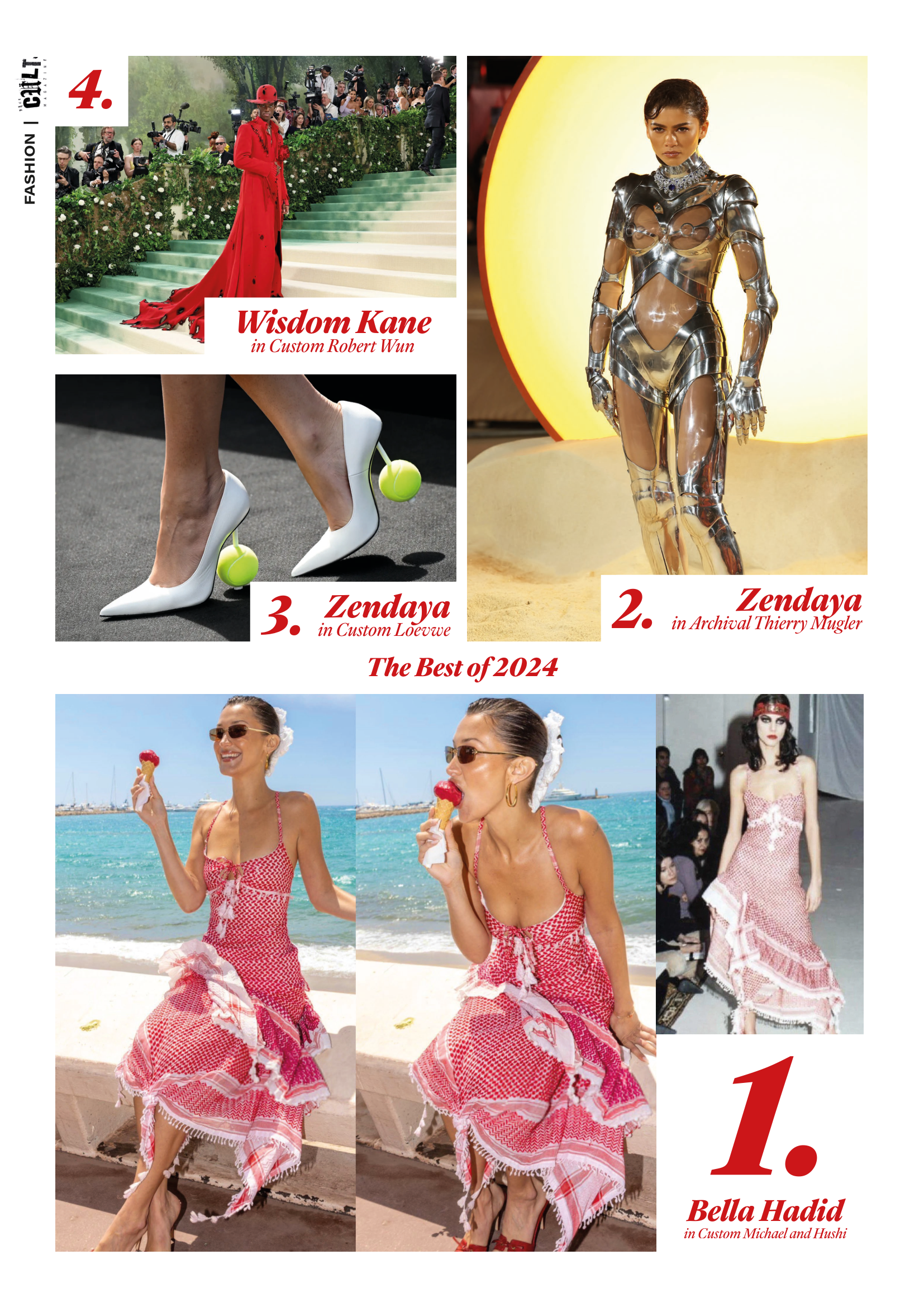
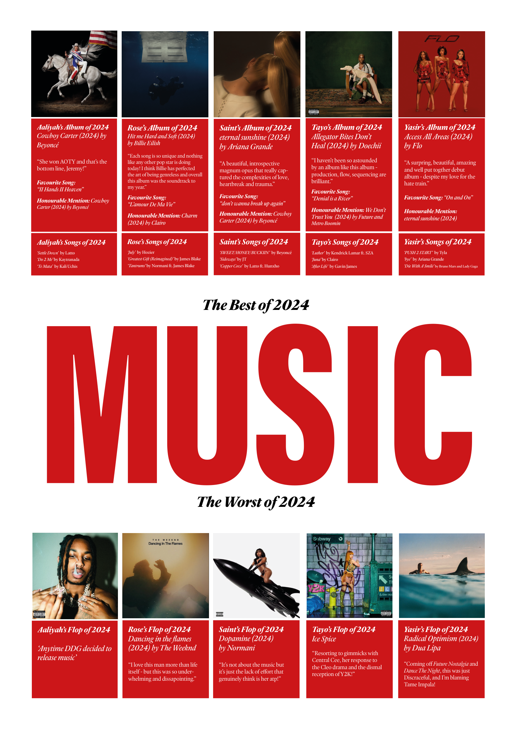
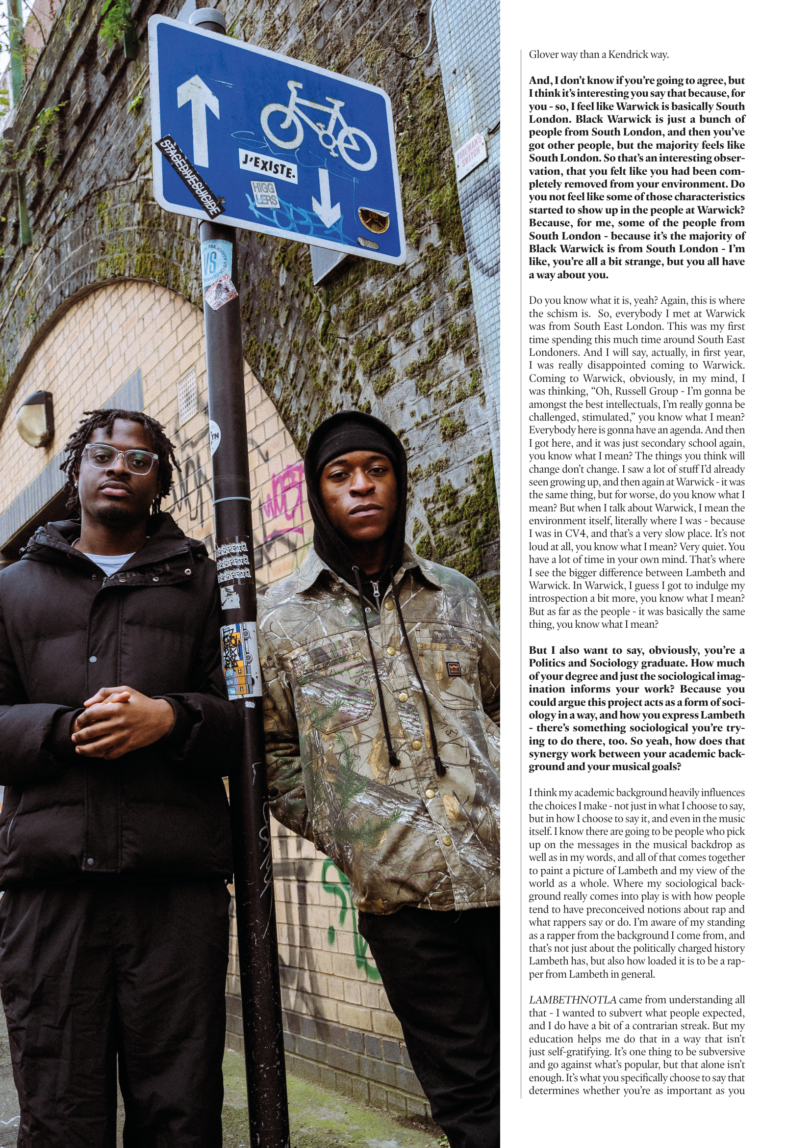



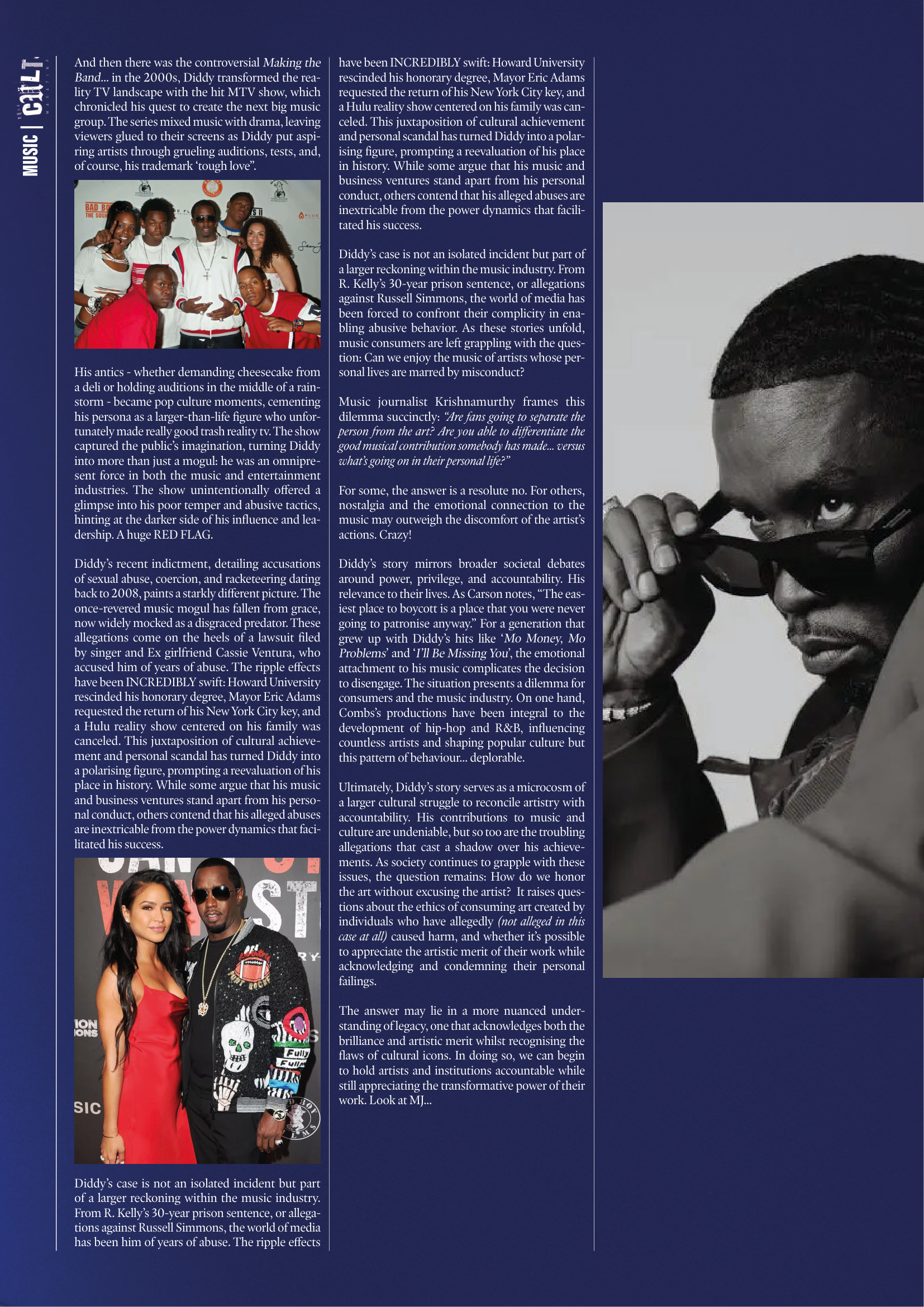
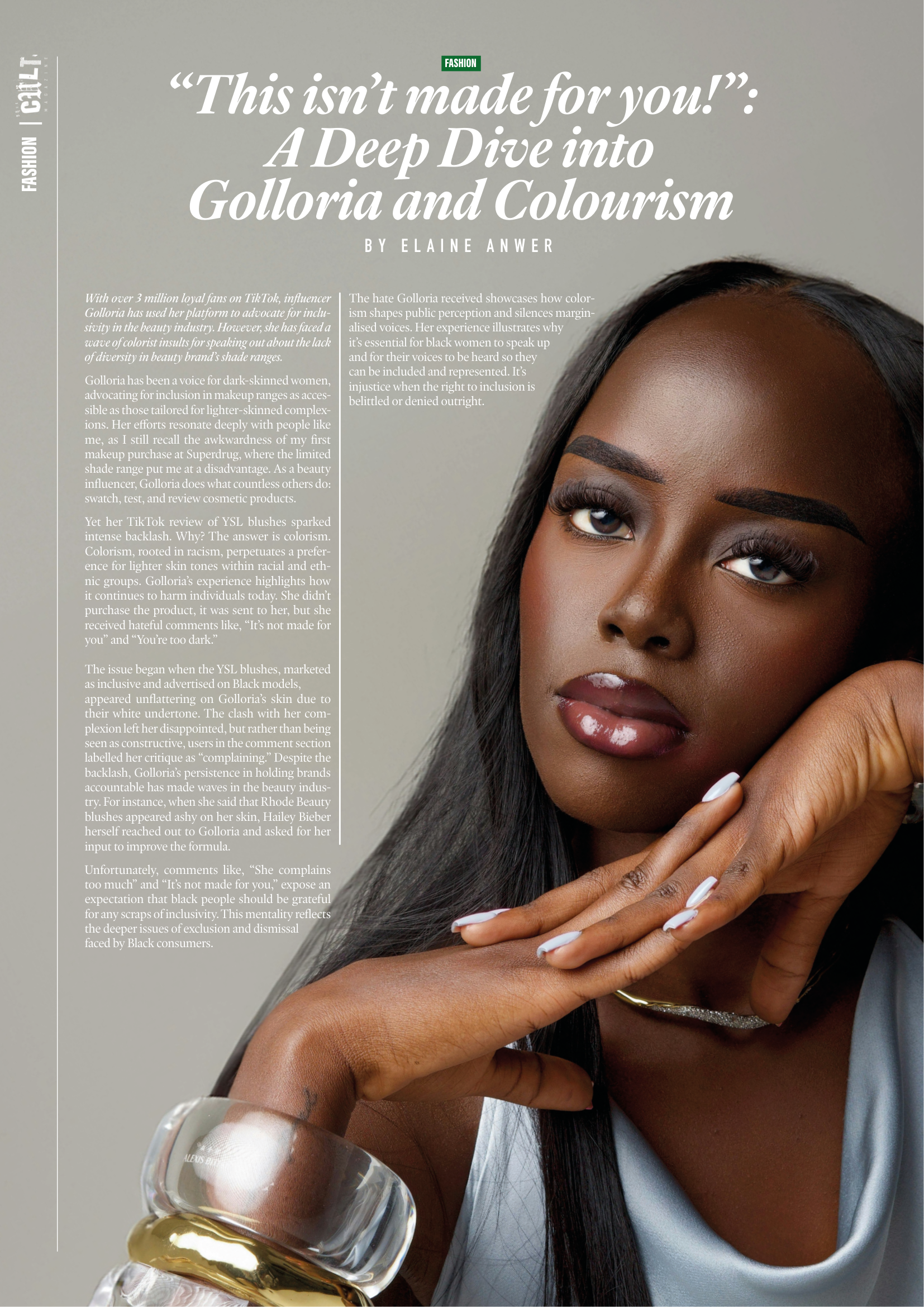
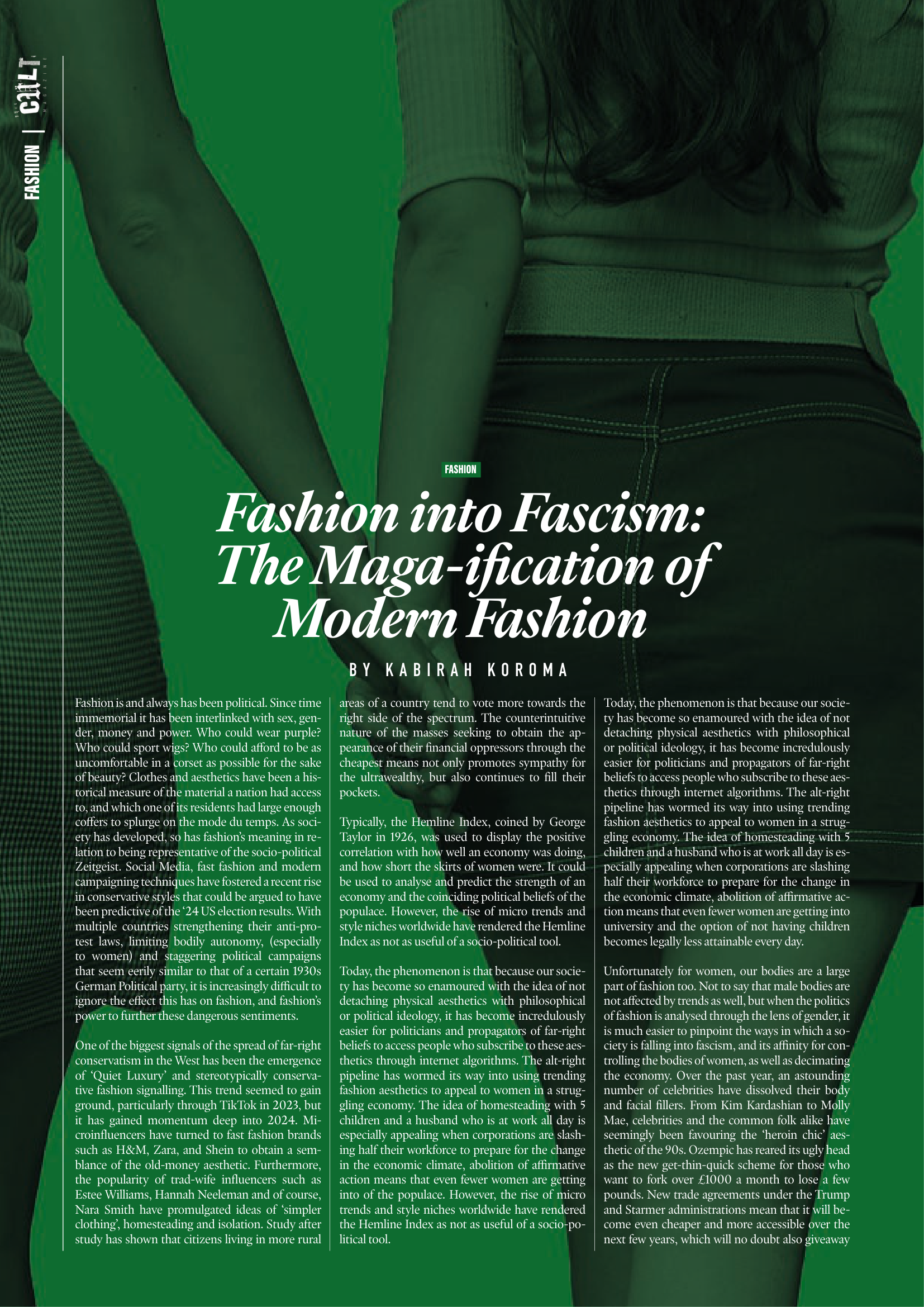


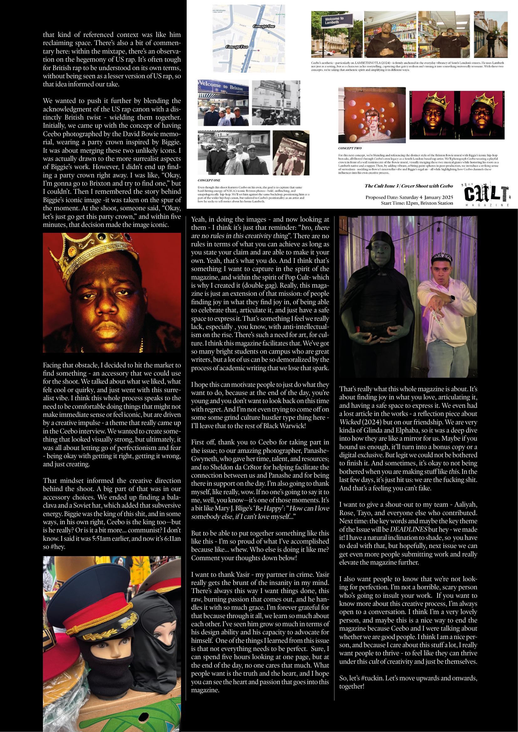
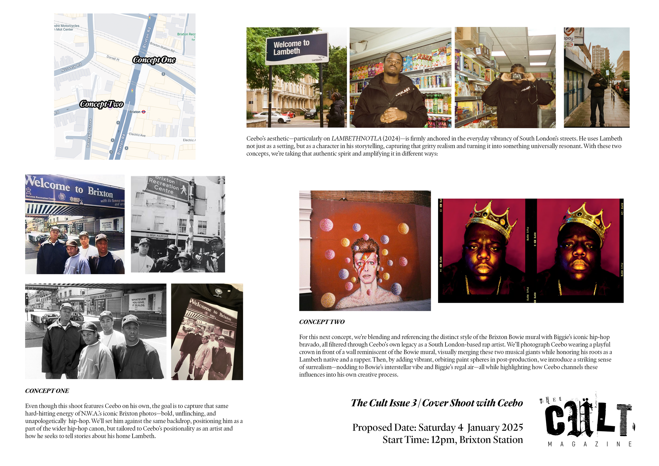
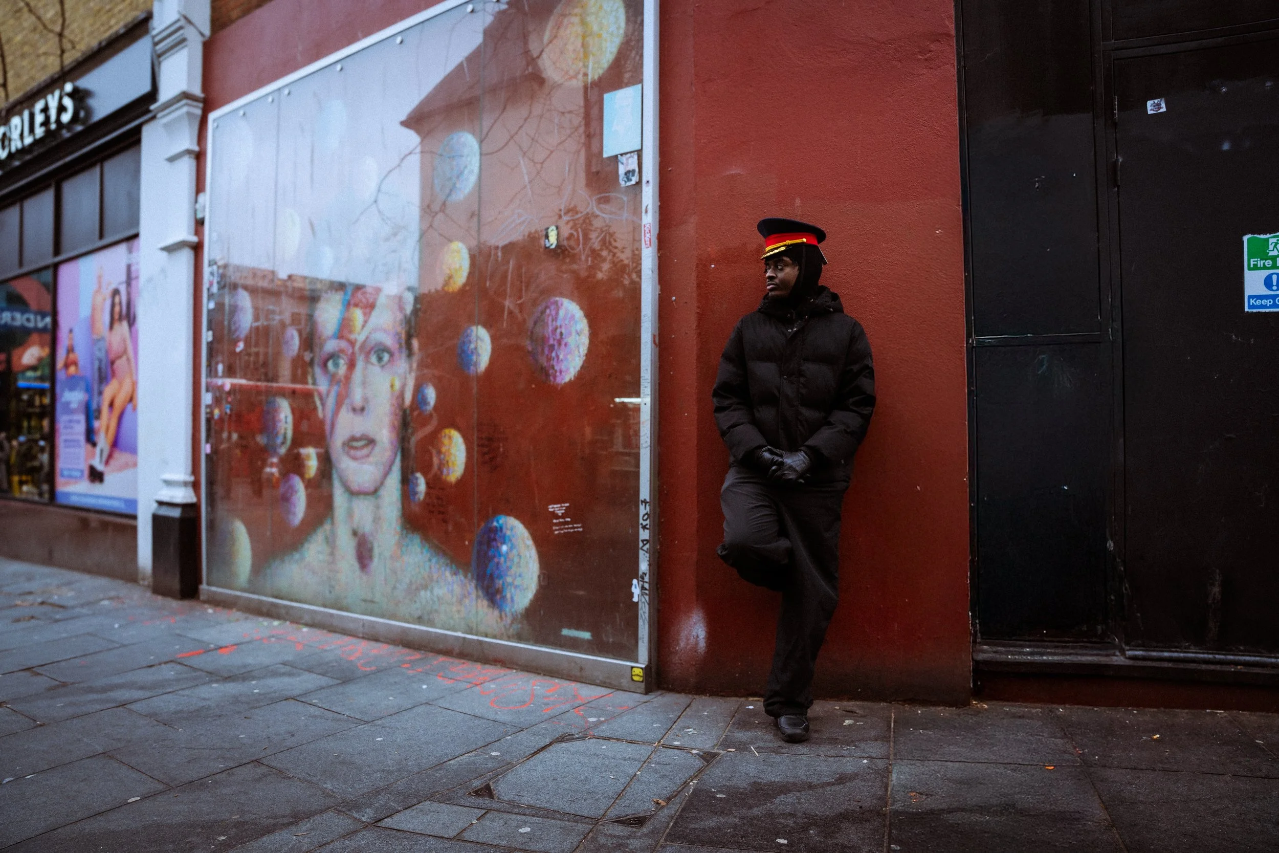
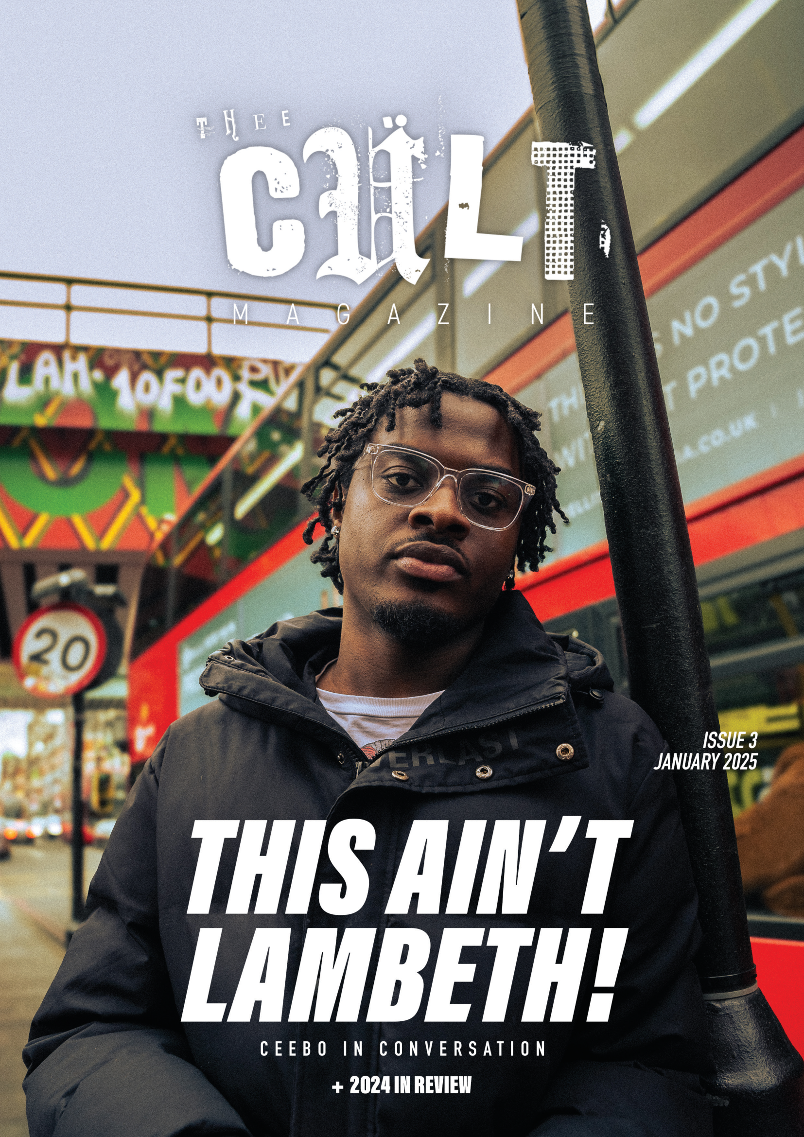
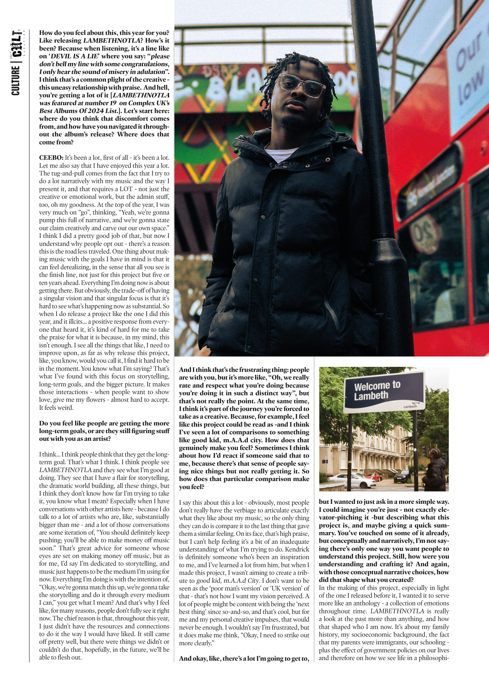
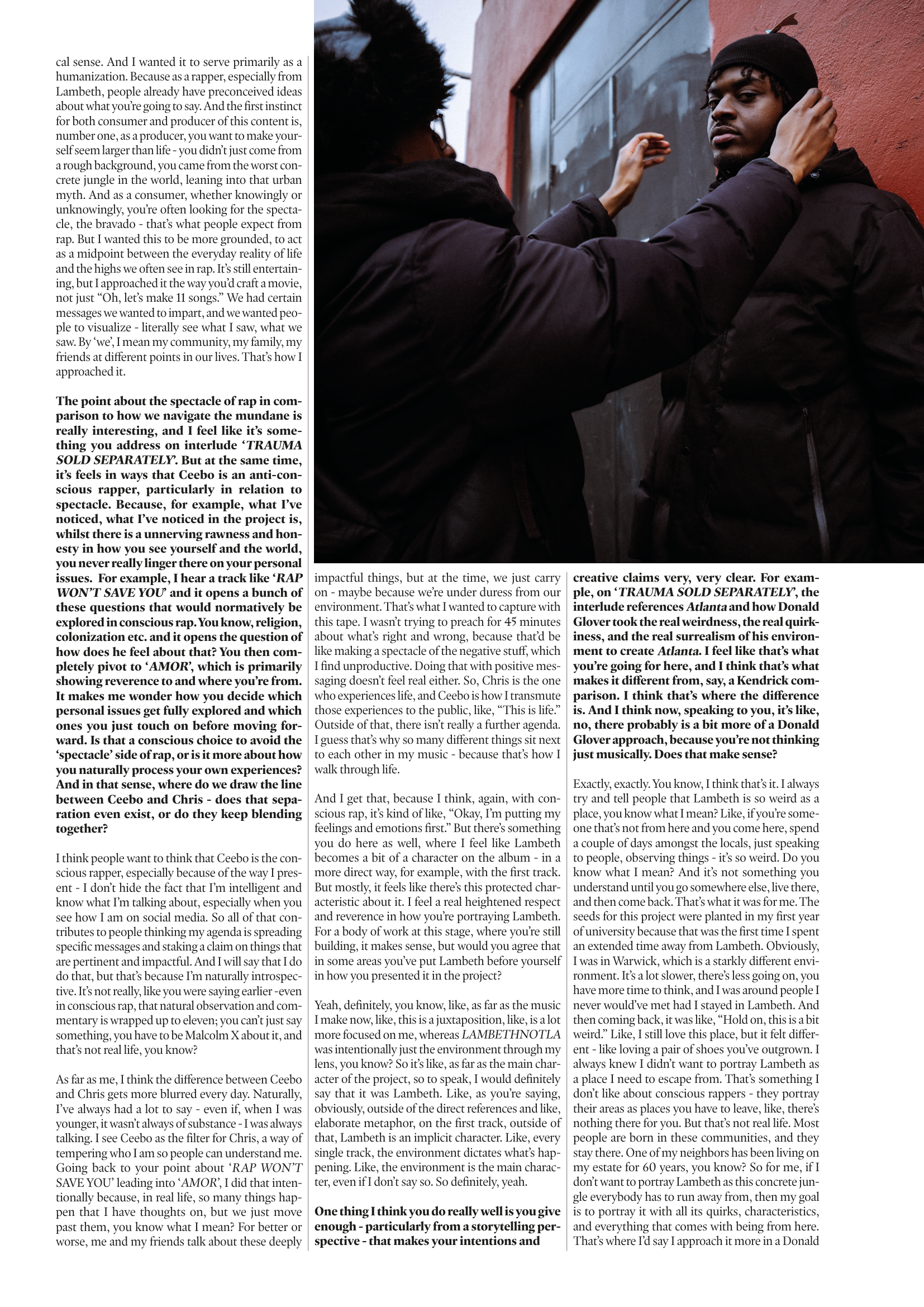
A defining feature of Issue 3 was the introduction of a formal cover and cover story, featuring UK rapper Ceebo following the release of his mixtape LAMBETHNOTLA (2024). I led the development of the cover concept and directed the photoshoot in collaboration with photographer Panashe-Gwyneth Mushandu, using the project as an springboard to construct a clear visual language around the ideas explored in his work.The visual direction was initially inspired by a reference brought into the process by Culture Editor Aaliyah - rap supergroup N.W.A photographed in Brixton - which became a key point of departure for the shoot. Rather than treating this as a loose influence, the intention was to engage with it directly, using it to think through how hip-hop iconography operates within a UK context, and what it means to reclaim that visual language within South London rather than reproduce it as an American import.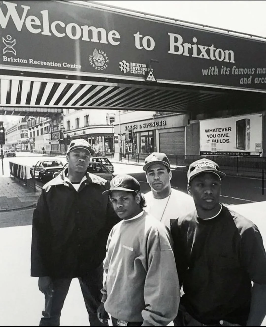
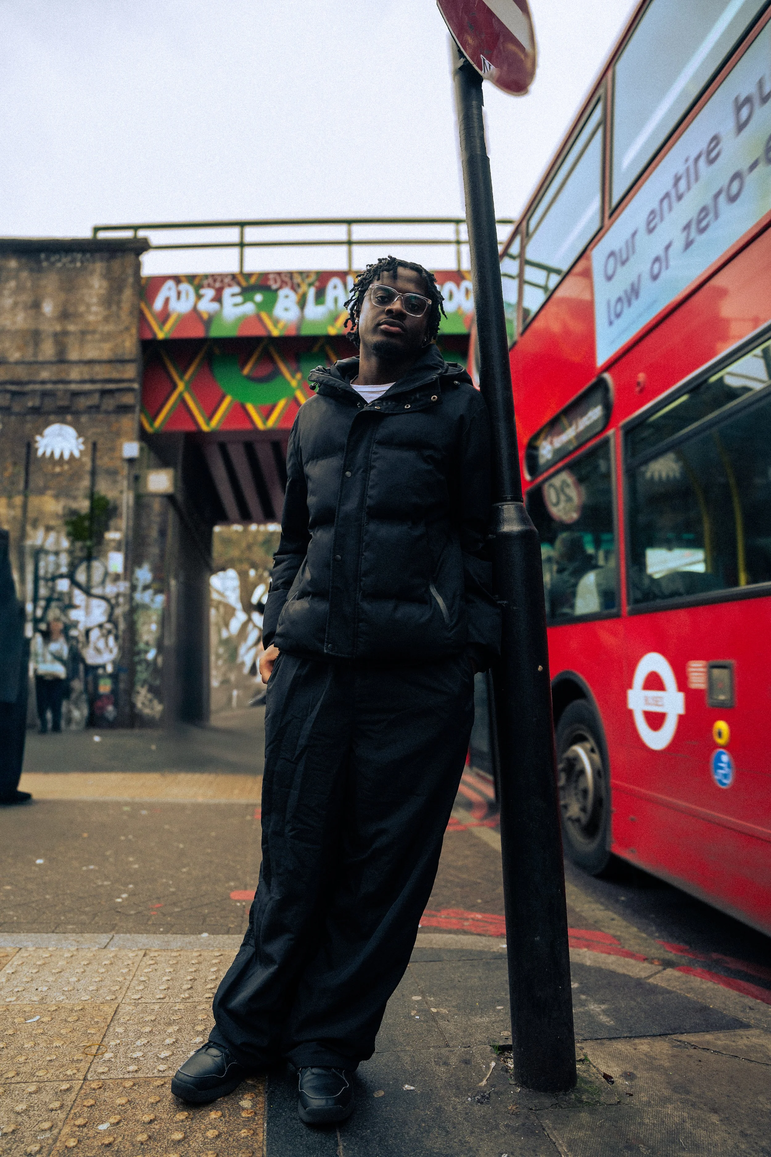
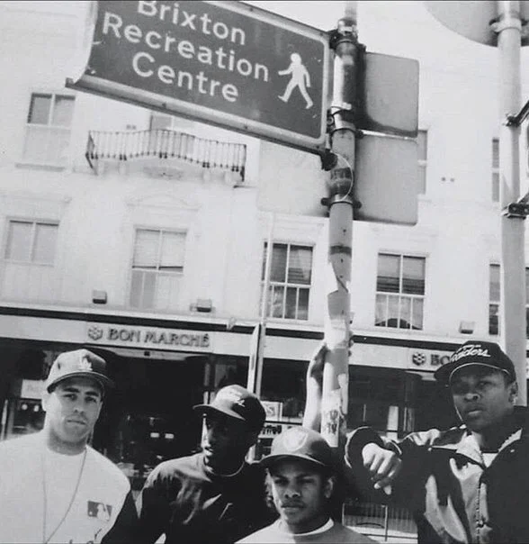
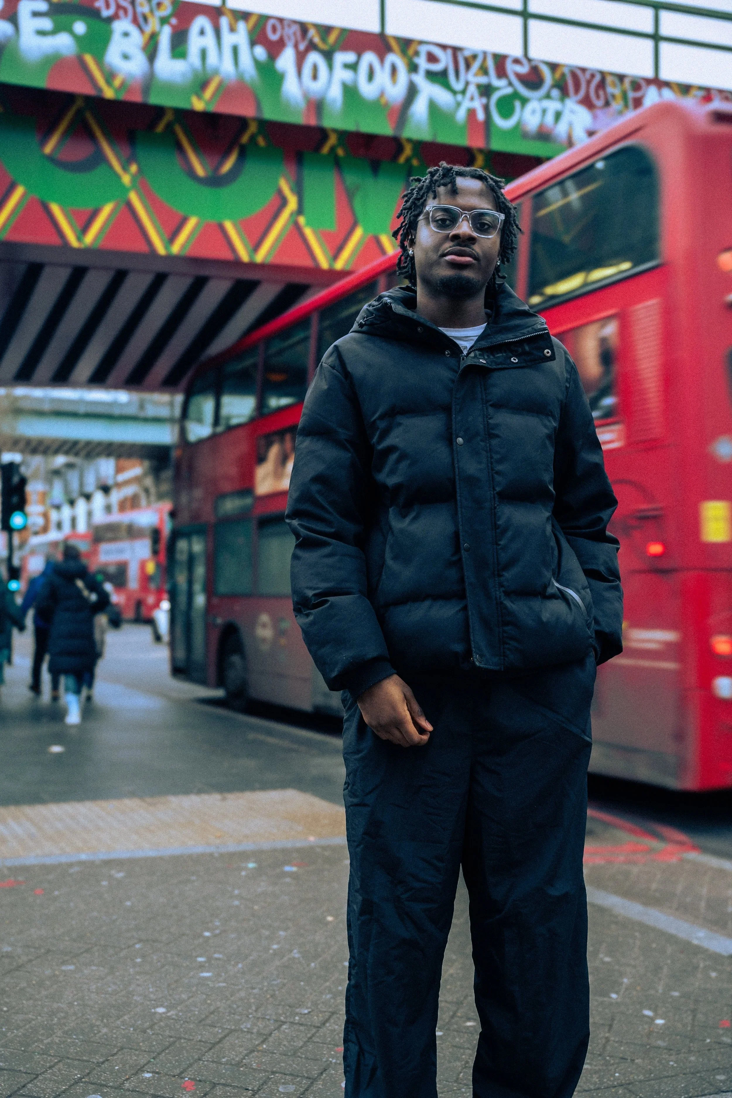


From there, the process became one of reinterpretation. The goal was not to recreate the original image, but to construct something that felt rooted in Lambeth - aligning with the conceptual framing of LAMBETHNOTLA - while still engaging with the visual language and mythology of hip-hop. This involved grounding the imagery in local context and allowing the artist’s identity and perspective to shape how those references were translated. Building from the N.W.A reference, the shoot became less about recreating a specific image and more about understanding how iconography is constructed. Rather than treating references as fixed visuals to replicate, I approached them as systems - asking what makes an image endure and how that logic could be reinterpreted within a new context.
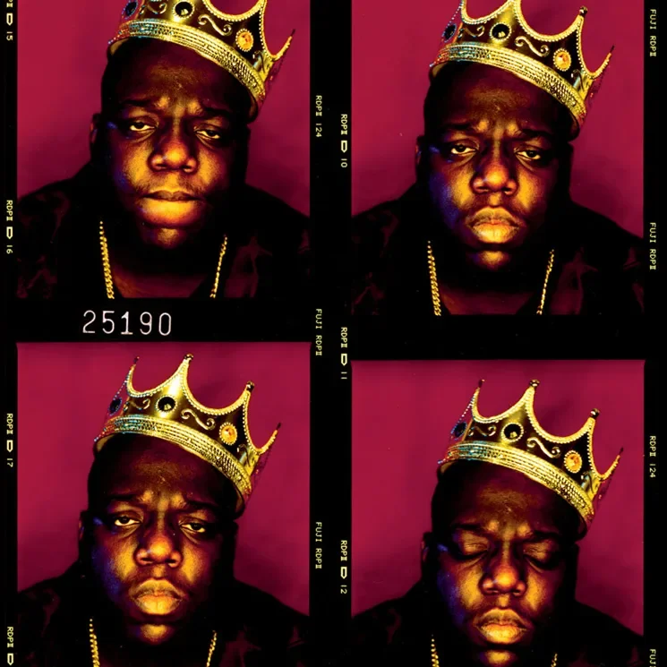
From there, the direction expanded beyond hip-hop alone. Being in Brixton, I began thinking about the proximity of different cultural icons - most notably the David Bowie mural just minutes from where we were shooting. That contrast became important. It allowed the shoot to move beyond a single lineage and instead position the subject within a broader field of cultural influence, where different forms of iconography coexist and inform one another. This thinking carried into the execution of the shoot. Initially, the plan had been to use a party crown as a direct reference to The Notorious B.I.G.’s portrait. When that wasn’t possible, we went to Brixton Market to find an alternative. It mirrored the conditions under which the original Biggie image was created - a spontaneous decision that later became iconic - and reinforced a key principle in my approach: that iconography is not only defined by reference, but by the circumstances and decisions surrounding its creation.
What became important here was not simply referencing the image itself, but engaging with its underlying logic of spontaneity and immediacy. This approach reflects a key learning learned through this shoot: using cultural references not as endpoints, but as materials to be reworked, repositioned and re-authored within a new context. In this sense, the shoot functioned as a case study in constructing imagery that operates within a lineage of influence while still asserting its own identity. As an early articulation of my approach to creative direction, I have discovered a new part of my creative discipline - not simply producing images, but constructing the conditions through which they can become meaningful and, potentially, iconic.
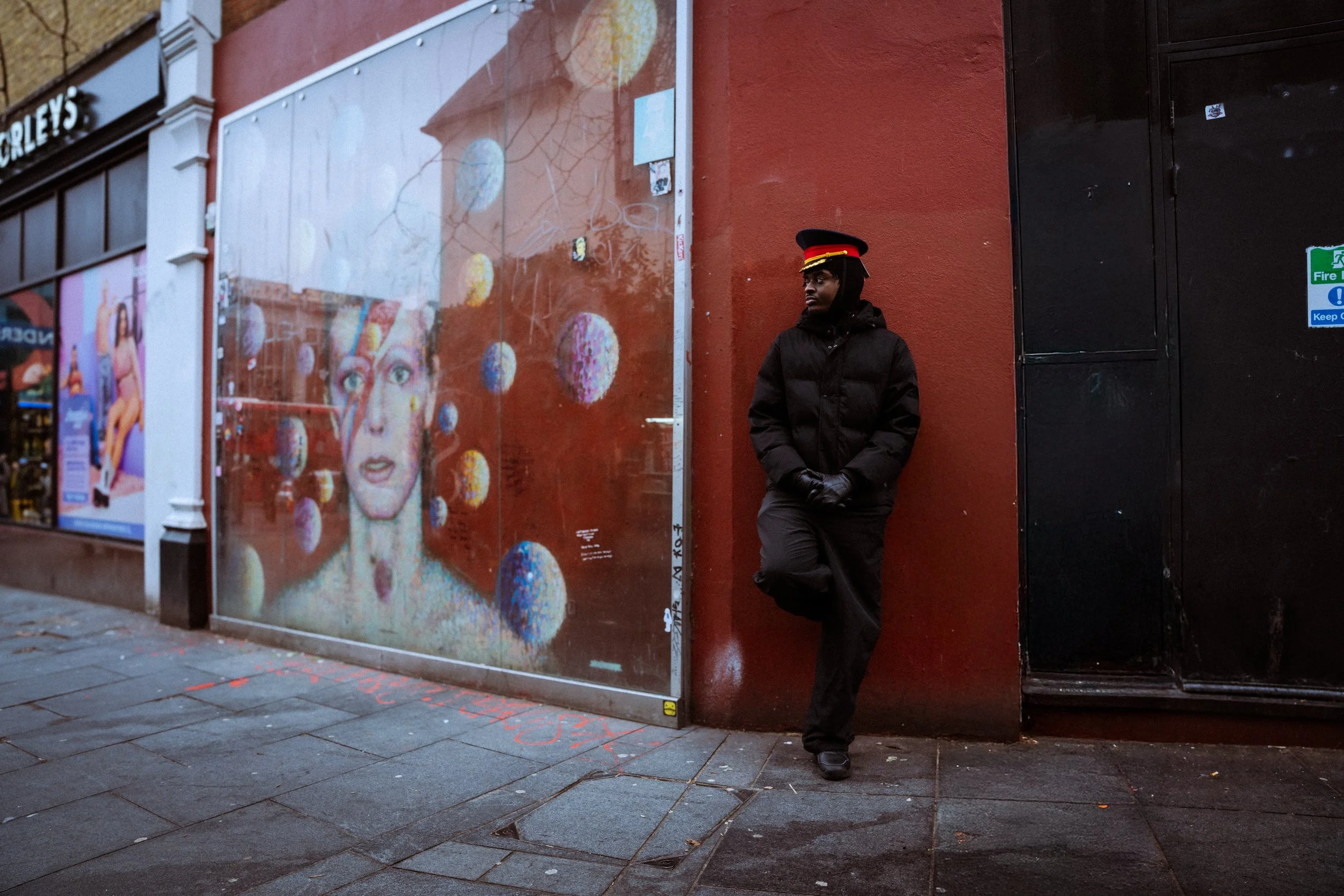

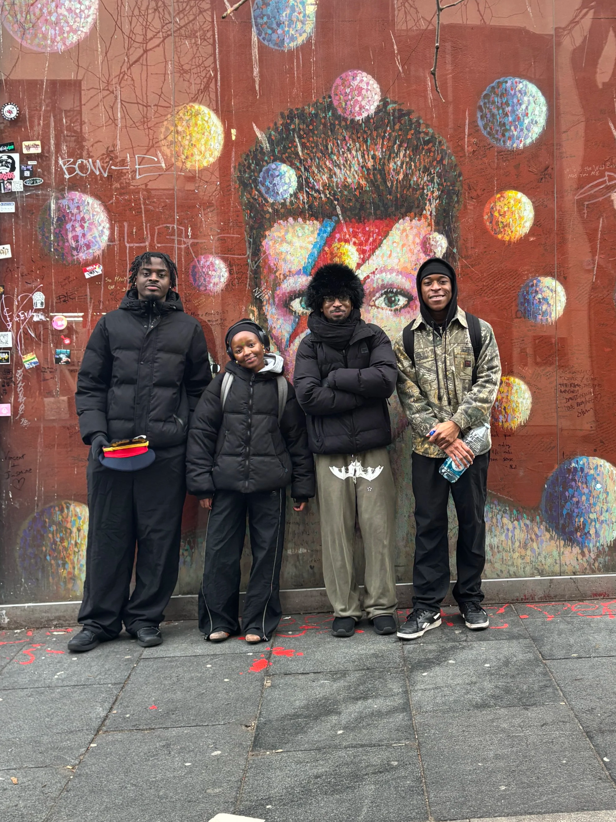
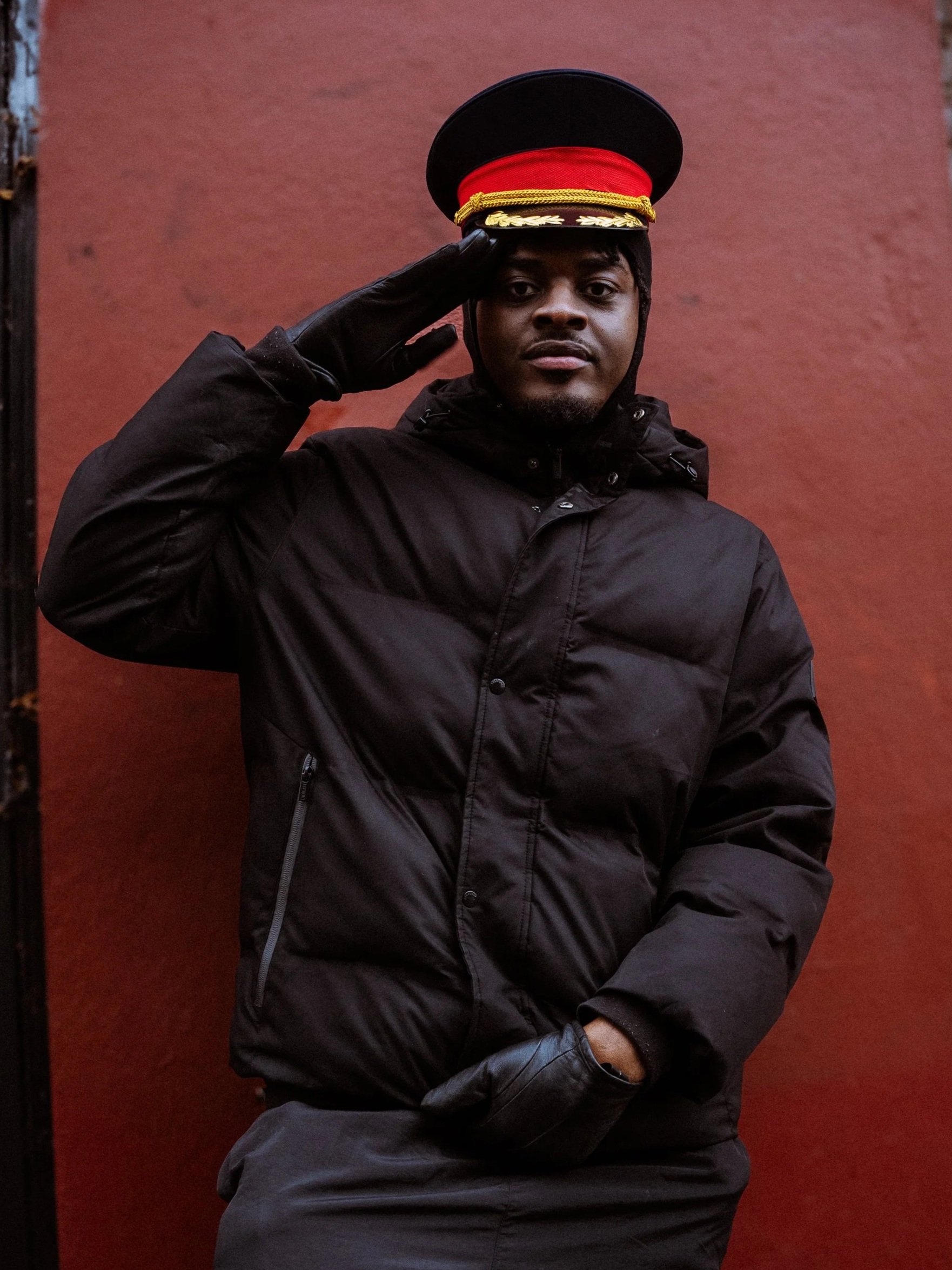
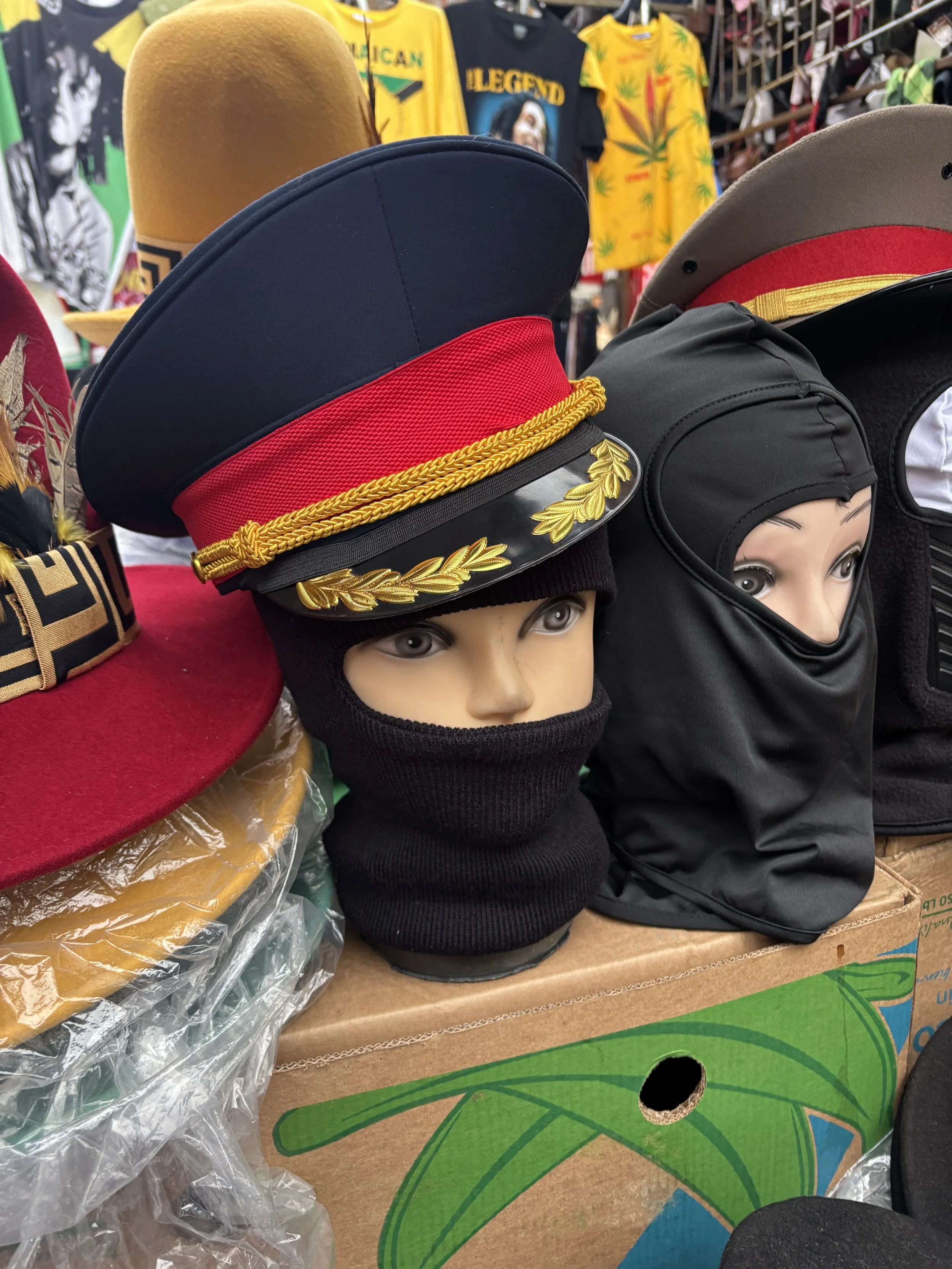
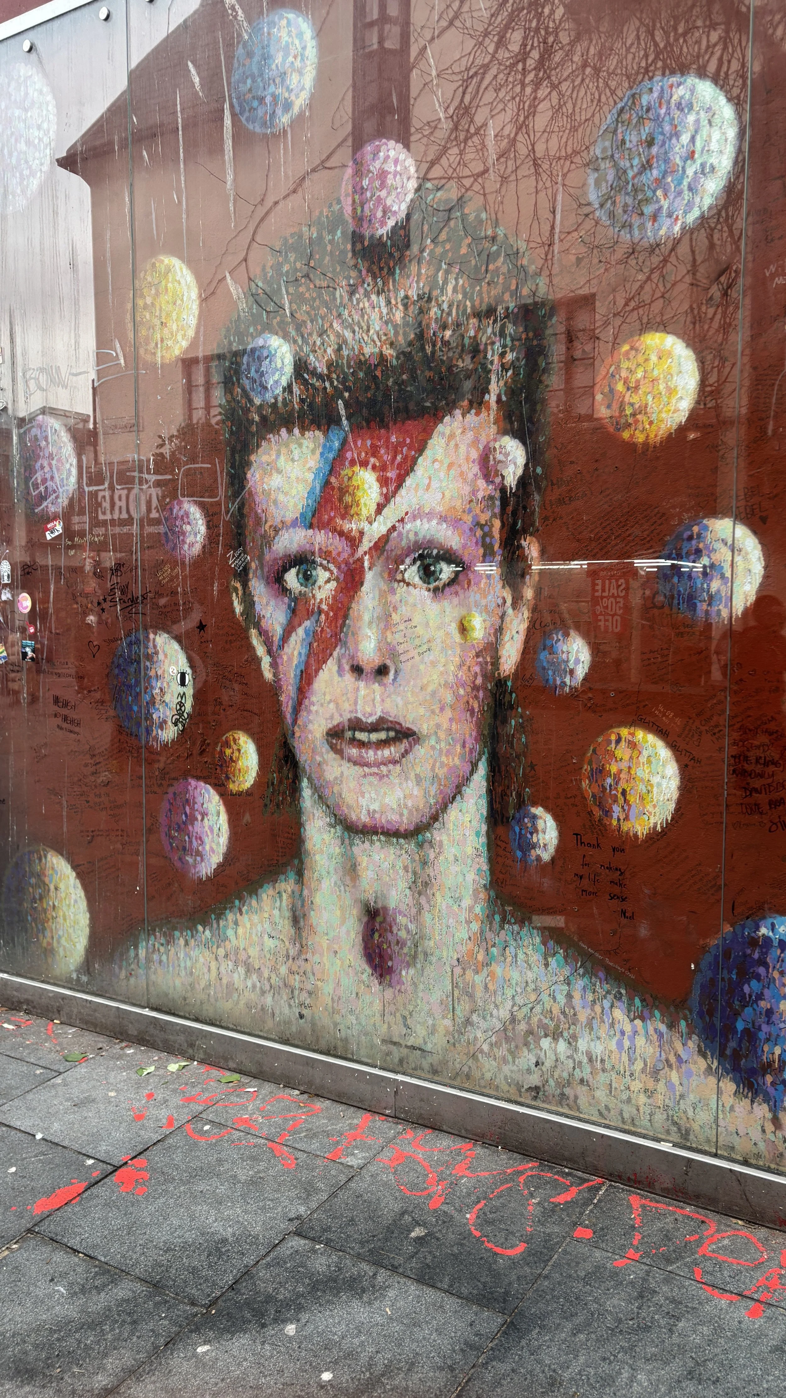
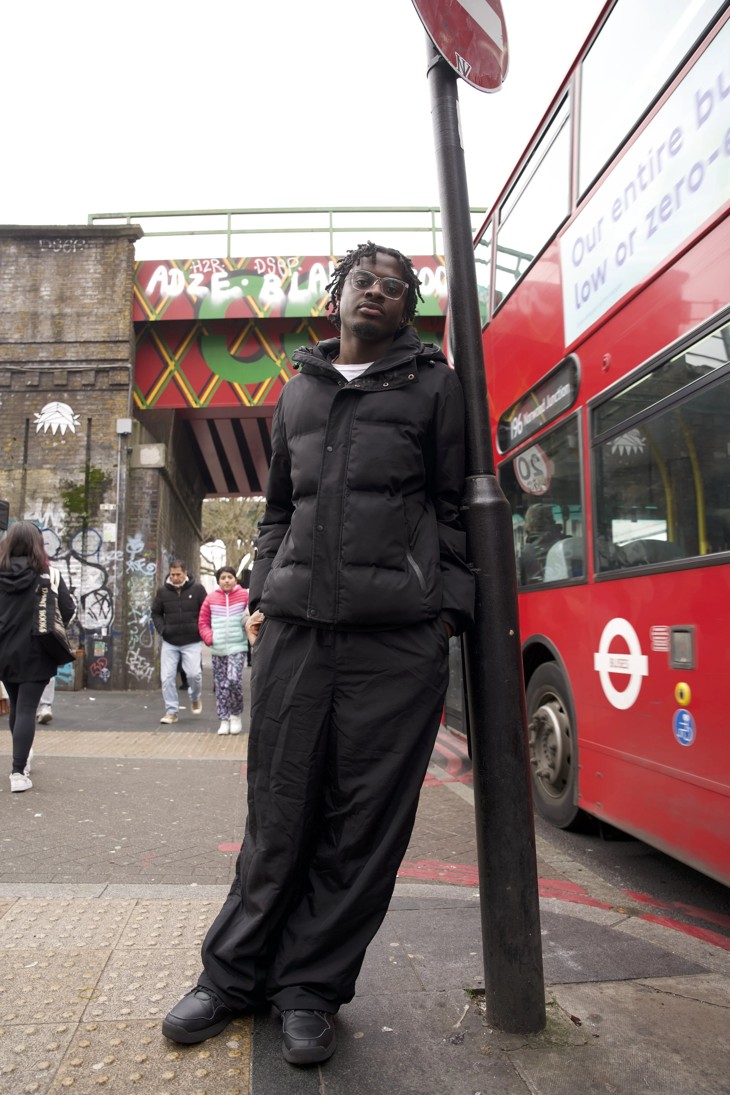
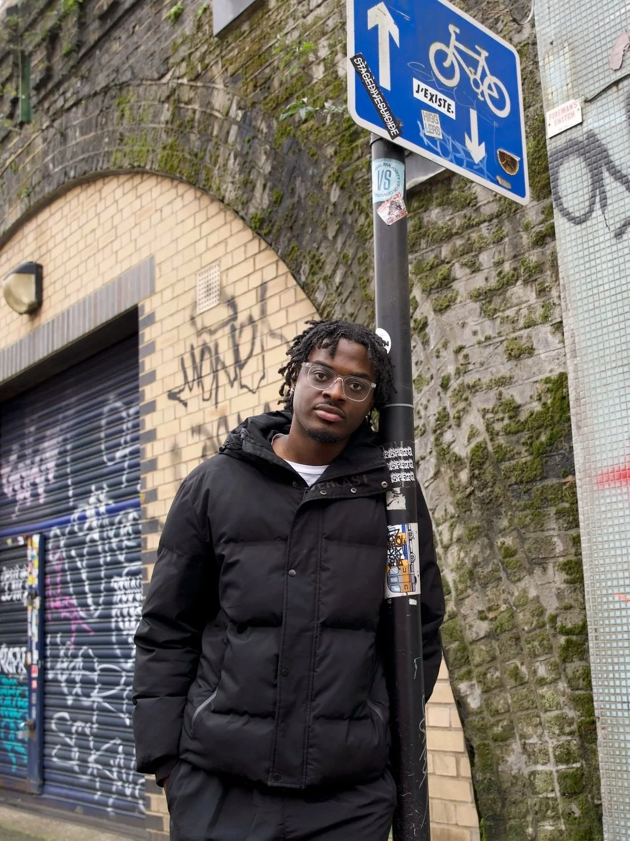
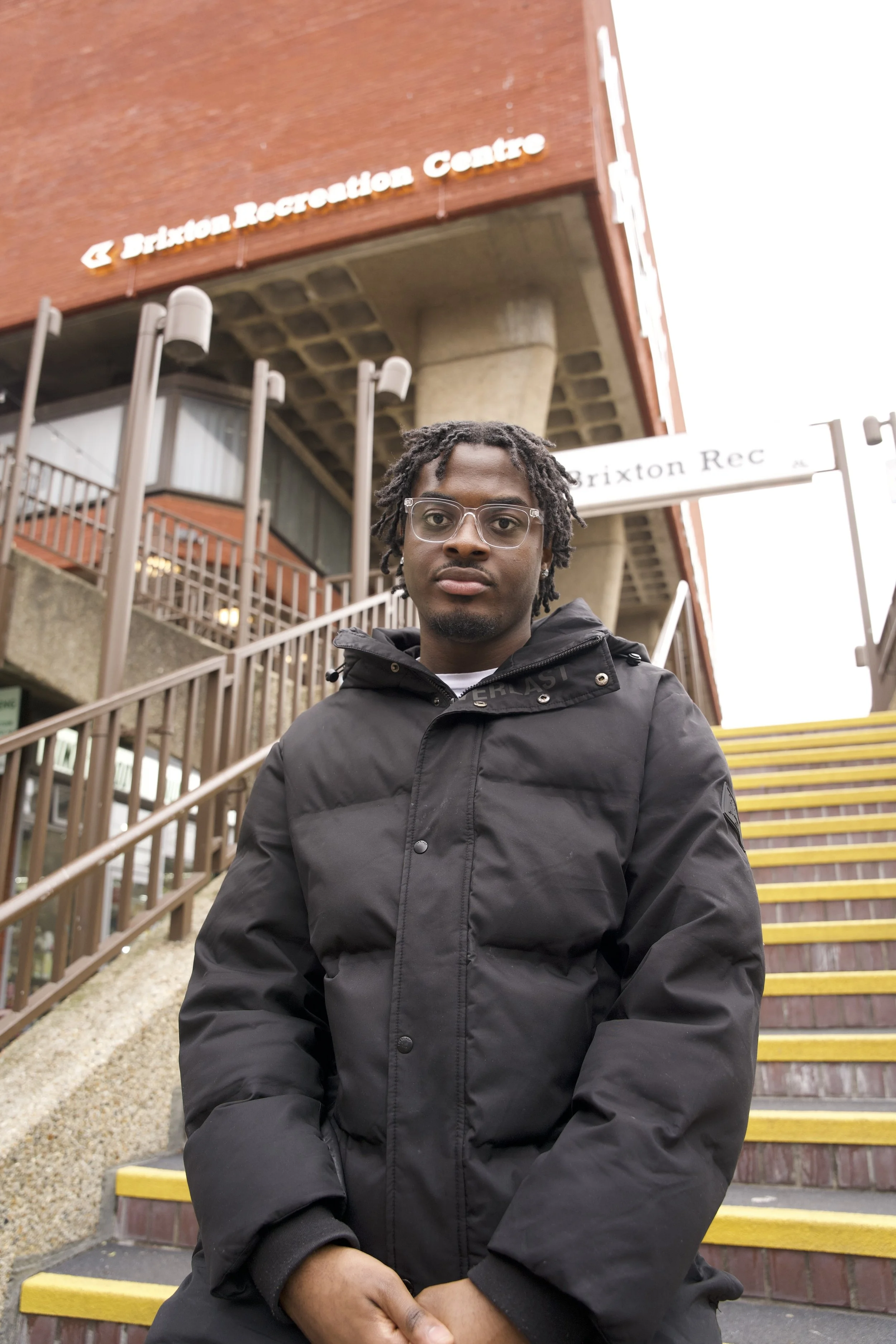
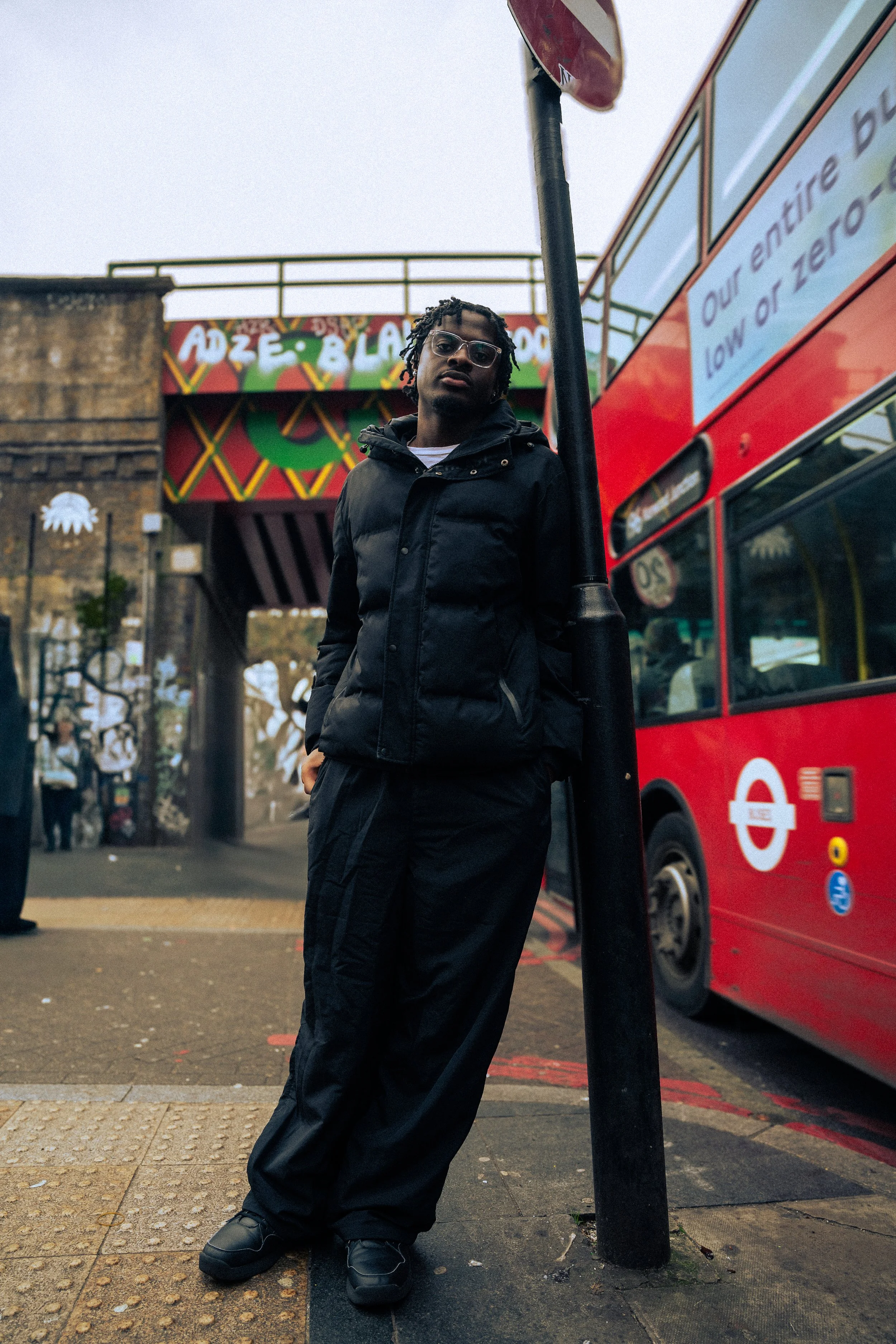

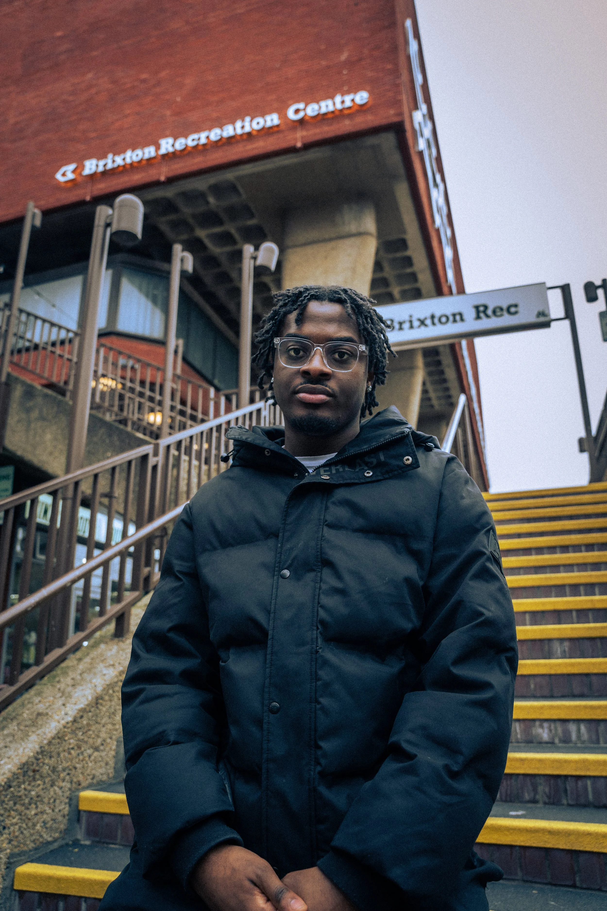
Alongside directing the shoot, I was responsible for post-production, including colour grading and final image selection. This was my first time working in Adobe Lightroom, requiring me to quickly develop a new technical skillset in order to bring the images into a cohesive visual language. Working across images captured in varying lighting conditions, I focused on balancing tone, contrast, and colour so that the final set felt consistent and intentional. This process extended my role beyond direction into final image authorship, ensuring the visuals aligned with the magazine’s broader design system.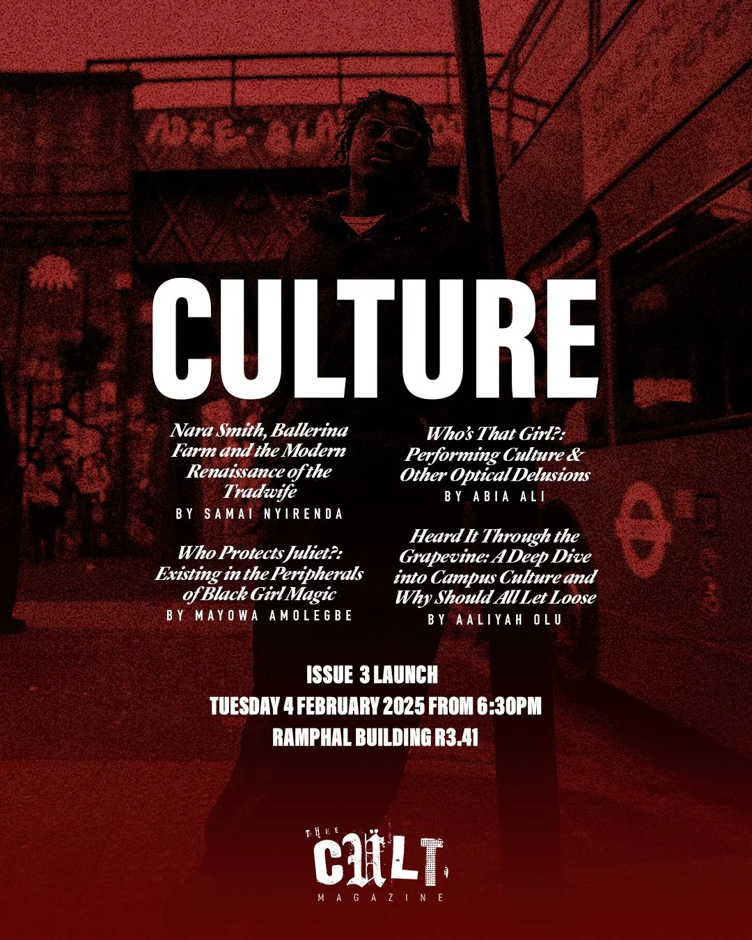

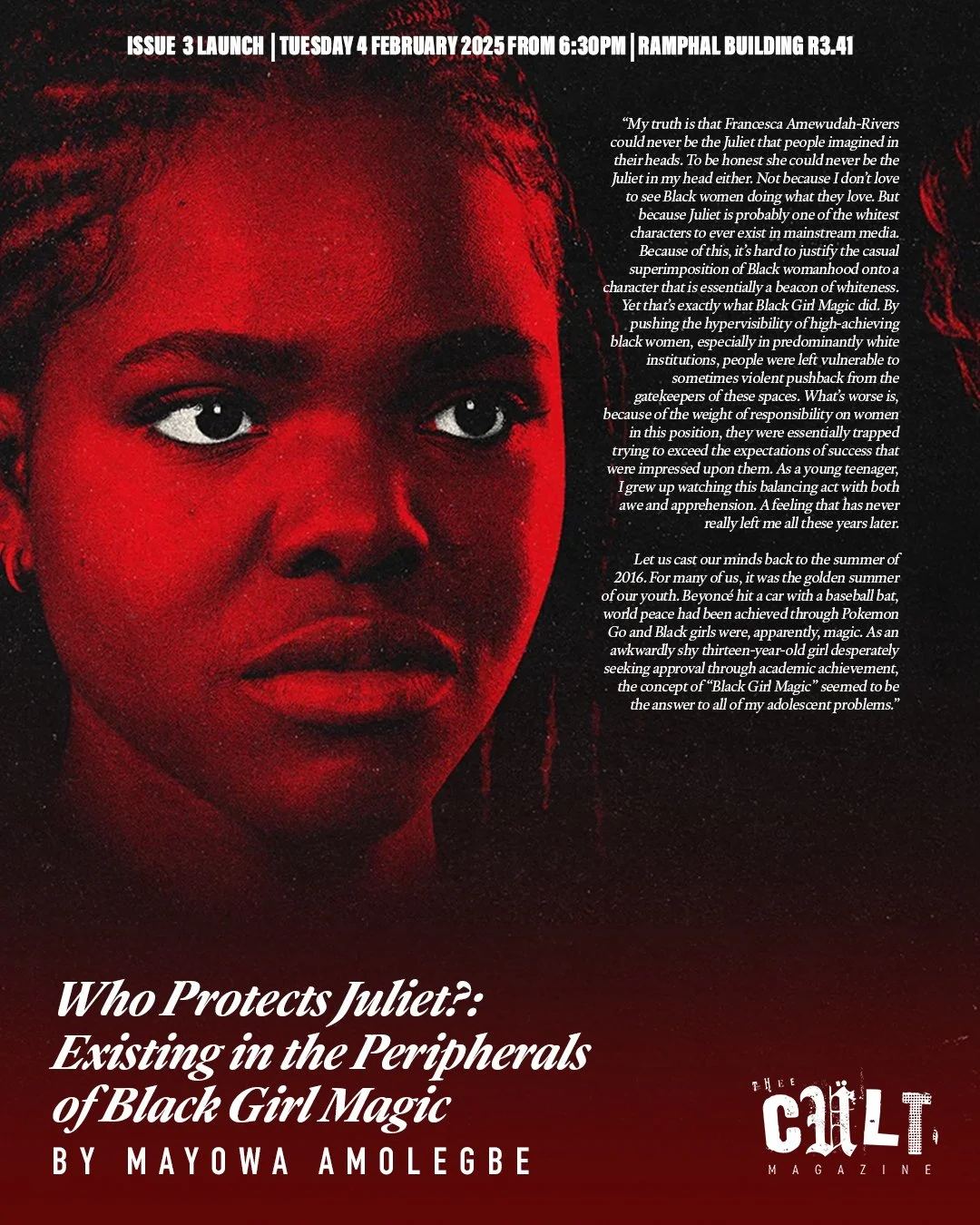
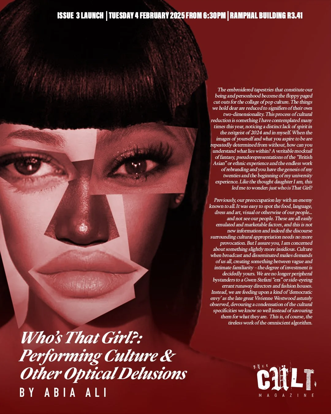
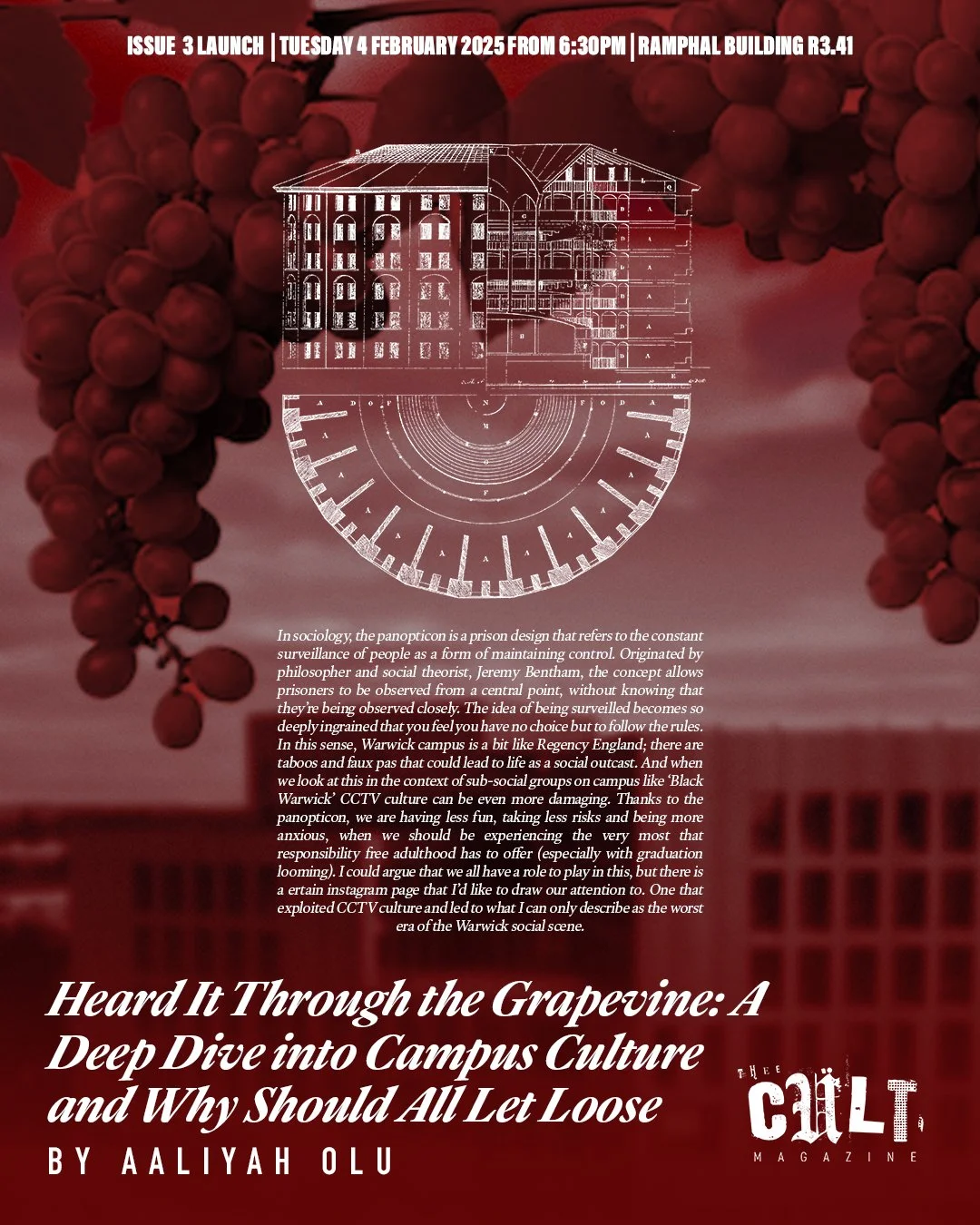


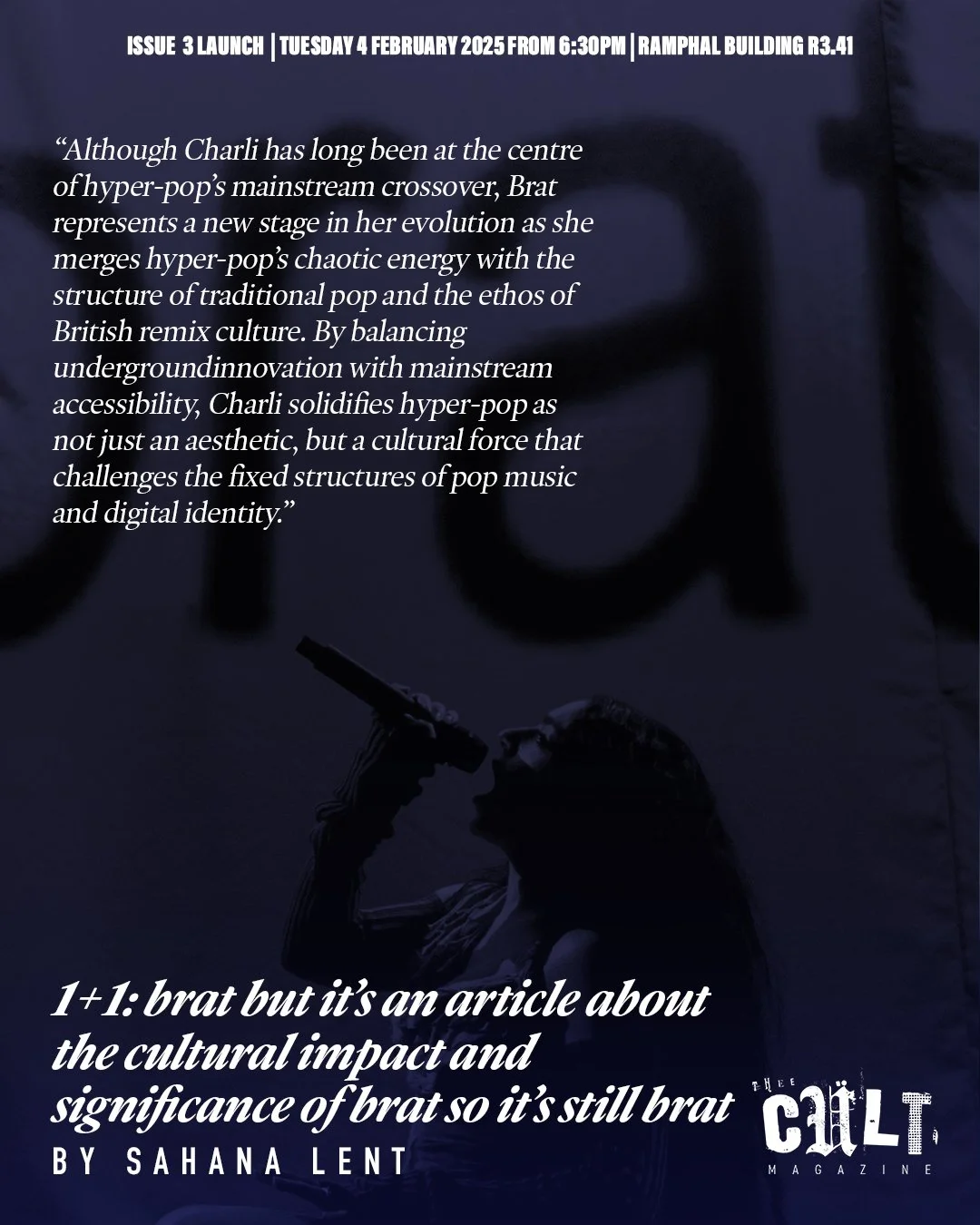
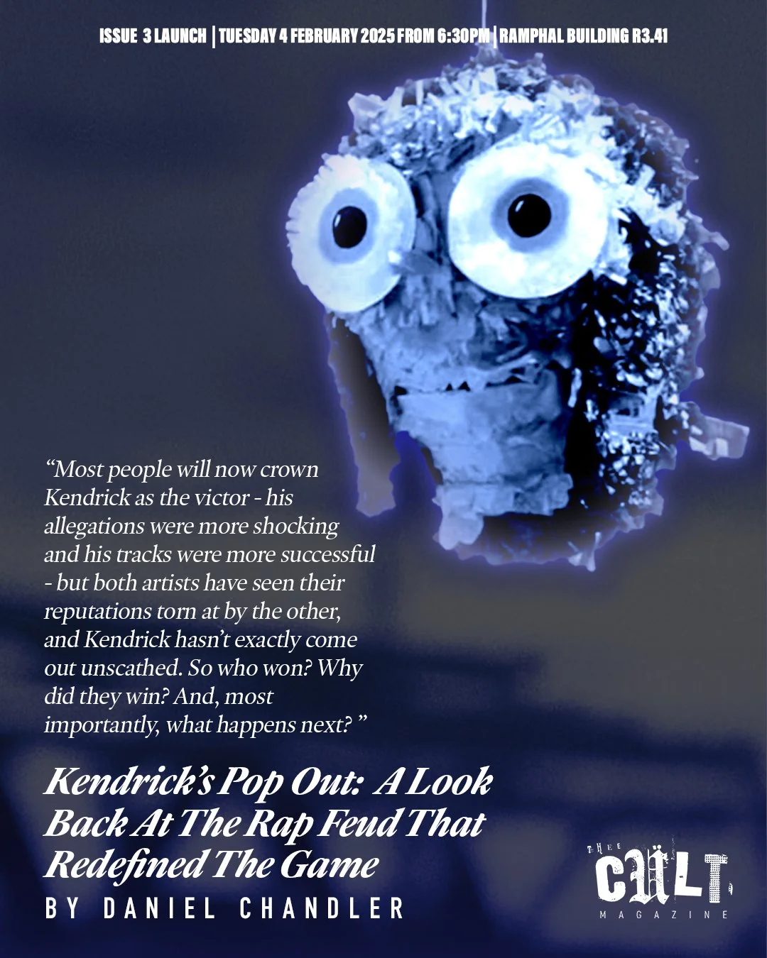
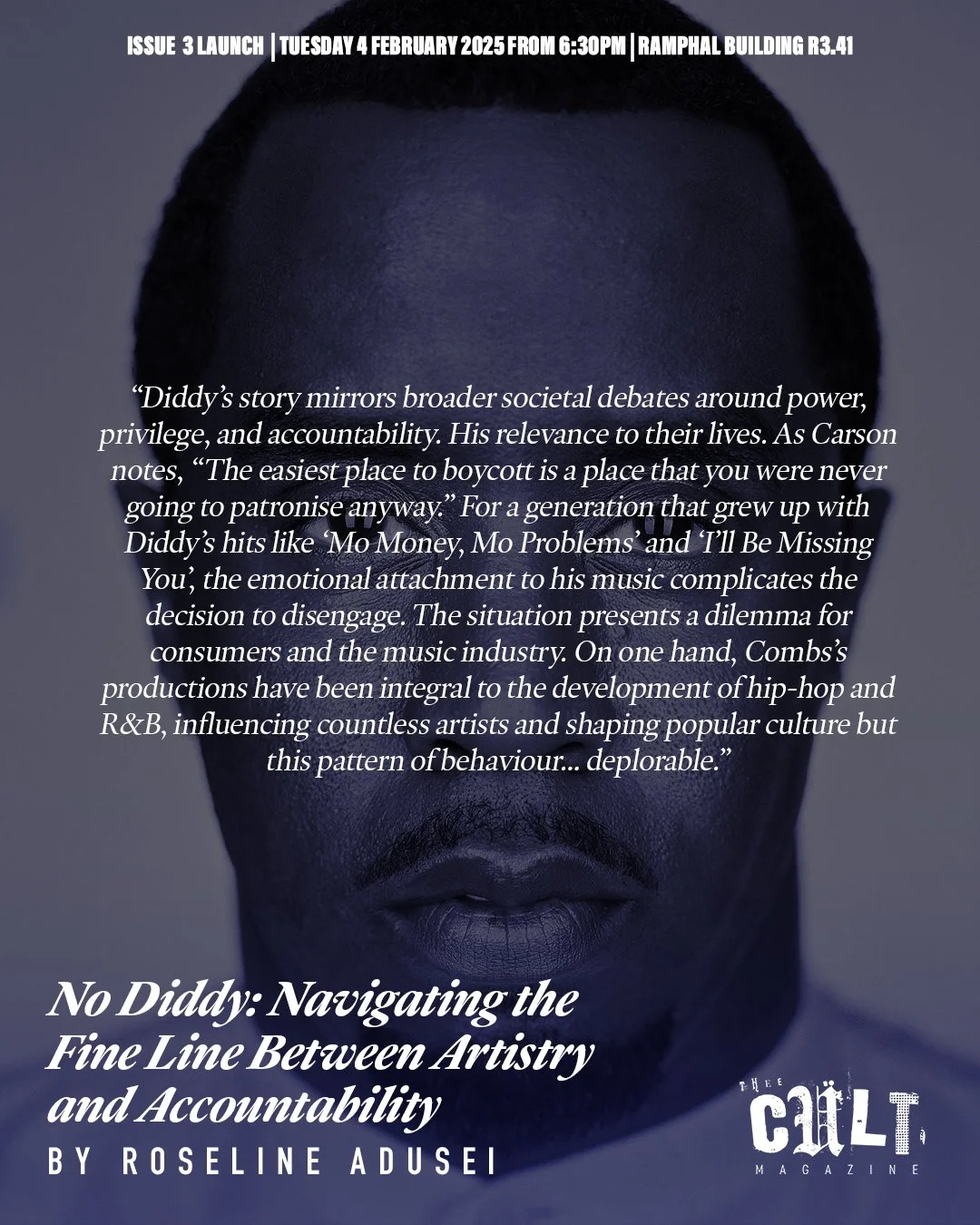

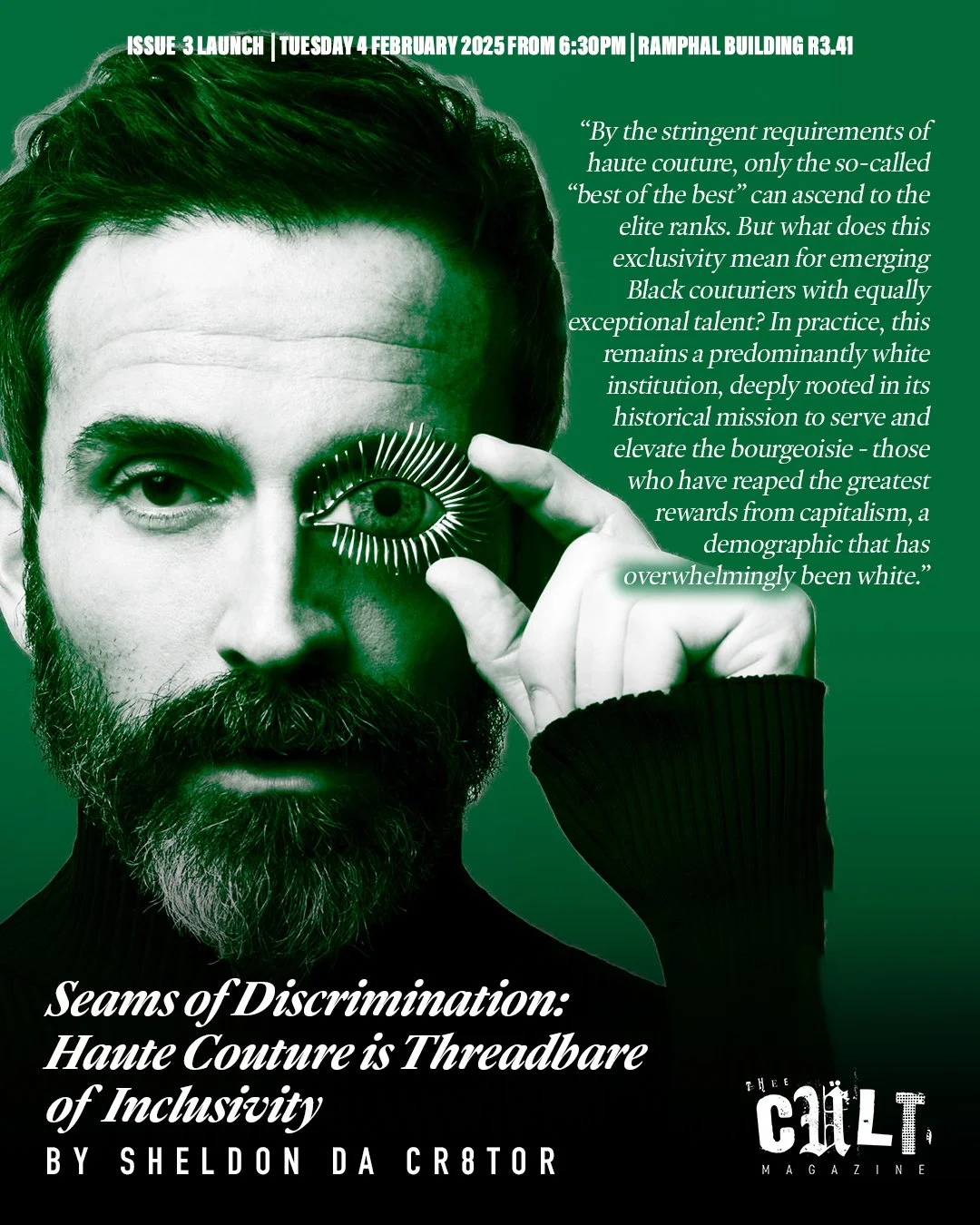

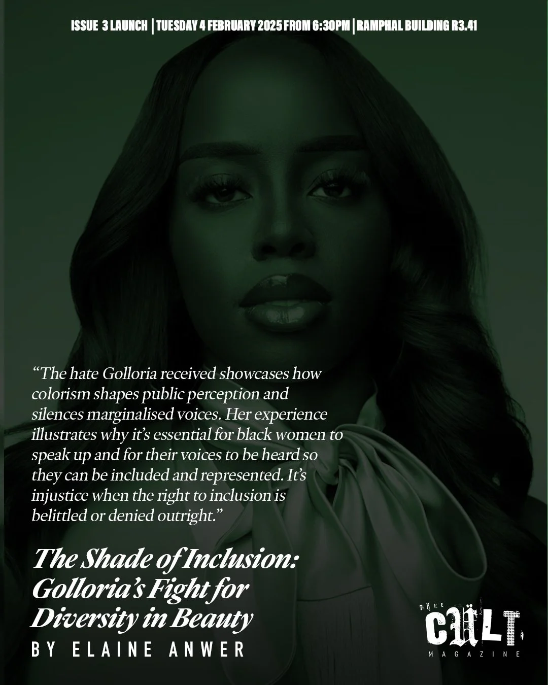
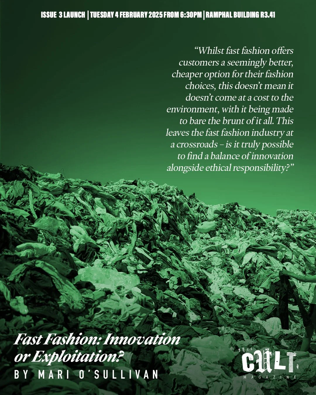


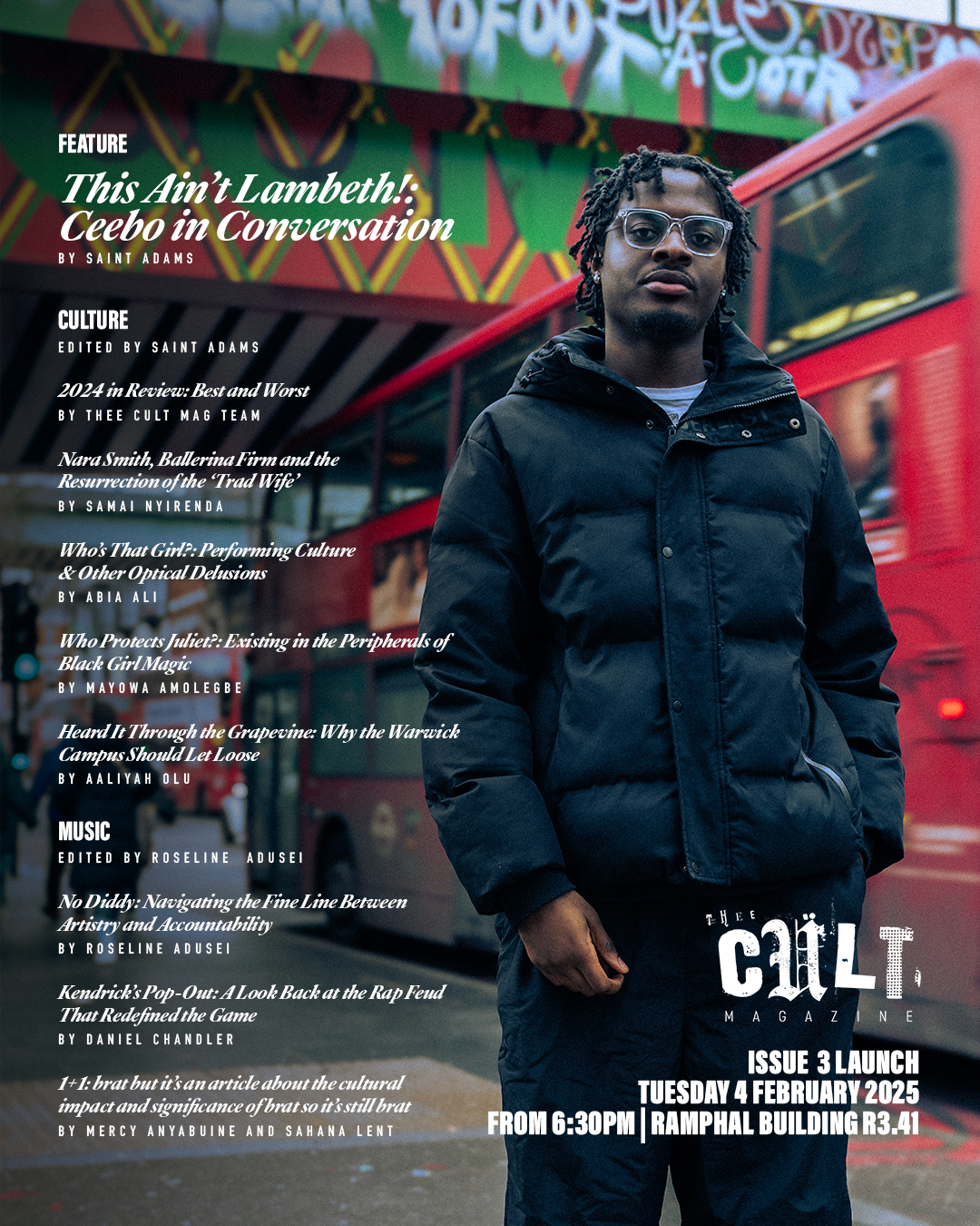
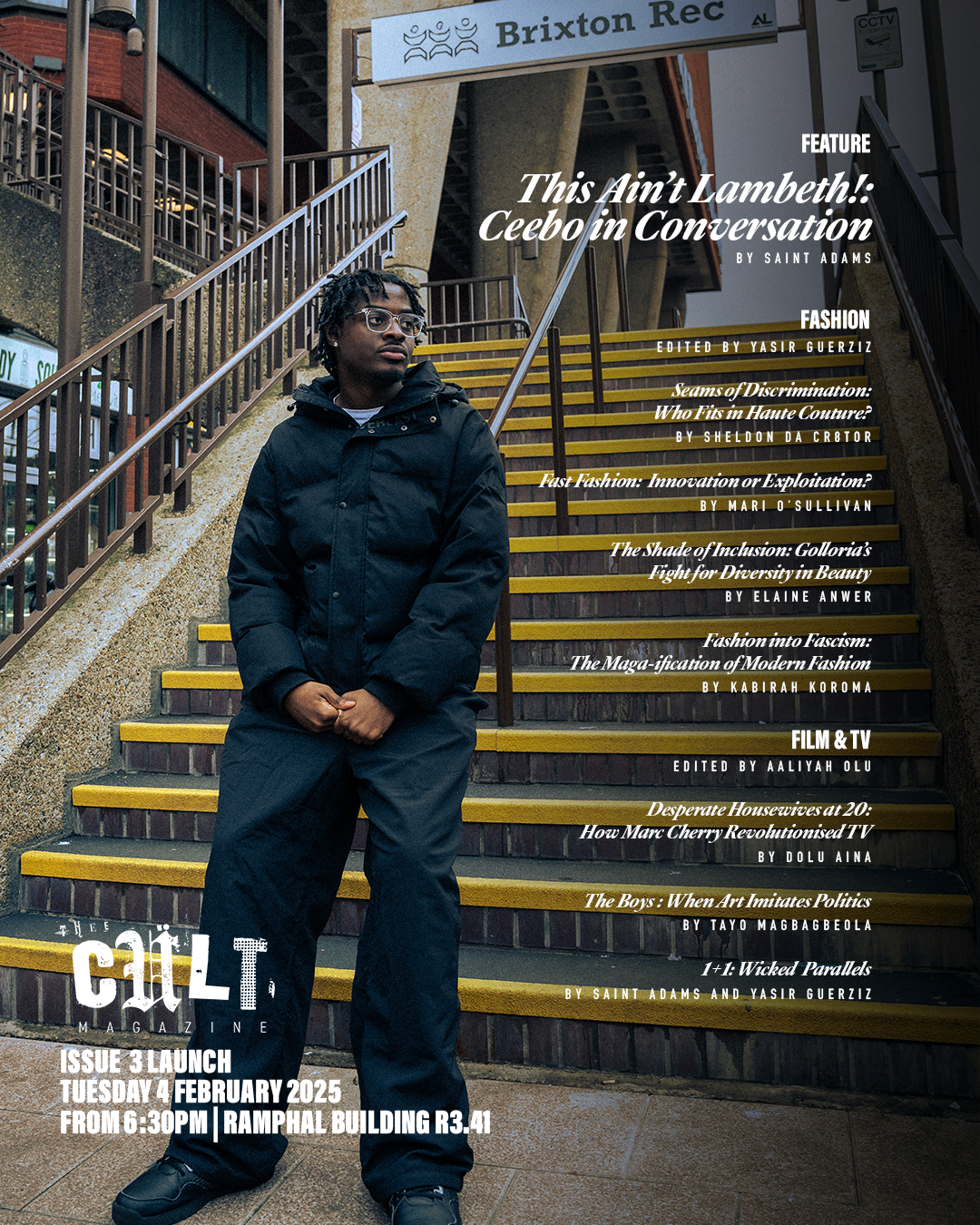
The social media rollout for Issue 3 reflected a more developed alignment between the magazine’s visual language and its outward-facing communication. Rather than functioning purely as promotion, the content began to mirror the structure and tone of the publication itself - previewing articles, highlighting contributors and foregrounding student work as the central focus. Posts were designed to be both informative and shareable, using formats such as carousels and story-friendly layouts to circulate content more effectively across platforms. This approach allowed the magazine to extend beyond the page, creating multiple entry points for engagement while maintaining a consistent visual identity.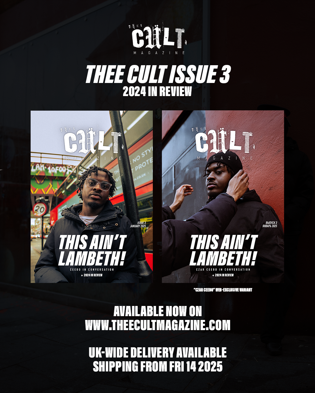


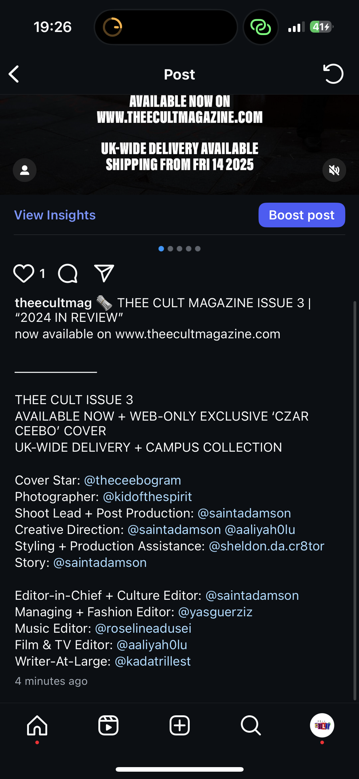
Alongside this, Issue 3 marked the introduction of a dedicated website, developed by Yasir Guerziz using Shopify. While intentionally simple in its construction, the site represented an important step in making the magazine accessible beyond physical distribution. For the first time, audiences were able to purchase and order copies online, including a limited Czar exclusive cover variant tied to the in-person launch.The website also introduced a foundational digital presence for Thee Cult, including information about the magazine and its wider vision. However, social media remained the primary driver of engagement and distribution, acting as the main interface through which audiences encountered, shared, and interacted with the publication. This process highlighted how the magazine could operate across both physical and digital spaces, with social media functioning as the core platform for visibility and circulation, and the website supporting access and purchase. Together, they established an early model for distribution.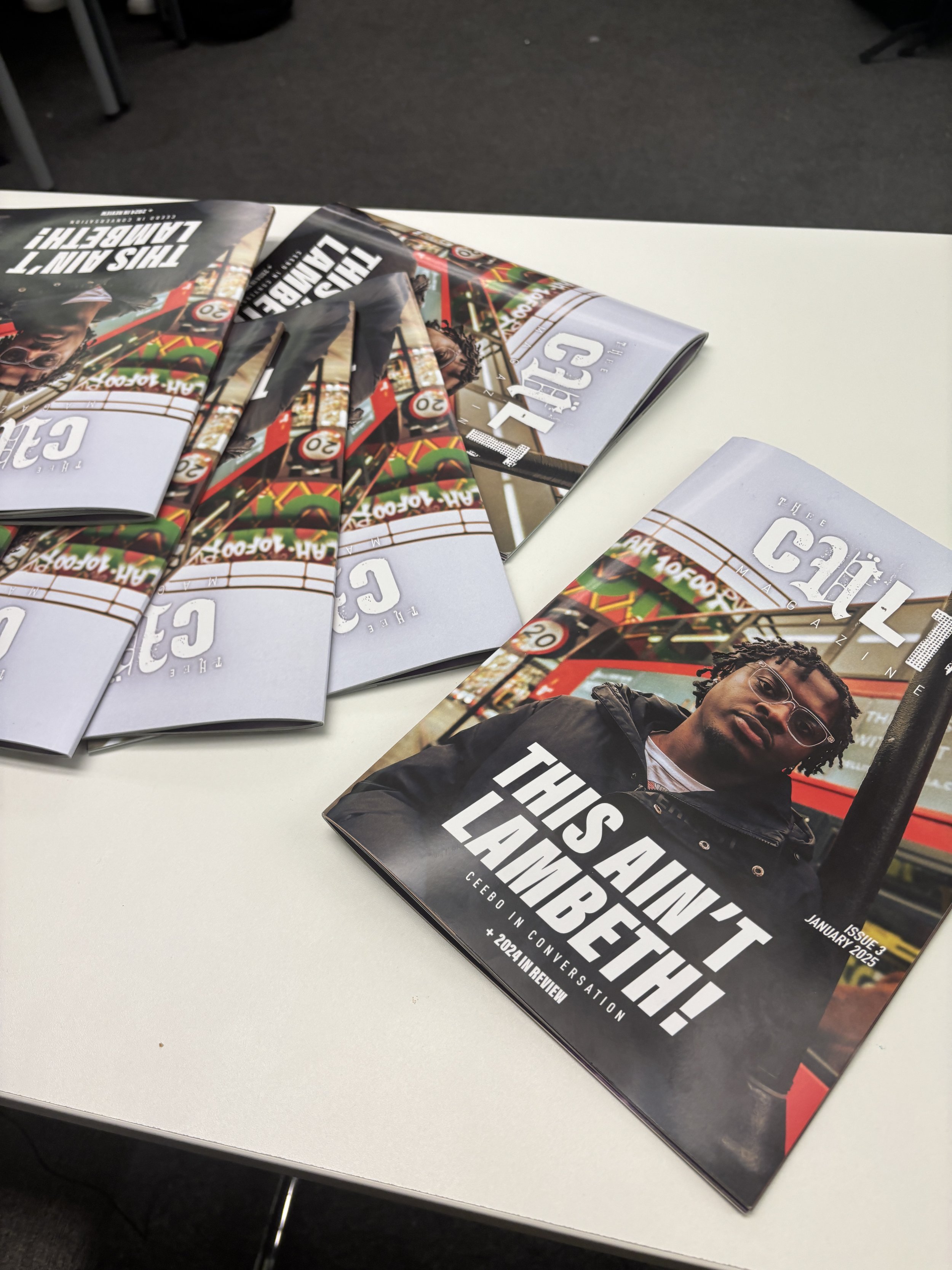
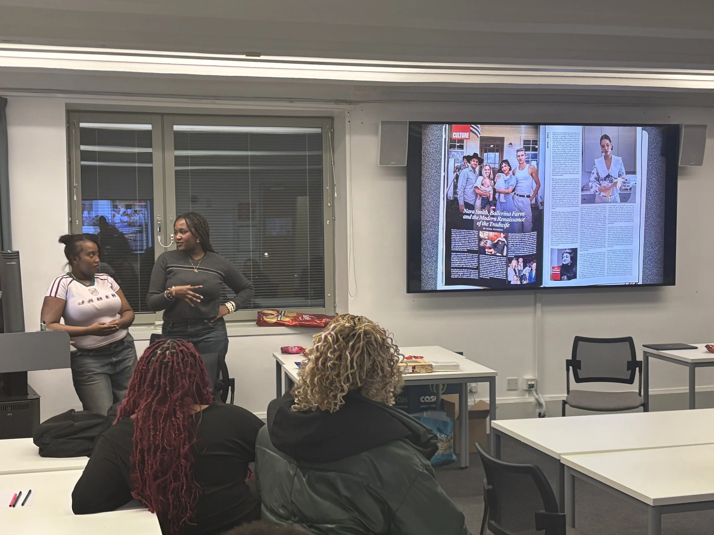

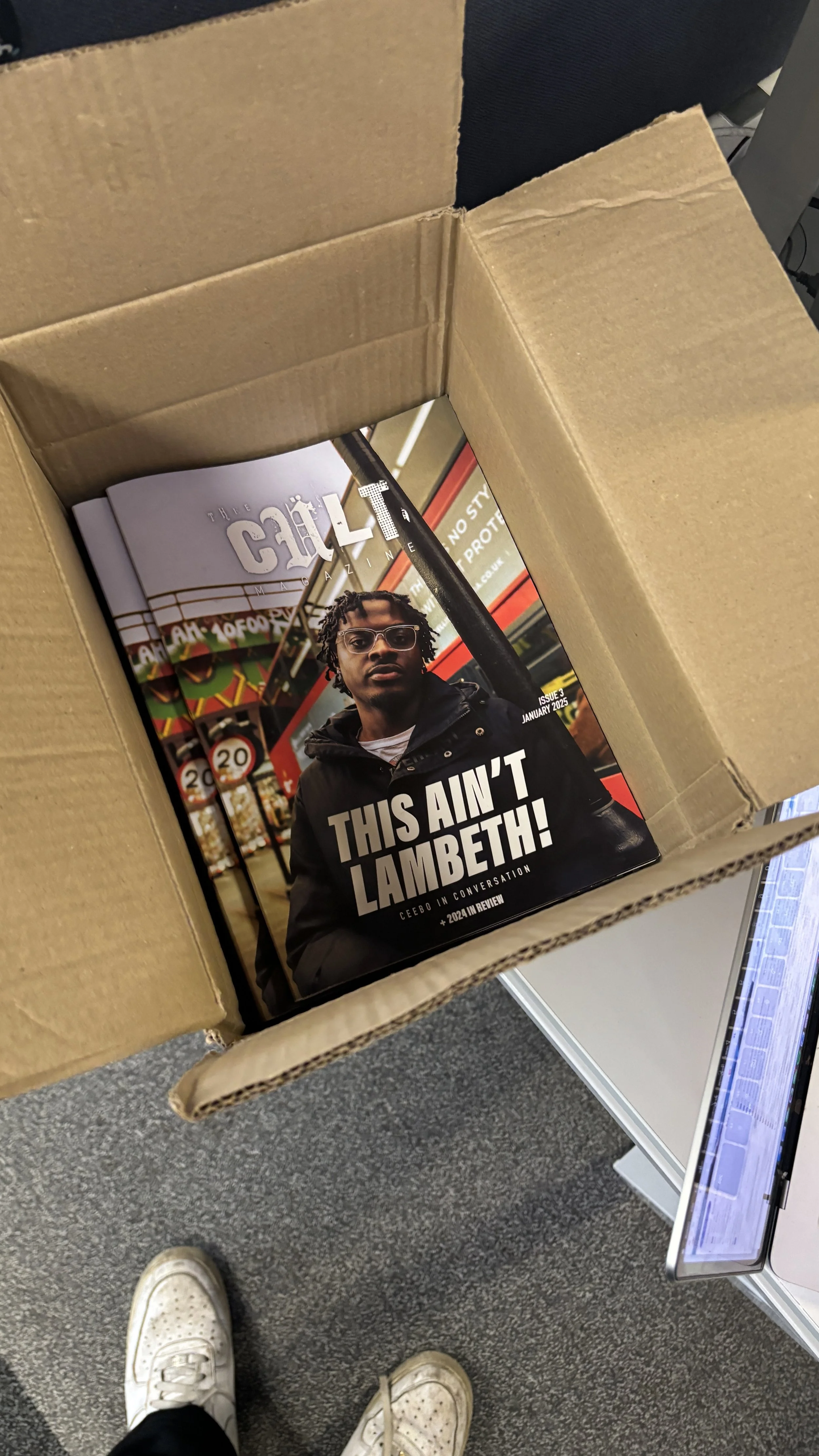
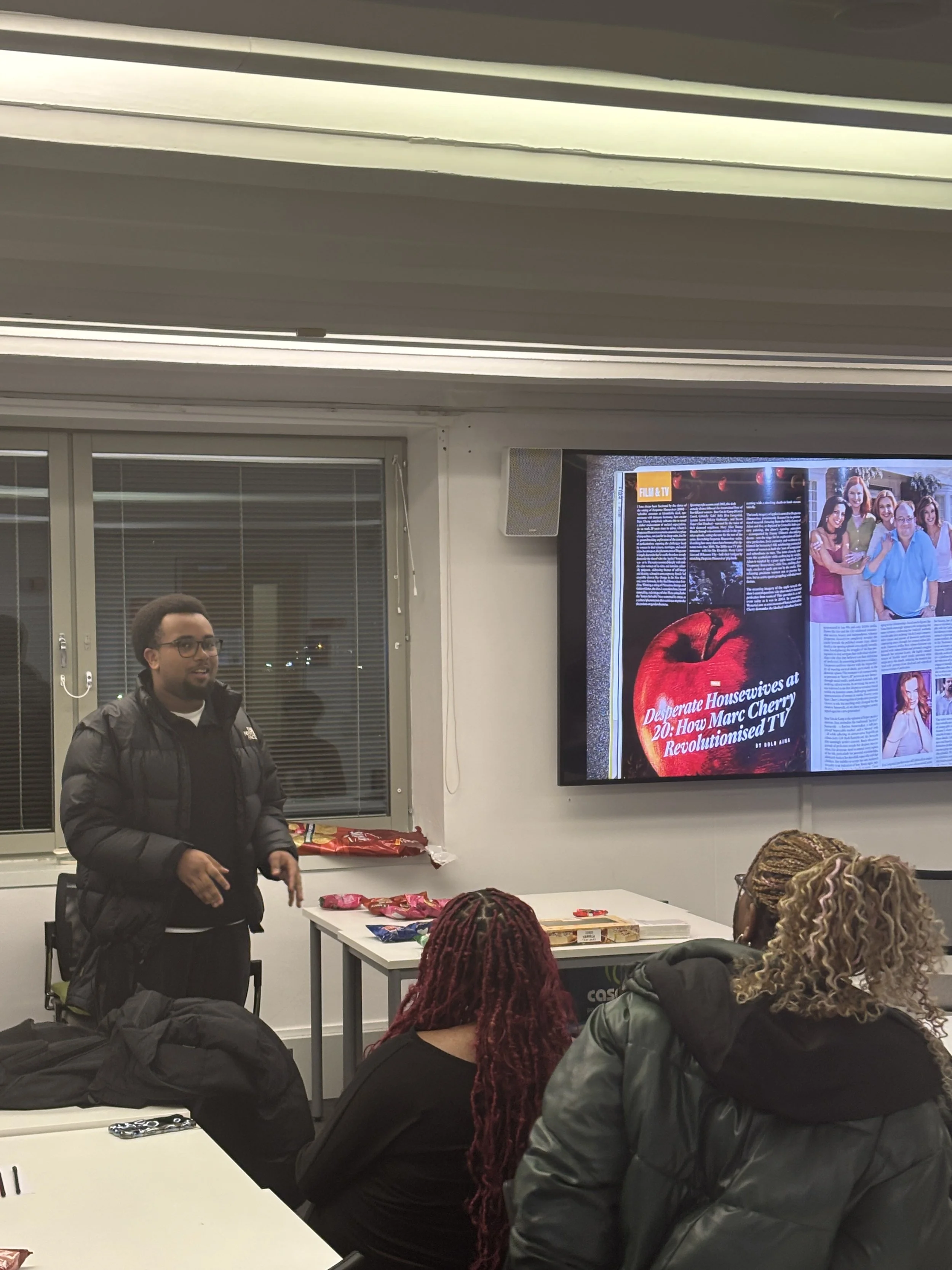
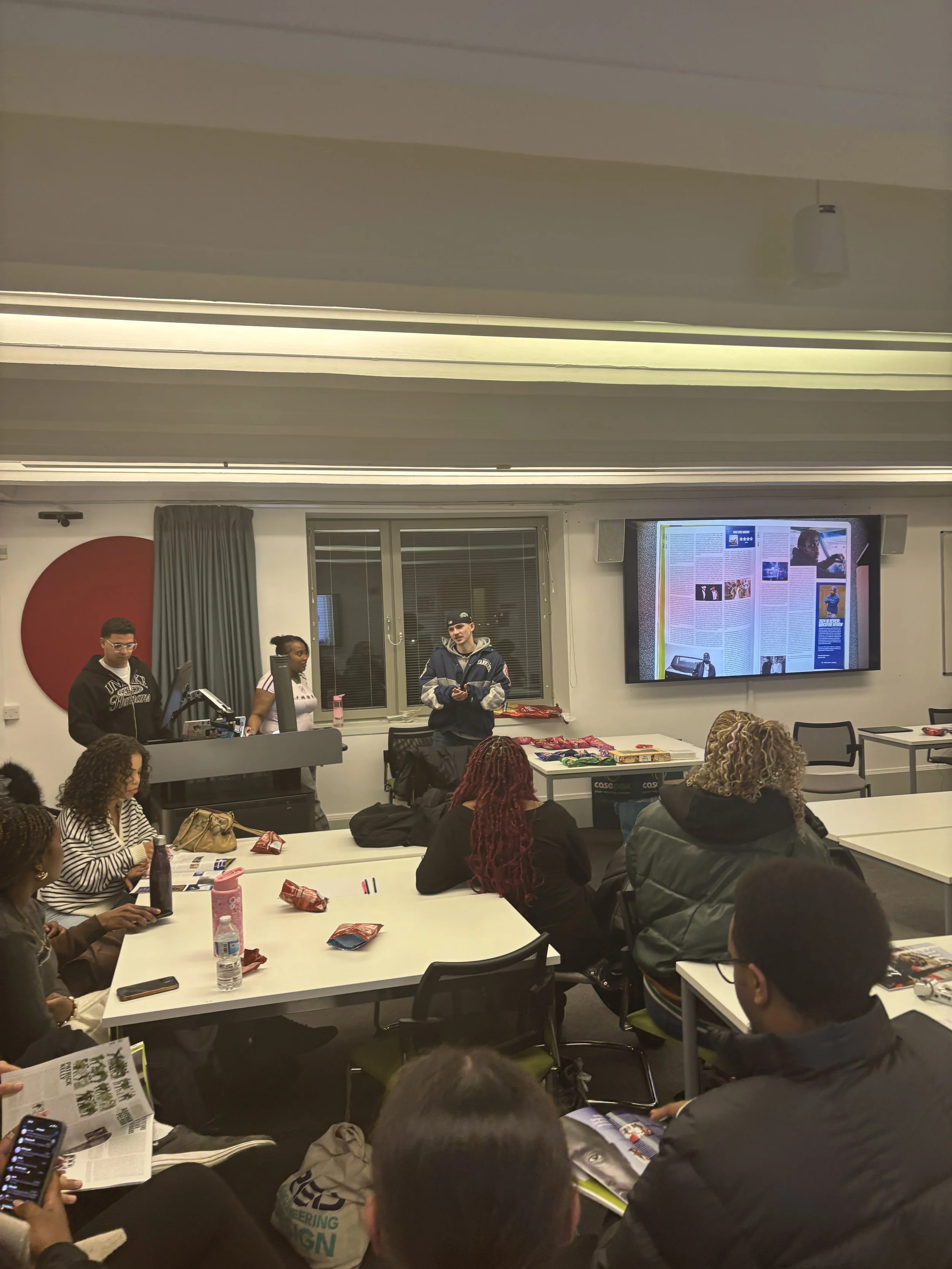

Issue 3 culminated in an in-person launch event. Alongside physical sales, the event featured a live Q&A with contributors - hosted by Culture Editor Aaliyah Olu - where writers spoke about their articles, their motivations and the ideas behind their work. This moment brought the purpose of the magazine into focus. What had been developed through systems, design, and production was ultimately about platforming voices - creating space for young writers to articulate their perspective and passion. In a cultural climate where experience is increasingly difficult to access - with publications closing and fewer opportunities within youth media - creating space to simulate those environments becomes important. The launch, in that sense, wasn’t just about releasing the magazine. It was about giving writers the opportunity to present their work, speak on it and be part of something that operates like a real publication. That moment grounded the project, connecting everything back to the people it was built for.Ultimately, Issue 3 marked the point at which Thee Cult established itself as a distinct publication, operating with a defined editorial structure and a working production flow. What had previously been built through experimentation was now functioning with intention. With systems in place across editorial, design and distribution, the magazine was able to support a more cohesive and scalable process. This created a foundation that could be expanded and developed further, allowing the publication to move toward a more ambitious and sustained vision moving forward.